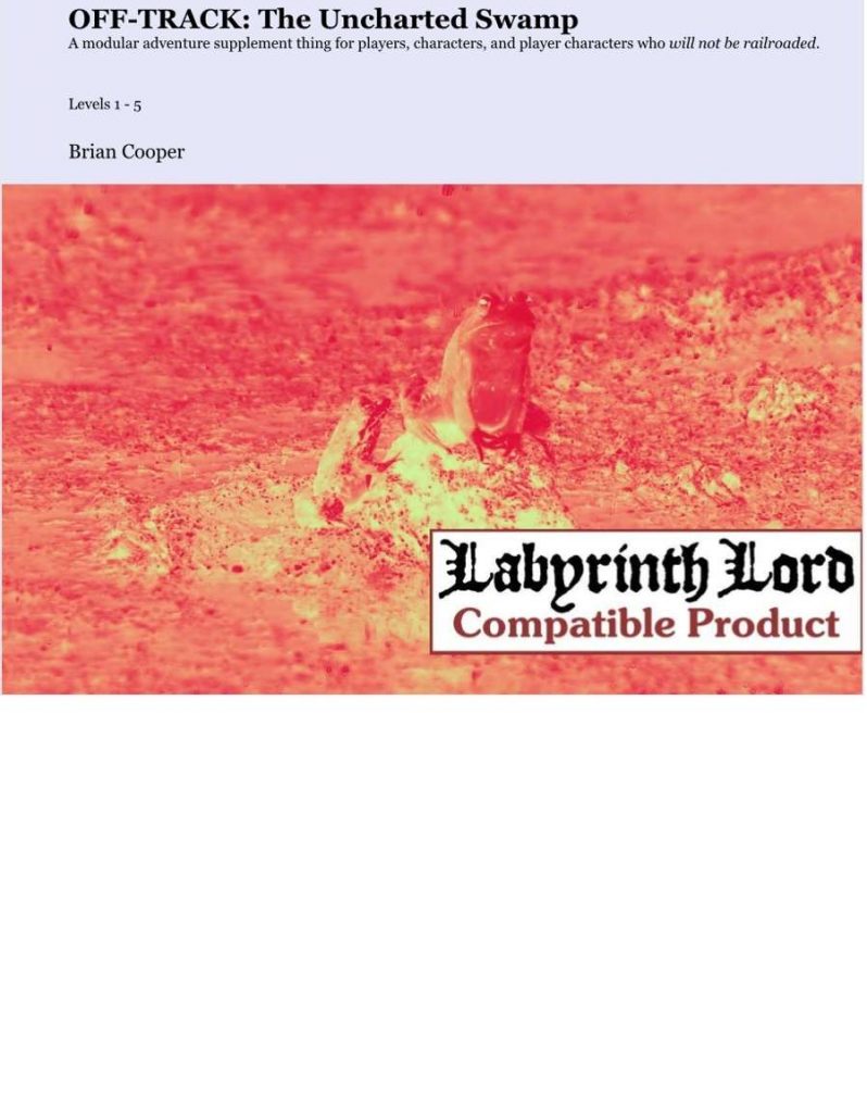
Cowpie Mushrooms

  • By Martin O
  • Goodberry Monthly blog
  • OSR
  • Low Levels

Inspired by real life events! About mushrooms that grow on cow shit! It has cows and doggos in it!

This eight page heist adventure outline is about harvesting mushrooms that grow on cow shit … from farms with uncooperative farmers. Generally well organized, it gets in and out fast with a good  focus on gameable information rather than trivia. A little more lead in and a map would have made this super great, instead of just good. It’s a silly fucking heist, but, the best D&D is Heist D&D, a sandbox area and some stupid fucking plans created by the party. It’s hard to not like heist D&D.

This is really a kind of outline of an adventure. It gives you a brief one page overview of the goals (stealing mushrooms to sell to a rich asshole) and a little background and then launches in to descriptions of the three farms. The descriptions are focused on the task at hand: stealing the mushrooms. You get three power curves: a senile farmer with two cows, a farmer with about two dozen cows and dogs, and a farmer with forty cows and a military background and large family.

The elements present include a local sheriff, about an hour away, who hassles the party a bit in town and warns them about lynch mobs. Note what this does, giving the party two important bits of information. Not only do they have to worry about the farmers, but now they have to worry about the sheriff getting sent for and the local mob militia. But … they also know he’s about an hour away … both of which can now factor in to their plans.

The farms are tersly described. The house and farm, proper, is just a blow off in a sentence or two. The focus is on the people and NPC’s. How they react to both an up-front appeal “let us collect the mushrooms” and how they react to trespassers at night. A schedule for each farm, letting the party know who is where, and brief but sticky personality quirks. You get dogs who go for the face or crotch combined with sweet little quiet bulldogs. You get suspicious teenagers along with a little kid who loves candy and another who loves adventurers.

Note how good things are mixed in the bad. There are things to take advantage of, and things to watch for. The adventure locales are a collection of elements good and bad, for the party to build their plan and attempt to execute.

Bolding is used to good effect to call out certain sections of text, helping the DM locate important bits. The personalities are terse, in just a couple of words per, but stick well. Arthritic beagle, a dog that barks incessantly but it the sweetest dog ever. You know how to run this once you read it. The vision is communicated well.

On the downside …

There’s no map of the farms. Yes, I know, I sound like an ass. But a decent map of the farms and/or surrounding lands would have allowed more caper play, sneaking behind hedgerows and setting fire to things and the like.

There’s also a more that could be done with the summaries. The dogs have a personality summary on one page and a stat summary on another page. A little combined action would have been nice, but it’s not a deal breaker, since the adventure IS only eight pages long.

The map is, I think, a part of a larger problem. The focus is on the three fams and everything outside of that is handled in just a paragraph or two. Just a TAD more in the way of the region/local village/buyer assholes, would have provided a more solid grounding for kicking the adventure off. As is, we’re just told the buyer is a rich asshole. That’s enough to run him for me, but adding another one or two buyers, and maybe the BAREST of villagers/towns nearby, and a little regions map (without more detail) would have provided the DM just a few more tools to kick the thing off and run some of the more interesting complications.

Everything drives the action. All of the details are focused on the task on hand. The words are all meaningful to the adventure. It’s a rare adventure that can do that. This is a nice little adventure.

This is free over at the Goodberry Monthly blog.

http://goodberrymonthly.blogspot.com/2018/12/cowpie-mushrooms.html

Posted in Level 1, No Regerts, Reviews | 5 Comments

Praise the Fallen

There were those demented powers that wanted to return all to naught, to become one with the Ever Slumbering Void.  Pantheons collided and the heavens shattered with war. Untold cosmic powers were lost without their names ever spoken by mortal tongues.  Countless legions fell. Defeated in their gambit of annihilation, they scattered across the universe. Several of the Fallen, fell to this world, forever imprisoned at their point of impact…

This sixteen page adventure describes a thirty room dungeon, home to a cult trying to resurrect the fallen angel that crashed there in eons past. Decent usability at the table and a kind of … starkness (in a good way) of the cult and temple remind me a bit of the starkness of the old Tharizdun adventure (WG4?) mashed up a bit with Death Frost Doom to add a bit of local color.

There was this old 3e supplement from an indie called The Void that I bought at a local indy game store that is now closed. It represented something outside of law and chaos, and in fact as you progressed down the prestige classes offered you lost an axis from your alignment. It had a decent idea, presenting the void as something outside of the normal game. This adventure isn’t exactly that, since it has a fallen angel, but it does capture a bit of that otherness/void/nothing feel. There was a certain starkness, a coldness, from WG4, and this has a lot of that same vibe going on, but in this case it’s brought a little more to life with more modern use than WG4 had. I guess because there IS a cult in this place.

I should mention the layout first since its something I’ve only seen once or twice before. You you took a dungeon map of thirty rooms and divided it up in to sections of four or five rooms each, and then put a mini-map of those four rooms on a single page and all of the room descriptions for the same page, then you have an idea of the layout. Reminiscent of parts of Blue Medusa, and several “a bunch of one page dungeons make up the campaign” adventures, I seem to recall only one or two other adventures also having this exact same layout. It works pretty well, forcing the room descriptions to be short. There does seem to be an unnatural mania, though, with keeping the room numbers off of the map that I don’t understand at all. Both the main map and the mini-maps don’t have any rooms numbers on them all, in spire of the individual rooms being numbered. There are just arrows drawn from the text sections to the point on the map. Arrows that sometimes don’t come through well. It doesn’t seem easy to know which part of the booklet to run to to find the next section of the dungeon the party moved in to, or at least not as intuitive as it should be. The decision to leave room numbers off doesn’t seem to have another purpose, and detracts from ease of use.

The encounters are suitably creepy. “There are 4 statues of angels in various stages of anguish. Each statue has a kneeler in front of it. NE angel is reaching back toward heaven as he falls, his wings distingigrating.” [three more one sentence statue descriptions] [A one sentence description of what happens when someone of law, chaos, neutral kneels on the kneeler.] [The mini-map also has a short one-sentence text box pointing to each statue, describing an item that the statue can give.]

First, excellent layout. What’s the first thing the DM needs when the players enter the room? It’s the first sentence of the room description! Then, the obvious follow question from the players is answered: whats each statue doing? Then a short listing of the interactive effects, based on alignment, with the boons cleverly noted by the other text boxes. There are both good and bad things that can happen to the party, which is good design. If only bad things ever happen when you play with the dungeons toys then you will no longer play with the toys, which doesn’t make ANYONE happy. Tying it to alignment, in this case, isn’t exactly my favorite tactic, but, finally, a use for that Undetectable Alignment spell that doesn’t involve an NPC using it to trick the party, maybe?  Note also the wording. Anguish. A kneeler. Wings disintegrating, not to mention the imagery of an anguished angel rach back to heaven as it falls, with its overloaded cultural attachment that we all have. This is a good room description. Oh, also, if you fuck up in this room then the doors to the dungeon lock and the only way to unlock them is to sacrifice someone while saying “Praise [angel name], the Fallen.” Sweet! And we know this because of the trance someone goes in to when they fail their save which causes the effect. There were consequences for your action, the DM notified you of it, and there’s now this kind of … timer? that hangs over the adventure: how do we get out? Again, good design. You communicate things to the party, raising the stakes.

Another room has a statue (yeah, a number of statues in this one …) reach out as if you grasp a persons hand. Do you? Huh? Well? It looks inviting … The DM knows its a set up. The party knows. The DM knows the party knows and they know he knows. Delightful anticipation and tension, a hallmark of good D&D!

Nice magic items, wanderers doing things, same level depth transitions, in media res stuff, like a little girl about to get sacrificed. Lots of good stuff going on in here, including some prisoners to rescue and some friends to potentially make. A nice ally to the cult, the Phaen Witch, not really a member but more of an independent agent, also shows up, rising up out of the floor in places and times. Good imagery, good NPC vision.

The text description style gets a little much in places, and something as simple as a bolded black dot, between different text sections in a room, would have gone a long way to help in a couple of the longer rooms. And the layout style, while forcing a sparness, doesn’t benefit a few things, such as “2 Swords of Light.” Those probably could have used another couple of words of description. It also makes an appeal to rolling your own magic items and treasure in places. Again, sparness is appreciated, but not to the extent it sacrifices to abstraction. An appendix is a wonderful thing, the adventure could stick room treasure there and still maintain its dedication to the format its chosen. There’s also a kind of “Hey, you just stumbled on to the the ritual that JUST completed to bring the angel back to life!” Yeah, ok, I get what the designer is trying to do. Trying just a little too hard, I think. Maybe a mechanic to push the ritual forward instead of an ex machina would have been in order? The hook here is also not really present. Just a map with a note about it being the location of a fallen angel. So, bring your own hook and place your own reason for the party wanting to be here. “Treasure” ,meaning XP, is the usual reason for OSR adventurers, but the implication is there that there is some GOOD to be done, which, tonally, doesn’t really match an OSR motivation. Making the Fallen Angel an oracle, or you need its dust, or something like that, maybe.

I will mention also, the art style, something I usually don’t care about. Most adventure art doesn’t really contribute to the adventure. It’s just a picture. In rare cases it can really contribute to the vibe the adventure is going for or help communicate something like the horror of a monster. The art here is all a kind of black and white, maybe with negative images? (I don’t know shit about art.) What I DO know is that it does a great job in helping set the mood for the DM on the starkness of the VOID imagery that runs throughout the adventure.

This is free at their blog. It’s an interesting thing. You should pick it up AND encourage the designer to make more. Oh, and !!!ALSO TELL THEM TO STICK A LEVEL ON IT NEXT TIME!!! Grrrr… pet peeve …

https://graphiteprime.blogspot.com/2018/12/praise-fallen.html

Posted in Level 3, No Regerts, Reviews | 12 Comments

The Charnel Pits of Reynaldo Lazendry

  • By Jeremy Reaban
  • Self published
  • OSR
  • Levels 2-4

After 200 years, a bold band of adventurers plunded the first level of the dungeons beneath the ruined tower of Reynaldo Lazendry. What horrors await upon the second level of the insane mage?

This fifteen page adventure describes level two of Jeremy’s dungeon, with 56 rooms and a Frakenstein/revivification theme. It’s inconsistent and, it seems, jeremy’s heart just isn’t in it.

I’m always happy to see large dungeons, even when they arrive in installment plan mode, like this one. Big dungeons, exploratory things, are what the game was designed around and really show off the strengths of D&D. The mechanics of the game, at least up until 1e, work well with what large dungeons have to offer. To that end, the map here is an excellent exploratory map, with loops and moderate complexity that really allows the game to show off how it works. Loops, bypassing, dark corridors that anything could be lurking down … it’s all present here.

The theme here of a Frankenstein lab level, with some Herbery West thrown in, is a good one. It allows for a lot of room for weird effects. Stitch some new abominations together, give some severed body parts life, and fill in a lot with creepy things floating in strange liquids in jars. This is expanded upon with other moments, like couches whose seats can be searched for loose coins. If you accept that every waterfall needs a cave behind it then you must also accept that couches need to have things in the cushions. Life has a logic to it and D&D should play to that logic. Players LUV it when their theories and logic make good.

But, all os not good in Charnel Pit land. For every washroom with buckets full of weird eyes and baby shoggoths with attachment issues there are also fifteen rooms where not much effort was put. The food storage room, two, tell us the door is hard to break through but can be picked … and nothing at all about the room other than that. Normal food? Body parts? Anything evocative at all? No. Still, room four, the morgue, tell us that it is as cold as the food storage room. So … it’s the same temp as every other room in the dungeon, because the food storage room told us nothing. Room seven tells us, exhaustively, how many wigs are present of each color even though it has no bearing on the adventure?

The rooms are focused on history and backstory rather than interactivity. The Torture pits tells us that “Twelve of these pits contain people who Lazendry brought back from the dead using the revivification process but were incomplete or somehow not right as referred to by ancient wizards as liveliest awfulness.” So rather than focus on the occupants ,the sights and the smells and how the party might interact with them, we instead get a brief bit of history, justifying why the creatures are here. They are here because we’re playing D&D tonight. Or, we want to anyway.

Monsters, especially in something inspired by Lovecraft, should be awful. In this they are … present? We get descriptions like “strange pre-human beings not unlike ogres with very large mouths” or “appear to be a misshapen human shaped mass of flesh, often with bones exposed and large gaping maws. They are ferociously hungry, even though they don’t need to eat.” You can see hints in these descriptions of something better, but its abstracted to the point of providing little of concrete value to inspire.

Jeremy has a style that he likes to write in, and I don’t always agree with his choices, but in this adventure he seems to be slipping even from that. It feels more like a first draft, or rough notes, than it does a complete adventure. Still, coming from Jeremy, that makes it better than most.


This is Pay What You Want at DriveThru with a suggested price of $.50. The preview shows you the entire adventure, something I wish more designers would do. From it you can tell exactly what you are buying before you buy it. Note page three, the first page of rooms, for some of the writing style issues, and then page four and page ten for some light humor and heavier monster descriptions.

https://www.drivethrurpg.com/product/257586/RL2–The-Charnel-Pits-of-Reynaldo-Lazendry

Posted in Reviews | 7 Comments

Hanson’s Gap


  • By Frank Schmidt
  • Adventures in Filbar
  • OSR
  • Level 1

This eleven page adventure presents nine encounters, in linear order, as the party passes through a mountain pass. Single column. Linear. Read-aloud telling the players what their characters feel. Forced combat. It feels thrown together.

I don’t know what to do. I told myself I was going to find the joy in D&D adventures. Concentrate on the positive, and just mention the negative off hand. And then, this adventure was the very next one I encountered.

So, I like the cover. I used to draw little stick figure army man battle scenes when I was little and have had a fondness for them every since. Man, I used to love those little plastic army men and their playsets. And the name is nice: Murder Hobo Inc. I’ve used the Murder Hobo idea as a kind of crutch for getting the party together. Never having seen each other before, they instantly recognize their bond with one another as fellow murder hobos. Those daring few willing to live life on the edge and with gusto!

And the party has a map of the countryside showing a safe long journey around the mountains to their destination city, and a little mountain pass that’s MUCH shorter with a skull and crossbones on it. What ho! No self respecting player would ignore telegraphing like that! Adventure awaits! It’s charming.

There are several elements to the encounters that also fall in to this charming category. Berry bushes with fruit that heals, for example. Far too often adventures only include bad things. Everything you mess with is dangerous and kills you, so the party learns to not mess with things. Interactivity drives D&D, and learning to NOT interact is not the lesson we want to teach. Likewise there are some hippogriff chicks to capture. With a sale price listed, I’d be much more interested in training them, and would have appreciated some advice in relation to that. Finally, there’s this tree with some bodies hung up in it, swaying. This imagery has always appealed to me as a DM. Scarecrows, warnings, etc, always give a kind of warning, a message to the players. His serves to both set the mood, providing some subtle subconscious atmosphere, as well as providing an explicit warning to the players: dangers ahead, be on guard!

And it would have done that here had it appeared BEFORE the dangerous encounters, instead of after them. 🙁

I can take barbs because of my taxonomy, but it comes from ruined expectations. This adventure is labeled “OSR.” Look, I know that no one can agree what it means, either literally, in the case of the ‘R’ or figuratively in what it espouses. But this isn’t OSR. Some will argue that yes, it is, because it chooses to label itself OSR. And by that it loses all definition and we are admitting that everything is meaningless. ‘I liked it.’ becomes the rule of the day, of life. You can have no expectations. Of anything. And that should be ok.

Agony and Ecstasy. To live free from expectations, and thus also the disappointment that it can bring. A utopian vision that each of us is charged with, to create our own brave new world. Of course, reality that is that we subject ourselves to the petty tyrannies of life all day long, for our filthy lucre, to hand over to someone else in exchange for a car, that arrives without wheels, an engine, and looks strangely like a bag of imitation doritos (empty), for the low low price of $36,400, financed at 7% over 96 months.

The adventure starts by telling us it is linear, literally, it tells us it is linear. The party must walk in the trail and cannot climb the walls or avoid the encounters as presented. The encounters are forced fights, with little more to them (with exceptions) other than “roll for initiative.” One encounter, the DM is encouraged to rearrange the adventure to make the betrayal of the party more effective. The read-aloud tells the players how their characters feel. And it asks for a DC14 medicine check in one place. What then? And streamed on Twich!

What then?

This is $1 at DriveThru. The preview is two pages. The second page shows an encounter, representative of the typical encounter. The first page, second paragraph of the “DM Background” section. Last sentence. Linear Adventure.

https://www.drivethrurpg.com/product/261388/MHI–0-Hansons-Gap

Posted in Reviews | 11 Comments

(5e) The Mad Mage of Xen’drik

By Travis Legge

  • Self Published
  • 5e
  • Tier 2

Deep in the jungles of Xen’drik, embedded in the side of a mountain stands the tower of the Mad Mage Xeffon. Though his various servants can be found flowing in and out of the tower on a daily basis, the elusive wizard has not been seen in many years. Some say he no longer lives, while others postulate that he is locked up in his laboratory, tinkering with magics that could alter the face of Eberron!

This eighteen page adventure is in an eight level wizards tower with seventeen rooms. It is the usual drivil that one comes to expect of the D&D marketplace, bereft of value. I guess I deserve it for looking outside the Adept box.

Imagine my surprise in buying an adventure and finding this tasty tidbit: “This is not an adventure. It’s barely a supplement. Really, it is a toolkit which I built to use on my stream and I am sharing now with you.” Then why is it in the adventure section? Why isn’t it in the “fluff supplement” section? Because it won’t sell as well? Because people won’t mistakenly buy it then? Regardless of Bryce puffery, it IS an adventure. Travis, it appears, thinks he needs a plot to have an adventure. Adventure Location is fine, and most times tacking on a fetch quest plot makes the thing worse instead of better.

Anyway …

The map is garbage. I had to blow it up to twice normal size to make it even partially legible. Maps are not art, they are play aids. They can be pretty, but not at the expense of legibility. Screwy number fonts and a greyscale map that’s too tiny to read/use/interpret does not help the DM run the adventure.

The blurb mentions “flowing inside and out of the tower” which implies an outdoor portion, but that’s not there. This is JUST a description of the towers eight floors. The only view in to the area around the tower is the picture of it on the map. There IS no surrounding context. It’s just eight levels of a tower. Not even a description of the outside of the tower. Barely a supplement indeed!

The rooms, proper, are boring and disorganized. A neat barracks room stuffed full of lizard-people. Well-kept rooms with beds made and personal items in footlockers … is that how you picture a kobold lair? I recall making a similar complaint in some official WOTC drow barracks. Either make the kobolds kobold like or put in humans. You dilute the meaning of kobold when they are used as a substitute for human foes. Oh, you were just building an encounter and wanted something of the appropriate hit die? That’s a terrible idea and also explains why this adventure is so generic and bland. There’s almost nothing wizard-like in this tower. It’s all boring blandness. And what there is is described in a manner that makes you fall asleep. Not evocative writing at all. There’s no burning passion behind wanting to run this, based on the writing.

The room organization suffers also. There’s a writing style were you put an overview first and follow up with more detail. There’s another style where you give no thought to how the DM needs the information and just throw all the words you can think of down on the page and expect the DM to read and memorize the entire adventure for immediate recall. You can guess where this one falls …

A very basic example is the first floor. The description goes: “This floor is used as the latrine for every inhabitant of the tower, including the ogres. The sewage covers the entire floor, roughly four feet deep. There is a potpourri odor thanks to a minor illusion on the area, but it barely penetrates the sewage stench. The room is dimly lit due to several dancing lights throughout the area.” Note the first sentence. It explains the floor, providing justification for what follows. It’s not needed, at least not as the first sentence. Far more important are the next three. The floor is flooded, it smells, and there are lights. THAT’S what the party is looking to know right off the bat, and therefore what the DM needs immediately. This is a great example because it’s easily understood and a terrible example because it IS just one sentence.

Transitioning though, to room seven as an example, yields more fruit. Paragraph one: you see light and here’s a bunch of mechanics. Paragraph two, there are are some big rocks in a circle and here’s some mechanics. Paragraph three, there’s three monsters in the room and here’s some mechanics. The DM needs to read three paragraphs in order to present the room to the party the first time. No. A well written room allow the DM to glance down and in half a second relate the room to the party.

There are a heavenly host of other issues. Treasure is abstracted away, destroying yet more wonder to the game. The history of rooms are in their descriptions sometimes, providing nothing but padding.

Just another adventure by someone who doesn’t know how to write an adventure. I always applaud people’s effort to publish, I just wish they took more time to understand how to do it instead of leaving it to the rest of us to pick up the $2 bag.

This is $2 at DMSGuild. The preview is six pages and shows you the first ten or so rooms. That’s a good preview, doing what a preview should do, letting you know in advance of what you are buying. Check out Floor one and room seven for the examples I provided of misorganized text.

https://www.dmsguild.com/product/260992/The-Mad-Mage-of-Xendrik

Posted in Reviews | 2 Comments

Dead Planet

By Donn Stroud, FM Geist, Sean McCoy
Tuesday Knight Games
Mothership

There is a planet that no ship escapes. A place where death calls like a beacon amongst the waves of the living. This is the DEAD PLANET.

This 52 page adventure for spaceman games presents a small series of “one page” dungeons, ala Stonehell, all related to a theme: being trapped in orbit around a certain planet. Colorful and evocative, runnable, with a hefty portion of the writing directed at actual play, it walks the line of performance art without getting too much up its own ass so as to be unrunnable. I often say that sci-fi is my favorite but I don’t know how to run it. I can run this.

Well hell, I don’t know where to start. This thing uses the same format as Stonehell, or The Fall of Whitecliff. There’s a general description of an area, heavy on text, that supplements a “one page dungeon.” The idea is that you read the background text and then you can run that portion of the adventure from the one page. The extra text is inspiration, background, things half-remembered and maybe a back reference for when you are running the one-pager. Stonehell did this in a format that was quite regimented and therefore easy to follow. Whitecliff did this in a more loose format, formatting things depending on the circumstances of the one-pager, social, dungeon, etc. This thing walks to the line of usability/performance art, looks down at, and does a jig on it with its tongue hanging out waggling, eyes all googley, while flipping the world off with both hands. It’s gets about as close as you can to the usability/art line. Garish colors, different fonts, immersive quotes, page backgrounds … it reminds me of Black Sun Deathcrawl or #WeAllLiveOnPunjar in places. But, at its heart, it’s using the Stonehell format. Buying in to that, as I did in my Stonehell & Whitecliff reviews, means accepting the overview text and its relationship to the adventure at the table.

So, your ship gets sucked to this system and can’t jump out. There’s this planet, a moon, and a FUCKTON of derelict ships in orbit. That means there’s a section that describes the nearest derelict ship, a derelict ship generator system, a couple of one pagers about the moon, and a couple of one-pages describing the planet, including a kind of hex crawl.

This seems the correct place to mention a cult of survivors on the moon, cannibals, who ritually cul off parts of themselves for social status to feed the tribe, who also have a giant ship harpoon that shoot at ships to drag them down the moon. So, yeah, that’s kind of tone this thing has.

It does a lot right in terms of presenting information to the DM. Monsters generally lead their descriptions with the most important bits. Here’s a Glow Skull: “Brittle hyaline globes filled with phosphorescent liquid. Inside the globe, an internal skull can be seen moving within the green glow of the liquid.” That’s the first two of three sentences. It’s exactly what you need, as a DM, in order to run them.

SImilarly, the adventure provides the resources the DM needs when and where they need it. On the moon crawl there’s a short section called “how far can you walk?” There’s a timeline next to the section where the party has options on how to proceed. Huts on a plan? There a little table called “I search the bone hut.” How about that cannibal base? There’s a table focused on looting it. There’s a nice NPC summary sheet, with their quirks and goals easily seen, and thus easy for the DM to roleplay them. The emphasis on interactivity with the party, and resources to support that, is quite high. It’s almost like they thought about it and had that in mind when writing/designing/laying it out.

Did I mention the cross-references? Extensive page references exist in this. If it mentions another location, or person, or something then it also puts the page number next to it so you know where to go look for more info. That’s VERY good. In fact, one of the first such sections is “how do we get out of this system?” along with page references to the ways mentioned. Players love using scanners and sensors. The descriptions tell you what they say!

On that point, they don’t REALLY tell you what to say, the text in the sensors section gives you a general overview, allowing the DM to fill in what the characters actually get. Rather than prescriptive, it allows the DM to riff, with all the good that implies.

I like an adventure with some social elements. Hacking things is boring and its much more fun to talk to someone before you cut them down. This has that. Citing, again, the cannibal moonbase, they talk to you and ask you to surrender. Doing so brings a whole fuckton of interaction possibilities on the base. And … FACTION PLAY! That’s right, talking means you find different people with different goals and can support one side versus another and so on. This offers SO much more richer gameplay than just rolling to hit.

It’s open ended, non-linear, and fuck ton of good times.

Which is not to say it’s perfect. Like I said, it fucks with the Art School line a little much. I’m not willing to say it strays over, but it does it enough that I raise an eyebrow and I’m certain its going to be a bit much for some folk.

Likewise not every descriptions is a good one, leading with the most important stuff. Not every monster leads with the description, some rooms lead with a history, and a decent portion of other things are NOT oriented toward actual play. This is generally around the random tables used for treasure and ship generation, but not always.

This is $8 at DriveThru. The preview shows you the first “one page” dungeon, (a derelict ship, the closest one) proper, as well as the derelict ship generator. It may have been better to show the support pages for the dungeon in question, so as to get a better idea of how the various pages and sections work together, instead of half of one section and a general rando table.
https://www.drivethrurpg.com/product/249108/Mothership-Dead-Planet?affiliate_id=1892600

The print copy is $15 at:
Dead Planet + PDF

Oh, and I don’t know how I missed this my entire life [Ed: i do Bryce. You don’t pay the fuck attention.], but there’s this website called ExhaltedFuneral.com that sells print copies of this, and like a hundred other kick ass RPG things. This has GOT to be related to one of those metal-head DCC guys/artists.

Posted in Reviews, The Best | 11 Comments

Worldsend

EPSON MFP imag
  • By Keith Salamunia
  • Pinupsbyindi
  • OSR
  • Levels 1-5

… the adventurers are hired by a mysterious benefactor to aquire parts in a remote region, that ultimately leads to a seige to hold off an army of the undead.

Well, this is a thing.

This 24 page adventure contains a series of nine related one page dungeons. You collect some objects for your patron, and then defending a city from an undead army. The dungeons are linear and not written very well, but the art is nice. That makes sense because I’m pretty sure the designer is an artist.Any, the entre things is handwritten so … art was placed over usability.

Rule 1: It’s gotta be usable at the table. The font used in this is either a handwriting font or its actually handwritten. Either way, usability suffers. If I have to fight the text to get the adventure out then, well, I’m not gonna fight the text, I’m going to move on to something else. I get it. Artist. The One Page contests are full of artists. Cartographers are, on rpggeek, classified as artists. Great! Form + Function, right? (or so says Helmut, the proprietor of the Form+Function furniture store where I shop) Except when it doesn’t work, and it doesn’t work here. Hero needs to remember to keep his head down and designers need to remember that legibility is important.

The maps are linear with about six to eight rooms each. Do I need to explain why linear maps are bad? It doesn’t since the entire adventure is linear. Do adventure one. Then two. Then three. Keep going. No freedom. No original thought. For your convenience, consumption has been standardized.

The writing is the usual stream of consciousness stuff that one expects from the majority of products, with little thought given to organization or editing. Focusing in on the first dungeon, we get such gems as: “Family crypt full of coffins. When door is open Zombies will arise. If they are defeated a modest amount of treasure is in the coffins.” Note the multiple if/then statements. The back of my noggy noggy brain (all gone for beer and tobacco) is working on a theory that this and the linear nature or the dungeons and adventure as a whole is related to the same thing. A must happen before B. That is how adventures work, right? That shows up in map, the adventure plot, and the motivation for zombies and quantum nature of their treasure. I put three things to you, gentle reader. First, the quantum shit annoys me. Second, it is related to the original sin of linear plots. Third, it is sloppy writing that pads out the descriptions with filler words, clogging it up like an Elvis colon full of fried peanut butter and barbiturates. There IS treasure in the coffins. The zombies animate when the coffins are fucked with. The world exists outside the actions of the party.

Room four, in the same dungeon, is … something? “After unlocking The door ‘n, playas find an old coatroom.” First, quantum and padded again. Second, WHAT?!?! Playas? ‘N? WTF is that shit. It does continue with with one of the better room descriptions: A couple of old coats hang on hooks, the wallpaper is peeling, and everything smells damp. Tree roots are growing through the raimenents(? sp?) of the destroyed bathrooms. I don’t know why bathrooms are related to coat closets, but, whatever.

Room eleven tells us that a guard chamber contains old beds for warriors. Two ghouls still guard the room even in death. Nothing usable is in the room, except for a small bag of coin under the bed. So … the first clause is irrelevant, just say there’s a bag of coin under the bed. Again, padded, and another example of a writing style that is loose and not thought out or edited.  

The final room has the ghost of Lady Eris, a spellbook, a ruined philosopher’s stone, and a Deck of Many Things. A) NICE FUCKING JOB! Decks are wonderful and more designers should put fucked up magic items in adventures, no matter the level. The Deck represents everything wonderful about D&D. Free Will, good and bad effects, pushing your luck. Second, the goal of the adventure is to retrieve the Heart of Eris. I thought it was a gem, but I can find no reference to it, except in art which shows a red rock. I guess, though, it’s the heart of the ghost? Not clear. And Not Clear is Not Good Design.

The other dungeons are similar, and range from actual dungeoncrawls, like a tomb, to a wilderness, town, or castle defense section.

You got your art in my peanut butter. Normally I wouldn’t care, but, in this case, the test sucks. Mostly not particularly evocative, illegible, and unclear.

This is Pay What You Want at DriveThru with a suggested price of $1. The preview is six pages. It shows the art style, and page four show you the first dungeon (which is why I concentrated on it in my review.) It’s representative of the dungeons, but, again, there are more event-drive “one pagers” as well.

https://www.drivethrurpg.com/product/259920/Worldsend?affiliate_id=1892600

Posted in Reviews | 3 Comments

WFRP – If Looks Could Kill


by Andy Law, Dave Allen, Ben Scerri
Cubicle 7
WFRP
Beginning Players

Legends claim the Beast of Ortschlamm stalked the marshes near Ubersreik for centuries. But few believe it… When the adventurers agree to help Rutger Reuter, a charismatic, young merchant from Ubersreik, little do they realise what’s in store. What starts as a simple job guarding building supplies, soon turns to tragedy, horror, and murder. The Characters will not only need their wits about them to negotiate the double-dealing camp of Reuter and his business partners, but also the Beast they have unwittingly stirred…

This 28 page introductory adventure has the party as camp guards during a mill construction. A couple of good design ideas do nothing for an adventure that is meant to be read instead of played. Even among bloat/obfuscation adventures this one ranks high.

You start on a river barge and meet the dude that hired you. The barge overturns and a giant fish attacks. You go to a construction camp, meet the two other co-partners in the venture, and are asked to dig up some standing stones. The dude turns up dead and you’re tasked with following monster tracks in to the swamp. There you meet three villagers who killed the dude & faked a monster attack … being attacked by a real basilisk. Coming back to camp one of the co-partners has stolen the paybox and the other was behind hiring the crooked villagers to kill the dude. IE: two fights and a little roleplay.

This is published in the Warhammer Fantasy Roleplaying Product Identity Style. Which means a shitty font that’s too small and lots of italics for read-aloud. I can do without the font with legibility issues, the tony font, and the italics. All three make you feel like you are fighting the adventure to pull content out of it.

This is exacerbated by the FUCKING AWFUL organization of the text. Long paragraphs with details buried in them and seemingly endless number of them. It is CLEARLY laid out to be read and not to be used at the table. Bullets, whitespace, headers, organization, things to draw the DM’s attention to them while scanning … all are missing. It’s just one big text blob.

The NPC are organized like shit, two pages for the opening scene with your new employer, the co=partners mixed in later in their own shitty long text paragraphs. It is, essentially, a linear adventure with a couple of roleplay scenes separated by a couple of combat scenes. I don’t find that format particularly compelling and wish it would have taken a more open ended approach

It does do a decent job of presenting some dialog in the NPC’s voices, although better NOC formatting would have made this much more additive to their personalities.

It also does something pretty interesting with a skill check to find some treasure. An astounding success gets you the treasure. All other successes get you the treasure also, but with increasing difficulties. This ranges from rumors around the camp, or a pickpocket, or your employer showing up and watching you like a hawk. Turning the roll in to an opportunity to roleplay and add roleplay complications is quite good design.

It’s too bad this is so shittily organized/written to be read instead of played. The double/triple cross stuff with the partners is interesting, as is the digging up of the standing stone and some of the roleplay possibilities with the workers, the swamp villager crooks, etc. While a small and simple adventure those elements really elevate it. It’s just SOOOOO hard to wade through the text. At this point the product identity is just mimicking shitty cost-based choices form the 80’s and is not a detriment to the line.

This is free on DriveThru. The preview is four pages. The last page is the best example of whats to come. The italics, wall of text, etc.https://www.drivethrurpg.com/product/259270/WFRP-Ubersreik-Adventures–If-Looks-Could-Kill?affiliate_id=1892600

Posted in Reviews | 7 Comments

Fane of the Frog God

Stephen J Grodzicki
Pickpocket Press
Low Fantasy Gaming
Level 3?

This fifteen page adventure has an eighteen room ruined temple inhabited by frogmen. With the bulk of the adventure in six pages, it manages relatively focused room descriptions while making some decent stabs at evocative writing. But good wanderer actions can’t save an also ran in the frog man adventure arena.

Challenge of the Frog Idol and Tower of the Were-Toads weigh heavy in this review, alas. Unfair to compare! Unfair to compare! Yes, life IS unfair.

Some dude wants you to go with him so he can collect artifacts at a abandoned elf temple. Not exactly an archeologist, it’s more of a “elves are extinct and I’ve got a thing for them” than it is the academic archeology of so many adventures. Any way, the old temple is partially flooded and has some frog men living in it. The history, background, and hook all come in a single page that gets in and out quickly and is fairly forgettable and ignorable for folks just wanting some frog men in an old elven temple.

There’s a good action-oriented vibe to the various encounters. This ranges from the wilderness encounters, to the wanderers in the temple to the actual rooms. A snake looks for food, frog men play in the water splashing, or giant eagles land in trees engaged in a mating ritual. It’s enough to get the DM going to create something, which is what they should be doing.

The descriptions are going just a little extra also. A forest is ancient and lush, with trunks as broad as houses and an intricate canopy obscuring direct sunlight. Snakes try to drown their prey, stirge swarms buzz, frogmen playfully leap out of the water, a mirror is stained and spotted with mold while objects gleam in a clearing. Nothing if “big” or “large” or “red” or “huge.” Note the use of intricate, or laping, or buzzing, or other more descriptive word choices. There’s an attempt to paint a picture and that’s the kind of value add that I think adventures should provide.

That said, it’s still not the most evocative writing. There’s a … layering? Missing. Rooms feeding off of each other to layer up a vibe. Yeah, the frogmen flooded rooms are next to each other, but it doesn’t feel like the whole is more than the sum of the parts, as far as evocative writing goes.

It’s also the case that the designer cuts a few corners. That gleaming from the wooded clearing (a clearing full of foreboding, good writing in that) isn’t described. And laughing coming from a hollow in the tree is not either. I get it, the designer is allowing room for the DM to expand further and riff of of unexpected things. I’m not sure how I feel about this. I’ve bitched so long and so hard in thousands of reviews about the lack of value add that when I see someone TRYING to do something it still sets me off. Anyway, it probably deserves a pass.

What doesn’t deserve a pass is room nine, and I want to use this to illustrate a larger point. There’s this HUGE partially flooded cavern. If you drew two lines across it to divide it in to thirds you’d have rooms seven and eight and nine. Seven and eight are the entrance and middle and nine of the back third, up above water. Nine has an frog god idol on it. And a torch illuminates it. But no mention of that is made in roos seven or eight. So you get to nine and suddenly there’s this eerie torch illuminating an idol. LAME. LAME LAME LAME! Think of the effect, in entering room seven, of the DM noting the flickering light in the distance, and then it becoming more distinct, the frog idol, etc. There’s a kind of lack of “big open area” awareness in this, and this is not the first adventure to ignore it. A bonfire on the roof of an abandoned castle, or eerie lights in one corner of a graveyard … designers don’t seem to take a look at the map and note sounds, lights, or monsters drawn in from other areas. That’s too bad, seeing something in the distance can be both a good motivator to get the party going and a good way to get them focused on something so they ignore something else. 🙂

There’’s some good magic items, nice and unique, and some poorly thought out org choices, like putting monster stats before room one instead of at the end. I should think that would make it harder to locate the stats during play?

Anyway, bullywugs, errr, frog men,  riding dragonflies are cool, but things are a little too … staid for me, where frog men are concerned, especially considering what Challenge and Were-Toads did with them. This is a decent adventure, it’s just not a GREAT adventure. And I can’t tell you what a pain it is to live like me every day, with standards that high.

This is $1 at DriveThru. The preview is only two pages long and only really shows you the one page of background/hook. A page of room descriptions would have been nice, to give people a good idea of what they are getting. Also,how about trying to put a level in the DriveThru description?

https://www.drivethrurpg.com/product/260671/Adventure-Framework-46-Fane-of-the-Frog-God?affiliate_id=1892600
Posted in Reviews | 30 Comments

Cess Pit of the Bogg-Mother


By Jeff Dee
UNIGames
AD&D
Level 1-3

What strange being has taken up residence in the long-ruined swamp-circled castle, and what is its connection to the increase of Orc raids in the region?

This eleven page adventure uses three pages, plus map, to detail a small seventeen room underground dungeon. The descriptions tend to the vanilla+ side of the spectrum, with things little too journeyman for me.

It is always with some trepidation that I review things by folks from the early days. It has been my general impression that they tend to copy their earlier styles, for better or worse. The nostalgia that clouds our memories, combined with the many uplifts in formatting and presentation, can lead to, uh, misaligned expectations. Jeff’s sins are not as major as some of his peers.

There is an odd division here between vanilla and what “cess-pit of the bog mother” would imply. Imagine in your mind those scenes from Aliens that depicted the slime tunnels at the bottom of the complex, full of victims, etc. If you had seen the movie and heard me describe it to someone as “alien slime tunnels” would you be disappointed with my description? The content of this adventure has potential but the writing is weak.

Muddy, tree roots from the ceiling, pools of water, trails of slime … these are some of the elements of the adventure. But it comes across in the writing as: “This is an empty, muddy earthen cave. There are several pools of muddy water on the floor. Roots dangle down from the ceiling.” Okkkkkk…. So, yes, that’s all true. But it is much more fact based than impression based, I might say. It certainly doesn’t overstay its welcome, but it’s also not particularly evocative. When I say vanilla+, it’s what I’m referring to. The writing is generally solid, but not very interesting.

I might also cite a couple of editing issues. Note how that room description beings. “This is an …” A LOT of ofthe room descriptions begin that way. It’s pointing your finger at someone and naming it, instead of using it as some kind of implied potential energy. There’s a lot of “appears to be” and other little “weasel words” that steal the energy from the text and the writing.

Room six, in particular, has issues. This is the big baddies room. Almost a page long, the description is all over the place. I’ve talked about this before, but ONE of the better ways to write a room description is to start with a very general overview of what the players see/experience when they enter the room. That’s the very first thing the DM is going to need when running the room, so by putting it as the first thing in the description you give a nice little overvview for the DM. While the players are reacting to that First Post, the DM can be glanceing down at the follow-on details, perhaps organized with whitespace/paragraph, etc, around the major room elements. But in this room its all over place. You have to read the entire thing to get a sense of what is going on and then process it and then relate first impressions to the players. Uncool for a page long description. The adventures lack of bolding, or even much formatting beyond the paragraph break, is not a positive either. Again, a focus on helping the DM is missing.

There are other small things that set me off. The hag baddie creating healing stuff from a swamp herb … but its only usable if your evil. This is usually seen in the form of an artifact that is only usable by evil folks, but the entire “you can’t but they can” shit is lame. And then other weirdo things like a lack of tracks in the ruins above the dungeon etc. It’s just not very deep in a lot of places that are not specifically “slime monsters.”

The map, though, is fine for being a small one. Not really. It does a good job of showing detail in it and overloads the map with information for the DM. For a small map it’s pretty interesting with its features and loops, etc.

Is this BAD? No. Is it GOOD? No.

This is $2.50 at DriveThru. The preview is three pages. Only the last page gives you an idea of the writing, and that’s for the wilderness area. https://www.drivethrurpg.com/product/119609/JD1-CessPit-of-the-BogMother?affiliate_id=1892600

Posted in Reviews | 3 Comments