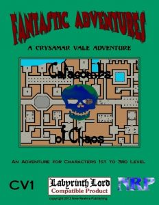
By Walter P. Jones Jr.
New Realms Publishing
Labyrinth Lord
Levels 1-3
The trading season has begun and the town of Ravenor is filled with merchants and celebrators looking to enjoy the upcoming Spring Festival. But not all is well in the capital of Crysamar Vale. Tremors rumble through the land, damaging buildings, and fisherman complain that the fish are becoming scarce. And during quiet moments, when the fires burn low and most revelers have long since gone to bed, the rumors grow darker. Tales are whispered of bloodless bodies being found in the streets at dawn, of boats drifting down river in the morning mist, their crews gone, and of strange smells and sounds that make the blood of even the hardiest soul run cold. Something dreadful has come to Ravenor.
This 25 page adventure describes a fifty room “standard” dungeon The map is actually decent, but it is PLAGUED by long read-alouds, boring history and room trivia, and massive amounts of DM text. This reminds me, most of all, of the initial draft of Dwimmermount: minimal keying expansively described.
The start/introduction has a column of read-aloud. The town council, a column of DM text later, has another column of read-aloud text. The rooms have read-aloud. The read-aloud is boring. Here is a masterpiece: “ A small stream of water flows into this chamber from a passage in the north wall, feeding a large pool in the southwest corner. Light debris litters the floor and there is an opening in the east wall.” The focus is on trivia from the map. Where the stream enters. Where the pool is. The detail is uninteresting “light debris.” This is not specific, generic, using boring adjectives like “light” and unspecific nouns like “debris.” This read-aloud has done NOTHING for the DM or the players. Floors have dirt and debris in read alouds. Mounds are “large” in the read-alouds. This is poor writing, evoking nothing but boring genericism. This is then exacerbated by long DM text. It’s long, contains history and room trivia not relevant to running the adventure. “A hidden catch will open the secret door, revealing the passage beyond. There is nothing of value in the room.” This is akin to telling us, in a normal village, that the sun shines or that a door can be opened. Of fucking course a door can be opened. That’s the nature of a door. It’s notable if it CAN’T be opened. Expansive text for minimal keying.
There are bright spot. Creatures with bulbous eyes and webbed claws. And here’s a temple description in read-aloud: “Trailers of mist drift through this large room, diffusing the pale green light that emanates from a crystalline dome overhead. Mottled blue stone forms the walls and floor. To the south, a large object looms in the mist.” That’s a decent read-aloud description, painting a picture of a room in your mind. But there’s FAR too little of it and far too much DM text to wade through. Focus, people. FOCUS!
The map is decent, using color and having themed sections and a nice selection is flopping corridors, the way an exploration dungeon should have them. It’s only half a page though, making it hard to read; a full page map would have been better.
The adventure also has an objectives table You go in to the dungeon at the behest of the town council. As you come out, and share information with them, they will offer you various rewards. Did you tell them about the evil temple? They are pleased to know about it and they’ll pay you a little more. There’s about twenty entries on the table and I think it’s an interesting mechanic to push the party to interact with the council/town, and push them to explore. There’s not really any decent information to help the DM interact with the town, but, hey, the table IS interesting.
Lots of read-aloud. Lots of DM text. It’s a pain to wade through and the bulk of the text just isn’t that creative or interesting. The core of the dungeon, as a “generic dungeon” isn’t that bad, with rats, undead, mist, temples, etc, but the amount of effort you need to get there is just too much for me, much like the original Dwimmermount draft.
This is $6 on DriveThru. The preview is five pages. All it shows you is the massive read-aloud for the introduction/start and the town council, etc. You learn nothing of the actual rooms. Bad preview! No cookie for you!https://www.drivethrurpg.com/product/104138/CV1-Catacombs-of-Chaos?affiliate_id=1892600

“The map is decent, using color and having themed sections and a nice selection is flopping corridors, the way an exploration dungeon should have them.”
I don’t know what “a nice selection is flopping corridors” means.
sloping?