
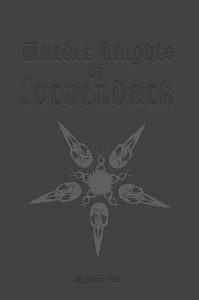
By Glynn Seal
MonkeyBlood Design
Swords & Wizardry
Level 4
No one knows from where they came. All feathers and spite. Their vile beaks spit angry screeches, and beneath their wing beats, acrid miasmas swirl. […] Since the coming of this otherworldly realm, the Grimwater Lake region has been plagued by the atrocities of the ‘harpies’ — as they have been incorrectly named — regularly raiding the surface lands. None have been ravaged more so than Wychington, a small town on the northern lake edge at the mouth of the Lesselling River. […] The Lord of Wychington, Corben Truss, has sent out word of the need for aid and assistance to any that will heed it. Maybe, just maybe, that is you?
This 49 page adventure describes a couple of adventuring locations with about seventy rooms. A small town gets attacked by things they think are harpies, but are actually crowmen. It’s vaguely interesting, but hard to get in to. Something is wrong and I don’t know what.
This should be a cool adventure. The crowman thing is interesting. The maps looks good, both the color regional ones and the location maps. It’s got some decent ideas in it. The town has some barely covered viscera and blood from the attack the night before. The crowmen burn people alive. They feed on innards. “The attack is as violent and damaging as it can be for the townsfolk.” That’s pretty nice. Good advice for the DM to convey a mood.
But … when I look at this my reactions is that it’s a combination of hipster story-game adventure and some Pathfinder adventure. And I can’t point to ANYTHING that makes me think that. It doesn’t click, or resonate. The descriptions might feel flat? I don’t know.
Here’s one for a certain room: “This chamber is covered in niches with burning red candles. Bits of viscera cover the floor and rusting iron chains hang from the ceiling with half-eaten cadavers hanging on blood- soaked hooks.” That’s one of the better descriptions, and I’m not sure I would characterize it as sanitized … but it also doesn’t come off as … I care about?
I don’t know what the fuck it wrong.
I DO know that other bots are misses. The DM is advised to have the characters arrive in town at dusk and if not then fuck with them with attacks, horses running off, etc, until they do arrive at dusk. And that’s not for any real reason that I can tell. Yeah, the first attack happens at night, but … so? There’s viscera over town, people are cleaning up, but there’s no advice on what they relate and so on … which would seem to be a natural question if you walked in to town and saw a bunch of blood being cleaned up all over the place. The actual night attack in town doesn’t happen until page 18, so the adventure can get a bit long in tooth in relating irrelevant things. The town map is not helpful, separating the key from the map, and the town entries are not in any kind of order I can detect … just a rando list of place names to dig through to find something. And some rooms go on WAY too long, like the one with the exhaustive list of what two dead adventurers are carrying.
But the main issue is that fucking text. I don’t know. Font, background images, spacing and margins … it all points to something too interested in itself. But that’s not something that impacts the text. It actually gives decent advice in places, like an order of battle for how the crowmen react to incursions.
Here’s another bit of text: “A three-day old, disembowelled human female corpse lies here caked in blood and bits of guts. This is a Wychington villager that was dragged down here as a later meal.” What a fun introduction to a new location!
Maybe they feel abstracted, or disconnected from the rest of the text?
You know, it feels flat. Even with the more colorful descriptions. Flat in the way that Barrowmaze sequel, Spider Caves? felt flat. Or maybe it doesn’t feel cohesive?
So, look, it’s probably a fine adventure. I’m probably just off today. Maybe.
I have no idea what to think about this. It has parts that seem cool … but it just doesn’t click for me. At $5, with no preview, it’s kind of much to take a chance on. If you’re rolling in cash, buy it and tell me whats wrong with it. My eyes glaze over.
This is $5 on DriveThru. The preview is broken.https://www.drivethrurpg.com/product/254507/Murder-Knights-of-Corvendark?affiliate_id=1892600
The ‘quick’ preview worked for me…and there is a video of the POD. Also another review at Drivethru, Murder Knights–A Murder of Crows–Crowmen…cool play on words.
Sounds like you may need a change of pace to freshen things up. Here’s an idea – perhaps you could revisit some of the adventures you have reviewed and loved in the past, and look at them with fresh eyes. Could be a fun way to break things up.
“This chamber is covered in niches with burning red candles. Bits of viscera cover the floor and rusting iron chains hang from the ceiling with half-eaten cadavers hanging on blood- soaked hooks.”
“A three-day old, disembowelled human female corpse lies here caked in blood and bits of guts. This is a Wychington villager that was dragged down here as a later meal.”
It sounds very droll, and nothing is gained by detailing teh gore. Better is:
“…candles burn in wall niches; viscera on the floor, while cadavers hang from hooks.”
“…a rotting, female corpse lies here, caked in gore.”
It does feel off. Somewhat indifferent and detached,
Indifferent & detached is a good description of it.
You & Landi now have a homework assignment: why? At a glance is looks like it is engaging in the mechanics, but it does not succeed. Why?
Why say “human female” when you can use the word “woman”? And who uses the word “viscera”?
Yes, better.
Maybe it needed more tentacles?
Monkeyblood is mostly a map and art guy, and a good one, so I suspect it seems slick partially because it is, the author has a real talent for exacting design. The question then is does the writing meet the design standards? Not sure from the review. Too much gore, or excessively described gore seems like an extra sentence problem not serious.
The question then is what else makes it dull or uninteresting? Are the locations interesting in content and layout?
I had somewhat similar reactions to the adventures in the Midderlands products from Monkeyblood. The whole setting, aesthetically, is interesting and new and not standard Tolkien wrapped up in new words. But the adventures and the more particular descriptions left me nonplussed. Especially the adventures. They seemed linear and forced (in a real “arrive at dusk” kind of way) and not equal to the promise of the setting. And I felt they assumed character (and player) motivations that they shouldn’t have.
Hi folks,
Firstly, thanks for taking the time to review this, Bryce. Sorry that I only just got around to seeing it.
Secondly, this feedback is really useful to me. I feel sometimes that I may be too ‘wordy’, and should use more terse and impactful sentences, so I want to take that on board as I start to write Midderlands #3. It seems to be a fine line between being evocative or flat, engaging or boring – and it’s a skill I want to improve on.
I should also probably avoid any things that push the party in a particular direction. That requires improvement in my adventure designs. Again, I want to improve on that too.
Ultimately, some people will enjoy it and others won’t, but as long as it’s not total shite, I’m reasonably happy that it’s part of my continuing improvement as a game writer/designer/artist/cartographer/layouter.
Ah, yes the original preview didn’t work, because it was set to look at the wrong file (my error), but that was corrected with help from OBS in how to alter it.
Thanks again for the time providing the review and all the feedback comments, Glynn