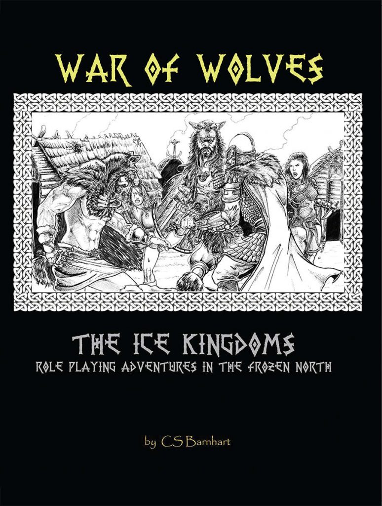
By CS Barnhart
Mad Martian Games
OSRIC
No Level Given
The peaceful villages of Eastern Thanegard are under attack. Fenrir raiders have taken up arms against Einheriar colonists. Or have they? And if they have can they be stopped? These are the tasks Thane Egil has assigned to a small band of adventurers. Travel east, interview the victims, track down the culprits and deliver the Thane’s Justice. But all isn’t what it seems and foul sorcery and blood thirsty revenge may be behind the recent uprisings. Can the brave adventurers uncover the truth and stop further bloodshed, or will war consume them and the Thanelands?
This 26 page adventure is a hunt for wolf barbarian raiders who are a whopping and a whoomping every living thing in town. It’s core ideas are decent, if not good, but the designer has, rather euphemistically, no idea how to write an adventure.
Essentially, you’ve got some bandits who are impersonating the local Wolf Barbarians. They rob and raid, leaving the blame on the barbarians. The thane has you assigned to stop the wolf barbarian raids. You figure out it’s bandits about the same time you’re slaughtering them, and then face down the leaders and an evil wizard allied with them. It’s an oldie of an idea, but still a goody.
The execution in the idea is what is lacking. There’s a regional map provided, for the party to explore. But there’s no scale provided. The adventure mentions hexcrawling the map, but, again, no scale on it. The map, which has incorrect location keying on it (Editor!), lays out a number of locations and and provides for some wanderers, even with a little color to them. But then the locations, proper, are then laid out in “plot” order. First the village that was just burned. Then the village that will be burned the next night. Then the bandit camp. Then the bandit HQ. Then the evil wizards lair. You’re clearly meant to do the adventure in this order. And there’s nothing necessarily wrong with that, except in the mismatched styles used.
It’s initially laid out like a sandbox. It’ mentions hexcrawling. But then it switches styles to linear plot adventure. Then, the five actual locations, are detailed in a very conversational format, like it was a plot adventure. This is the village. These are the people. These are the reaction rolls. Then the baddies show up. Then the baddies do this and this. Then a fight starts. The next encounter on the linear path will detail consequences, like questioning people from the last encounter that leads to this encounter … at least sometimes it does that.
NPC’s and local color are very inconsistent. The first village, burned out, gets a few NPC’s to talk to. The wanderers have at least a little color to them. But then the second village, not burned down yet, gets no local color or NPC’s at all. Then, the integration of the “events” in to the main text, in long paragraph form, just like how all other information is presented, makes following the adventure hard. You need to hunt to pick out information. Or maybe you don’t if you just run it like a linear railroad, running “one paragraph” at a time.
And then information for the DM is inconsistent. At one point you can track baddies. “How many” is a natural question for a player to ask. Nothing provided for the DM to help them. Or, where do the tracks go? At least some page cross-references would have helped. Instead turn to encounter three and do the math, provided you remembered that encounter three, which you have no reached yet, has the formula for calculating how many baddies. And then, the placement of the “questioning of the prisoners” in the NEXT section is weird as fuck. It’s not actually the next location, it’s more “what happens after the last battle” formatting. Weird as all fuck, that.
Information is sometimes spread out over pages that makes it hard to follow. Guy’s Chaotic Henchman blog had that excellent series of articles on basic layout that would have helped with that.
I think perhaps beefing up the wilderness section with scale would have helped. Describing the villages, bulleting out or using whitespace to call attention to differing sections and important information would have helped. Sticking “event” information in a separate section for each location, or at the end, would have helped. Adding more local color to the locations and/or sticking in NPC’s would have helped. Handing this adventure off to other DM’s to run and then really interviewing them to ensure you understand what was confusing and what thir problems were would have helped.
I shall make no mention of the 8th level wizard, by himself, with 42hp. WTF is the CON on that dude?!
But, it does have some interesting design. If the designer can learn how to write, edit, layout, and form coherent sections then this guy could be going somewhere. Those are all skills you can learn, I think, much more easily than coming up with good ideas, which they have already.
Also, THERES NO FUCKING LEVEL PROVIDED FOR THIS ADVENTURE! We the consumers, are generally buying an adventure based on level. It needs to go in the DriveThru description, and maybe put it in your level AND in the adventure title page also, for future reference.
This is $5 at DriveThru. The preview is the first six pages. So you don’t get to see anything of the actual encounters, but you do get to see the regional map and some of the “page overrun” formatting issues. Show some encounters in your preview. That’s what the preview is for: to give us an idea if your “real” writing style is worth the $5 to us. And the “background” information is generally seldom representative of encounter style.
https://www.drivethrurpg.com/product/294713/Ice-Kingdoms-War-of-Wolves?1892600