
By Andrew Cowley
Brittannia Games Design Ltd
Chivalry & Sorcery 5
Levels 10+
An advanced game, exploring the idea of corruption as a force, represented by demons and
otherworldly entities. The game takes the characters on a surprise visit to the Royal Hunting Lodge on the outskirts of the mighty Cordelon Forest where they are sucked into a world like none other they have ever seen.
This 84 page adventure details makes a lot of wrong decisions. Emblematic of the modern style, it looks nice but glosses over the play in favour of … I don’t know? I seriously don’t know why or how it is as long as it is. A lot of conditionals?
I’m deep in to my request list now, hence a C&S adventure showing up. There’s a reason these things have not been reviewed. This adventure starts with three pages of fiction … which does not endear me to grabbing it to review …
I’m struck by two things in this adventure, once of which is common these days and one not so much. Second, there’s an almost mania in not actually covering the core parts of the adventure. In any adventure there are things that stand out a pivotal moments. And to generalize, in any encounter there are aspects to the room, or encounter, that are clearly meant to be why it exists. THE MAIN THING. And yet there’s this thing going on in this adventure in which these elements are glossed over. Its strange, to see the most important parts of the encounter given almost no words at all. I seem to recall the WoTC adventures doing this a lot, Tiamat in particular, when I reviewed it.
And, firstly, this thing is emblematic of all of the adventures published by the minor game systems. You know what I’m talking about, all of the RPG’s other than D&D. C&S, Cthulhu, Runquest, basically every third party publisher of core RPG systems. There’s an emphasis on the product looking good. Glossy pages. Nice art. Layout that looks nice … but is essentially non-functional. While wandering around GenCon I would pick up A LOT of adventures and thumb through them and see the same thing over and over and over again. As if everyone is copying off of each other. Or, more to the point, as if they are going through the motions of producing an adventure, hitting the surface level stuff. The Trade Dress stuff in the OSR comes to mind.
There is an interesting little paragraph or two on Demons & Devils. On how they don’t actually want to kill people because that would work against their main purpose, corruption of the soul and spirit. After all, you don’t want them going to heaven, you want them to be corrupted. A nicel take and another aspect to them that is glossed over. I’m forced to think, again, about my monster book project that covers things like this with monsters instead of the mundane aspects of killing them and where they live. And now, on to the bad!
First, though, my usual bitching. Long sections of italics read-aloud. Just like everyone else does. Long read-aloud is a non no and long sections of italics are a nono. We don’t make things hard on the DM and we don’t compel the players to pull out their phones.
But, now, my gripes.
It’s like the designer doesn’t want to cover the core concepts of the adventure. Corruption, ad so on. There’s a part, early on, where the party is at an inn. There’s not much description, in spite of their being A LOT of words. And I don’t mean just the inn, but what goes on at the inn. We get the following: “Many of the NPCs will have tails to tell, of Trolls and Dragons, who have slaughtered even the mightiest of knights and heroes. Try to instil a feeling of desperation and fear from the NPCs in the group, making it infectious to the player characters.” This IS the heart of this part of the adventure. It’s why the inn is here. And yet this is all we get. There’s nothing more. The inn is five pages long, including the NPC’s, but they are little better. No stories for them to tell. Just “he was in war and got scars there.” Give me a sentence. Give me something to riff off of. You’re not dictating the game by doing this, you’re helping the DM run it. And then there’s a section that says something like “Do some gambling. Do some brawls.” And I’m not really being an ass here, that’s all there is. Why? WHo’s brawling with who? Why? Give me some grudges, a cheat, something. You need something to hang your hat on and it’s just not here.
A core part of the adventure is finding a camp at the base of the titular fort. It’s got some missing soldiers in it, engaged in a bacchanalia. We get “The camp is a tough roleplaying encounter, the gamesmaster needs to prey on the characters beliefs and vows and try to get them to say or do something against these vows, beliefs or dogmas. That is, the people here are placed to try to corrupt the characters away from their beliefs.” But that’s it. There’s nothing more for the DM to riff off of. Oh, there are a lot more words, but to no effect in gameplay. THIS is supposed to be the heart of this encounter, and a major theme in this adventure. But there’s nothing here to help the DM run it.
But there is text. Paragraphs of text. Columns of text. PAGES of text. Encounters, rooms, that take two pages in some cases. His is not runnable. You can’t run this at the table. You need a highlighter, notes, and copious time ahead of time to prepare it. And then I suspect its STILL a struggle. No dout the designer can run it, it is meaningful to them. They created it. But for the rest of us? No.
This is clearly a product with a lot of work that has gone in to it. And, yet, it misses the mark in almost every way possible.
This is $15 at DriveThru. The preview is the first six pages, enough for the title page, contents, and the start of the fiction piece. It shows you nothing of the actual adventure, making it quite hard to make an informed purchasing decision. Unless, of course, you can recognize the Tyle 2 demon from a mile away.
https://www.drivethrurpg.com/product/365045/Hillfort-of-the-Pagans?1892600
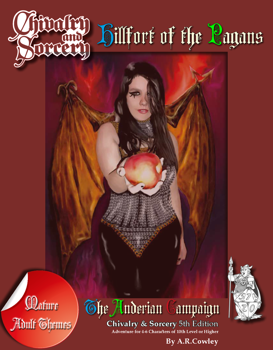
The cover is just eye-gougingly ugly, looking like a bad Photoshop from somebody’s girlfriend’s 2006 MySpace page.
Post your pic for comparison’s sake.
It has to be the authors gf right
If so the logistics are adorbs
Levels 10+ and not much to do aside from vague moral quandaries? Jeez.
I can smell the estrogen from this cover…mmm
Bryce:
Your review perfectly conveyed this product to me. Thank you!
Agreed. Not that anyone looking for an OSR product would have actually bought this one. 😉
What warrants the “Mature Adult Themes” warning on the cover?