By Jonathan Hicks
Farsight Games
Swords & Wizardry
Levels 1-3
Welcome to Wherwest! This is a town full of opportunities at every corner, adventure through every door and danger at every turn. Glory and gold awaits! That is, if you can get past your first night here.
This 22 page adventure details a nine room friendly wizards tower that has been invaded by demons. Event based, forced fights, and sloopy text detracts from the attempts to add a little sparkle to the adventure.
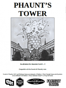
Well, there’s some nice wording here and there. Nice imagery (with art attached) of a small fortified village with a tower in the middle, blue light on top, acting as a kind of beacon in the wilderness. After a magical explosion there’s the smell of sulphur and rotting meat wafting through the smoke and fog around the tower.
There’s also a nice scene or three, like … “a badly damaged gelatinous cube sloshing its way down the street, falling apart with great globs splashing onto the ground …” Or people trapped inside that need escorted out. Or a cleric fighting for her life … who heals you if you save her. And … consequences. Going after the cube or saving the people slows you down; it’s a distraction from your main mission: getting to the top of the tower to stop a demon infestation. Getting distracted has consequences: an extra demon added to encounters after that.
This sort of consequence based events appeals to me. Fuck around and it gets harder. Save a villager and it gets a little easier with heals, etc.
What’s less interesting is … well … everything else. 22 pages and nine rooms means issues. In this case, single column, long read-alouds, and extensive DM text, all of which detract from the adventure. “This is the main hall where Phaunt receives guests, petitioners and dignitaries”, begins the description for room one. And then dimensional data. And then a description of a normal room. And THEN a description of the combat with demons in the room. Most important things come first people, and room purposes are not needed, nor are histories or descriptions of typical things.
The DM descriptions are expansive, with a lot of asides “so the party should be able to deal with them [demons] quickly.” says the text, adding nothing to the adventure except a conversational style that clogs things up. Text is wasted describing the detailed mechanics of an archery contest, with no hint of flavour to make it exciting, like onlookers, other contestants, the judge, etc. That’s what will make the context interesting and memorable, not the mechanics.
And, of course, there’s the forced fights. S&W level one. What’s that mean, something like 2hp each? Maybe 3? The party faces forced combat after forced combat. That’s ok though, we’re told repeatedly that if they get in trouble then the DM should send a town guardsman in to help them. Ug.
The main treasure room in the tower exemplifies the adventure. Lot’s of simple book +1 items … that you can’t use because they are locked down by the wizard. What’s the point of it all?
This is $3 at DriveThru. The preview is four pages and doesn’t show you much. But … that long read-aloud? While nothing else reaches those heights it is a good example, nonetheless, of the style.https://www.drivethrurpg.com/product/251353/Phaunts-Tower?affiliate_id=1892600

‘Sloopy text detracts’ might be my favorite Bryce typo of all time.
Hang on Brycey!
I really like the cover art. A real kinetic feel to the tower going “kablooie!”
Hi Brycey – thank you very much for taking the time to review this. It’s constructive reviews like this that really help writers as they give feedback that can be put to good use.
Thanks again, and keep up the great work!
Really good one, simple and so many interesting scenes. I love the beginning with games on market like medieval market in real. Will play it with my kids as side quest in our S&W Game, will be fun!