
By Christopher Clark
Inner City Game Design
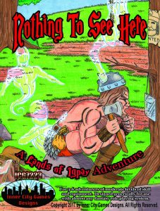
Generic
Mid-levels
While you were away, things did not go according to plan. Someone ran up a whole bunch of debts in your name. Someone made a lot of promises and commitments on your behalf. Someone even signed you up for some sort of inn time-sharing scheme. Someone was not very nice; not nice at all. But they looked like you, sounded like you and got you into more than a lot of trouble. Perhaps you’ll show them the meaning of the word trouble, once you find them.
This 37 page adventure has three locales, two of which are likely to be visited. It is the very definition of ‘terrible generic stat’d adventure’, with all that implies, such as long ponderous text. There’s a Tunnels & Trolls kind of very simplistic thing going on where you go somewhere, like a health spa, kill “barbarians” in dressed in suits, and then move on. It’s not the humor, which I usually hate, it’s light enough here to be ignored. But the text, oh my god, the TEXT! I knew it! I know it! This is the same terrible style & formatting used in Eldritch Enterprises products! I knew I’d seen it before!
You’re in a forest and see Wanted signs with your faces on it. You’re wanted for a variety of crimes, like theft, etc. If you camp for the night you’re attacked by some barbarians. If you don’t camp and instead move on you’re attacked by the same barbarians. They are collecting on a bar tab you are accused of skipping out on. When you kill them you find a flyer that leads you to location two. This is the adventure in a nutshell. Some guys attack you, no matter what you do, with a little light farce attached, and you get a clue for the next location where the same thing happens again. Eventually you find a cave with some shape-changing fey that like to mimic people and cause trouble for them. You, of course, kill them.
Lots of read-aloud. Lots of DM text. All of the stats are in that cumbersome generic weirdo format that hasn’t been used since sue-happy T$R days. There’s no real orientation, leaving you wondering all the time what’s supposed to happening, or could happen. “Once any character announces he would like to try to catch a fish from the lake, The Count leads them there …” It’s ALL like that … you have to be INTIMATELY familiar with the byzantine structure to know where to go and what to do and what’s available.
I’ve seen a lot of bad adventures, so I’m not going to say this is the worse formatting/structure ever … but it is certainly in the same ballpark.
This is $15 on DriveThru. The preview shows you a few pages of the most comprehensible part of the adventure: the confrontation with the evil fey in their cave. It’s a paragon of virtue in layout and design compared to what’s come before.https://www.drivethrurpg.com/product/222335/Nothing-To-See-Here?affiliate_id=1892600
This doesn’t sound too bad, as long as your players don’t like agency or depth in role-playing, and you skip the read aloud text.
Wow. Just wow. I saw this adventure in one of the daily e-mails I get from Drivethru, and I considered checking it out. I decided to pass on it before I ever even saw the price. I probably would never have paid $15 for it, but if I had taken a chance on it, boy would I have been pissed. Thanks for reviewing this and saving me from that mistake.
Dammit I was proud of having the worst formatting and best typos – proud and free! I guess I’ll have to release something with a more eye watering font – not for $15 though.
It’s such a shame because there’s a potentially cool premise here. It may not be original to have a doppelganger imitating a PC (it’s been done in pretty much every comic book), but I don’t know if I’ve read an interesting adventure written around that concept.
What if a vengeful alchemist who the PCs pissed off starts selling potions that let people temporarily assume the shapes of the PCs? I could see an entire adventure based around an angry alchemist trying to secretly get revenge Wile E. Coyote style.
He does a bunch of malicious stuff like that which leaves dumb clues that lead the party back to his lair. But wait! That was his intent all along, and the lair is just a trap! That’s where it gets at least slightly serious. I know it’s hackneyed, but I could see that being a lot of fun. And yes I went off on a bit of a tangent.
Inner City Games Designs goes way-way back. It is a pretty interesting case because it predates any sort of old-school revival, renaissance, or even mass interest in old-school gaming. It is an authentic relic. Eldritch Enterprises with Jim Ward, Tim Kask and Frank Mentzer? Ha! Think “mid-1990s” and “with Gary E. Gygax.”
Yes, ICDG was already releasing “old-school” adventures harkening back to the 1st edition classics when old-school was not even a gaming term. The Ritual of the Golden Eyes is from 1999, and A Challenge of Arm’s (apostrophe placement deliberate) is from 1996. Both have been written in cooperation with Gary, and for their time, both are fairly lavish products – they have cardboard folders, pull-out illustrations, parchment maps, and one even has a bestiary. Basically, your platonic idea of lovingly made fan material.
Unfortunately, the contents are really, really dire – embarrassingly bad. I tend to give away adventures I am not interested in, but these two ended up in a landfill because I didn’t want t inflict them upon anyone. Sadly, being a forerunner is no guarantee of anything (also see: Death in Reik Caverns).
And what do you know: we have been here before. https://tenfootpole.org/ironspike/?p=950
Welcome to the club buddy. The number of double purchases I make …
So the title is “nothing to see here”, the cover literally depicts a steaming pile of ****, and it’s $15 in pdf*… am I paranoid to think the author knows exactly what he’s doing?
*Although to be fair, I just checked, and it’s on sale for $4. So, I dunno, maybe not.
I clicked around, he’s got another adventure, “Tentacles? Really?!” And oh God, the cover. I’m tempted to drop the $4 to see how bad it is, but the preview doesn’t even look entertainingly bad.