By Markus Lindermun
Apes of Wrath
OSR
Level 4? Wjo knows.
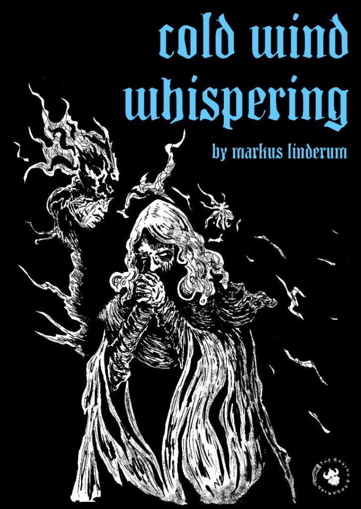
A crying statue, missing children, a mad wizard, raging conflict and a sentient wind whispering words of madness …
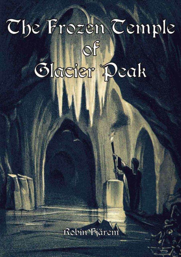
This 68 page digest adventure features a seventeen encounter pointcrawl up the side of a wintery mountain, with a couple of small seven-ish room dungeons in a few of the locations. You can see what it is trying to do, but it just comes off as … static?
I don’t really know what to say about this. It exists. It’s not great. It’s not insufferably bad. It’s just mediocre. (And, in my taxonomy, there’s no room for average.) I think I know why it is the way it is, and that’s what I’m going to talk about. Mostly.
First, though, the adventure. The usual assortment of “someone paid us to go here” hooks, along with a decent one: they say that a goddess sleeps at the top of the mountain and provides boons to those that awake her. They journey through hell (a frozen one, in this case) to seek knowledge is a classic one, and fairly easy to fit in to a campaign. So, up the pointcrawl mountain you go. Your decisions, right or left, are generally arbitrarily made and not toward some specific goal. Individual locations tend to give you a hint of the next location, but not your progress towards a goal. So “a trail leading in to a sense forest of red foliage, with a distant amber glow coming from deep inside it.” Ok, so, check that out I guess? It’s as good as any other choice. Red door or blue door, you choice is arbitrary.
Why is this different? What makes this different, say, then taking a right hand turn or a left hand turn in the dungeon? This choice. Also, is seemingly arbitrary. And yet, it feels different. In our usual exploratory dungeon adventure we have a reconnaissance in force: the party is loaded for bear and looking to fuck some shit up and get the ca$h. It IS an exploration and therefore the decisions are (almost) arbitrary when deciding right or left. But when an adventure is NOT an exploration, when there’s a goal, then we have different things needed. The mindsets have changed. I am looking for the lost valley; is this the way? I am making choices to help me find that, to accomplish my goal. In front of this we place the red door and the blue door. It is arbitrary. The decision is meaningless. Is there a place for this? Sure. But too much and our mindset and framing is lost to the “who really gives a fuck anymore?” cause. And this blog exemplief time and again, Apathy Kills. It doesn’t matter that left is the red forest with golden glow and right winds further in to the forest with a huge tree visible. I mean, piquing someones interest is good, but you need to feel like you are making progress also. Otherwise this is just a funhouse museum visit.
The individual encounters in this, taking a page or two each with the mini/lair dungeons taking a few more, engage in a couple of interesting sins. One is perhaps forgivable and the other NOT.
First is that new sin, the inappropriate use of randomness. In several locations, when the party first enters, the DM is instructed to roll to determine what currently inhabits the area. This is not a superior way to describe an encounter. A randomly rolled encounter can not be integrated by the designer. The encounters next to it can not be influenced by it, in the text. It cannot be hinted at in the next room. It cannot be integrated in to the room text proper. It’s just The Town Square with some random monster standing in it. Yes, absolutely, emergent game play from randomness is totally a thing. But, I point you to Websters Unabridged Dictionary, again, as the model of perfection for this type of adventure. There’s not context to the encounter, either local or in the scope of the large adventure. Sure, “reroll on every subsequent visit” could be a thing. As could “roll on the wandering table on subsequent visits.” The role of the designer is not to ask the DM to roll, but rather to create an integrated environment that riffs off of everything. Inappropriate randomness doesn’t do that and is lazy design.
The second problem, though, is far far worse. Nothing is going on. I mean, NOTHING is going on. Oh, sure, there are places to visit. There are people to stab. There’s a machine to fuck with. But, overall, the general vibe is one of a static environment. There is not much, if any, dynacism to the environment or the individual encounters. “Hawk Meadows” is a perfect example of this. You’ve got tents, a shooting range and an aviary. They torture prisoners, worship a nihilistic god, and conduct lavish feasts.This is it. Their leader, 6th bastard of a 6th bastard, runs a tight ship, we’re told. But that’s just it. There is no inciting action. There is no tight ship to interact with. In spite of generalized hints, which I quoted above, there is nothing going on. If I just said “village of dudes who worship a nihilistic goddess” you’ve have as much to run the encounter as the half digest page provides the DM with. No sacrifice in progress, or prisoners in a cage. Nothing you WANT and not really anything that they want from you. (I guess you could infer “dinner”?) It’s just this static place. And this happens times and time again in the adventure. We get some hint of something. A spaceship. Refugees. A buried statue. But, all we get is that thing. There’s nothing actually going ON with it. Not much to explore or interact with. Over and over and over again. Yet another giant buried statue. The encounters don’t have a disposition to them. There’s a passiveness to everything.
This robs the adventure. Everything is supposed to be connected, for the most part. THings in one area relating to things in another. Instead it all just comes across as individual THINGS in individual PLACES. There’s very little cross-pollination. There’s very little motivation in the individual encounters. The malaise of existence comes back to you, instead of being driven off by bread and circuses. Sysyphsus fails, time and again.
This is $10 at DriveThru. The preview is nine pages, but you don’t get to see any of the encounters. Boo! Boo I saw, Sir!
https://www.drivethrurpg.com/product/353958/Cold-Wind-Whispering?1892600

