By Marco Serrano
Self Published
Mothership
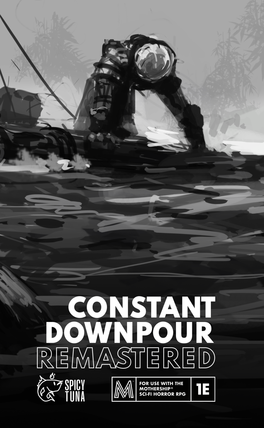
In Constant Downpour, players are Space Military soldiers who have just been dispatched to Venus in response to a distress call. SD-021, a sun dome located deep in the Venusian jungle, is under attack and requesting immediate backup. Most soldiers deployed there become insane from the constant downpour, lack of sleep, and hallucinations caused by the atmosphere. Others die at the hands of Venusian soldiers, fall victim to lethal traps, or the horrors of the planet itself.
Fuck You, gentle readers. I like SciFi. It just sucks much more than the OSR and I don’t know how to run it. But, sometimes …
This 104 page adventure presents a little jungle hex crawl in the rain after you crash land on a planet. Decent atmosphere, and a lot of subsystems, that end up at about forty digest pages to describe about seventeen hexes. I’m not sure I can support the randomness, as presented, but I must say the entire thing is one of the better scifi adventures.
You’re a group of mercs on a rocketship going to a mining dome on Venus-3. Oh no! Your ship has crashed! And you ejected! But you landed safe! On a planet covered by water at least half an inch deep and thick thick jungle, with no sunlight and CONSTANT downpour. (Yeah! I worked in the title!) Oh, and, I guess your comms devices don’t work. Time to head out in the direction you think the dome is, I guess, braving the wildlife, the plants, the rivers, the jungle, the hostile natives, and the psychological wear from the rain.
Unless you dawdle. Then some dudes show up. Dudes who were on a different rocketship that crash awhile back. You see, they think that the merc company, the ones you’re under contract for, crash some ships on purpose. To get rid of the crews that they don’t like.So, add, maybe, some crazed mercs to the list of things to deal with as well as maybe the mercenary company proper. Maybe? Along the way back to the mining dome you might encounter some bunkers, in a couple of hexes, or maybe a dome or two … destroyed by the natives. All in addition to everything else.
And I don’t know what to think about all of this. There are A LOT of subsystems here. Stress builds up, and the party can have nightmares that can do weird things. Or you can have a collective dream in a bunker that reduces stress. And there are a lot of native berries and frigs with weirdo powers. And when you enter a hex, or move through it, you encounter not just what’s in the hex, if it’s one of the seventeen special hexes, but you also roll on the random hex encounter table for something. There is a tremendous amount to keep track of here, both in terms of bookkeeping and in terms of tables to roll on during play.
And I’m generally not sure what to make of it. One the one hand I can see how everything kind of works together; you’ve got this Heart of Darkness thing going on, or, maybe Apocalypse Now, and I’m totally digging it. And the systems generally make sense. You don’t need the frog table till you got a frog and you don’t need to pull the old River Crossing rules and subsystems until you cross a river. I think it all kind of works together well, although I do think you’re gonna have to read and reread things and pull out some tables to organize better and have at hand and ready, as well as rolling some encounters and things ahead of time.
And I find a decent amount of that annoying. Especially for the fixed encounter hexes. I would have much more liked to have seen less randomness in these and more things that fit in well with the main hex theme.
But, man, some of the encounters are just dynamite. A collection of rocketship nosecones,making their own rocket, a monument constructed by the natives. That’s some freaky ass shit! Or a cliff, with hundreds of dead people in spacesuits, just like yours, at the bottom of it. With warnings of what happens to your kind here. And a HUGE native, pensive, who will fight no more forever, with some hints and wisdom. Some of this shit is absolutely terrifying! If I’m playing this I am, 100 percent certain, shitting myself during those two encounters. Really big venus flytrap? No problemo. Obscure references to my inevitable fate presented in a very visceral way? Game over man! Game over!
Oh, oh, did I mention the Deja Vu and Details to Repeat rules? It’s tips and a table for the DM so they can sprinkle in some phrases and shit in their hex descriptions … knowing that players pick up on this shit and will think they are traveling in circles. That’s how you fuck with the players man, none of this cheap ass gimping or teleporter shit, but by using them against themselves. Remember Brycies boardgame 102 advice: You are never playing a game, you’re always playing another person.
The thing is also a shitshow, in places. Editing and descriptions, while great in some places, do seem to fall down in others. We get references, in one place, to a hidden recorder … and nothing else. No information on whats on it. It feels like something is missing. And in other places it feels like the formatting, used in other places pretty effectively, just disappears. (and, a weary criticism by now, this should have been letter sized pages and not digest. I know, we all like to masturbate over zones, but paper size works better for something running longer and more complex, generally) And the map, well, I could be perhaps convinced otherwise, but it seems like it’s a little sparse. I’m down with the preplanned hex descriptions, they do a great job of building tension with that sort of evocative writing that I love to praise and find on such an uncommon basis. But, also, I suspect there’s a lot more randomness in encounters, during play, then there is stumbling over the preplanned ones. There are map fragments, and the like, to be found, that might ameliorate this issue, but it just feels like you need a little more to get people moving towards the “points of light” so to speak … even if they are not light … 😉 And when some of that does exist it is buried IN the hex in question, far too often anyway. “The reflective peak sticks high above the jungle line and can be seen from up to 4 hexes away” one hex tells us.
And I’m not entirely sure of the venusians. They might be a little common on the tables for my liking. Or, perhaps, a little more advice on running them, as hit and run tactics or something. This is clearly an adventure that plays on the players vibes, and advice, about the venusians, etc, on amping that up and meshing with it could have been a better use of space than some of the information presented.
When you enter a hex with one particular shattered dome: “Dominated by a massive clearing and rolling fog. Shapes and figures are undistinguishable besides the waving grass and reeds. Tangle grass (2m tall) wraps together for seconds before whipping apart, flinging water. Heavy granite-colored reeds poke out above the grass, intermittently bopping to the ground.” And then as you enter it: “The heavy door is slightly ajar, letting through the smell of fresh bread and rich spices. Four steps in, the illusion fades. The air is stale, chilly, and scentless. There is no sun in the center of the massive dome structure. The ceiling is black and bashed holes let the rain in. “ A build up of tension, you think you are safe now. And then you realize you are not. That’s some good shit.
This is $18 at DriveThru. The preview is nine pages. A better preview, perhaps showing some hexes, should be in order at this pricepoint.
https://www.drivethrurpg.com/en/product/441688/constant-downpour-remastered?1892600