This nineteen page adventure details a four level manor with about twenty five rooms in about five pages. It’s just combat encounters in a non-keyed long paragraph descriptive format. Combined, of course, with counter-productive skill checks. A few interesting details show some potential, but this is just Yet Another Garbage Product.
And I’m the asshole. I’m the jerk faced jerk because I protest the torrent of shit and vomit that erupts like a firehose in to my face. How bad is this adventure? It’s got three stars on DriveThru, THAT’S how bad.
So, old manor house in a town. Abandoned for multiple centuries. Rumored to be haunted. Over the years people have gone in to never come out. Still standing intact. Some dude in the town is obsessed with it and wants you to investigate it out so he can move in. Inside are the seven deadly sins. You go from room to room, finding one and then fighting it. That’s the entirety of the adventure. A straight up hack right out of the worst that 4e ever produced. Maybe worse; those had terrain.
I’m pretty sure that 5e still pays lip service to the three pillars concepts. Combat, roleplaying, and exploration. This is just combat. Nothing more. Any joy or wonder that D&D has is entirely non existent in this adventure. There’s nothing to explore, nothing to interact with. It’s just rooms with combat.
Oh, I’m sure it THINKS its exploration. But there’s nothing truly to discover or interact with except the monsters.
And the format, oh my. The section headings in the text are by floor, and then by room. So, First Floor and then a subheading Kitchen. Of course, the map is numbered and doesn’t have the room names. This means the room numbers are put in to the text of the paragraph and you have to look there. Further, those subheadings? There’s not one per room. The Serving Room, not described, is mentioned in the Kitchen subheading but not elsewhere. This is not an isolated event, most rooms don’t have any description at all and are just mentioned in passing.
Why are they mentioned in passing? Why, to pad out the text by describing the doors on the map. The north door is open and leads to the Kitchen, for example. You know, THE THINGS A FUCKING MAP TELLS YOU.
A house, with windows, yes? That you can look in? The text makes a point of telling us repeatedly that kids throw rocks at the glass. Well, no windows on the map, or even a hint of them in the descriptions. There’s absolutely no thought at all that has gone in to thie as a real environment. Mostly.
There IS a decent idea or two. A fireplace has ashed out on to the floor and there are ashy bootprints across a rug, as if someone was pacing. Oh course, you see the someone probably before you see the bootprints, and they attack you immediately, so the impact is lost, but the idea for a creepy descriptive thing is a good one. Broken glass from windows on the stairs. Again, a pretty good detail.
These little bits show some promise, but they are VERY few and VERY far between and do very little to redeem the lack of interactivity and terrible format.
And you don’t even get real treasure. You’re told to put in a CR2 hoard. THAT’S THE FUCKING JOB OF THE DESIGNER! That’s is LITERALLY why we’re paying you. (Or, well, turning to a pre-written adventure in the case of a $0 or PWYW adventure …)
Oh! Oh! I almost forgot! Skill checks! It’s full of useless skill checks! In fact, the skill checks run COUNTER to the adventure. In general you make a skill check in this to determine how some rando body you find died. And the details are creepy. But if you don’t make the skill check then you don’t get the creepy. Is that the point? To NOT creep out the players? No, of course not, you want them shitting themselves with fear. But you hide that behind a skill check.
This is Pay What You Want at DriveThru with a suggested price of $1.You get all nineteen pages in the preview, so it’s a good preview. Page four of the preview (page two of the text) shows you the long-form descriptive stye that is indicative of the writing in this adventure.
John Fredericks
Sharp Mountain Games
Labyrinth Lord
Levels 5-8
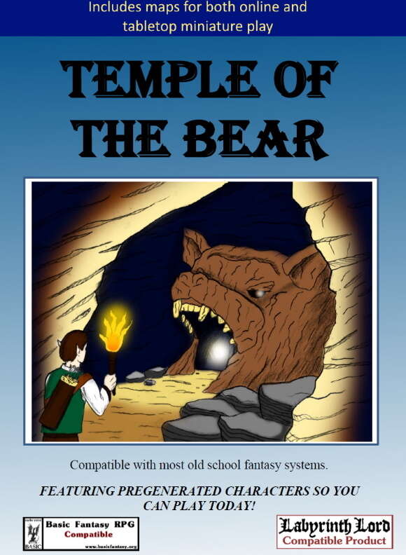
Explore the TEMPLE OF THE BEAR in hopes of rescuing a hostage. There they will confront an evil wizard and his minions who hope to bring back a forgotten, evil cult.
This thirty page adventure contains a dungeon with fifteen rooms and a couple of outside encounters in about nine pages. It’s just long-form paragraph descriptions of each encounter location. Low interactivity, poor usability, uninspiring descriptions. The usual trifecta.
The DriveThru description does not have a level range. The cover does not have a level range. What does have a level range? The back cover. Which is only available once you purchase the adventure. It’s not even clear to me why these things have back covers. Isn’t that used for marketing purposes in game stores/bookstores … and don’t these products exists only as PDF’s? So the designer is slavishly following some template without regard to the actual purpose? And it results in a blind buy without knowing the level the adventure is for?
Villagers are missings. The party, I guess, is somehow motivated to look in to it; the pretext doesn’t really exist in this one. Except … someone missing is the mayors daughters boyfriend. She’s 18. The mayor lets the party take her with them on the adventure. WTF? Seriously? I’m NOT giving my 18YO daughter over a group of murder hobos! Didn’t he see The Last Valley? Jesu Christo!
From there we switch to the road in to the forest … which only leads to the dungeon, so if you kep following it then you’ll arrive there. Big mystery, I guess? Anyway, you get attacked by owlbears because forced combats are evidently a thing in Old School D&D. Oh, wait, they are not? There’s a thread on a forum RIGHT NOW about character death in D&D and the impact of forced combat mindsets? Oh. Well, bad design then I guess.
Oh, wait, fuck, no, I forgot. The town? It notes how it’s a good starting location for the party/campaign. Note again the level range if 5-8. I guess you’re either starting at 5-8 or you bought this adventure for the two paragraph town or the designer has, once again, not given thought to the context the information is being presented in.
Information in the encounters is relayed in long form paragraphs. Multiple paragraphs per room. With lots of padding. Ensuring that you need to scan everything to run the room. And that the adventure text will be padded out. To nine pages. In a thirty page adventure. “First bob will do this and then he will do this and then he will do this and then he will do this.” Yes. Perfect. Exactly the sort of writing I expect.
A certain trap takes three paragraphs to describe. It’s giant jaws that snap down, kind of like a giant half-open bear trap. Three paragraphs.
An evocative description in this is “After encountering the monkeybears, the party will come upon the Old Shrine. This area has a stone altar, a broken pillar, and broken stone benches.”
Interactivity is confined to traps, monster fighting and a ghost you can talk to.
Monetary treasure in this adventure consists of 77gp and a 20gp gem. That’s a joke, right? This is a Gold=XP game, right? LabLord? Yes?
This time I promise I promise I promise I’m going to remember the name Sharp Mountain. Next time I promise I promise I promise I won’t tell myself “its been awhile, maybe they are better now? I should check in …” No. No I should not.
This is $2 at DriveThru. The preview is five pages and shows you nothing of the adventure, so you have no way of understanding the encounter quality before purchasing. Which, while bad for the consumer, is great for the producer
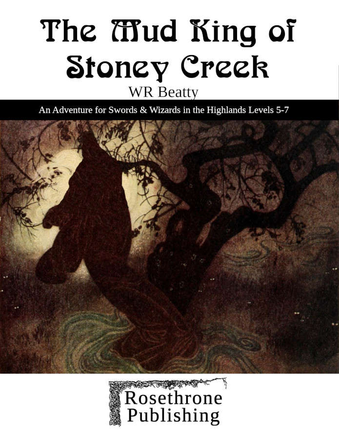
Beavers have dammed up Stoney Creek… but the villagers who went to break up the dam have not returned. Perhaps something sinister is going on here?
This nineteen page adventure details a small wilderness with ten locations and a troll cave with eighteen more. I might call it a Lair Adventure & Environs, since it’s a small-ish location and is … a lair. It’s firing on all cylinders with good usability, creatures doing things, good treasure, and decent interactivity.
Do I like Rosethorn? I recognize the name but I can’t recall previous quality. Anyway, this one is good. The monsters have arranged for a beaver dam in a remote section of a road. They they ambush travellers who are camped for the night in front of the new lake. In the village, a couple of villagers went up a month ago to clear the dam. They didn’t come back. Then two weeks ago four more went to look for the first. They didn’t come back. Then a mob went up with all the villages weapons. THEY didn’t come back. Ouch! One of the hooks has a trapper going there to bust the dam, and looking for protection, which could also slot in well as to Why The Local Lord isn’t Involved; he hired the trapper. Then again, at levels 5-7 in OD&D the party is pretty Big Shits themselves … which I choose to ignore.
There’s a nice little wilderness area described around the dam, lake, road, and cave. It all makes sense. A dam, a stream, a stirge tree, an attacked campsite, an inviting campsite, a lookout. It feels like it all works together well and makes sense together. A lot of this can be summed up as “they are trolls, they don’t care about the piranha/stirge tree/razorwire.” Take the beavers. D&D being what it is, you could spell a conversation with them, and the designer has provided notes on what they knew. Along with other creatures you might capture, just a few bullets on what they can relate. The piranha are attracted after a few rounds. They patrol the banks for a few rounds after a feast. Too much blood and MORE piranha show up from pools deeper in to the caves. A retreating troll might shake a tree full of stirge; he doesn’t care about them. A stirge, injured, flees to not return. It all kind of makes sense.
And then there’s some monster actions mixed in. The troll, fleeing, might shake the stirge tree. A goblin, fleeing, might jump in the water … and get attacked by the piranha. Another might be thrown in elsewhere to attract the piranha and creature a diversion. There are some charmed trolls inside … but charm works both ways; they tend to ignore the party is they don’t directly attack them or they are ordered otherwise. It’s this very neutral way of writing the adventure that leads to opportunities.
Obstacles present themselves. The aforementioned streams/pools of piranha … I mean “NeedleFish.” In the water there is some razor sharp wire strung as obstacles to overcome. Treasure is stored in a steaming hot 180 degree mud pool, or deep in a pool of piranha or a water monster. These are open-ended, with no suggestions given, just something for the party to devise a way to overcome. And it doesn’t FEEL like it’s a gimpy set up, it feels like this is natural and how things should work.
For the most part. The razor sharp wire is pushing things a bit as is the existence of a MU with charm in service to the troll king. I’m not sure the Charm MU is really even needed; it doesn’t feel like the charms provide that much of a needed background explanation.
Treasure is good. Magic Lead. Weapons with names and (brief) histories. Items described sometimes with non-mechanical states, like chains that cannot be broken. Mundane items also get a little description, adding to their flavor. There’s a wandering monster table that has them doing something. There’s a monster reference stat chart at the end. The map is interesting, for a lair, with water features, terrain, collapsing tunnels, various levels and the like. Good job on it. There’s probably enough treasure, also, which is rare for a GOLD=XP game. You’re not gonna level, but there might be 40k or 50k, which is good for a lair.
On the weird side of things, it sometimes engages in tables for the sake of tables, it feels like. A goblin has four possible reasons for being outside. A water monster has a table of random special abilities and weaknesses. The wanderer chart is a full page … which is great from a usability standpoint, it’s easy to find. But in all of these cases it feels like there’s more content than is needed/expected. That’s not bad, i just found it a bit strange.
The map and text, while both good, could work together a little more. In particular light is strange. Room ten mentions it is lit … and also that room six is … but room six doesn’t mention that. With a simple map, like this, you don’t necessarily need to note light/sound on the map since it’s easy to scan ahead in the text as the party leave down the hallway to the next room. Nut … it’s also nice for those details to somehow be conveyed to the DM ahead of time. It’s related to the “outside vista” issue where the party can see a lot of an environment at once, looking down on a ruined keep for example, but no overview is given, focing the DM to scan everything to tell the party what they see “in one go.”
These are minor though. The evocativeness of the writing is the major shortcoming. And by “major shortcoming” I mean the area for most improvement that the adventure has, not that it’s a major problem. The writing is terse and the environments well described and interesting, but the writing is also a little flat. Hmmm, no, not flat. It’s not generic. But it also doesn’t really spring to life in your minds eye. And let’s be clear, I’m being kind of a jerk here. The language use is fine. But of course I want everything to be perfect. Tersely writing an evocative description that springs to life in your mind is not an easy task. Again, not that it’s bad here, but it could be better. Have I inserted enough qualifiers yet?
This is easily a Best. When you want an adventure and go to DriveThru to buy something THIS is EXACTLY the sort of thing you are hoping for. I wish every adventure ever written were at least as good as this. Yeah? Fuck it. This is my new baseline. I now hold your Rosethorn adventure up as the platonic example of a journeyman quality adventure. Writers could do A LOT worse than emulate the format & style of this adventure. There may be other ways to achieve the same thing, but this thing is easy to relate to.
This is $2 at DriveThru.The preview is five pages and shows you outside encounters and a few inside, including most of the piranha pools, the fleeing goblin, troll, stirge tree, etc. It’s a good representation of the type and quality of writing/adventure you’ll be getting. The last page, has room I3, and shows some of the “not flat not the best” writing I spoke about.
On a misty hill, far from the hustle and bustle of the big cities, lies the blasted ruins of a long-forgotten Convent. A village living under the shadow of the darkened moon. An Innkeeper’s daughter and her fiancé missing. The PCs are asked for help. Have the tentacles of an ancient, long-banished heresy resurfaced, to glide silently through the Convent’s moss-covered stones?
This pleasant surprise is a 44 page adventure detailing a three level ruin with about sixty rooms in about twenty pages. It does a decent job being spooky, evocative, and interactive. While it could be organized better it’s much better than most. It’s not great, but it’s better than most.
Check out that cover! Not the usual garbage soft-genero-fantasy cover here! Striking and sets the mood well. My only comment would be that the impact from the lit window is distracted by the white text of the adventure name. The window ends up being almost unnoticeable. Too much emphasis there, though, and the players will probably fixate on it. But … Did you need to put the adventure name, descriptions, edition number, mature audience warning, and publisher on the cover? Not to be too big of an ass here, but … this is a PDF only product. While you might want those things on the cover if this were to be sold in a traditional game store … is it necessary for something that will only exist as a filename? Or, even if it’s a boutique printing, like Lulu, folks have already selected the adventure, you don’t need to convince them. The DriveThru blurb text in the description does all the work that the cover text usually did. Not that I really give a shit but it points out of the possibilities that exist for a product as PDF only, or boutique print only. If you’re gonna go out of your way to have such striking imagery on your cover then why muddy your vision? Anyway, this is the height of nitpicking from me, and a terribly shitty way to start a review of a decent product.
This adventure does a lot things right. Maybe not to the full extent it could, but it hits a number of points high enough. It’s specific in its descriptions. It provides evocative text. It has a fair amount of interactivity, and it’s usable enough at the table … with a few notable exceptions.
You arrive at an inn. The reticent villagers eventually tell the party their plight. The party trapses off to find the innkeepers lost kid & fiance … even though everyone else in the inn thinks they just ran off together. As they get close to the ruins they catch a glimpse of them in the moonlight, an eerie light in a high window, and hear a bell tolling in the distance. Coming over the last hill they see the convent fully. Not intact with the eerie window light as you first saw. No, just a ruin with most walls less than chest height.
Reticent villagers. Most of them think the couple ran off. They don’t want to help the innkeeper search anymore. Pretty believable in context. It’s a lie, of course. The innkeeper doesn’t have a daughter and the inn regulars do this to send selected travelers to the cult in the ruins. The regular villagers are scared as all fuck. The bell the party hears is the innkeeper ringing the village bell to warn the cult people are coming. (And it’s spooky as all fuck also, in context.) Moonlight, mist, darkness, ruins, a lonesome bell. The brief glimpse of the convent, which then is ruins in full vision, is a great introduction to the Mythic Underworld concept. You Are About To Enter Someplace Else. Beware! And then, when you get back out of the convent, you get to deal with the 0-level NE villagers who tricked you there. Hapless evil fuckwits, noncombatants who put up no struggle. What cha gonna do with them orc babies? There’s not a direct advice on this, but it’s mentioned and, in context, its done well. It’s a consequence to the adventure and that always makes them feel more immersive.
In the ruins there’s the old office of the old mother superior. There’s a hidden compartment. It has some old parchment, the mummified hand of a child, and weird little figurine. Something to find. Something creepy. A pedestal with a moon phase puzzle, simple, just match it to the current phase of the moon shining overhead. Things to open, as simple as that, interactivity is obtained. The cultists have a brief mention of some order of battle/responses, as well as the briefest of tactics advice (fake surrenders, etc.) Just enough to help the DM out without it droning on and on and on. The maps are well done for being relatively low room counts, there’s a side view present, and the mundane treasure is well described. Crystal decanters with perfume. A silver covered mask with moonstone inlay. (Theme!) But I didn’t notice much in the way of magical treasure beyond simple book potions. (But they are, at least, in green and red bottles. Again the extra word of specificity helps immensely ground imagination enough to let it soar.)
The NPC’s in the inn, at the start, have short little descriptions, just a couple of words on appearance and maybe a sentence or phrase on what they think happened. Not a life fucking story, but information directly relted to the fucking adventure at hand. Imagine that! Likewise, what they have to relate to the party is presented in bullet form, easy to find and relate by the DM. This is all great.
Let me now skip mentioning other good details and shift to what could be better, because I am never satisfied.
The first level is mostly ruins. Chest high walls AT MOST. This brings up the Lord Of All I Survey issue. When the players can view an area at a distance and take it in then there should be some notes about what they see. Notable features, etc. The alternative is the DM scrambling through a dozen room descriptions or more trying to figure out what they see, in response to that question. When the players can see a lot then the designer should help the DM with the notable features they see. A pool of water NE, Stairs in the left center, etc. I THINK the map covers most of this, but it could do a better job showing the elevation change (implied by stairs) between the two halves of the ruins … an important detail for some secret doors and potential multi-level combat that is going to take place. I should also not that most of the adventure takes place behind the aforementioned secret door. That’s generally a No No. Putting your adventure behind something that the party can fail at (finding a secret door and/or solving a puzzle in this case) means we have to cheat to keep playing. Better to do something else to hide the doors. (ALthough, the issue is somewhat mitigated in this case because there are two possibilities, finding the door and just solving the moon phase puzzle, but, still.) It does something similar in another place in the adventure, putting a body behind a secret door and then stating the DM should fudge it since its important for the party to find the body. Well .. then why’s it behind a secret door then?
Read aloud gets long in places. This is almost always because the read-aloud is including follow-up information. The text tells you that you find, among other things, a small figurine. And then it goes on to fully describe it. That lengthens the read-aloud and REMOVES interactivity. A key part of D&D is the back and forth between the players and the DM. Describing the figuring in the DM text keeps that back and forth and shortens the read-aloud. And, again, read-aloud isn’t always bad but long read-aloud IS always bad. People pull out their phones and attentions wander. Monologues are not engagement.
There are a couple of other issues also. The cultists inside really need a small section on what they know, etc, oto handle the inevitable torture/speak with dead that happens when players capture/interogate prisoners. And the stat blocks, especially for the cult, get long. Condensing the stat block is an age-old problem … but important to solve nonetheless.
The most serious issue is, though, the general style used to format the room entries. There’s a small section at the rear which describes this. It’s trying to use background coloring and other offset words to highlight and bring attention to section breaks and so on. It doesn’t really work at all for any room that has more than a little complexity to it. Room nine on the second level is the perfect example of this. Long read-aloud. Multiple read-aloud sections. Plain text breaking it up with words like “a normal perception roll reveals” before more read-aloud. A whole lot of conditionals for things the party might look at that are, esentially, headers for read-aloud. It tries to break this up with line breaks. So, previous read-aloud ends. Empty line. Plain text that says something like “the open coffin:” then another empty line. Then the read- aloud for the open coffin. Better, I think, to eliminate the additional empty line. That makes the read-aloud belong to the text more, instead of it just being a page of paragraphs and sentences broken up by empty lines. The background-colored sections then intrude also in to this mix … without much reason. Why do the Iron Doors to room 14 get background text but the open coffin doesn’t? The format doesn’t work.
5e reviews are a pain. Do I grade on a curve? There’s so little decent for 5e that I want to. In the end I shall not! And I regert that decision not!
This is $5 at DriveThru.The preview is four pages. It gives you four pages of the actual adventure, so it’s a good preview, giving you an idea of what to expect with your purchase. You can see room nine of level one in the preview. It’s a good example of how the format, which works ok elsewhere, tends to break down on the more complex rooms.
Can the characters save teh(sp) starving city folk? Can they defeat the impending invasion?
This fourteen page adventure details six scenes in eight pages. While not exactly linear it has more in common with modern plot-based adventures than a more open older style. It’s also an absolute MESS in presenting information. One of the worst.
It’s listed as OSRIC … but it also makes reference to the players using their skills and players with strong social skills and using first aid skill, etc. This would lead me to believe that it’s a conversion … ah, yes, I see now on DriveThru that it’s available for a slew of other systems. The usual conversion issues are present: no fucking treasure means no XP and the combat, if used, tends to be forced. Neither are good in OSRIC. The OSRIC gang would probably be ok with the adventure, mechanically, since it’s only mechanics are some stats for some new monsters. But there’s also no level given on the cover or in the publishers blurb or anywhere in the adventure, except for it saying “this is an introductory adventure.” I guess that means level one’s?
This is more of an adventure outline than an adventure. The first scene and last scene are required and then the middle three depend. There are two abandoned ships in the harbour locked together and your mission is to tow one back. Thus the three additional scenes: if you board ship one, board ship two or just tow ship one back. Each of the scenes consists of MANY paragraphs, over a couple of pages, describing “first this and then this” types of things in a very abstracted way. I mean, Bloody Mage/Stink in Golanda abstracted. It’s all very high level, there’s a lot of it, and it’s not organized very well. The delete key is a designers best friend, and removing text and highlighting other things with bullets, indents, etc would have made the different sections, and important text stand out more. I really do mean the comparison to, say, Stink in Golanda by BM … this adventure is just barely there in the most abstract way.
The first scene has the party in a hold listening to a combat above them as they come in to port on a ship. Then they get involved in a food riot and given their mission to go out to See A Ship In The Harbor and tow it back, since it contains much needed food for the city. “At some point someone accuses the party of stealing food or cutting the food line” is the extent of the food riot and food line description for the town. Like I said … REALLY high level and then it’s combined with A LOT of information, most of it superfluous.
Each “scene” has an optional combat, so a kind DM can ensure that NO combat happens in the adventure. It’s all “the floating could attack the parties ship” and so on. At one point there is an opportunity for the party to get in to a fight with about 400 2HD/3HD bug-monsters on one of the ships. That’s something you don’t see everyday. It’s handled terribly, but I applaud the “We done fucked up!” opportunity. It’s in the last scene, the return to port, that critical information comes to light: there are bug eggs hidden in the flour on the ship they’ve come to tow back. At least I think there are. The adventure says about as much “there are bug eggs in the flour; it’s their plan to get them in to town that way”, but that’s it. Nothing more. Further, it mentions several times that the ships are tuck together but gives no mechanics or words of advice AT ALL on how to unstick the two ships, even though it’s likely to be the parties first line of questioning.
And did I mention that the tug you take over has 96 slaves below deck rowing? I guess this was Zweihandler conversion? I tend toward a rather pragmatic style of D&D play, but even as a player I usually don’t let slavery go unmurder-hobo’d unless the DM fiats my inability to.
I don’t understand the decisions that adventure designers make. I suspect most are just overly enthusiastic about their creations. Which is great, but I wish the final products were better. It’s not one of the worst I’ve seen … but it’s a breathe away from being one of the worst.
(I should note also that I’m pretty sure this is an English as a Second language adventure. There are some misspellings and grammar issues, but while noticeable they don’t make the adventure unplayable in any way. The long form text descriptions and abstracted adventure do, though.)
This is $3 at DriveThru. There is no preview. And what do we say when No Preview comes a calling?
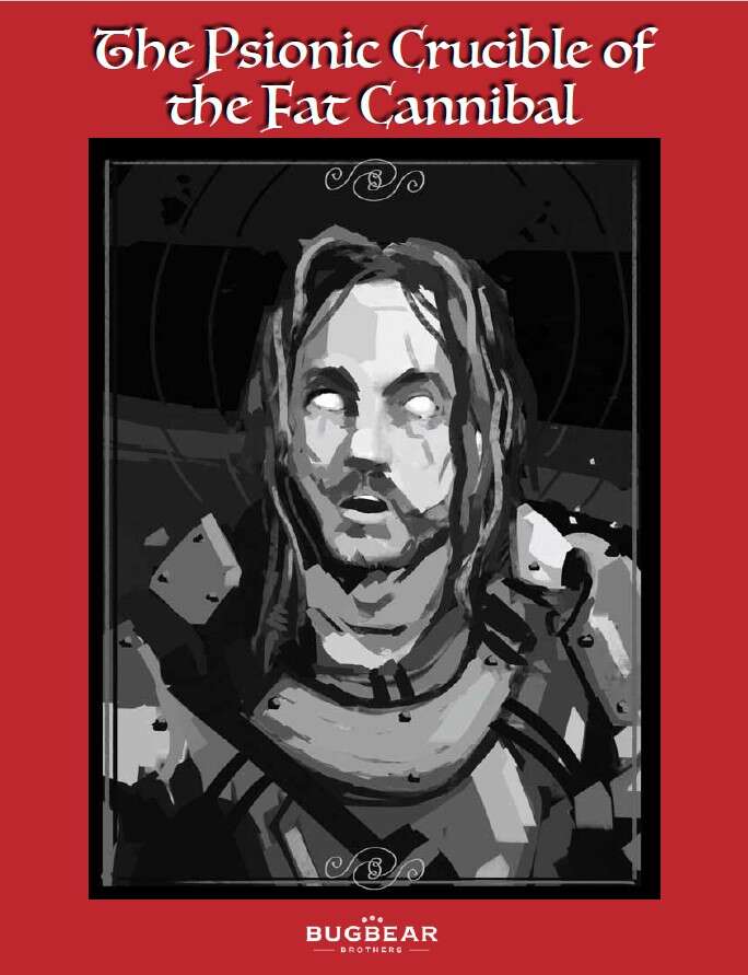
The bastion of the North, Xaefen Keep, has succumbed to darkness. Recently, there have been whispers of forbidden psionics that have taken root in the citadel. It is feared that this vile new craft is being used to torture the minds of young squires and madden them, thereby undercutting the Crown’s power. The renowned knight, Ervin Greystyle, also known as ‘The Axe’, has recently ventured North in order to investigate these troubling rumours. It has been several weeks since Ervin’s last correspondence, and he was due to return many days ago. The last letter Ervin wrote to the Crown contained a cryptic, macabre reference to a ‘gluttonous baron’ and his ‘mage juicer’, who reportedly dwelt in the lower crypts of the Keep. A reward of 500 gold pieces has been issued by the Crown to any who would confirm or refute the ravings contained within Greystyle’s last correspondence. There isn’t much time left now…
This 28 page adventure details a ten room dungeon in about nine pages. It’s got some good ideas and tries to be original in both treasure and descriptions. It also drones on too long in it’s read-aloud and DM text and is constrained by it’s smaller size. It’s notable for what it could have been.
This thing is so un-generic. It’s not using the generic fantasy tropes that are seen everywhere. It adds more detail to just about everything. It edges over in to Eberron territory, probably. There’s a fat cannibal baron. There’s a wizard addicted to potions. The local villagers are afraid of the Wendigos that plague their village at night, gaunt figures with decayed deer heads. They are engaged in pacifism, led by their local priest, in the hopes their god will save them. There’s a magic item that consists of a pair of of sow’s ears. And another that consists of a ghouls finger. And a pool of water around a column that if full of cloudy eyeballs, floating. It has a hut, underwater, of translucent glass, held down by “thick black tendrils and vibrant green roots protruding from the sea floor.”
And that’s only a sample. The environments here ARE interesting. They are new places with new things that the party has likely never encountered before, like the pool of eyes. The magic items are unique and well described. Mechanics are not overly emphasized in magic … that ghoul finger wants to return to its shelf … at a speed of 60’ and push 300#. Hmmm, now can I, as a player, exploit THAT? And that’s a good item.
Haunting choir music, a woven meditation carpet, the scent of rot permeating your nostrils. Thick hemp straps. Note the use of adjectives and adverbs, the way these things are described. Not large or big or small or red. This is excellent use of language in order to add more to a description, to paint a vivid picture for the DM. “One of these paintings is molding and teeming with cream coloured maggots-some in the midst of hatching, others fully grown-chewing at its outer edges.” Sweet! Oh, did I fail to mention the cariboo skulls lined with nails that some prisoners affix to their own skulls in their madness… the faux-wendigos? This is good shit. It’s not all great, there’s are some “large” room contents and the like, but it’s got it where it counts.
What its also got is a case of Mouth Runneth Over syndrome. The read-aloud is long. The DM text is long. And long for interesting reasons.
It’s not the usual irrelevant bullshit detail. There’s a thing that 5e adventures sometimes do where the read-aloud fully describes the room. If there’s a bookshelf with an interesting book on it, in a hyperbolic example, the initial read-aloud describes the bookshelf, the book, and also tell you what the books contents are. In other words it assumes a certain amount of follow-up and just infor-dumps the entire thing up front.The first room, that one with eyeballs, is a good example. The entire first paragraph does NOT describe the first room of the dungeon. It’ describes the ruins outside that you come upon. Oops, guess that should maybe be in a separate section, to make it easier to find, etc? Then it tells us of a room dominated by an obelisk. And it describes in detail the damage to the obelisk. ANd then the moat around it, filled with clounded eyeballs, with irises of various colours. From their state of decay it’s clear they’ve been here some time. The description goes on about some murals, but lets pause and just examine that obelisk and moat descriptions. The damage detail would be perfect for a follow-up in the DM section, as would the eyeballs, cloudy, and iris details. By NOT infor-dumping you encourage back and forth between the players and the DM. They ask about the pillar, you reply it looks damaged, They examine more closely. You describe more. (Someone, somewhere wrote an article/blog on this that was very good, but I can’t recall it.) The moat. I look at it, it’s full of something. I go over and look closer. Eyes. Ewwww! I look at the eyes, they are cloudy … with scintillating irises. Ewww!
The adventure also engages in a lot of if/then clauses in the DM text. IF the players do this THEN this happens. Ray’s book on editing covers this, and other common writing issues, pretty well. These sorts of writing mistakes are common in this adventures and the designers would have benefited greatly by Ray’s book. The DM text proper is also lengthy for other reasons, mostly through some sloppy writing that takes a more conversational tone. That style is ok in places, all work and no conversational asides make DM Bryce a dull DM, but when it goes excessive it make the DM text long. And long DM text is hard to reference during play.
There are also other missed opportunities. The village nearby, with the “Wendigo” problem, is given very little attention. Serving as a base and intro to the adventure it could have used quite a bit more. And better organization than a simple paragraph dump of information. It’s got good roots but needs more to bring it alive. A missed opportunity. Likewise … and I think I realize the gravity of what I’m about to say, this thing is constrained by size. Expanding it, a bit better design and integration of the areas, and you would have something that people would talk about the way they talk about Thracia. No, it’s not Thracia, not close, but it had that potential.
On the nitpicky front, it’s got a random Big Bay Guy location chart. I don’t get why people do that, for multiple play throughs? In this case it can be a little justified since there’s a kind of map puzzle in one room that can show you locations … and creatures moving about in the place adds some life to the place. Generally though … it’s something that raises my eyebrows as a sign of ill things to come.
It’s also got this weird System-less thing going on. It lists itself as generic/agnostic and OSR. And then mentioned exhaustion checks. And advantage. And lists DC’s for stat checks. That’s 5e. But is it, really? I suspect it’s just the designers home system which is a mash up of many things. The DC stats checks will wrankle the hard core OSR crowd, but it’s all easily ignored/converted on the fly by even an ok DM.
And there’s no level range on the cover or in the product description, you have the buy the damn thing first to learn it’s levels 3-5. Not cool.
Nonstandard. Imaginative. Some decently evocative writing. But suffers greatly from Too Many Words. And, a couple of large missed opportunities. And sup with that title? It feels randomly generated.
This is Pay What You Want at DriveThru with a suggested price of $1.50. The preview is four pages and shows you nothing. Bad preview! Suck! Show us a room! Give us a sample of what we’re actually buying! Oh course, in this case it’s Pay What You Want, so you can get the entire thing, but, still.
By Paul Riegel-Green & Ben Burns
new Comet Games
5e
Levels 1-4
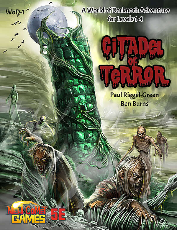
Spring time has arrived, the fields planted, the trade routes are opening and the Orc raids will be coming soon. It also means the arrival of the mysterious but powerful mage Melius. But this year, he has yet to make his appearance. What chance does the small city of Adwick have against the ravaging hordes of Orcs without the wizard’s assistance. Every day that slips by, causes the leaders worry and concern. You and your small band of adventurers have been tasked with traveling through the abandoned ruins of Rochdale, then into the swamp known as The Moors. To seek out Melius’ tower and discover what has become of the wizard. What evils lurk in the ruins? What dangers will The Moors hide? What will you find at the Citadel of Terror?
This 68 page adventure details a wizards tower with about twelve rooms as well as a couple of overland encounters. It’s massively overwritten, both in DM text and read-aloud, and is one of those “make a skill check to tie your shoes” adventures. At least I got to pay $15 for it …
I’m supposed to be nicer. I’m supposed to explain more. I’m supposed to describe why things are the way the way, or should be, in detail. I’m supposed to do a lot of things. And then something like this comes along and saps all of the life out of me.
It starts with the party being ambushed by 24 orcs. “That’s a lot” I thought “for level 1’s.” Not to worry, it’s not an actual encounter. A calvary of gnomes and halflings on war dogs come to your rescue. Well Buckher, some strings are more obvious than others.
This then degenerates in to the town where the party is sent to find a missing wizard in his tower. And it’s all done in third person read-aloud. “He tells you that …” “he explains that you have been selected” “when you enter the bar the dwarf behind the counter welcomes you and introduces himself as …” Jesus. H. Fucking. Christ. Abstraction. Filthy fucking abstraction. Read-aloud, when used, should immerse the listener. Abstracting to the third person and abstracting thing like “your welcome” is utter bullshit. Specififty is key. He raises a tankard drains it and slams it down spraying out “Your Health!” through foam. Contrast with “the swarf behind the counter welcomes you.” Abstracted vs specific.
Not to mention the fucking length of the read-aloud in this. It drones on and on and one, in spite of people not paying attention to long read-aloud. There’s even a faux-study by WOTC proper! But out designer friends don’t know that.
This is joined by the WAY TOO EXCESSIVE dm text. Mountains of it. Mountains of mountains of it. A five goblin fight takes a page. Some stirge around a pedestal takes two pages. Excruciating if/then clauses.
You need a DC 16 persuasion to have the bartender tell you about the missing wizard. The most mundane of information. That’s in his own best interest to relay. And skill checks of this type are generally set low. But not in this adventure. But don’t worry, they are everywhere! And All of the conditional clauses take up lots of extra room! Are you an elf? There’s a special line for you in the column long perception check results … your DC is 2 lower than everyone else! THis is a total and complete lack of understanding of how skill checks are supposed to work. No doubt learned from other badly written adventures.
One of the outdoor encounters, with five goblins, has a master goblin thespian pretending to be an old woman. I’m pretty sure that’s not meant to be literal, but it still trends the wrong direction. And DC 19/24 skill checks at first/second level? Is that even possible in 5e?
No real overland map, in spite of their being an entire swamp to cross with multiple random encounters in it. Or an entire series of woods encounters … that are essentially linear since you get led to each and need to find some rings at each to get in to the wizards tower.
And the actual writing? “They appear to be dead.” Well no shit. That means dead. This REEKS of just about every bad writing/editing decision you can make. What’s the name of Ray’s editing book? These people need that bad.
And our 8th level wizard, who can’t rescue himself … I just can’t go on. This. Is. Bad.
This could easily be a one page adventure and loose nothing, in spite of the massive limitations of the one page format, it’s that overwritten. It concentrates text in all the wrong areas, giving painstaking room descriptions that are meaningless to the adventure.
It is for designers like this that I feel sorry. They had an idea. They want to do good, I’m sure (doesn’t everyone?) but they have NO idea how to get there. No doubt they had some design principals … as evidenced by the massive skill check text, but they were the wrong things to concentrate on. Also, I applaud their eschewing of DMsGuild. But, man, ya gotta actually learn how to write an adventure. It’s got nothing to do with the motivations of the NPC’s or the balance of the encounters or how correct the rulings are. Usable at the table, Interactive, Evocative. This is none.
Also, where my Terror? I was promised terror!
This is $15 at DriveThru. And for $15 (fucking bullshit!) you get no preview. So it’s a blind buy. Of $15 crap. To be clear, price is pretty much irrelevant if the adventure is good. But when they are bad, and they are almost always bad, the fucking $15/pdf shit stings. ESPECIALLY WHEN THERE”S NO FUCKING PREVIEW!
By Jay Murphy
Vanishing Tower press
1e/BX/etc
Levels 2-6(!)
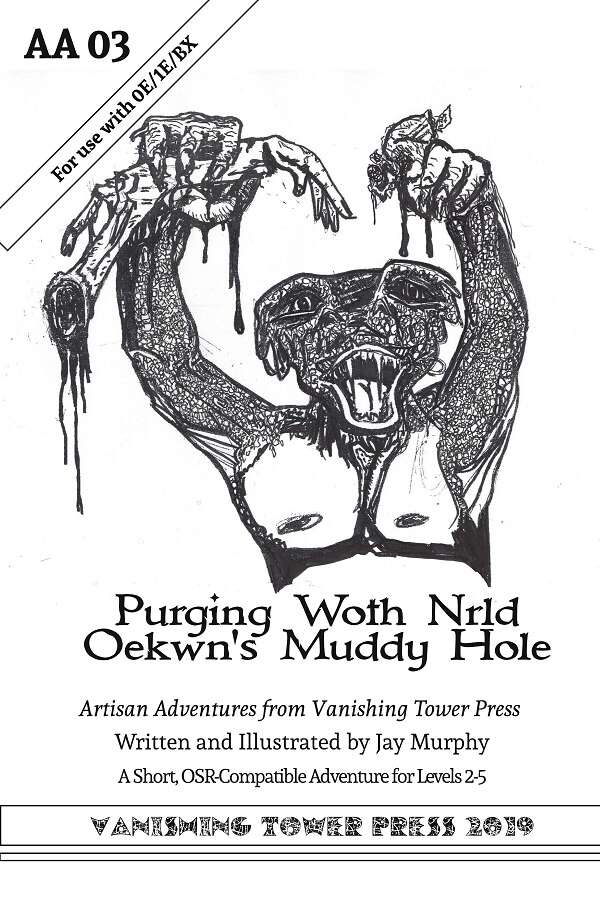
A gasping faithful of the Grim Gauntlet, gripping bloodied mace in gashed hands, lies wounded in the forest. They have just crawled out from their failed mission within the “Hole”. A trio of fanged-mouthed humanoids killed their party before they escaped with their life. Robid has sworn to destroy this forgotten shrine of evil. Will the PCs help?
This forty page digest adventure describes about twelve rooms in about fourteen pages. There’s a small cave complex combined with a small weird temple complex … petty-god ish. Good interactivity and evocative writing combines with spotty organization.
When I first looked at this I misread it and thought it was for OSRIC. As I was looking it over I thought to myself “Jesus, the OSRIC guys heads are gonna explode”! Then I looked again and it was 1e/BX/OSR systems. Ok. We’re talking a tone here closer to OD&D than 1e or generic B/X. Not really gonzo, but with a healthy, healthy non-standard monster and situation mix. “Petty God temple with Trogs” maybe describes the tone?
The tone is very OD&D: lots of new monsters and new magic items … no book items at all. The situations are weird. A sickening yellow membrane across a doorway. A harbinger in the dungeon. Dismembered corpses scattered about … with the things you need to desecrate/shut down this temple. It’s weird mix of trogs and petty gods stuff … it sets a dark and ominous tone with the text. A room is barren, with the heavy smell of wet earth. Corpses ripped up, parts missing, with maggots infesting them and maggot/wing/wasp things festing on them. The smell of ammonia precedes the pink slime monsters. There are weird alters and things in the dungeon to fuck with. It’s a good mix and sets the tone for “weird” without it being gonzo.
Treasure seems light for anything but level 2’s … and the first monster encounter is with 11 2HD monsters in a room blocked by monsters … that’s gonna be rough for level 2’s. Blocking monsters can be a problem in older editions of D&D. Or, maybe, it sets a pretty strong level range if there’s no way around them or clever way through them. It also does some weird things with information in place. “If Bob is with the group he’ll tell the party that his buddies died in the next room …” Well, if Bob is with the party then they may have asked that before getting to this room. Having the Bob section tell us what Bob kbnows is far better than digging through the text for each room to ferret out what someone knows.
The organization of the text is … inconsistent. Some rooms do a decent job or organizing the text for the DM. Room two has two dead bodies that have attracted Muckwings (stats for muckwings) (order of battle notes) (body 1 descr)(body 2 descr.) That’s a decent layout. You’re likely to se ethe bodies and then the monsters when you enter, and then you’ll search the bodies and the layout reflects that.
Another room, though, mentions the smell of ammonia first (good) but then monster stats. And then mentions a small hole in the floor the size of an apple. THEN it mentions the back wall being dominated by an upright stone coffin. Then it covers reaching in to the hole. Then the same paragraph covers the coffin and it opening. It’s all over the place. First things first then second things second. Jumping all over the place with your room text forces a complete reading for the room … which is not good at the table during play. Other areas tell us that pink slime encroaches out in the hallway from the room. Well, fuck, that a detail that should be on the map or somehow otherwise noted prior to the room so the DM can run it correctly.
But, it’s certainly original. And full of evocative writing and interesting interactive encounters. And is non-standard as all get out. If you want something a little different then I’d Regert this … but the somewhat tortured writing in places and lack of clarity in others makes it a tough recommend on the Bryce Lynch “On the Best” scale. A scale which is unfair to original works like this.
This is $4 at DriveThru. The preview is GREAT. You get some art samples (which do a good job conveying a Darkest Dungeon tone and brining the monsters to life) and you get to see about seven of the room. Note room two in particular. Can you tell me what items the bodies have and if they are pertinent to the adventure? Check out room five and see how the bolding clases with the monster bolding … and that giant hand/head alter. Pretty spiffy!
This small dungeon combines subtle Egyptian and Mayan themes, weird fiction, non-Euclidean geometry and a touch of gonzo oddness.
This 24 page adventure details a fifteen-ish room dungeon in about twelve single-column pages. It’s interactive, evocative, and tries hard to be useful to the DM at the table using a nested tree-like description format. Commitment to a vision is a good thing. Too much commitment to a vision is fanaticism and not good. You gotta know when to sacrifice. This don’t.
A great many of my positions can be thought of in terms of a spectrum. You’ve got two extremes and a middle point and I’m generally encouraging people to move off of their position near an extreme closer to the middle where a great band of “good enough” surrounds the “perfect” midpoint. This is usually confused as “Bryce wants everything spelled out for him” or “the reviewer favors minimalism.” No, neither.
The descriptions in this adventure are pretty well done. They’re evocative. This isn’t achieved by droning on and on. This is achieved both by good word selection and leveraging a “less is more” attitude. Many things lose their wonder when overly explained. Magic items, Wonder. Magnets … how do they work? One interesting technique, used here, for being evocative is to remain mysterious. Our brains want to fill in detail. They want to explain. By giving them the right degree of detail, in the right way, they leap to explain and imagine and fill in. The main description for room nine, The Crypt, is “Scales cover the ground. An altar in the southeast corner. Murals of religious scenes: snake as deities, snakes as priests” It’s not much but revels, in a way. I’d summarize it, but it’s already essentially summarized for you with crypt, scales covering the ground, an alter and freaky murals. And note that the freaky murals are DESCRIBED. It’s not just “murals of victory” or some other abstraction, as many adventures provide for. No, it’s specific: as deities, as priests. It’s not the only way to get to an evocative description, but the combination of specificity and starkness does a great job.
It’s also fairly interactive, pillar two of the Bryce Watchwords. More than just stabbing things. There a great set of snake jaws that make up a door with gears to move them. More than trap, a trap wto PLAY with. An alter of snake bones (in that crypt, great detail, again) that releases toxic gas when disturbed. Jars hanging from an intertricate techno ceiling with fluid in them … and proto snake things as well. A wall covered in lichen and vines … and a hidden power cable. There’s so much that reveals itself to further examination … and reckless play. Check.
[Note: this next part has some comments about Engligh as a Second Language. I would not say this adventure has language issues. Far from it. But some of the choices made in formatting remind me of non-Engligh Subject/Verb order … and I see things available in Spanish as well. It’s an academic comment, not a usability one.]
And then there’s the “Helps the DM run it”, of which a major part is the DM’s ability to scan the text and locate the information they need. This adventure is trying a format I’ve seen a couple of times before, with nested bullet points to describe things. Major thing. Then a nested detail, and then maybe a nested detail of that. It’s not a bad idea. The top-level bullets helps bring the eye to the important details while it’s then easy to find additional information about those things by looking at the nested/indented bullets.
The adventure has a couple of problems in its specific implementation though. First, it’s gone overboard on the nesting. There are four or five levels in some cases. And three is pretty frequent. This end up making things harder to understand. I THINK I get what is going on. It’s almost like it’s one of those modern grammar teaching lessons where you break a sentence down in to clauses and make a tree-like structure from it. Now, let’s assume you did that for EVERYTHING in the adventure. That’s not the case here, but imagine it. It’s trying to follow some quite strict rules about nesting of detail … and has made that the assumption that this is good. Well, yes, it’s KIND OF good. But, by strictly following those nesting rules you’re loosing sight of the overall goal: usability. This reminds me of those adventures that always put a Sight, Sounds, Light, Door, Smell, taste, etc section at the start of EVERY. SINGLE. ROOM. regardless of if they need it or not. Too much implementation of a decent idea. Instead, focus on the overall outcome, usability, keep your general technique in mind, nesting, and sacrifice the technique when it detracts from the outcome. In one section there are some While Apes. That’s the top level. Ok. Second level nest: chained to the walls. Well, ok. Third level nest: they are food for the goddess. Uh … was that necessary to nest? White Apes-? Chained t o the wall, food for the goddess would have worked also. Even better: White Apes chained to the Wall-> Food for the goddess. Then the important detail “there’s fucking apes chained to the wall!” is immediately apparent. The adventure does this time and again. It needed to add a little, the obvious shit, to the top level nouns and combine a bullet of two. That would substantially condense the adventure.
In other places the nesting looks backwards to me, with the important details deeper in the nest. A door-> Make a dex save to open it using tools->if opened make a dex save vs death->success: leap backwards to avoid being buried by snakes. The snakes falling from the ceiling is the important bit (so many they smother you!) but it’s buried. It should be moved higher up. Likewise there are other details that seem to be in a weird order as well, like a stone circle in room one that left dangling near the end. And for its attempt at usability, I still have no idea what “1g” and “1p” refer to in the monster charts, or which door in room one is stuck and which isn’t. Still, it’s trying, with cross-references and all.
I think it’s a great attempt. The format needs some polishing, but it’s got potential. And the evocativeness and interactivity are certainly present.
This is free at the designers blog. Which is interesting in and of itself.
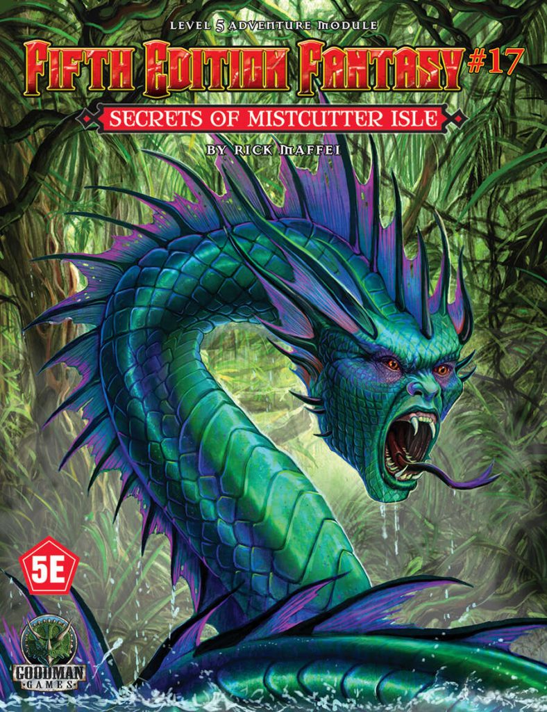
Mistcutter Isle has always had a dark history. For years the isolated isle served as a haunt for pirates and smugglers looking to hide their ill-gotten gains. But before that, legend has that the Isle was home to a race of savage, sea-dwelling creatures that enslaved other races. Somewhere on the Isle, it is said, is their hidden temple. Such tales were not always believed, but recently sailors have seen unusual purple lights in the sky above the Isle. Something is happening, and those with long memories fear that evil is afoot. Do the adventurers dare investigate the secrets of Mistcutter Isle?
This 28 page adventure details a sea cave complex with about seventeen areas. Editing mistakes and a formulaic approach make it bland.
Let us imagine you had a formula for making an adventure. You drew a map. In each romo you placed a monster. You also place some obstacle in some room that the monster is not impacted by. You do this for each room. You call this an adventure. 4e did something similar where there were these big set piece rooms with terrain modifiers and some kind of magical effect. It felt generic in 4e and the formula approach feels generic in this adventure. Oh, not every room is this way. Some just have a monster. And some just have the trap/obstacle. But it’s close enough.
There’s this naga and she’s luring adventurers to an underground temple so they will trigger traps so she doesn’t have to. Mistake one: luring adventurers. God this is so overused. Isn’t there any other reason for things existing other than this? What happened to just being evil? And having loot? In fact, there are two decent hooks that in no way involve the bullshit “luring.” The navigators guild hires you to map the island, for navigation purposes/threats, and a nearby town sees purple lights coming from the isle and “that can’t be good. Better find someone to look in to it.” I’m not a big fan of “hiring”, but the navigation guild stuff is a great pretext for getting in to trouble, and more realistic than hiring mercenaries. The “we see purple lights and that can’t be good …” thing is at least more interesting than the usual “hired by archeology/wizard/sage” boring of stuff. Which to be fair, is present also; I just don’t mention that shit anymore. If the designer doesn’t make an effort then why should I?
The read-aloud is in italics. I hate long sections of italics. I find it difficult to read more than sentence, and sometimes less. Bold it. Box it. Offset it. Just don’t fucking put it in italics. It’s hard on the eyes and comprehension.
Editing is terrible. I mean REALLY terrible. I mean more than the usual terrible editing, which plagues RPG adventures. In this case numerous mistakes creep in. “The area B colossus …” There is no colossus at area B. There’s a big statue elsewhere. Do they mean that? The map has shaded areas to indicate flooding …which don’t make sens to me AND are wrong. The text refers to six, nine, and ten as flooded … but six is not shaded on the map. But room one is. And the flooding text, combined with the map notations are supremely confusing in and of themselves. I still can’t figure out what’s flooded when to how deep and how deep if not. Are they entirely underwater? Who knows. I spent some time looking for a map of a specific dead-end hallway that referred to “areas a, b, and c on the map”, but there was no map with a, b, and c on them. Then, finally, on the least encounter, I saw that they had a full page map for the last room. ANd inset below it was a little map for the dead-end hallway. NOT a good editor.
This is on a small island. There are a number of encounters, five or so. There’s also a wandering monster table. The encounters are essentially just entries from the wandering monster table that’s been expanded to fill a lot more text. There’s just no meat to them. Fight a monster, big stat block, move on.
Encounters details why the monster is here. What it thinks and feels. How it got here. Why it is still here. It’s history of past battles. None of this is fucking relevent to the adventure. Instead of spending the word count on, tersly, describing an evocative environment it instead indulges in this trivia nonsense.
Enter room. Listen to read aloud. Identify obstacle. Find and kill monster while avoiding obstacle. Get treasure. Go to next room. That’s no D&D. That’s a caricature of D&D.
This is $7 at DriveThru. The preview doesn’t work. So you can’t actually tell the quality of what you’re buying beforehand. I can has sadz.
The link to the product in this review is probably an affiliate link. If you follow the link and buy the product, I make some money. Just thought you should know.