
By Taylor Seely-Wright
Self Published
Shadowdark/OSR
Level ... 1?
Crawlers delve into the cursed, abandoned halls of the dwarves. They delve for gold, glory, and magic. They delve to find the truth of the fortress and its abandonment.
The product page on DriveThru has a kicking map; go check it out before looking at the review! It’s what lured me in!
This 24 page adventure presents a Moria of about fortyish rooms. Nice map, some decent ideas. But it lacks life in it’s descriptions and the interactivity is a little CRPG “fetch the blue key.” More than a little. A nice try.
A return to Narnia. Err, Moria. Err, Kazad Mor. These things never work out. Nothing ever captures the scale of Moria. Plus, stoic dwarf rooms are boring. As are elfhomes, for that matter. Nothing compares to the epics of men. Anyway, you’ve got the ancient dwarf blah blah blah of Kazad Mor It’s got loot. It’s got a cursed thingy in it. Let’s head the fuck in and fuck some shit up, yeah?!
Our first room is the entrance. “1a: Ruined Bridge. Collapsed bridge over magma.” starts the description, telling us of collapsed supports and signs of blast marks. It goes on with another sentence, telling us that we enter through a carven dwarf mouth. (This is all in a terse, almost OSE format, but more on that later.) But what we have here is a very fact based description. There is a collapsed bridge over magma. We don’t get the heat, or the eerie red glow. There is no looming darkness from the other side of the carven mouth. Churning, flowing, bubbling? Yes, you can absolutely write that you have a collapsed bridge over magma, but if you can write four more words to bring in the VIBE of that scene then you’ve gone above and beyond in bringing the encounter area to life. That’s the challenge of being an adventure writer. And, also, the hardest part, I think.The entire dungeon is like this. A terse but not evocative description of the room that relies mostly on facts rather than feelings. And that’s not an effective way to convey whats going on. Sure, you need to include facts at some point, but you want the DM to really understand the mood of the room at a very primitive level. Collapsed bridge over magma isn’t a bad description. But it is also not a good one.
Which is interesting, because I’d guess that, oh, half of the monster descriptions in this adventure are pretty decent. Pulling four at random: A squat, sawtoothed humanoid with one red eye. A gruesome specter with unfinished business A black light, darker than darkness with a horrifying face in its heart. Grotesque melding of dwarves in a hulking mass of madness. I can criticize the spectre description, and i don’t think Gruesome or Grotesque are descriptions, but rather conclusions. But the rest isn’t that bad. Squat, sawtooth, red eye. And the black light thing is an interesting description as well. When monster descriptions focus on appearance (or, maybe, vibe? If they make you feel chill or something?) then the description is doing well. You want one that matters to the players. The ones that focus on ecology suck donkey balls. This isn’t the monster manual. I’m running a fucking game here and the players want to know what they see and I want them shitting their pants because of what they see. The monster description needs to help do that. We do, though, get a page of monster stats, I think fourteen stat blocks on a page. Not bad!
And the interior sometimes has some very interesting encounters in them. You can meet you a ghost with unfinished business … who might possess you for eight hours before departing, leaving you with knowledge. That’s fun! And, Jesus, one of the wandering entries is a horde of 100 living corpses in a great moaning hoard, arriving from one direction. Can you imagine? As a wanderer? I love that sort of environmental hazard. Usually it’s like a robot sentry or something, but a horde of living corpses just hits differently. Speaking of the wanderer table, you can also get things like this on the OMENS table: “1d6 frozen dwarf corpses wearing stone masks emblazoned with an eye. These dwarves are standing in a semicircle facing the door” Gah! That’s gonna FREAK. THE. PARTY. OUT! And that’s what shit like this should do, after all. Those are some nice entries. But, also, a lot of the interactivity is the traditional stabbing and more than a few “go find the blue key for me” sorts of things, except you need to put ghosts to rest by watering plants or arranging a feast or something. Fetch quests, especially these basic ones, are not really the height of interactivity. And, other than traps, that’s about it. It’s an attempt, I think, to introduce situations in to the adventure, which I can appreciate, but I don’t think that’s the depth I’m looking for in things to do other than stabbin. We do, however, get some zones of play, from the Hag zone to the Zombie zone and the great hall and so on. That’s quite well done.
I need to bitch a bit about formatting and layout. That map is what drew me in, it’s great, but, also, the numbers tend to the illegible. That’s not cool. Especially “1e”, which took me about five minutes to figure out. Doors are also almost hidden. The number one function is use at the table, and so I have to be able to read it. You know where this is going, don’t you, The Designer? There are two versions of this adventure,a print and a printer friendly. The print version is an atrocity. White text on black backgrounds, yellow text, lots of italics in funky hard to read fonts. And a shading system that DEemphasizes the main rooms and emphasizes the notes. Both versions use icons in the text to note traps and monsters, which I think causes more confusion in this text, in the way its implemented. You know, you might find a middle ground where the print version is STILL nice to look at and yet is actually possible to use easily at the table without stabbing your fucking eyes out?
I would note, also, a tendency of the formatting to place emphasis where it should not be. We get, in a room or two, notes about the distance, like a fetid wind blows from the north or the south hallway is glazed with webs. That’s great. But in other places there’s this weird order to the text that I can’t figure out. I’m a strong believer in, generally, putting the most obvious things first in a description or list of bullets. But, in a room with a crack in the wall that is glowing red, should we bury that in the text? Maybe stick it up front? Or, in the finale room. It’s got a stone tablet in it covered with shifting text and an eye diagram thing floating around on it. Cool? Eventually we learn that it’s as big as a barn. Oh. Hey. Need the info. This isn’t exactly OSE format, it’s got more words than that, but in both cases I think the same comment applies: it can be good if you really work the descriptions hard. And if you don’t and don’t really understand how to use them then you can get something worse than text description. I’m not saying that this is a full on disaster, but it definitely causes some disjointed moments again and again.
DId I mention that, at a minimum, room 39 on the map isn’t mentioned in the text? Well, I think it might be there, but there is no “Room 39” label, just a room description where I think it should be. Hrumpf. Shit happens. Life will go on.
I could go on. There’s a lot to talk about here. Mostly because the designer actually tried. It’s almost there man, a great first draft.
This is $2 at DriveThru. The preview is thirteen pages and shows you every keyed entry. Great preview! But also it’s the print version, so you’re gonna have to look past that and spy the actual entries to get an idea of the formatting and fact based descriptions and weird orders of things.
This sounds tempting, especially for the price.
Moria has been done.
But let a stronger man than I resist haunted dwarven mines.
Cover is Art Punk Central, and Shadowdark/OSR level 1(?) is a red flag too. Good to know that it’s actually not shite.
Not everything with edgy art is “art punk”, and art by itself is not the bellwether of a decent, enjoyable product. There is room in a product for both art and content; they aren’t mutually exclusive.
Writing off an adventure because of the art is literally like judging a book by its cover (i.e. something we are oft advised against, for our own good). This whole “art = bad” movement is the dumbest thing to happen to D&D, I swear.
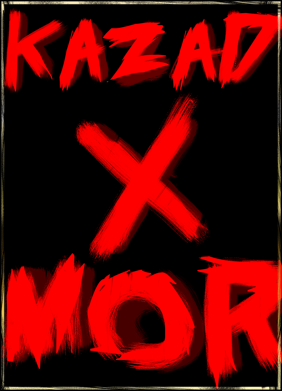
That’s cute and all, but the cover is literally 3 words in smeared red letters. It has nothing to do with art and everything to do with artpunk
So what you and Bucaramanga are saying is, “I really want to cling to my useless and judgmental presuppositions, even though they are disproven by this adventure being both decent and NOT artpunk.”
Everything that isn’t public domain lithographs is “art punk” to people these days.
“Everything I don’t like is artpunk, even when it’s not.”
They have become that which they most despised.
Ugh, look at this obvious art-punk garbage: https://princeofnothingblogs.files.wordpress.com/2024/02/image-17.png
Smeary red words on a field of black with some nonsensical fragmentary ghostly sketch beneath. This “Prince of Nothing” guy sure loves art punk…
I don’t want to like it for industry drama reasons, so it’s definitely artpunk!
I think the catgirls win this one. Good night, sweet Prince!
Hah! Getting trashed on my covers! A lethal blow! I promise the KS version will have a better cover.
I think its pretty funny the catgirls still don’t get what the issue is even after I have literally explained my viewpoint multiple times. But then again if they did, they would be able to make better adventures.
I will give any enterprising catgirls a hint: My contest forbids the use of neither art nor layout. It does have other stipulations. What could I mean to achieve with those stipulations?
I came up with the Slyth Hive cover. Direct your shit at the correct person. I welcome it, cept…your anonymous, so why waste my time? Shit, you got me, I wasted my time already…if only I had a correct piece of art to convey what I’m trying to say so you would understand…
I think anon is trying to say that even though prince hates artpunk, his cover is similar to this review. So we shouldn’t judge by the cover since prince’s adventure most likely is no artpunk on the inside. I don’t think they try to shit on the cover or be weird about it.
Is prince so dense that he actually doesn’t understand this extremely simple point and genuinely thinks the poster is “trashing” his cover or is he being deliberately dishonest and engaging in bad faith?
Either way, why should I listen to what he has to say ever again after witnessing this display?
I think the term “Art Punk” when used here as a criticism/critique is a shorthand for some sort of style over substance achieved with an overabundance of edgy artwork. Mork Borg has been the poster child of this, but you see it too with a large amount of the non-Kelsey Shadowdark offerings for example.
The Shadowdark stuff from Arcane Library shows what you get with excellent artistic style and MASSIVE substance. When the substance is good no one has a problem with art at all. Another excellent example of this is Merry Mushmen’s Nightmare Over Ragged Hollow – it adds awesome art (IMO) to the awesome content of the largely artless Ragged Hollow Nightmare by John R. Lewis. The added bonus here is that the high usability of the module actually improves because of how the art is utilized in the maps and other parts of the module.
Style and substance work off of each other, but when you are talking tools for a job (i.e. elf game books) substance is the launchpad for style. Otherwise, it is just a cool picture of a monster with some mostly meaningless words and numbers.
I think Gus L.’s stuff sometimes is invoked as being “Art Punk.” If so, it’s good Art Punk.
Evocative writing + great gaming material + great artsy maps.
I’m skeptical about ‘massive substance’ from AL until I have checked it out myself but ‘substance’ I’ll credit no problem, it looks sincere and competent. J.R. Lewis makes creative work, I’ve reviewed several of his adventures although I am not always a fan of his OSR conversion work and I don’t think it’d qualify as artpunk. It is interesting to observe that even when we are praising the substance we don’t actually discuss the substance, i.e. what makes it work or stand out. There is something to making adventures that is more then pretty descriptions. Something about how we interact with this medium.
There has certainly been good Artpunk (a term coined and described by Patrick Stuart btw) the likes of DCO, Gardens of Ynn, Brad Kerr is in that corner etc. But the focus on artistic expression on the high end coupled with a compulsive lowering of the bar for entry on the other is not conducive to material of substance. Anyone can enjoy pretty writings or drawings or stan over layout. Substance requires engagement, commitment, understanding. Thus a dichotomy.
I ask.
1. Is it preferable to have system neutral adventures or to have them for a specific system? Why?
2. Is there a critical threshold for system complexity below which adventures must suffer?
3. Do you enjoy the game as an experience, or as a test of skill?
4. Are all forms of gameplay valid? Can you play an RPG wrong?
Just to clarify – I was not saying that Ragged Hollow was artpunk, just using the two versions as a demonstration of how substance is the foundation. Same for the Shadowdark example. Non-Kelsey Shadowdark starts to wander into some artpunk like space. But AL Shadowdark has a foundation of substance but looks great too. I used a bit of hyperbole there with the MASSIVE. That was just based on the fact that Kelsey is one of the few on this site with a near perfect (perfect?) score.
Answer Key: (1) Specific system, because we’re lazy GMs (2) OD&D (RPGs like Lasers & Feelings are not complex enough) (3) yes, both please (4) no, yes (if LARPing is for you, then you’ll probably answer the opposite way)
You all sound like such fuckknuckles right now arguing about style and art.
Is the adventure any good?
IDGAF if it fits your precious genre.
I miss Joesky.
10ft Pole and Noartpunktopia aren’t the sort of places Joesky would touch with a 10ft pole. He wouldn’t waste his time on this sort of bigoted political posturing, purity nonsense, fear of catgirls, or pearl clutching. Joesky had games to run, beer to drink, and house rules to share.
At least Bryce has his shit together and can actually read things without pre-judging them.
His comments section, though? Yeah. It’s starting to look like high school band camp.
No one gives a fuck about all these petty little dramas/cliques except the people commenting above. Seems like they actually care more about it than the game at this point.
IS ARTPUNK BAD? LESSEE, ARTPUNKS GOT…
1) BABEZ AN TITS!!! HOW MANY BABEZ IN UR PRECIOS FUCKIN KEEP ON BOREDERLANDS? NONE THAT’S HOW MANY!!!!
B) SPIKY METAL AND SKULLS. CHECK. HARDCORE CHEK!!!!
3) WORDS THAT LOOK LEIK BLOOD!!! BLOOD IS COOL, IF YOU DONT LEIK BLOOD THEN U SUCK AND ARE LITTLE BAYBY!!!!
5) COOL FUCKIN SNAKES AND DEMONZ AN SHIT!! OSR SHIT IS ALL LIKE PONCY DUDES IN FEATHRE HATS. NO WAY WITH THAT, GET OUUTA HERE PONCY FUKCERS!!!!
D) VIKINGS AND DETH GODS AND APOCALIPSE STUFF!!! OSR STUFF IS ALL LIKE MERMAIDS AND CULTISTS AND LAME AS HELL BULSLHIT!!! BOO!!!
WINNAR: ARTPUNK!!!!
I was gonna say, Joesky’s right over there talking about the “artpunkness” of the cover of his latest module.
Apologies, somehow I got the idea in my head that Joesky was an alias of Prince. I am putting this correction here before they notice, hunt me down and punish me. Prince is not, and has never been, Joesky. Weird that I got this idea in my head…