
By Harry Menear
Self Published
OSE
Levels 1-3
STRANGENESS AND TERROR FROM BEYOND THE GRAVE! Borgenwold is cursed, they say. Cursed by pride and greed to cower in fear of the past. A fell monstrosity from beyond the grave has risen to devour this town and all who dwell here.
This 61 page exercise in pretension has a fourteen room dungeon. It shows some promise, in specificity, but lacks interactivity and the designer has their head so far up their Layout Ass that they ruin any hope of usability. It’s as if it were a kickstarter for a one page dungeon with four rooms, and all the stretch goals added things … but not to the dungeon and not actually usable. Just shit like “what color is the mayors hat back in town?” tables.
Some dude in town hires you to go to his moms tomb and bring back some priceless treasures for him. He’ll pay you 500gp per treasure recovered. Why you’re giving this shit to him, instead of just keeping it for yourself, is beyond me. He owes a loanshark and will be gone in a week anyway, if you don’t give the loot to him, so might as well take it. Speaking of the loanshark … he’s set up a big bad wolf … but has no stats. I assume that means he has 2HP and we stab him and take his shit. He’s got no bodyguards mentioned, when the text goes out of its way to mention bodyguards for everyone else. I assume this means the adventure was not playtested but a variety of other groups. Oh, yeah, did I mention the hooks and timeline don’t match up?
Weve not gotten a shipment for a couple of months now …” while the issues have been going on for a few weeks.
So, look, this is going to be a theme with this review. The adventure is pretty much crap. There is some high points with the specificity involved, which shows a good deal of promise, but just about everything surrounding that is shit. But, you don’t really KNOW it’s crap just by taking a glance at it.
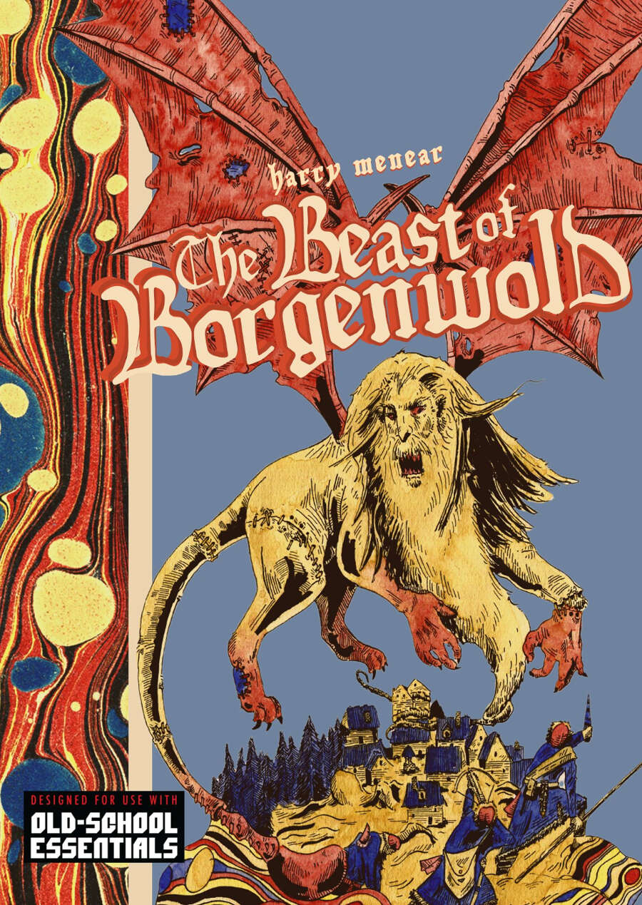
And let’s talk about that. It looks niiiiicccccce! Ooo, look at that cover! Two page spreads! Nice art! And, hey, check out that fucking layout! Pretty artsy! Fuck me man, let’s put that fucking thing on the coffee table, am I right? (A reproduction of the wenge table in the Japanese embassy.) Oh course, it’s absolute shit.
The same fucking problem we always have with this art house garbage. The morons get a hardon over their layout. Their fancy fonts. Their background images. How they mimic some cutout style and put the tables at odd angles. The tables that take up an entire page. OOooo, look, a faux gothic style of font! Text that runs at an angle! Fucking idiots. I’m am so fucking done with their bullshit. If you don’t want people to run it then just label the fucking thing as a coffee table book and be done with it. Bt, ohhhh, noooo, no one will buy it if you label it like that, right? They want a nice looking book. Who the fuck said it … the secret to success is to pay for art and layout and have a print fucking version. That’s how you make bank. That’s what the fucking idiots buy. But, also, you are abandoning the core feature. It’s like buying a gorgeous new PC case … that’s completely sealed. You’re failing at the primary purpose. The fucking thing is a monstrosity to read. You can’t fucking follow it. It’s like almost every fucking choice was made to look pretty rather than to contribute to usability. And in this case I mean legibility. You’re fucking brain hurts to look at this. You can’t scan it quickly. The fucking main font, the use of the bold font, the off center text. The fucking gothic font. SHadow boxes and background images. It’s a fucking nightmare. Oh, sure, looks pretty.
And, while I’m on a I Can’t Fucking Stand This roll, let’s talk about the core of the adventure. A fourteen room dungeon. Everything else in this is essentially padding. And, hey, I don’t mind a little local colour. I love it in fact. But the main adventure is the fucking dungeon. Fourteen rooms. Sixty pages. More on the shit-ass dungeon later.
What do you get? How about a table to describe the local hunters? You see, there’s some side shit (which is tangled up in the main quest.) The titular (heheh) beast is an undead manticore, taxidermied. There are some hunters about. You get a table to make up some hunters. EVen though they don’t really play much of a part in the adventure. They are hardly mentioned. ALso, there is not one table but like four. On four separate pages. That you get to roll on to make one up. How’s that for usability?
No? It’s not? But, hey, one table per page lets you so some funky layout shit! I mean, fuck you and actually running the thing. Otherwise we’d put all four tables on one page. Or, JUST DETAIL A FEW OF THEM IN THE FUCKIGN APPENDIX. People don’t understand what random is for.
There’s some other shit hanging around in this. Some crazy goblins described over seven pages. The sum total osf which is unpretentious is “Small, cramped passages — too small for anyone but children and halflings to move about. Goblin eyes shine like stars in the torchlight.” That’s your goblin lair description. But, hey, we did get to masturbate over all of those freaky deaky goblin tables that take up the rest of the pages, right?
There’s a hex map. It serves no purpose and is not linked to the text. Therefore it’s not a map. It’s an art piece.
And the dungeon? It’s trying to use the OSE format but it fucks it up because because it dopesn’t know what is important. The idea is a short little description with bolded words that expanded upon. But this thing is all over the place in what it thinks is important. Thus, you’ll be readying the entire description to relate some bits to the party. This stands in direct opposition to what the OSE format is trying to do, when implemented correctly. Summary first. Or important things first. Or some way for the DM to figure out those things first. And, ultimately, the dungeon is just about stabbing shit. Stab stab stab. Stab stab stab. Almost no interactivity beyond this most basic of type. Enjoy your stabbing of 6HD creatures that are undead and immune to everything but fire and silver and magic. In your level one adventure.
The fucking thing looks like an adventure that someone has sunk money in to, and thus will be good. But it’s all flash.
It’s got some decent specificity. Good even. The lady that runs the tavern does so “with her two knucklehead sons.” Perfect! That communicates a lot! Of a magic hunting horn “The horn vibrates with raw magic; its makes your hand numb and your teeth hurt just holding it, like gripping a live wire.” That’s a magic magic item description! You know you’ve got something! Some commentary on some magic ‘godling’ fish says “If you eat enough of a gods children, you are eventually deemed a worthy addition to the family.” Absolutely! That’s one way of becoming a god/godling! It makes perfect sense and jives with all mythology ever.
And, check out this terrific description “[…] bodies of villagers, merchants, hunters, guards — brutally, gleefully rent by claw and tooth. Hoisted into the trees, impaled upon pine limbs; a grisly larder. The air is putrid, a wall of sweet death smashing against the nose. Rotten corpse fluids run rivulets down tree bark. Flies swarm and buzz in clouds.” Fuck yeah man! Good description! So the specificity required to have a good description, to write a terse description that conveys overloaded meaning exponentially multiplied in a way that word count would not imply, os absolutely there. When the designer chooses to. In a dungeon room? No way. Hanging ut on its own somewhere, apart from the dungeon. Yup!
“All the bestial heads mounted on the tomb’s walls animate, roaring, bleating, and wailing as one of the rooms’ animals come to life and another hunt begins.” Absofuckinglutly! Now, but ina room fucking description that matches. Trim yor fucking text. Organize it so that the most important shit is up top, and actually give us some descriptions of the situation, or a way to ferret it out to relate it to the DM. And take a chill pill when it comes to the fucking layout. Jesus, man. Make it fucking legible. The main thing is the fucking dungeon. Agonize over the fucking thing. Beat yourself over the writing. Then, you can pad out the region and town and npc’s and shit.
(And, note, I’m not EVEN bitching about the disconnect between the hook, town, manticore, and adventure. I don’t fucking care. This is a bridge too far for 99.99% of designers, so I’m not going to beat someone up over it.)
The cottage industry continues. Layout dudes doing layout adventure bought by other layout dudes. But, he is not a ninja.
This is $6 at DriveThru. The preview is six pages. The first six pages. So, one actual page of adventure timeline. IE: worthless for making a purchasing decision.
https://www.drivethrurpg.com/product/410351/The-Beast-of-Borgenwold?1892600
Zine quest is coming – backers beware!
AI is coming everyone beware !
https://boingboing.net/2023/01/08/add-adventure-complete-with-fantasy-artwork-made-with-ai-tools.html/amp#amp_tf=From%20%251%24s&aoh=16732805981585&csi=0&referrer=https%3A%2F%2Fwww.google.com
Unless we can get AI to read the entire content of this blog.
Wow! I can feel the heat coming off this one!
Sometimes I think I read these reviews just to feel better about myself.
I am sorry, but I don’t even think the layout is visually appealing. 1990’s Photoshop overload.