
By Scott Craig
Cutter Mountain Simulations
Shadowdark
Level 1
Life is hard for the clans of the wold, a life of toil and sacrifice. But there is joy as well. A marriage festival is underway; kith and kin have gathered at the homestead. But harken! The bridegroom has been captured; his retainers slain in cruel ambush. After a violent change in leadership, the Blood Blade goblin tribe has turned its face from peace and now threatens war. Can the raiders be caught, and the bridegroom returned to his family? Four heroes give chase, hoping to overtake the raiders. But when this hope is dashed, only one path remains to effect a rescue of their friend.
This 29 page digest adventure presents a dungeon/cave with about eighteen rooms. It would be a decent introductory adventure if it didn’t follow its own formatting standards so well. A tough edit and it would be a nice GoTo for starter plot adventure. And without that edit it shall also die and be forgotten.
Ok, so, Frank is getting married tomorrow so he thinks it would be a great idea to go to the local (Friendly) goblin tribe and do some trading. His buddy Bob comes back, wounded, along with a gobbo on a wolf. Gobbo says there’s been a coup and Frank is now held captive. But … he remembers that, years ago, the gobbos found a barrow on the other side of their hill warren. It was full of undead so they left it alone. But, eventually, a gobbo shows up in their warren from the failed barrow expedition … having come through it in to their caves. So, Gobbo the Gobbo thinks you can sneak in through the barrow and rescue Frank. There’s a very “clans of the steppe” thing going on here, which I can dig. At least I can dig the commitment to it in the writing; it’s not perfunctory. Well, it is, but its also consistent. Also, this seems like a good place to note that the designer drops the word “Verisimilitude” a couple of times in the intro.
The dungeon, proper, is supported by an ok map. We’re not really getting loops in an eighteen room map. It’s more of a tomb map with a couple of caves attached to the back … the forgotten back way in to the gobbo warrens. But, it shows features on the map, which helps a lot with the DM immersion needed to riff on an adventure and make a good player experience. Lots of same-level stairs, cave ins, boulders, statues, water features and so on. And … monsters are noted on the map. I appreciate this, for reaction/noise purposes. I do note, with pedantic interest, that in a section of worked stone dungeon, there is a side passage, a tunnel, hand dug/collpased, etc, that you can use to bypass the hallway up ahead. Excellent! Except, the bypass saves you five feet. You are literally just cutting a corner. Sadz! Better, I think, to have an obstacle and tempt the players with a dark dank tunnel that they have to crawl through to bypass it … IF THEY DARE! Anyway, lost opportunity.
There are things to do in the dungeon. Undead that rise out of the water, gobbos taking a piss that you can sneak past or gack. Traps of various sorts, from designed to natural. Statues and alters. And the ever-present (in good adventures) water features that gurgle, rise up to your knees, have waterfalls, and so on. So, pretty decent interactivity, including some role play/talking to shit if you so desire. Nice variety. Nothing outstanding, but the college try was given to the interactivity checklist … in spite of a waterfall noting that “it is unclimbable.” Ha! Obstacle, meet party!
The major fucking problem with this thing is the formatting, and what it does to comprehension.
Let us imagine, if you will, that we are in a series of dark caves. A thousand feet underground, with a thousand rooms behind us. All dark. All caves. Do we need to be told that the next room is dark, and a cave? In a dedicated heading section for each … in every room? This pops up occasionally. Someone decides that rigorous application of a format will bring extra clarity. SOmetimes it is using so many coloured boxes that it looks like a rainbow barfed. And, sometimes, as in this adventure, there are a multitude of section headings, the same section headings, in every room. Light. Smell. Sounds. Danger. In every room. You don’t need this. It wastes space and it distracts. Yeah, absolutely, I appreciate smells, etc. But integrate it in to the description.
Further, there are an abundance of bolded section headings here, which essentially serve as bullet points. A lot of them. In one room you are looking at: Trap, Light, Smell, Sounds, Danger, Sundered floor, wall fissure, mortared brick walls, five alcoves line the walls, north door, east door, west door, wester half: wait-deep water, wester half: uneven terrain, examine the north fissure, examine submerged debris, search the alcoves, examine west door, examine north door, examine east door. Is that it? I think so. That’s too much. You are obfuscating the room contents in your effort to bring clarity. Bullets and bolding are not the answer. If, by using them, you are making the adventure HARDER to use, then you’ve not accomplished the goal. These, like all Tenfootpole criticisms and remarks, are guidelines abut tools. We can’t lose sight of the end goal: runnable at the table … which generally means easy to scan and locate information.
And this thing is SO thick with this shit that there is no way I would ever run it. Not even close. Edited/rewritten, to condense it and focus more on the rooms, individually, than the overall adherence to formatting … then maybe I would. It would be a decent starter adventure for a 5e-like game. Or Shadowdark 😉
And, while we’re at it, let’s look at the evocative writing. I was gonna be done with the review, but I want to piss about a bit more. We’re told:
Exposed megalithic stonework. Revealed by a rockslide.
Stone portal. Cracked and leaning.
Stone double doors. Stand ajar; sundered and pitted with age; crude knife symbol hastily painted in faded red.
So, made out of stone, yeah? 😉 Megalithic blocks, cracked and leaning, frame two pitted-with-age door slabs, sundered, with a crude knife painted in faded red. How about that instead?
This is $3 at DriveThru.
https://www.drivethrurpg.com/product/431649/Sepulchre-of-Dusk–compatible-with-Shadowdark-RPG?1892600
Woah, Bryce discovers emoji’s. ?
Wrong! It’s colons, semi-colons and parens. 🙂
“Back in my day we had to *type out* our ’emojis!’ You had all you needed: a frown, a smile, and a wink. They were all on their side. And, we liked it that way!”
Bryce failed an adventure on layout.
Bullet points. Cracked and leaning.
Buttcheeks. Stand ajar; sundered and pitted with age; crude knife symbol hastily painted in faded red.
I just hate it when my buttcheeks stand ajar.
Idk about a red knife but Noartpunk would certainly have a crude symbol of some sort
It would be the red D&D logo but one D would be a dragon and the other D would by Yochai Gal serially cancelling Jim Parkin and Ben Milton so he can retroactively plagiarize their work in the next edition of Cairn.
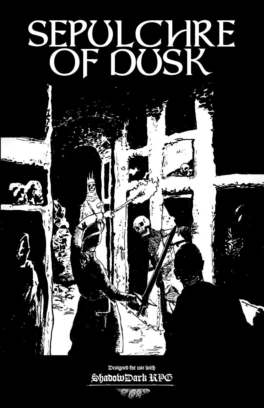
Nice cover!
It actually looks pretty good. I does seem, however, to be one more good entry on a glut of 1st level modules.
Yeah, agreed, cover’s cool.
Looks like Mike Mignola’s style.
Sometime, with formatting, we are tempted to write-up an adventure like we’d write a computer program—explicit and rigid.
It don’t end well.
Why would you send adventurers to deal with this setup? The whole clan going to war seems like a much more realistic outcome.
Most adventure hooks are transparent garbage but everyone agrees to it because hey, game day. I rarely use what’s presented, instead finding a way to splice an existing element into it in a quasi-natural way. Failing that, treasure map. Everyone loves a treasure map!
Update: A fully revised Sepulchre of Dusk was released in early 2025. The revision took into account critiques from Bryce and others, and includes an improved layout and map, and additional pre-generated player characters.