
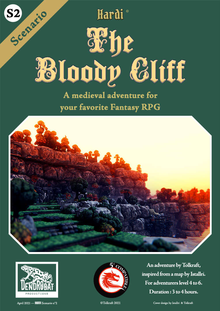
By Tolkraft
Dendrobat Productions
OSR
Levels 4-6
The sole heir of Baron Solreigh was kidnapped, in the middle of the night, in the heart of the castle! The ransom letter is signed by Masked Harald, a thief, robber and benefactor of the poor.
His lair?–?the Bloody Cliff?–?is known, but would resist a frontal assault, which would also put the young heir in danger. Bringing the Baron’s son back safe will require a very cunning plan…
This 45 page adventure uses ten pages to describe a 26 room bandit hideout; their lair outside in the woods and the caves nearby, as well as a short “investigation” phase. The intent being a raid on the lair by the party to free an NPC. The maps are essentially unusable, and the formatting TOO formatted. A good lair assault ruined. This is an EASL adventure from our friends in Vive la France, but doesn’t really have EASL issues other than an awkward word choice or two.
So, the asshole barons son has disappeared and Robin Hood wants some cash and tax breaks for the poor as ransom. Oh, and the new young pretty maid in the castle is missing too. Things that make you go Hmmmm…. The baron hires you to go on a commando raid to rescue his sweet loveable boy, all Longshanks/Prince Braveheart style. You can poke around the castle a bit, asking questions of people and looking at rooms, maybe turning up two or three bits of information. There’s caves in a cliff, there’s an entry at the river, and so on. So, fucking around ahead of time pays off with alternative points of entry and approaches. That’s good. You then walk over to the cliffs and do your assault the usual way: sneaking around until your plan goes to shit and then stabbing everyone. Most of whom are 1HD in this instance.
Base assaults are near and dear to my heart. Sandboxy, a good base assault supports the DM and lets them run things on the fly, giving them the tools for the “normal” base and then how the base adjusts and reacts, etc. As well as supporting play with multiple ways in and a good map. This is trying to do that, but not very well.
The maps are a major issue. They are done in some arty program, I suspect one meant for battlemaps, with colors and features. But they come off crowded and confused, with an inability to really tell what you are looking at, where the rooms are much less what the features are or how they work together. You’re fighting the map the entire way, trying to figure out how things fit together. There are some photos in the back, showing a DwarvenForge type 3d terrain set of of a portion of the inside of the caves. I guess that helps a little.
Our issues continue with the text. There is generous usage of long blocks of italics for read-aloud, making it difficult to sort through. There is a fancy gothic font used as a header throughout the adventure, even in room names, that I can’t for the life of me read. I actually had to go through the adventure searching to find the name of the kings son because the first letter was in the fancy gothic font, all illuminated manuscript style. Man, you gotta think about this shit. I know, I know, you want to make a pretty product. I want one also. But not at the expense of the legibility. Or, rather, not in a way way that impacts legibility to the extent that I can’t read it/figure out what the fuck room is where.
And the room formatting. I am a victim of my own words sometimes. Highlighting, building, bullet points, white space, they can all be used to make a text easier to scan and to find information. And when TOO much is used it then becomes harder. The text becomes disconnected from itself, too much space between things, the natural “grouping” of items is broken and your brain can no longer recognize (or, “easily recognize …”) that differing items are related. And that’s a major problem here. Long sections of DM text with too much shaded text blocks, highlighting and bullets. The read-aloud can be cringe-wrthy in place, with phrases like “ … as if even the water was afraid of the sinister name [the bloody cliffs].” *sigh* This is not what I need in my life. I want a description that makes me, and the players, think “wow, even the water is afraid of the cliffs!” not, being told directly, what to think. That’s telling instead of showing. You always want to show.
We can combine this with some basic issues around base assaults. There is little to no guidance on an order of battle and/or how the base reacts to incursions and alarms. There are four lieutenants in the base and we get VERY little guidance on where they how, what they do, or how they react. (Although, its implied that at night they are all sleeping in the same room.) There’s very little in the way to help the DM. I could also point out that while there is guidance for climbing the titular cliffs, there is none for just walking around the other side. I mean, cliffs, not mesa, right?
Oh, I don’t know what else. I mean, there are separate entries for how to find the place in the day vs the night, which is good. And there’s a cute little section about what you can overhear the bandits talking about if you listen in or buddy up to them. And, yes, there is some guidance on negotiating with them (only works on a critical success!) or bluffing your way in. So, varying success levels there. And NPC descriptions tend to be too long. They do have some “three words” personality summaries, but their goals and what not are buried in text, with no highlighting. Not that they ever show in the adventure, except sleeping in their rooms.
And there’s a lot of abstracted shit. Observing the cliffs is just a skill check, and if you critically fail you get captured. Doing a jailbreak (at the barons castle) on the one bandit who’s been captures is just a skill challenge. Climbing the cliffs, the DM can, the text tells us, be a real hard ass and make the players note HOW MUCH rope they have, to see if they have enough to scale the cliffs. If this a thing? Abstracting a climbing distance? You have rope listed so it doesn’t matter how far you repel? I get it, resource management can be a pain, but, fuck man …
Hard pass here. And, mostly, because of the map and the lack of comprehension on how it works. Reworking the map and formatting would help a lot.
This is Pay What You Want at DriveThru with a suggested price of $3. The entire thing is available as a preview, so, good job with that. The map is on page 24 of the preview. Check it out now, the funk soul brother.
https://www.drivethrurpg.com/product/352361/The-Bloody-Cliff?1892600
Those maps remind me of the ones used in the 3e era D&D miniatures game only turned up to 11, on steroids! Some of these designers need to realize that utilitarian black and white maps are not a bad thing, or some relic from the past to be discarded. Give us usability any day over an art project.
This thing with the maps is going to keep happening as we see VTT become primary and printed secondary.
That’s a fair point about VTT. I’m still stuck in my luddite ways lol but I accept that VTT is the way a lot of people game these days.
And kudos to the designer for chiming in here.
Squeen is on the money here. It looks like the publisher has explained the map making process below, which is largely driven by a particular program. And choosing to especially serve a particular map-making program and style is valid if one likes it and is trying to promote it.
For most other people providing VTT maps, a more traditional map is built first and the detail of furniture (or whatever) is added on top in a layer that can be turned on and off. So it shouldn’t overly burden someone to add both types, pending the theoretical day when demand for a more traditional map just isn’t there anymore.
Agreed. VTT maps are a *primary* requisite for me.
Probably, but for myself I find I’m reverting to simpler maps on my VTT, as my players sometimes get lost in the business of the “set dressing”.
That should be “busyness of the ‘set dressing'”.
Interesting. I suppose that could be a selling point to put on the promo. “VTT maps included!”
VTT seems blasphemous for OSR, however. How many people use the battleboard for combat? And doesn’t drawing out the room kind of negate all the fun with letting the players map out the place themselves?
Hi! As you are not the first to suggest this to me, I already did. XD
The second line of the DTRPG product page says in bold :
“This adventure includes VTT support:
2D maps and NPCs portraits for your favorite classic VTT
3D board for Talespire, a wonderful and easy to use 3D VTT”.
I don’t think that OSR and VTT are antinomian. I play with Talespire (go check some video on Youtube to see what it looks like if you don’t know) for over a year and a half now, but mainly for immersion and visualization.
Having a “grid” do not imply you have to stick to it.
And battle board or not, the most important thing is that the whole table enjoys the game.
Hi Bryce,
I’m Tolkraft, author of ‘The Bloody Cliff’ (and ‘Mount Saint Mikkel’, you reviewed last January). I assume that if you review ‘The Bloody Cliff’ (that was published 6 months ago) now, it’s because of my previous message inviting you to do so.
So, first of all, thank you very much for the time you dedicated to this adventure. As always, your review is quite severe and exacting, but very honest and constructive. Explaining what doesn’t work, and why, is invaluable to me.
I wish I had such advice when writing and publishing my first three adventures. Well, at least, for the upcoming one, I’ll try to improve what I can :
– Shorter read-aloud sections that show, don’t tell.
– Improve readability on keying, initials and titles. In this particular adventure, I admit that having different info in the entries whether it’s night or day made the keying quite difficult to handle. I tried to offer more possibilities to the GM, but it has side effects.
– Make the goals and behaviour of main NPCs more obvious in the text.
– More guidance for the GM, on ‘how to run this adventure’.
Regarding the maps, the topic is difficult.
They are made with Talespire, a 3D VTT available for 25$ on steam, so they are built in 3D (with some kind of fantasy Lego bricks). The upside is – if you own Talespire – I provide in the PDF the link to the adventure’s board (the 3D map + minis with their name and HP). It’s ready for you to play and enjoy. (This may sound like an ad, but I’m not affiliated with them. I’m only really digging the software for more than a year now).
The downside is, being in 3D, the maps are meant to be zoomed in and rotated… to be explored. Talespire is a wonderfully immersive software, but, obviously, the 2D top-down screenshots I use lack readability compared to the usual 2D maps. I do my best to offer GM maps with walls and limits in color, and some kind of ‘DwarvenForge’ 3D view to help, but it’s fa from perfect.
My only solution would be to redraw the maps in 2D with software like Inkarnate or Dungeondraft. But it would require a lot of time, as I’m not really familiar with these tools. I might try, though…
For the ‘lots of abstracted shit’, I plead guilty. They are late, post-playtest additions to the (quite lengthy) text, so I made it short and quick.
Following your advice, I might try to rework the map, and provide an additional and clearer 2D version. For the formatting, or any modification of the text, it’s more complicated, as I would have to redo and update both French, English and Spanish versions 8-O.
It’s probably too much work for a free, 6-month-old adventure.
I hope you’ll also review ‘The Burnt Church’, my last and short (9 pages of text) adventure, even if I fear that you’ll regret the maps (same style as before) and the lack of guidance for the GM.
But hey, constructive criticism is always good!
Thank you for the review, and I’ll try to do better in the next one ; it’s a medieval whodunnit in a vineyard!
Checked out the adventure, briefly. The maps weren’t as bad as I had feared. The scenario sounds interesting and the creator sounds like they have promise. And class, judging from their comment. Imgoing to keep an eye out for future contributions from them.
Thank you, Brandon, much appreciated!
I know I promised to bash your brains in a while ago, it is just that I haven’t been able to find your brains anywhere I look on your body.
Hi!
I tried to redo the “interior map” with Dungeondraft:
https://i.postimg.cc/Y997zK7K/S1-Map-DD-interieur-retouch.jpg
Is it better this way, more ‘readable’, even without the keying? Do you get a better comprehension of the layout with this kind of map?
Or is it still ‘too much’, and an old-school B&W map would be better?
I try to do pretty modules, and finding the balance between aesthetics and usability is tough.
All comments are welcome,
Thanks for your time.
Nobody?
I like them better. Still, I personally prefer more muted colors and less extreme lighting for high contrast and the ability to print B&W.
But I think most folks wouldn’t object to what you’ve got there.
Thank you, squeen.
Here is what a B&W print would look like:
https://i.postimg.cc/v8gDhH4Q/S1-Map-DD-interieur-retouch-3-preview-NB.jpg
I’ll see what I can do for a real ‘printer friendly’ version, probably a more old-school style.
Hello everybody.
I redraw the maps for this adventure from scratch, Dungeondraft style.
Here they are: https://www.drivethrurpg.com/product/381387/The-Bloody-Cliff–Free-map-pack
You can also use them to tell your own stories.
Merry Christmas and happy new year!