
By Billy Longino
U.H.H.H. Games
OSE
Level ...?
Yeah, that’s the title of this thing. And kudos to the designer for using it frequently and consistently throughout the product. I recognize greatness of vision when I see it.
Welcome to the Thieves’ Guild! Things are not going so well. The thieves are incompetent and prone to in-fighting. The guild has become more like your local underworld supermarket than the den of intrigue and villainy you’d expect. So, obviously, it’d be a lot of fun to explore. Inside, you’ll find a decently fleshed-out adventure site for your would-be heroes and/or ne’er-do-wells to infiltrate, pillage, or die horrible deaths in. Also included are a handful of silly NPCs for use in your city campaign. And there’s ratmen. (Actually, I checked… There’s no ratmen. Sorry. They’re all dead before the PCs arrive.) This product is designed using all of the amateurish art, poorly considered humorous prose, and difficult-to-read (and use at the table) layout you’ve come to expect from a classic DIY adventure!
This 32 page digest adventure describes a dungeon with about forty rooms, a former ratman temple complex in the sewers that is now a thieves guild complex. It’s got a lighthearted beer & pretzels/DCC vibe going on, but gets thick in places and a little too loose with the facts and formatting for ease of use.
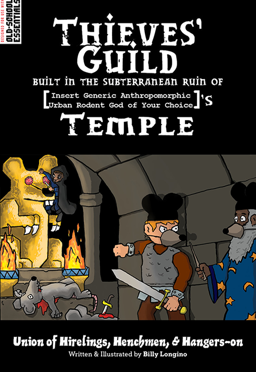
The designer states it’s a joke adventure. That the layout is half-assed. That the art is crap. That they have completely ignored any ease-of-use approach. Meh. Looks pretty much ok to me. Better than most adventures. And the encounter areas to have a certain panache to them; you know, as a DM, where to hang the adventures hat in the room. This is the same way as in the better DCC adventures … which is not too surprising since the designer has some credits listed in Gongfarmers Almanac. Furthering this evidence is the map. It’s an excellent piece of work, with a lot of interesting playable detail. Done by the designer it shows an art flair, that flair so common to the DCC house organs, and perhaps a designer that bends more toward art than writing or design. Which I tend to find attractive in an adventure. Art-centric projects tend to have a stronger vision and rely less on mechanics and more in inspiration, IMO. (And, one of my favorite cons, Con On The Cob, is an artist centric gaming con.)
There’s a pretty strong vision for almost every room and most wandering monster/event encounters. The former ratman temple (from the PHB cover) that’s now a brothel. Great unique magic items and NPC’s. These things have character. They give the DM inspiration to work with and from. Top shelf ideas abound in each room or NPC. This is augmented by a formatting style that, while it relies on paragraphs, uses bolding in them to call the DM’s attention. So in the sentence “Loos stones hide a treasure behind them” the words “Loose Stones” might be bolded, to help call attention to it as a separate thing in the room. It’s totally a workable style and I’ve seen a couple of good adventures use it. It gets to the core concept of making the adventure easy on the DM to run (in spite of the designers warnings to the contrary.) Room names help orient the DM to the content even before the text arrives in the paragraph, giving us an idea of where to go and how to properly receive the detail to come. And there’s a little humor embedded for the DM “Ratmen, were-rats, ratty human priests, and layfolk” describes one event encounter with a group coming to take back their temple. And that’s a theme here, a certain meta-ness for the DM, exploiting every trope for amusement. One section, on a ghost, gives his backstory and then says “or you could just use a standard book ghost and not an interesting one.” This designer gets it. Put something the fuck interesting in! And they do, over and over again.
But all is not well in art land.
While the designer rails against brevity and so on, in their adventure overview, or, perhaps, chides and acknowledges they didn’t engage in it, that’s still no excuse For Their Sins.
“This passage was once …” happens over and over again in the text, telling us what the room was, or what a person once did … that has no impact on the adventure. The Bolding gets out of hand in places, with a couple of rooms having nearly 50% of their text bolded. That ghost history? A long section of text in italics. “This door leads to room i …” just as the map says it does. There’s enough of this that it almost seems on purpose, like a bad adventure design contest entry. And rooms are sometimes a little TOO loosy goosy on things, like numbers appearing, or even if there IS a creature in the room. If you mention a creature in bold, but don’t stat it, is it there? What if its in a forest and claps one hand while falling? Another two fucking hours in editing would have solved all of these problems, I think. Unless, I mean, the designer made a piece of performance art and then offered it up for sale in the adventure section of DriveThru. But they wouldn’t do that, would they? I mean, that’s not cool if they did.
A larger issue is the adventure proper. While the individual elements are great I think it lacks a bit, holistically. It’s a thieves guild, underground. Do you explore it? Do you hack it down and loot shit? Are you there to make contacts, to fence something or some such? Its focus is more on that last part, making contacts. As a place to hack and slash, or visit, the orientation of the rooms and content is less effective. And, I wonder if the selected room/key format might better be left off if its more of a Thieves Guild resource guide than an adventure? I suppose by using room/key you get to use it for all three purposes, with the entire package not really being optimized for any of the three. But I can’t help but think it lacks on exploration or exploitation and is far too oriented towards “lets fence this and find a hooker.” I’m not sure there’s an answer to this. It FEELS off though, maybe because of using room/key for this. But, again, serving no master it could be of use to all three.
So, it has decent ideas. It does an ok job of communicating them. It needed another couple of hours of hard editing. And it needs more focus on what it wants to be. Because, in spite of what the designer says, it’s not a joke adventure or ignoring good design principals. So, Fuck You, to get a No Regerts.
This is $4 at DriveThru. The preview is six pages. It shows you the wandering table and several rooms. Including some NPC’s. It does a GREAT job of showing you the type of content to expect. From the snarky writing, to the ease of use bolding, to the stronger ideas for each room. Note rooms A1 and B, for example of the loosy goosy style that could be better.
I think sometimes we fall in love with our creations and/or just collapse under the production effort. Whatever the reason, it’s understandable to me that the creator here might be savvy enough to understand he hasn’t made that last “beauty pass” to push his creation into the Best, but also unwilling to make the extra effort. He’s feeling guilty enough to throw in some self-deprecating comments up front, but not confident(?) enough to really go for it.
I think the art is a cut above, despite it’s cartoon-ish nature. So, this fella is no dummy.
Alternately, he may suffers from that all-to-common fear to appear to be trying (and possibly fail with your best attempt). At least with a cool-n-casual demeanor, one can feign that they could’ve done better if they really had wanted too. In many way, that cool-temperature facade is what distinguishes the artsy-folks from the RPG geeks—who’s hot-temperature passion overflows without second-guessing how it might be perceived.
I think it’s not worth anyone’s time to include a self-critique in the intro. “Do or do not”, as Yoda said. Don’t try to build in a parachute for your ego. Imagine if the beginning of every movie included (like Deadpool) an attempt to wink at the audience that this effort is half-hearted, and the director is capable of much better work—but instead chose to take you money while “phoning-it-in”.
One last attempt to psycho-analyze this poor fella (sorry!), but there is a similar decision being made by him with regards to his art-style. By choosing to go cartoon-ish, he’s also saying “don’t take this too seriously, it’s just a lark”. That’s not to say there aren’t great artists who go the non-photorealistic route (Phil Foglio comes to mind…as does Jason Sholtis). Yet, the quality of the art in terms of layout and details is a bit of a sucker-punch that then hits above your (lowered) guard.
That’s more than enough out of me. Thanks for the review Bryce—best thing I’ve read this Monday morning. You are a machine.
I’m going to stop, clearing taking this too far. 🙂
Damn the torpedoes, full speed ahead! Otherwise, you’ll never improve.
Thanks, Squeen, although I’m fairly certain I could do better. It wasn’t so much fear of inability in this case as laziness, but I’ll never pass up free psychoanalysis!
The art of course, is a nod to a famous cartoon illustration from the 1e DMG, almost the same composition, same style, just a slightly different take. So even there, the author knew what they were doing whilst placing “non serious” art that a serious grognard may recognise.
I’ll admit, you got me right on with “It needed another couple of hours of hard editing. And it needs more focus on what it wants to be,” I have to (with difficulty) admit that I was aware of that need when I called it “done.” It was honestly more of a “God, I’m tired of this thing” sort of feeling, so Squeen is right on when they says I “feeling guilty enough to throw in some self-deprecating comments up front, but not confident(?) enough to really go for it,” but all in all, thanks for the review, Bryce!
I’ll definitely take the advice to heart in my next (actual) adventure.
Always nice touch of class when an author posts a humbly reply to the review. And I feel your pain—the last 10% of any project always seems to require 90% of the effort.
Best of luck to you on future endeavors—and congratulations on getting this one out the door. I do think your artwork is quite good. The cover is nice homage to the picture on page 34 of the AD&D DMG.
Thanks. This one was a one-off thing, anyway; mostly, I’ve gone with a different style in my pamphlet modules and the one I’m working on right now. I appreciate the comments!
I hope you’ll review Thicc as Thieves as well. I ran that one just a couple days back and it worked fine.
Hey, if you wouldn’t mind, shoot me an email. I’d love to hear how it went.