By Christopher Moneymaker
Self Published
5e
Level 3
A killer stalks the night and must be caught before he kills again!
This 176(!) page adventure is rough. I mean REALLY rough. It’s nigh incomprehensible rough. Like “You can’t actually read it in order to run it’ rough. I THINK it’s just a simple linear plot thing. I think.
Of the 176 pages about a hundred of them belong to an appendix, character sheets, and so on. There might be ten or so pages of intro/table of contents also, leaving about sixty or so pages of actual content. Incomprehensible content.
I harp on legibility issues from time to time. If I had to point to one adventure to illustrate my point then it would be this one. It’s a nightmare to try to understand. First, it’s in single-column format. Single column is generally bad. Your eyes have a long way to travel across the page, causing you to lose track of where you are. It makes the physical act of reading text quite fatiguing. In formats like digest sized adventures then this isn’t such an issue, your eyes don’t have as far to travel. In a full letter size, though, it’s bad. It’s true! There are scientific studies!
On top of this, and perhaps more importantly for this adventure, it’s using a funky font. Basically, it’s a kind of gothic font with cap letter oversized, lots of little flourishes and stroke marks on lowercase letters, and it’s all in a heavy bold. This is NOT legible. Not even close. You have to work, work very hard indeed, to just engage in the act of reading the text. Scanning would be impossible for mortal man. It’s seriously almost impossible to read. On top of all of this are the maps, which looks like they came from an EGA/VGA computer game. Dense with color and thick with (more) weird font choices, they are, almost all of them, not going to be possible to figure out without a lot of work.
This is all a problem. A BIG problem. Like, the biggest problem I’ve ever seen in all of my D&D reviews. You’re fighting the actual legibility of the text the entire way. So much so that I feel guilty with this review, because I don’t think I’ve given it a fair shake with the content. I’ve tried to wade through it twice and while I think I’ve done a decent job, I can’t help but think I’m not getting the full picture. Did I mention the large block of red front on a beige background? THis thing is ROUGH to wade through.
Combined with this are LONG sections of traditional paragraph text. LONG sections. It’s all laid out in a if you ask about this then they say that format, with an emphasis on minute, light how far someones’s tunic comes down to the ground. It’s just impossible to find ANYTHING in this text.
But, at its core, it’s just walking around a village talking to some NPC”s and a few wilderness encounters and a small lair map. For 176 pages.
This is CRAZY. I mean, you could not point to a better example of the issues of legibility in adventures. Yeah, I’ve said almost nothing about the adventure. While some investigation and NPC talking to is a great idea, you first have to make the adventure legible, and this ain’t that.
This is $15 at DriveThru. The preview is eight pages and shows you nothing of the adventure, which a preview should actually do. Open it up and scroll to the last page of it. That big text blob at the bottom? That’s an example of what the ENTIRE adventure is like. And is one of the more comprehensible sections of text.
https://www.drivethrurpg.com/product/314883/Ravenloft-Prey-of-the-Black-Wolf?1892600

All other issues aside:
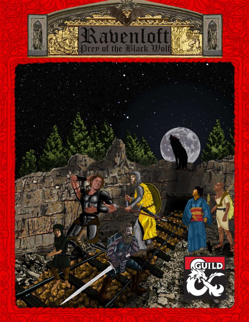
WTF is Willem Dafoe doing on that cover?
The whole coverl looks like someone had a stroke while browsing some strange stock art mash up site.
Man, better to go with no cover art at all!
Is…is that a railroad that they are walking on?
That is a very happy Willem Dafoe. Wow.
RUFF
Yeah, but is it evocative?
Here is a “Prey of the Black Wolf” review, linked by Christopher Moneymaker that I didn’t know of, that goes beyond Bryce’s reading comprehension difficulties as the module’s creator calls it! Ha Ha! https://www.youtube.com/watch?v=oWwnK3X0yes
LOL the cover!!
The cover looks like my party in Roll20
It’s also using a copyrighted term in the damn cover!
“Will you answer the call?” Nah I think not.
Gotta love that nom de plume though – it tells you everything you need to know. Honesty in advertising is laudable.
“Nah I think not.”
Genuinely funny.
“Honesty in advertising is laudable.”
Is that what this really is? It sounds more aspirational than descriptive.
Pretty sure that’s his actual name and you can use Ravenloft on the dmsguild.
I love these scorchers every now and again. Laughed my ass off.
I had a look at the above posted video review here: https://www.youtube.com/watch?v=oWwnK3X0yes
It does a good job presenting the module’s content in a way that helps sells it while offering some tweaks.
Now, I want to see Bryce go to video and see what his reviews will be like on Youtube!
I laughed so hard at this review that I cried for about 5 mins straight, I had to stop reading so I could wipe my eyes and just breathe before I could keep going. “I’ve tried to wade through it twice” God that was funny. Comments are great too! I went and checked the preview as suggested and it lives up to the hype. Thank you for this Bryce! Hat’s off to you for trying!
There is a sequel to this called, “Clan of the Black Wolf”! If Bryce were to review this, I am guessing it would likely be exactly the same review! https://www.dmsguild.com/product/366794/Ravenloft-Clan-of-the-Black-Wolf