
By WR Beatty
Rosethorn Publishing
S&W
Levels 2-4
They say the old baron went mad. They say he killed his lover. They say those ruins where once stood his opulent castle are haunted. Most people avoid the Broken Tower high on Eagle Peak, haunted or not. Bad things have happened up there. But some winged demon has been terrorizing Glynn Rock and something has to be done. They say the demon has been seen roosting on the crumbling crenelations of the Mad Baron’s Tower. And then there’s the bones…
This 34 page adventure describes a small region with about eleven locations and two small dungeons, including the titular one. Great interactivity and a relatively easy to scan format are augments by good treasure, magic, and decent descriptions. This entire thing FEELS like a place of mystery you want to explore.
The woodcutters boy is sick. You know this because there’s a merchant selling a magi dagger that he bought at a cut rate from the woodcutter. Get it? A round about hook. Nice! Or, Baron Wyrmslayer wants you to go kill the Bonepicker, the flying beast demon that lairs in the old ruined tower. Nice one that also. That drips with imagery … the flying wyvern lairing in the tower. Note how it’s not a Wyvern. It is, in fact THE BONEPICKER. Monsters gets names. That brings a mythic vibe. Also, the wyvern has pus nodules all over it because its suffering from a curse … the same one laying over the tower. The same one impacting the woodcutters son. A small village, not described much at all, just enough, with GREAT supporting in voice rumors, to give you what you need to run the adventure. A wilderness with eleven or so areas, a few decently expanded upon. There’s an ancient fey giant in the forest, dressed in bearskins and wearing a woven hat of leaves. There’s also that woodcutter, desperate for a cure for his son … and his QUITE alluring wife … give her a kiss? Ancient ruined gates stand in the wilderness. The Green Stone waits in the forest for the party. Then there’s that band of 64 gnoles, replete with human slaves, waiting to bring down the wrath of the gnoles on the villages in the area. And the goblin band. And that giant … he’s looking for the gnoles … him and his buddies got a score to settle. And, of course, then there’s those trees. The ones with circular areas of their bark removed. And some sigil cut in to them. Beyond, a dense green mist hangs in the forest. Uh … it’s a shortcut? This fucking things BRINGS IT. Augmented by EXCELLENT art choices (and you know how seldom I mention art …) all of those locations spring to mind instantly. Just the idea. Just the set up. Right outside of the village, right outside of the reach of civilization, just beyond the boundary of the forest … the world is magic again. The grass a little greener. Mist hangs in the vales. The sun shines a little brighter. Interconnected, fully realized (for whatever that means …) the place FEELS real like the MERP products felt like real places. This is a very, very good accomplishment.
Interactivity is high. From the wanderers, always up to something, to the various NPC’s to talk to and the things to play with and investigate. And it’s not just the same old same old shit either. A body at the bottom of a well, a bag of rocks tied to his waist. The Black Pudding in this FEELS not like a black pudding but like a nameless horror of a blob. Ghosts and Spirits abound, looking for weal or woe. The BEST fucking doppleganger I have ever fucking seen in any fucking adventure. Why? Because the entire place FEELS real. You’re invested. Because this thing has that most elusive of design principles. That thing I seldom mention. DESIGN.
And yet … I have three specific criticisms.
First, the monsters are … weird? I mean, I like unique monsters. I love them, in fact. But in this case we get a monster name and no/little description … with “no” being the most common. Thus the Crawling Horrors, the Skin Spirits, the Hostile Spirit etc, get no description. This is a serious miss. Maybe they are the S&W book, and are just rethemed for copyright purposes, from OFFICIAL d&d? Or in some supplement? Or in a Rosethorn campaign guide? I don’t know. But, even if they were, cross-references would have been nice. I do like a description for a creature, like the Firbolg giant with the hat of woven leaves that I mentioned earlier. Even a brown bear, in context. This don’t do that. Again, open to being wrong, if these are in a book somewhere.
Descriptions are likewise somewhat lacking. “…ragged sheets of some translucent material hang from the wall […] Skin Spirits re-possess their physical remains and tear themselves from the hooks anchoring them to the ceiling.” This is not a tour-de-force of evocative writing. Which is weird because the IDEAS in this are QUITE striking. They recall those ancestral/cultural memory imprints we all have, which should lead to STELLAR outcomes for the DM … but the descriptions just don’t make it there.
Finally, there’s a format used. The designer notes that they are experimenting with a new format to help with scanability and usage at the table. Yeah! Groove On! I applaud you! They note they are trying something from Castle Thadrian for Engines & Empires. (A brief interweb perusal indicates this is a physical product from 2009, and I see no copies readily available to consult in my library in the Volcano Lair.) I assume, though, I get what’s been taken. Rooms start with a box of text divided in to at least two sections: First Impressions and What Happens. From there the rest of the room is described outside of the boxed text, in a more traditional format. I get what’s being tried here. The first part, in particular, of First Impressions, is more like what the party sees when they enter the room and the second What Happens, a summary of the rooms deal-e-o. I’m not sure though that the format used is more effective than a more traditional Summary Paragraph (with bolded words) and the bolded words followed up on in subsequent paragraphs. I said I’m Not Sure and I mean that. I’m not sure. It seems weaker in this particular implementation, but there could be other things going on and it could be tweaked, I think, to provide a decent organization system. More evocative writing and those bolded words in the First/What sections followed by those bolds being expanded upon, or something like that? I don’t know. I can say, though, that it doesn’t feel more effective or better in this implementation.
The Crooked Dwarf is catatonic. If engaged in combat there is a 50% chance he will turn in to an albino fish for d4 rounds, otherwise he will fight with long sharp claws. In his mouth is a single gold tooth. Magic, of course, when placed in a toothless gap. Good stuff.
This is not a home run. More evocative descriptions may have made it so. But it is still a solid solid adventure. It is immersive and brings magical wonder, mystery, and a kind of realism … without becoming simulationist. Design is nailed.
This is $3 at DriveThru. The preview is 18 pages, which is more than enough to get a good look at the wilderness and dungeon encounters and see how they are written and get a sense of the adventure. It’s a great preview.
https://www.drivethrurpg.com/product/322457/Bonepickers-Tower?1892600
Hey this WR guy does good stuff hu? Seems like he is on a role. What is his style?
There’s some great stuff in there, although I think it could have done with another pair of eyes on ti just for the text. It looks like the Tinker’s name is spelled three or four different ways, plus a few other weird bits. Still second the recommendation.
Thanks for the review! I learn something from each one and try to incorporate what makes sense to em. Most of the monsters are in the Bestiary – available (unformatted) on Drivethru for free. I’m three or four releases behind in updating – but I believe everything in this adventure with one or two exceptions is in there.
The last copy of the Bestiary of the Rosewood Highlands is 1-3. It has crooked dwarves and hostile spirits, but not skin spirits or crawling horrors. There’s a newer version?
I meant to write “the last copy that I have is 1-3”.
John – it’s been a while since I uploaded a new version – just over a year! The most recent is v1-4 (uploaded August 07 of last year). It does include the Crawling Horrors – but not the Skin Spirits (or, curiously, the Wyvern!) I will work on getting another update out in the next few weeks.
Just read the review of your epic. Bryce said it had a ton of potential. I know Courtney used Sandor said he was good. Dont know the fee though https://www.blogger.com/profile/14972628887096890642
Here’s Bryce slobbering on WR’s cock again.
It does seem pretty big yo. Interactive and usability? Jump on that ish
Hes such a whore for Interactive and usability
3 typos in the product description does not bode well.
Well, two typos. Fixed now. Thanks for pointing it out!
Well, three typos. “And then there’s the bones…” is grammatically wrong as well.
If you’re being an asshole about beginning a sentence with “And”, it’s fine both historically & stylistically.
“And then there is the bones”
You don’t have to care about subject verb agreement, but it is a typo, and having that many is problematic.
“the bones” arguably is a collective noun here (i.e. it’s referring to the collection of bones as a singular entity, because the particularities of the individual bones don’t matter), in which case a singular verb is fine
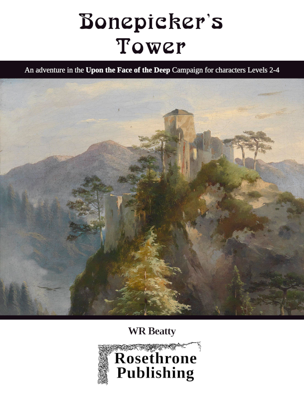
The illustrations are good, especially the Wyvern crawling up the outside of the tower (with WR drew himself!)—really sets the mood.
Nice job. My only formatting nit: I’d prefer the maps up front, preceding the text, rather than in a pile at the end….but that’s just me.
Yeah, I say front or very back. Hyqous Vaults had it in the center which was OK too because you can remove it.
I think it’s fine the are in the back/removable (too), but when reading the key I like a peek at the big picture first to get situated. “Here’s what I’m gonna talk about”—followed by details. Just like giving a lecture. Otherwise, I feel like I’m walking in to the middle of a conversation and missed the topic-of-discussion. (Feeling like a nitwit asking, “Hey guys, what are you talking about?”) Also it’s handy when the map is close to the text—like on a facing face.
Rotated maps get my goat too. Man, I’m high maintenance!
,,,AND…having the maps precede each section breaks up the book and acts like bookmarks.
OK. I’ll shut up now.
Like Stonehell?
Sorry, that was re: Squeen’s map prefs.