
By Madeleiine Ember
Ash Game Design
Troika!
Introductory Levels?
After a long fall, you’ve landed on something soft. A bit squishy and squelchy, really. And moving. Is it… a worm?
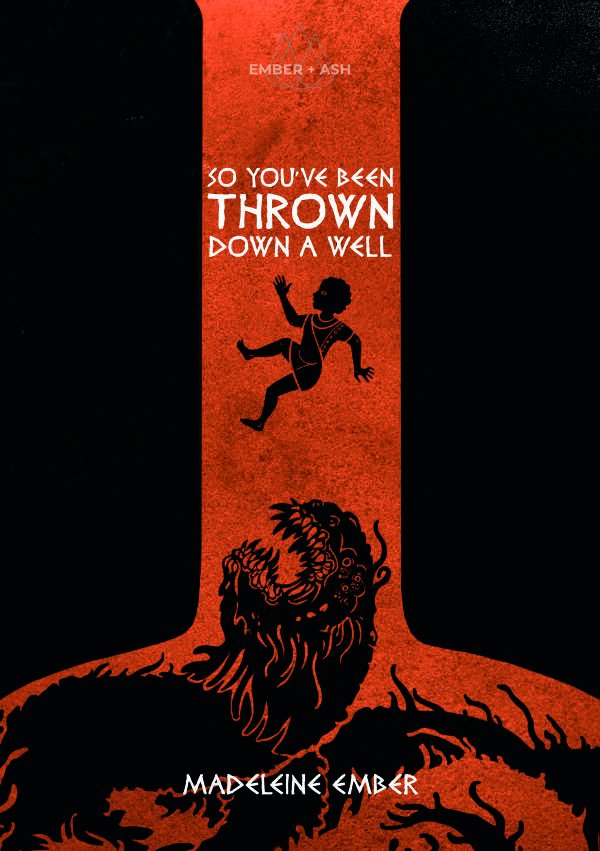
This “sixty page” adventure describes an adventure where the party is thrown down a well in to a weird underworld and have to regain the surface./escape. It is uber-weird, as Troika! Tends to be, and mostly linear, as modern adventures tend to be. That aside, a pretty book, it is not very usable, with massive walls of text and formatting transitions that are not amenable to usability. It needs a hard, hard edit and some layout effort … which is saying something because the layout clearly was quite involved … to no good end other than “pretty.”
First, of the 60 pages, about seventeen are devoted to backgrounds, with a decent sized appendix, so you’re actually getting something around ten or so pages of actual adventure, with that involving seven to nine encounter areas. This is a mostly linear adventure, which, in the modern vein, is just something you need to expect. Getting rid of Gold=Xp and exploration elements, modern adventures create small environments for the party to interact with. That’s what modern RPG’s are, and that’s ok, if that’s what you’re looking for. It’s a different genre, I don’t have a problem with that genre when that’s what I’m expecting to get when I buy.
The layout here is PURTY. Landscape design layout, with four column, black and orange backgrounds are striking with an art style reminiscent of ancient vase figures, in the negative space-ish, all in black. It’s drool worthy.
Drool worth and detracting from the usability, though. The white text, in negative, on the black and orange backgrounds make it hard to read. COmbined with the four-column (landscape mode) small text, making it hard to read. There’s a dearth of effective whitespace and section headings, bolding, etc, to help bring to the eye to important details and to help with scanning. There’s an attempt at this, through the use of italics to note another section heading, but the italics, in negative, doesn’t stick out very well. This all leads to a wall of text syndrome. The “Rememberroom” room, on page seven, have two solid columns of text, with only paragraph breaks. This is very ineffectual.
Is it the layout, the writer, the editor, or combination of the above that is responsible for this? A mix of all three? The writing certainly doesn’t help. A lot of if/then statements, some background mixed in, mechanics mixed in … it all combines to make the eyes glaze over. Recall that the most common complaint of adventures is that they are hard to prep and use. The usability. This is the chief barrier that an adventure needs to overcome. It must first succeed in its core mission: being used at the table. The most common complaint about adventure is that they are hard to use at the table. Look, it’s not impossible that the most dazzling adventure ever could be in wall of text/hard to use, but in a world in which people commonly complain about usability, the chief complaint in fact, the primary goal should be to make the damn thing usable at the table. Scalability. Readability. The ability to quickly and easily grok the room and reference the parts of it. It’s not an absolute, a disaster in readability may be worth investing your time in running anyway if its good enough. How many adventures are there like that? Thracia? Maybe one or two others? What’s the excuse, in 2020, to having a wall of text? You don’t know what you don’t know, I guess.
There’s some nice scenery scattered through. Maze has a little table with the following sentences in it, as example places for the party to visit: “Cavern with stalactites carved as greek statuary.” “a rainbow-lit (by fluorescent mushrooms) waterfall.” , “A gentle brooks that flows with glittering golden water.” There’s no interactivity there, just little single sentences. It’s nice imagery, but it should also serve so purpose. The Ed Greenwood “museum tour” adventures make a similar mistake, but instead of being evocative, as these are, they are pointless interactive
It’s got interactivity. Things to talks to, a rope bridge to traverse, NPC’s and situations to interact with. But they are a FUCKING PAIN to figure out because of the text issues. If I’m struggling, reading casual with all the time in the world, how can I expect to run the encounter at the table? After two times through the text I’m still struggling to understand the overall situation down below and how the adventure should flow. And in a modern adventure this is NOT a good thing.
A hard edit of the text. Focus the rooms. Work on the usability. Republish.
This is $10 at DriveThru. There’s no preview. $10 adventures without previews make me sad. How can one expect to know what they are buying without a preview? Are we to throw ourselves to the wind and hope for the best? Well, we’ve seen where that gets us …
https://www.drivethrurpg.com/product/313219/So-Youve-Been-Thrown-Down-A-Well?1892600
The module sounds like an analogue of Troika the game… start with & simple premise & make it needlessly complex to near the point of absurdity. I guess that is fun- burying things in baroque obscurity? How much fun is that once you get over the fact that “oh, this game is baroque, obscure & annoying on purpose. How droll. I pronounce it quite the wittiest game of the season”. But after the one in joke it’s a pain in the ass.
Have the guts to commit to something not ironic- then I’ll respect it.
What do you find complex about Troika?
Unnecessarily fiddly & complex parts of Troika? Initiative, rolling to cast spells, rolling to find/use your own gear, rolling AND consulting a table to find out what damage your weapon did etc etc.
I need some more historical detail on the well… is it an oil well, a water well, could it be artesian, or given the ‘bespoke’ nature of the product, and artisanal well? I want at least twelve pages of backstory.
So validated to read this! I bought a troika adventure and was very bemused to find the preview material was pretty much the entire adventure. I reckon you could fit these modules onto one page