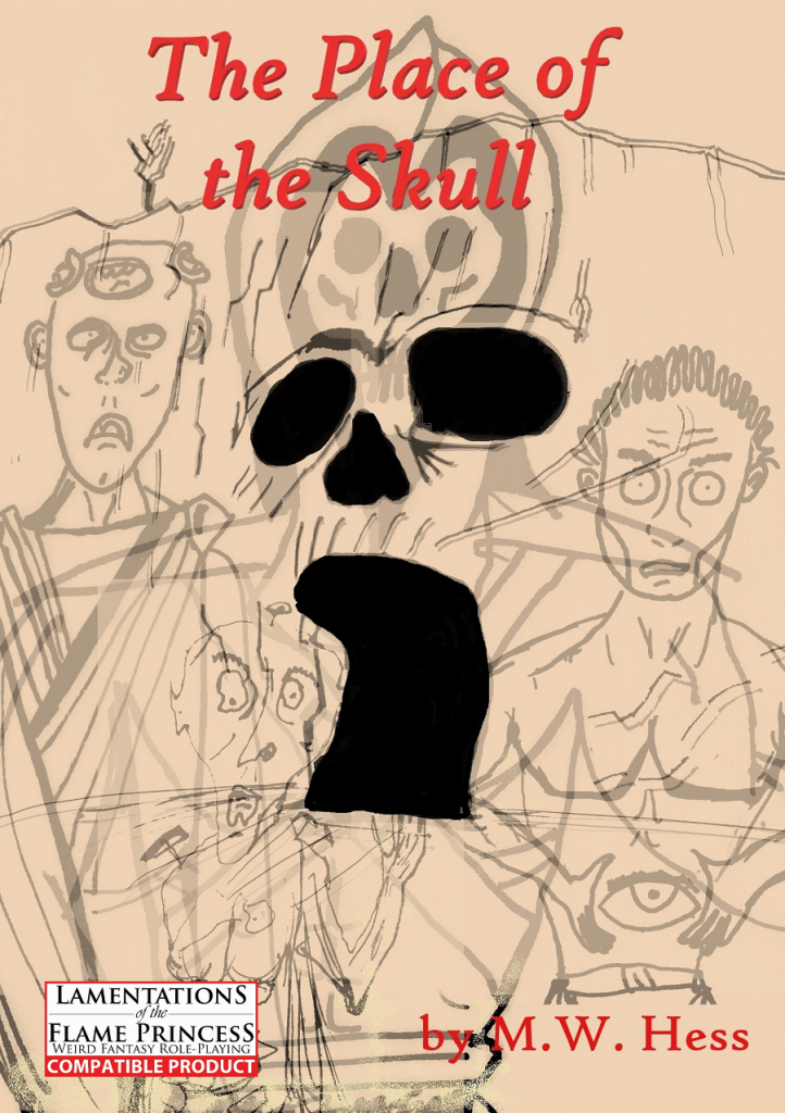
By Mark Hess
Self published
LotFP
A Sci-Fantasy adventure for old school gaming. A princess has been kidnapped, the players must save her by infiltrating a strange fortress of unknown origin. Weird tech, mutants, and evil swords abound.
This eighteen page adventure uses five digest pages to describe thirteen rooms. A little sci-fi, borrows from Conan and He-Man (and probably others) and uses a minimal format … although a decent one that concentrates on the right things. Still, a little light on the encounters for my tastes.
So, kings daughter has been kidnapped by Skull face. King brings out platter of rubies and throws them at party, saying that riches mean nothing next to the love of your daughter. Oh, and she’s a warrior princess virgin, so in addition to Conan and He-Man we’ve got some She-Ra stuff going on also. And probably more. There’s the Fun Guy, who has fungo growing from his head. It’s got some sci-fi elements to it, broken computers, a couple of plasma rifles and so forth. And also magical elements, like the Doomsword, which turns you chaotic and melts your face off so you can be the next Skill Face. It’s over the silly line for me. A little too on the nose with cultural references. Instead of allusion it’s direct reference after direct reference. Maybe as a silly con one shot but, as always, comedy and references are tough in adventures. Placed in directly, there’s no buy in and the game suffers. Referenced tangentially, they allow the DM and players to refer to those memories and the expanded meaning that they refer to.
There;s not much to this, just eighteen pages overall and just thirteen rooms over about five digest sized pages. That keeps the descriptions terse, all right! “The cave entrance branches to the right and left, only to meet on the other side. A hewn hallway leads to a set of stone double doors. The doors may be pushed open.” The hewn part is good, nice imagery of a hewn tunnel, I think, even if the right/left just repeats the map data and doors opening are doors opening. The throne room has “A large chamber with a wicked looking throne of shaped stone. The throne and the raised dias it sits on are surrounded by an anti-magic field.” That’s it. Large is a boring word. Wicked is a conclusion, but would be used ok if the throne stones were described as jagged or something like that. But, basically, this is all there is to the rooms. A kind of abstracted description with a little bit of iconic imagery referenced and not much beyond that. There’s just not much here to work with. MAYBE one thing per room, a little abstracted at that. You can see where the designer wants to take it but it never reaches any potential. There’s just not much here. It’s almost like an outline rather than an adventure.
This is $2 at DriveThru. There’s no level range given, but the preview is six pages and shows you the first four rooms, and the lead in information. So, decent preview, EVEN IF THE LEVEL RANGE IS NO WHERE PRESENT ANYWHERE.
https://www.drivethrurpg.com/product/310386/The-Place-of-the-Skull?1892600

It good
It good? I’m sold
The real review is always in the comments.
>Place of The Skull = edgy He-man for LotFP
>More Than Meets The Eye = edgy Transformers for LotFP
What’s the next 80s toy commercial getting this treatment?