By Vance Atkins
Leicester's Rambles
B/X
No fucking level stated
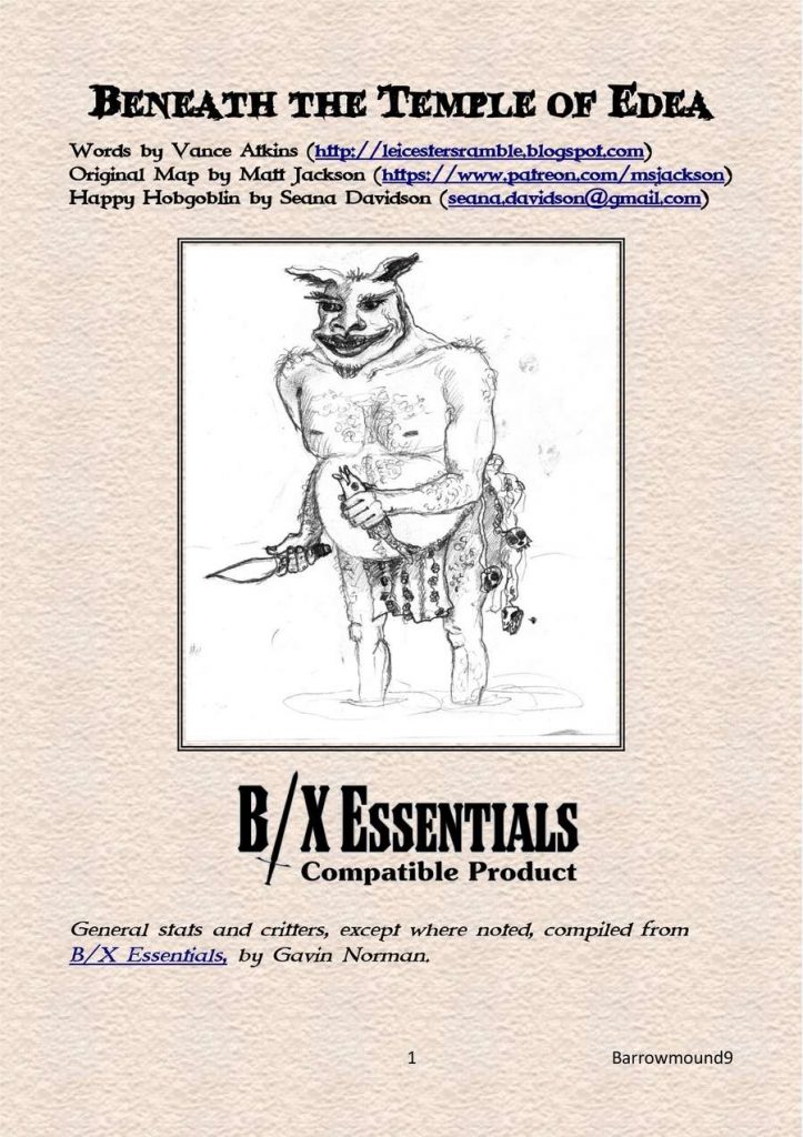
This twelve page single-column adventure features a sixteen room linear dungeon with hobgoblins-ish enemies. A few nice features can’t save it from itself or the mish-mash of text that makes up each room. It’s a monster! kill it and move on.
There’s a small temple with six encounter areas and then an underground cave with the rest. The temple is a highlight, with statues holding lamps (nicely illustrated by an included photo, btw. Art that compliments an adventure is rare and this was the perfect art choice for this feature.) With four or so rooms per page the writing is kept relatively tight.
It’s doing something weird with the writing though, something that’s off putting and I can’t quite put my finger on it. I’m kind of referring to it as a meandering style. I can’t exactly figure out the specifics, but its a loose writing style, with the focus of the writing, and organization, on things other than the rooms subjects?
There’s a loose phrase of two in the writing that’s obvious. “Examination may show that …” well, no. First you’re using the word “may” and second you’re phrasing this as an if/then. IF you examine the door THEN it [may] show that … It’s much more solid writing to say that there are scorch marks around the handle. (Which is a hint to the lightning trap on the door. I like trap hints for players who pay attention.) In another point there’s some commentary that a certain thing “may make it a dicey proposition!” A loose comment or two isn’t all that bad and if sprinkled wisely can provide a little humor/prodding to the DM.
But this isn’t what I’m talking about when I say it’s a meandering style. There’s weird background padding padding showing up before important room elements. Longtime readers will note that I prefer that obvious things occur higher up in room descriptions. The towering statue glowing red and shooting lazer beams from its eyes should be the first thing mentioned … unless there’s something else even more obvious when you walk in to the room.
Room 5, the monk living quarters, is a good example of this.
5. Manse – Up a short flight of stairs is the former residence of the temple monks. Its occupants were killed or carried off during the incursion from ‘below.’ The sparse furniture and fixtures here are overturned or broken and show more signs of struggle. There is nothing of value left beyond some cookware and thin clothing. One of the ‘guard lizards’ for the hobgoblins in the caverns (below) has wandered in here in pursuit of rats and is tearing apart the decaying corpse of a dead monk.
Up a short flight of stairs … the former residence. Killed or carried off. The guard lizard showing up last. Better would be a guard lizard eating decaying corpses in a ransacked living quarters, or something like it. The adventure text is almost conversational the way it meanders from the room approach (obvious from the map) the background, former room use, decorations, and then finally the obvious thing. And multiple rooms are like this in the adventure. They lack a strong focus. They are not overly long, but the writing feels loose and the interactivity feels empty, not a good combination.
The map is essentially linear. It does have a nice feature or two, with same level stairs and some escarpments to liven things up. But a linear map is a linear map. There’s little room to explore, you just kill what’s in the room and move to the next one.
I find these small and linear adventures quite unsatisfying. I know this is how many people run their home games, but as a prepared adventure it just doesn’t seem worth it. Then you add some substandard text and, well, why?
This is Pay What You Want at DriveThru, with a suggest price of $1. The preview is five pages and shows you the map and the first six rooms. It’s representative of what you should expect, so good on it.
https://www.drivethrurpg.com/product/279318/Beneath-the-Temple-of-Edea?1892600
