By D.S. Meyers
Oldegrave Adventure Company
OSR
Levels 1-2
What will the characters sacrifice to save the Western Wood?
Soooo … yeah.
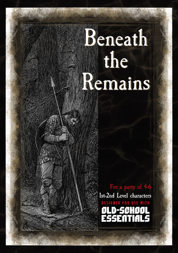
This 54 page digest adventure details about forty locations outside and in two small fifteen-ish room dungeons. Weird bullet format and a strange … forced? Nature to it, along with some abstracted detail, make this one a miss for me.
While staying in the town an old guy shows up in a wagon, shot by goblin arrows. His kids have been kidnapped, so the party traces them back to a fey circle and then a rose petal path to a glade. The fey queen says he was abusive and they killed him and are keeping the kids. Oh, by the way, could you go clean out a bunch of undead from some ruins nearby? I’ll give you The Gift of the Forest if you do. (Amulet of +5 CHA vs Fey/woodland.) The ruins are about eleven locations, with two mini-dungeons of about fifteen locations each. One of them has this artifact. A PC has to willingly give up their life to destroy it. If they bring it back to the fey queen then she kills them all for doing so and not destroying the artifact that she has never mentioned before. So …. Yeah. Obviously more than one thing wrong there. The overall vibe is a good one, enhanced by the old timey public-domain art selected. Well, good up until the point the fey queen sends you off. Then it’s just a boring old slog. The entire tone and style of the adventure changes. It was better BEFORE the dungeon stuff started.
The encounters for the ruins and two dungeons are trying to be useful to the DM. basically, each encounter has, like, three bullet points and then some stats and maybe a small section on treasure. There might be another small section explaining something or some development in some of the rooms. GL02-Hall reads “*3 goblin skeletons approach from the bend in the hallway. * Close quarters fighting.” Well, ok. I guess maybe that’s define in OSE? GL04-Kitchen. Big Chef Goblin Skeleton and 2 other goblin skeletons. Timer for ceiling collapse as the chef swings cleavers aimlessly hitting walls. Uh …. This is minimalism, or just a hair beyond it. And minimalism is No Bueno. I can roll on the monster charts in the 1E DMG and do minimalism.
The timer, mentioned above, is one example of them in this adventure and there are a few others. They seem … weird. I guess maybe the goblin chef one is ok. You can at least see him hitting the walls and I guess, somehow, you know they will collapse? But in another place the timer is just used to have some raven fly through a window in a few rounds. What’s the point of that? Suspense? I mean, the party doesn’t have any choice over it.
And, then, there’s the issue. The party has no choice. Not with the kidnapped kids. Not with the quest pretext. Not with the artifact that makes you have to kill yourself to destory it. Not with the fey queen who kills you if you dare bring it back to her, presumably wiser, guidance. Or with the ravens and maybe the chef. Interactivity is important in an RPG. Without it there’s this false sense of mission. You know you have no impact so you don’t buy in, or, worse, buy in to your character instead.
The town has sixteen locations. A few sentences each. None of them really doing much with the locations. They don’t overstay, except in the way that no content overstays. They just don’t really matter in any way.
Other details are abstracted. You can’t really talk to the kidnapped kids, or, lat least, the guidance on running them doesn’t exist. Likewise a fairy shows you the way to the undead ruins … a fairy with no name, description, personality or anything other than “ a fairy,” This is not assisting the DM. Is the party really unlikely to talk to the fairy?
GL01, the first room in the first dungeon is missing. It’s on the map but just isn’t in the text.
Look, I get what the designer is trying to do. But the bullets are just minimalism instead of interesting detail. A bullet that says “They attack when the party enters the room.” isn’t adding value. I applaud the attempt at being easy to scan, but I also want the content behind the scanning. It had an interesting thing going on with the fey queen and her no solution parley. But then it turned in to standard old minimal dungeoncrawl.
This is $4 at DriveThru. The preview is seven pages and shows you several rooms. In fact, it’s mostly the first few rooms. So, great preview! I encourage folks to take a look at it and review the format used. It’s not a bad layout, it’s just the content that is lacking.
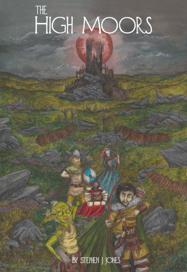
Stephen J. Jones
Unsound Methods
5e/OSR
Levels 1-9
The High Moors beckon… Little is known of the Ieldra – a race of cruel and depraved elves that once ruled the northern tableland called The High Moors – and no one has seen an elf in living memory. Their civilisation is dead, destroyed by an incursion from the Far Realm brought about by their hubris. The ruins of the High Moors have lain undisturbed for centuries. With news from a successful expedition, people have finally considered the treasures waiting to be discovered in the forgotten north. A number of expeditions have now been dispatched to bring back magic and riches. Unfortunately, danger, horror and madness awaits most of them.
This 198 page “adventure” is actually a mini-campaign setting, taking characters from level one through about level nine by way of a hexcrawl with about seventy location of varying depth. It’s above average, as hex crawls go, in terms of the situations developed and the adventures support for it. For $10, you get an entire campaign … not a bad deal at all!
So, a campaign setting. This means gods, races, leveling, coin systems, and other details have been changed. This hex crawl makes sense in the world that it lives in and would be quite the challenge to move it, unless it’s a pocket dimension, etc. It is such a Of This Place that conversions are going to be difficult. It’s a Gold=XP system, for 5e (and easily enough older school D&D) that also has attached to it unique roles for dwarves, elves, goblins, halflings, demons, giants, and a myriad of other races. It’s going to hard to fit this in without some effort … but … it does contain enough adventure in it to handle levels one through nine. So, why fit it in at all? Just start a new campaign using this, make it the centerpiece, and off you go!
The core of the adventure are the hex locations, about sixty scattered across three maps, each of which is about 11 hexes by 15 hexes, with a 1 hex=12 mile scale. These tend to stretch out to a page or so, especially where stat blocks are involved. In spite of this, they entries are relatively well organized. Each one tends to starts with an overview, what you might see from a distance as you approach, and then additional detail as you get up closer. Finally, the individual elements of the “up close” view get their own little bolded section that describes what it going on with them in a format that is relatively easy to scan. These locations have SUBSTANTIAL mysteries to solve, things that are missing, NPC’s to interact with, and so on. There is definitely some potential energy in the vast majority of the encounters.These are not the static models of Isle of the Unknown, but rather something more akin to the newer Wilderlands, that had more detail and the old Wilderlands. Interactive, lengthy, but generally easy to follow. There’s only so much you can do, though, via a pig-man village and the intrigue therein without running the words the top of the bowl. The same with the ruins, or mini-dungeons prevalent throughout the hex crawl. There’s just a degree of abstraction that you have to accept with a hex crawl. The hexes need to do a good job to inspire the DM because there’s just no word budget for detail. Nor should there be.
A substantial element to a hex crawl campaign is getting the players crawling and keeping them exploring. Numerous hooks are suggested, both more generic ones and then also more race-specific ones, which come off a little like secret society missions. Combined with the need to explore for coin purposes (you spend your coin, one GP to train for 1 xp) and magic then you get a nice little loop of coin, hooks, and missions you pick up out in the wilderness/hexes. It’s good. I think it more than adequately covers the pretext needed to play D&D tonight.
I’m pretty happy with this. The setting has a lot going on, factions and the like, along with some substantial “game world” mysteries to resolve. There are numerous opportunities to screw things up “Broodmother Skyfortress”/Rients style. There’s good cross-referencing, generally, and good imagery. The setup for the various sites seem interesting and more than throw-away sites. At one point there’s an invisible chain, going up in to the sky, that you can hear but not see. Climbing up it reveals a platform and a building to explore. It’s done very well. And almost everything is done well in this. There are significantly more highs than lows.
It feels like this was done in word, or some such, with a 2-column format used. This FEELS off, in place, maybe a little amateurish? I appreciate the singular effort of a designer, but the product could have been better with good layout. Not that it’s bad. Maybe it just REMINDS me of the look of products that ARE bad?
This is $10 at DriveThru. The preview is eleven pages, but not very good. It’s just the first eleven pages, which cover a bit of the overview. A few of the hexes would have been a much better preview.
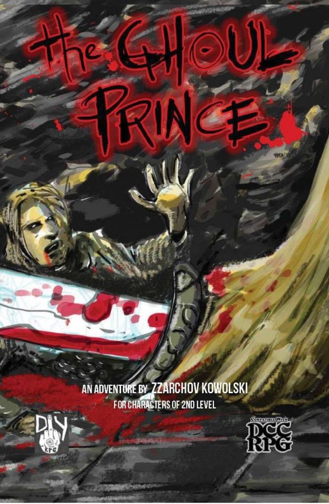
By Zzarchov Kowolski
DIY RPG Productions
DCC
Level 3
Behold the gripping terror of the GHOUL PRINCE, bargain your very skeleton to the unsettling BONE LADY, and claim the powers of the mysterious DEMON IDOL.
This 22 page adventure is a stunt dungeon that uses four pages to describe the same dungeon in five different ways. Decent map for its size, nicely evocative interior, interesting monsters (as all DCC creatures should be) and good magic items combine with some pretty good interactivity. An interesting project that proves the point it trying to make.
Sometimes designers have interesting ideas and want to explore them, and this is one such case. Can you take a standard dungeon and write it in such a way that you can retheme it easily/ Can it be written so that it can be a desert tomb, or an alpine mausoleum, or an iron-age bog tomb? Can you seperate the theme from the specifics and/or do it in such a way that it can serve several purposes? That’s what Zz is trying to do here, and what he succeeds at … at least in a dungeon of this size.
So, twenty rooms and four pages in a 22 page adventure … something is up, right? Eight or so pages are concerned with the specific theming. For each of three environments, plus your own, two pages are spent on what the various elements are themed as. What do magic symbols look like in a desert tomb as opposed to a bog tomb as opposed to an alpine mausoleum. What is does the trap on the chest consist of? What type of sword is the magic sword, and so on. There are a few more pages explaining the stunt concept and then a few giving some background on the guy whos tomb you’re about to rob, and his relationship to a new patron. The end of the book as new magic items, new monsters, a patron, etc.
The idea here is that you are going to take the two pages specific to the theme you’ve chosen and have then ready as a reference as you run the four pages of the actual dungeon. Here’s an example of how this works with the dungeon rooms. The entrance, body, wards are all described in the theming page, with the bodies being described as “Leathery bog mummies.”
A: Entryway
A sloping set of stairs lead down from the [Entrance]. A [Body] is curled into a foetal position at the bottom, surrounded by crudely made [Wards].
Monsters and magic are good, exactly as one would expect from a game with no monster manual or magic item list. Everything is nicely unique, with their own non-standard abilities. The lack of standard monsters and magic items is one of the things that makes DCC great, and Zz does a good job creating some new monsters and items to fill in nicely. Terrifying, unique powers, and objects of desire.Keeping the players on their toes, never knowing what the monsters abilities are, no monster manual to memorize and therefore remove the fear from a terrifying new encounter. No mundanity and victorian-era lists to catalog and remove the wonder of discovery from new items.
The map is a small dyson one, with twenty rooms, but one of the better ones. There are a couple of places where one section crosses over another, or same-level stairs, details are nicely placed on the ma and it looks suitably rough for an old tomb. I’ve been down on Dyson maps in the map. Too often a designer will take a small uninteresting one and try to build something around it. He does do good ones as well, even at this small size. I wish people would gravitate towards those instead.
So, put it together and you’ve got a pretty decently themed dungeon, with good interactivity. It’s got a nice villain to chase you around, Jason-style, things to use in the dungeon against him, mysteries to unlock and lots and lots of ways to die. All in a package that is four packages in one. You could take any one of themes and have a pretty good dungeon exploration with it. I DO think, though, that the format is going to wear a little thing in larger dungeons. There’s only so many ways you can say “magic wards” and have it come out inspiring and well. T some point the two page reference sheet will grow longer and at that point the utility will break down. For these smaller style dungeons, though, sure. Three dungeon themes to fit your specific campaign world, plus a couple of blank sheets to fit in to your.This is $7 at DriveThru. The preview is five pages. You get to see the intro, background, and part of a theming page spread. Ok, but a room encounter would have been nice as well.
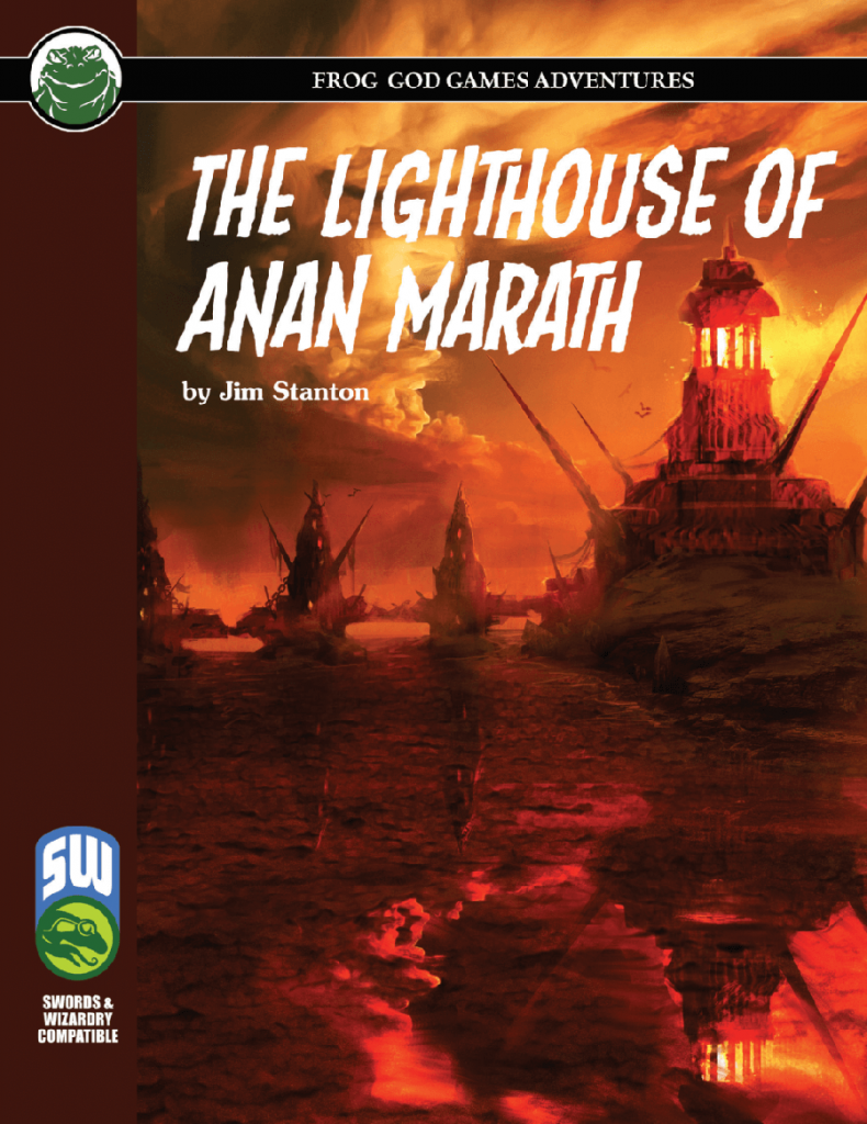
From the shoreline of the village of Saemish, waves can be seen tossing their salt and spray upon four small islands, the largest of which is Anan Marath. A great bridge, aged and deteriorated, spans from the mainland connecting these islands and ending at colossal lighthouse of Anan Marath. Each might y structure is created from the deep-green bedrock found only in the bedrocks of the watery abyss. For Decades, the Lighthouse of Anan Marath has remained dark. Slowly devolving into a state of shappy disrepair. But no longer! The village council has decided-narrowly and after angry debate-to restore the lighthouse and clear it of its dark and bloody past.
This thirty page adventure details fifty or so rooms of a lighthouse complex off the short of a small village. It has an interesting approach with the map environment and the writing can be quite evocative, if a bit unfocused in places. Some additional “context” work could have/should have been done, but otherwise it’s a solid effort.
Off the short of a small village is a chain of three islands, connected with a stone bridge, Florida Keys style At the far island is a lighthouse. Trade is returning to the region and the locals need someone to sort out the lighthouse so they can relight it, after many MANY years of disuse, allowing them to bring trade back to the town. It’s not abad set up and gets to that “points of light” theming of reclaiming the world. It also has a nice little non-standard reward: in addition to what you find they are willing to give you a percentage of all the trade goods/trade that come by. An investment in your future! I like that, and I like the way it cements the village in to the characters lives as a someplace other than a “one and done” adventure. There’s a bit of a disconnect in place: the lighthouse complex is either 250’ off shore (according to the text) or 50’ offshore (according to the map) and it’s stuffed FULL of evil baddies, from monsters to cultists to pirates. Why any one of them haven’t laid waste to the town is anyone’s guess. It’s pushing believability/pretext in that regard, but, at worst, it’s the town sewers problem all over again. And if I can deal with that I can deal with the baddies only being 50’ offshore of the village.
The writing here is not bad at all, from an evocative standpoint. Rotting trapdoors, mix with scrub and surf, wait-high crenels, bridges glistening with salt & spray and dark green seastone with the waves lapping up against it. It hits more than misses in this regard, with the locales really coming to life in the DM’s head through the word choice of designer. It doesn’t feel forced, it feels natural. I love this. The ability of the designer to put an image in to the DM’s head is one of the pillars of a good adventure. If the DM can really GROK the location then the chances they will communicate a great environment to the players is all the better. It really feels like the designer visualized the environment and then brought the power of the language to bear to describe it without going and on and on with the descriptions.
The map here is interesting, or, perhaps, the locale it is describing. Because it’s a causeway, it lands on the top of towers. Thus in many cases you are exploring DOWN, to the towers proper, or even to the rocky islands that support the towers the causeway lands on the top of. Likewise, the lighthouse is entered, in one possible method, midway through the top, where the causeway lands, giving opportunities to go down and up, with additional underwater tunnels. It’s a good effort of breaking the mold of just exploring down or up. Although, not always the clearest in it’s descriptions. There’s some puzzling to do to figure this out.
It does tend to lack focus in its descriptions. It mixes background and history and “this is why X is Y …” in to the descriptions. Regular readers will know that I eschew this. It detracts from the ability to scan the room at the table and relate the information to the players in a quick manner. The usual mistakes are made, from explaining why. Blah blah shaped this by magic, who were actually cultists of god blah blah blah. This is trivia and just gets in the way, and its done over and over again. Again, this is more like the writing I would expect in a style guide for the world rather tan in a technical resource for the DM at the table. In other places the writing isless direct, like with “This place has recently become the lair of an X.” Good that we’re being told X lives here, but it can be done in a more direct manner. These two things make the actual locations quite a bit weaker for use than if they were not present/used.
Of secondary interest is the lack of a polish edit. Certain things are confusing, or could be more direct. It mentions an arrow slit in one case, and only by extended thought does it turn out to be an alternative entrance to the lighthouse. The initial description, therefore, is not really effective in what it’s trying to relate: this is an entrance to the lighthouse that the party can use. It implied, rather than stated, and not implied very heavily. There are multiple examples of this in the adventure, things that require some puzzling out to figure out what is meant/intended. In other places there are opportunities missed. That one that sticks out, but its not the only example, is of the old town drunk, dead in a cellar from a beastie. He even gets a name ‘Cooter.’ That’s great, but the emphasis on this, up front, n the village, or an mentioning it up front in such a way that the party can learn it, is missing. There are passing references to clutists emerging from sea and ships in the night, but the emphasis and follow up isn’t there, up front in the overview and village, and this the opportunity is lost unless you read the entire thing and take notes. Not the strongest support and substantial missed opportunities for support play in the village before the adventure proper starts. There’s also a bit of lost opportunity to give overviews of the situations, since you’re outside and can see the entire thing. Thus if you want to do this you have to read the entire thing, figure out which parts are “visible” and try to come up with something on your own. Again, these sorts of “vista overview” descriptions are worth their weight in gold when trying to relate the overall situation to the party. If you can SEE cobwebs on the island, from the bridge, then that needs to be up front, not in the room key that describes that location.
Some of this, I think, is due to the Frogs lack of good editing. Simple mistakes crop up, like the HD3 fighter who is level 7. And, of course, the level range is missing from the cover or the product description on DriveThru instead hiding on the title page of the adventure … I wish the Frogs would make a fucking checklist and continously improve on it for these little mistakes ther continually make. At least they’ve stopped slapping the wrong cover on things.
Order of battles for the pirate and cultists are missing, but there are other strange comments like “If the party strikes up a conversation with this group of pirates ….” the ones guarding something, that you just killed a bunch of other pirates to get to? Are they in a talking mood? The adventure strikes me as a hack with little opportunity to talk to people implied in the text, so this comes out of nowhere.
But, still, a decent effort. Good environment, nicely evocative. Strains believability in places and the DM text is muddled, but, such is life in the age of cholera.
This is $11 at DriveThru. The preview is six pages and the last page shows you the first encounter description. It’s relatively good for determining what the writing is like for the rest of the locations, but I’d like to see more of them in a preview.
… you will search the Witchwoods for missing people, overthrow a tyrant, and bring peace and justice to a small frontier town by the name of Bromwich.
This 54 page adventure uses about 25 pages to describe a hunt in the woods, avillage, and an small fight with the mayor as the climax of the adventure. Weird mechanic choices abound in this, as well as the usual “I don’t know how to write an encounter description” issues that plague nearly every adventure.
There’s a convoluted backstory to this which I’ll complain about in a bit, but, first, the basic adventure outline. You’re hired to find some missing lumberjacks. Each day, when you are searching the woods for the lumberjacks, you roll survival. If you roll over X then you could encounter any of the encounters, on the chart, with a survival DC<=X. So, a chart full of fourteen encounters of various DC’s, once of which has the lumberjacks. After finding the lumberjacks the party is betrayed by the person who hired them. They are then rescued by the sheriff and given the “real” mission, to find someone to replace the corrupt mayor of the town. You go talk to some people, and then tell the sheriff who you want to be the new mayor. You then ambush the corrupt mayor, who offers to reward you if you take his side. And then the adventure ends, one way or another, with the party choosing a side and finishing up the combat.
The adventure is trying to have some complexity to it and be a little sandboxy. There are other quests to perform in the lumberjack camp, little fetch things, etc, and the “mayor candidates” that you talk to, pre-revolution, MIGHT have some things to do. The NPC’s are laid out up front, for the town, as well as descriptions for ten or so town locations. There’s also a pretty open-ended “get your stuff back” section, that is not supported by the text AT ALL, but feels like an infiltration from the few words there are about it. Further, there’s at least a bit of complexity to the otherwise stock characters, in places. The corrupt mayor COULD actually surrender, and he COULD keep his word, if the party throws in with him at the end. Further, his (nice) son is probably the best equipped to be the next mayor but, of course, no one trusts him. There are a decent number of opportunities to roleplay and gain allies as well. So, Simon tried.
Tried and failed.
The mechanics of this are terrible, and you know I seldom talk about mechanics, so they must be egregious. Fourteen locations on the forest chart, you can find one a day and only one has the lumberjacks. Further, the other locations do NOTHING to make your search more productive. At most, you might get rid of wandering monster checks. (which are fucking lame in an adventure like this, especially in the throw-away form they are presented here. Wanderers do different things in 5e than in OSR. Just make some decent encounters to scatter in instead of a traditional chart, if you’re going to use them.) So, just roll a check every day, have an encounter, and hope that, randomly, you get the one you are looking for. No chance to influence. The worst kind of random. Just suffer through without ANY ability to influence your fate. The journey IS in fact the destination, but no ability to influence your fate is a shitty shitty journey.
Likewise, when you talk to people, mayoral candidates, you need to convince them to take the job. They each have a different chart. If you do X things from their chart then they will take the job. BUT YOU DONT KNOW WhaT THE THINGS ARE, as players. It’s just fucking random. Did you do all of the bulltin board tasks? Do you know Bobs spouse was kidnapped? He won’t tell you that. This is all BS. You can’t engage in meaningful decision making unless you know the decisions you are making. “HAhA! Gotcha! You should have carved your initials in to random tree #2353 in the forest! You didn’t, now you loose!” Of course the DM is gonna cheat and fudge to make things happen and keep the action going. Is that the point of a DM? Maybe, but it’s more the job of the designer to keep that shit from happening in the first place.
So, you find the lumberjacks. And are then backstabbed by Mayor McDickCheese. He’s taken all the money he would have paid you and instead bought sleep poison. He poisons you and throws you in the river, tied up, to drown. Why not just kill you? Why not use killing poison? Why not just PAY YOU? Because, gentle readers, Wandering DM thinks they are STORYTELLER. FUCK YOU AND FUCK YOUR STORY! IT”S THE PLAYERS STORY, NOT YOURS! This sort of forced shit really pisses me off. If you make your save DC then bandits burst in and shoot you with sleep poison crossbows. The room has no doors or windows ,locked, everything set up against the party. Fuck you. Adversarial, railroad designer. Fuck. You. All so you can tie them up and throw them in the river so they can make a DC10 check or drown. That’s fun. Or, they missed? Don’t worry, the sheriff will rescue them. Because fucking plot. Shitty, shitty, shitty design. The players are viewers in their own adventure instead of participants.
Read-aloud is weird. There’s not much, but it’s long and in italic (bad!) when it does poop up. You have to read the fucking backstory to udnerstand the hooks and what exactly is going on. Again, terrible design. Encounters and NPC descriptions are full of meaningless trivia and backstory instead of tools and ideas to help the DM bring the adventure to life. “Karl moved here 25 years ago after a life of adventure” is meaningless trivia backstory. “Karl runs an underground booze ring and is looking to X with Y if he can” gives Karl a reason to be in the adventure and the ability of the party to interact with him in a meaningful, adventure driven, way.
Blah blah blah, says the generic ad copy, “discover a dark secret.” Zzzzz…….
This is $5 at DriveThru.The preview is fifteen pages. You get to see the setup, the NPC’s and town locations and their lack of adventure-driven focus in their writing styles. That’s about it though. A fifteen page preview should also show some encounters (and yet, the NPC’s COULD be encounters, so, ok, it does show some, but, still, real encounters also, please, so we can make an informed decision.) Two five star reviews as of my blog post. Geee, that’s surprising.
This 1122 page adventure details a ten level megadungeon, with fifteen sublevels, numerous pyramid levels, with some levels having upwards to 160+ rooms. An impressive feat of overall design, with many level interconnections and puzzles/rumors/clues spread out across levels. A decent effort has been made to make the size manageable, which helps but isn’t a home run. DM text can get long and it less useful than I would have liked, a testament to unfocused DM text. A singular creation, for fans & students of the megadungeon.
It’s a eleven hundred pages and I’ve been working on it for three weeks now, and I’m still not sure this review is any good.
Let’s get the obvious out of the way: Arden Vul is big. REALLY big. The biggest so far, in fact. In addition to the ten levels, fifteen sublevels, numerous “pyramids & towers with their own levels”, a ruined city outside, a wilderness area outside, and a local town, it is not uncommon for a main level to have 150+ rooms on it, with sublevels having 30-50 rooms. If a modern OSR product is expected to have around fifty rooms, then this is equal to AT LEAST, say, sixty or so levels. Added in to this mix are at least twelve major factions, from cultists, to major humanoid tribes, to a dragon, to a wizards. Dungeon levels have a crazy large number of interconnections to each other, including the requisite “giant chasm that runs through many but not all levels.” ig, here, is an understatement.
The book tries to make this size manageable. It has overview sections, up front that introduce central ideas and groups them together. So you might get a giant multi-page section on the factions, an in depth on each of them,how they feel about each other faction, things they want, their size and how they replace losses/are likely to react to events, areas they control and contest for, and other topics. Then, at the start of each level you get a little overview/introduction to the level. This will again mention the faction and briefly describe a few things about them, what’s going on, with a concentration on what’s happening right now. This same sort of general concept is followed for several different topics at the start of each chapter. Areas of legend/note get their own section, and then a brief intro in the chapter heading in which they appear. As do important NPC’s, construction/style notes, ingress/egress points, and so on. Further, it’s all pretty well cross-referenced. If it mentions an NPC it notes their location. If it mentions a location by name then it tells you where it is, if a clue is mentioned somewhere in the keying, then it both cross-references to the location the clue is for AND has some notes that explain it to the DM, for additional context.
But the place is big. IMPOSSIBLY big. And those efforts to make things manageable only help so much. The cross-references and “DM notes” work really well. “Places of legend”, iconic locations within the dungeon, also work really well. Introduced up front, rumors, things everyone knows about, and then overview of them and their context etc. It helps them integrate naturally in to the game. Other areas though, like the factions, start to get long in their multi-page “summaries.” You almost need a summary guide for the summaries. This is, especially with regard to the factions, a side-effect of the writing style, which I’ll cover later on. I’m open to this being a side effect of PDF version and the print version being easier to reference during play. In this case, at least, I could have used a reference table. And the same issue with dungeon styling and areas of control. I think I would have wished that this be embedded, somehow, on the maps. Different shading to show construction styles or who’s domain you were in, and/or notes on the maps to remind me what Achachian styling consisted of, or what Kertil styling consisted of. I’m am NOT gonna fucking remember that during the game. It’s more likely that I will ignore, intentionally or unintentionally, that section in the level overview. And if so, then why include it at all? This is not an argument to NOT include it, but rather better methods, in our hobby, to handle these sorts of “always on “information items. I need a memory prompt, dammit! Which if why I harp on summary sheets, or on-map information so much. There’s just SO MUCH. Handled well, it’s going to be a major enhancement to the game. But this doesn’t handle it as well as it should.
This is, at least in part, because it’s not breaking new ground as a product, in terms or styling and organization. I know, I know, hipster art project D&D adventures are almost a meme now. But, there’s also a trend in those products to search out the best way to present information to the DM, exploring new grounds of presentation and layout for clarity and impact purposes. This don’t do that. It take the usual standard dungeon format and adds some overview/summary chapters and some introductory text and that’s it. The cross-referencing and “ DM notes” for the clues are just about as far as this product is willing to push the boundaries of new layout/presentation/ideas. And yet, of all the products to come out, these large ones are the very ones that NEED that additional design/layout work. You saw this in, for example, Stonehell, in which the one page dungeon was then supported by breaking it in to four sections and then also giving each section three or so pages of supporting information. I’m not saying this product should have done that, but rather using Stonhell as an example of breaking new ground in order to handle its environment better. This could have/should have gone a little further down that path as well. What? I don’t know, but I do know it could use more help in this area. Is it bad? No. Above average, at least. But, not effective, or maybe completely effective, in helping the DM manage its size.
The dungeon has a serious flaw and it’s best to get that out of the way: the writing is unfocused. It mixes the past and present of the various rooms, hiding decent details in favor on expounding on the past glories of the rooms. What detail there is can hide behind an indirect writing style that further obfuscates scanning.
The room of Jhentis the Ghoul is a good example of this. In the middle of a floor covered in shards of broken bottles, a strange throne of bone and wood scrap rests on a desk that rests in turn on a table Jhentis sits on this throne gnawing bones and murmuring hungrily and angrily, wearing a key around his neck and piled next his throne are coins, jewelry, unbroken bottles and scrolls. But that’s not the description we get. Instead this is the description we get:
“This former alchemical laboratory houses the ‘court’ of Jhentris,
a particularly ambitious priest who returned after death as an
unusually powerful ghoul. Originally three large workbenches
sat in the middle of the room, and wooden shelving filled with
paraphernalia lined the walls. Most of the glassware has been
shattered, and Jhentris has built a strange throne of sorts out of
the surviving table and scraps of wood. The ‘throne’ consists of a
chair made of bone and wood resting atop a desk placed on top of
a table. Jhentris sits in his throne, gnawing bones and murmuring
hungrily and angrily. The walls are undecorated, save for marks
where the shelving used to rest. The floor is covered with glass
shards and other debris, rendering movement more difficult (-10’
movement). Some scraps of ‘treasure’ sit on the table to either side
of Jhentris’s throne”
Note the rooms previous usage, leading off the description. Is this the most important thing for the DM to know when the players open the door? Of course not. It’s the image of the ghoul gnawing bones, sitting on his throne, treasure, broken glass, and hungry mumbling. Note how it tells us what USED to be in the room, what is USED to be used for. This is trivia. It should not be included at all, and if it is it should not be what the room leads off with. Note how the walls are undecorated, except for the marks. Great indirect writing if you are writing to be read and substantially less so for play the table.
This is, though, a good room in terms of both imagery and in terseness. It’s not uncommon for a room to go on for a page or more, as each item gets some description, again in this unfocused style. Another room tells us thar the halflings have already looted a body except for a scroll in a boot. Mening, of course, that there is a scroll in the boot. I know this sounds like I’m pixel bitching, but the product if BIG and the rooms are LONG and this all makes the rooms a chore to scan and therefore to run easily. This sort of burying of information, either deep in the paragraphs or as the secondary part of a sentence is a common occurrence.
This is furthered by a writing style that likes to use the word “large” and other common adjectives. Three stone sarcophagi lie broken and looted in the middle of a chamber. This is not evocative writing. For every Ghoul on a Throne there are fifteen or twenty broken and looted sarcophagi. These rooms seldom come alive in my mind. Again, reference being made to the more … plain? Writing style of Barrowmaze. Highlighters out! Actually, better buy a gross of them, you’ve got 1122 pages to read, absorb, and highlight. No bueno. Normally, this would be the killing blow for me in a review. Confused and lengthy writing making the thing hard to actually do what its intended to do: be run at the table.
But, this has something else going for it: it’s interactivity..
This megadungeon is stuffed to the gills with it. The different factions, and their goals and how they can use and be used by the party is only one aspect to it. In addition to this “stretch goal” of roleplaying interactivity, the adventure is also full of “the usual” interactivity, the most common types. Hidden floor tiles full of treasure, passages, and pools and statues to mess around it. But, it then takes this to another level. It is STUFFED with those features. And, in particular, many of theme are themed. So, as you learn more about Thoth and Set, you figure out more and more how to work the various things you find the dungeon. Which position to put the statues arms in, for example. And there are numerous clues, murals, graffiti everywhere in the dungeon and its environs which help with party with their sense of discovery. “Ah! I bet this relates to that statue on Level 2!” Players LUV LUV LUV figuring things out and this allows them to do it. Plus many of the clues are for things on other levels as well, giving an additional aspect to it. There are also a TON of mini-quests to take on. These can be relatively standard things, like people in town needing/wanting something, or rescuing prisoners. I think, in fact, there’s something like two pages of captives, summarized and cross-referenced of course, that you can rescue in this place. And not one room with two dozen people in it either, scattered, with different goals and different purposes. And that’s just the beginning of the interactivity in this thing. Did I mention it provides rules for training? Yes, finally, an adventure setting that covers how to rid your MU of all that gold so he can train with a dude in town to get his level. It’s there to cover all the bases, in the dungeon and outside of it, with scores and scores and scores of opportunities for the party to dig in deep and the DM to take adventure of emergent play.
There’s a good sense of the familiar in this that is twisted just a bit to make it different. This is great for the players, and the DM, since it gives them a starting point in their heads to build upon. There’s a stargate-like teleporter pad, with addresses and stones to find and place correctly in order to dial in an address. And the theming of Set and Thoth, for example. Trolls that are not trolls that are trolls are present. Familiar elements, that you can latch on to in your head, but given just a little twist in order to bring some freshness to them and make them un-generic.
This being such a large product, the question is going to arise if you can yank specific levels and reuse them for your own purposes. Yes? Maybe? I don’t know? There are things going on in this that is going to make that more challenging than usual, which is going to require a little work. The level interconnections are many and varied. They are clearly outlined at the start of each chapter, which is a boon for fitting this in to your game piecemeal fashion. Certain things, though, like the chasm running through the levels or the stargate-like teleporter system is going to require a little creativity to get past. While many of the factions are generally self-contained, there are incursions of other-level factions and references to them. Again, this is going to take some work to mold and fit in to your existing game. The interactive elements, from the teleporter gates and discovering their addresses, to the Set and Thoth theming, to the statues/interactivity clues that refer to things on other levels, just are not going to make sense if you pull just one level. And, of course, the faction roleplay elements themselves. The integration of each level with the other levels is really quite involved. And that’s absolutely GREAT if you’re using this as a standalone and presents a challenge if you want to yank a random levels. Having said that, some levels and sublevels are more easily yoinked for standalone than others. So, CAN you? Yes. Put if you really like a level and want to yoink that specific level then you may face some rather substantial work in order to filter out and/or replace the interconnected elements. The summaries though, of the iconic locations, level interconnections, faction/level overviews, DM notes, captive-to-rescue table, cross-references and so on should help you quite a bit in this effort. You’re not alone!
My notes for this adventure run eleven pages and I’ve only touched on the major topics. This adventure is interconnected in a way that few others are. The cross-level design and faction play across levels. The interactivity of the levels. The support for the DM in terms of cross-references, tables that summarize hostages, quests, and other topics. My chief complaint is the writing for the individual rooms, proper. They evocative nature of the writing is inconsistent and the DM text long and lacking focused. That means extra prep work, highlighters, and the like. This isn’t the sort of thing that runs easily at the table, because of that. And yet, there’s nothing like this on the market at all.
The PDF is $110 at DriveThru. The preview is twenty pages. Of that, there are a few pages that hint at the summarization levels: the iconic locations on pages fourteen through eighteen. Prior to that there is a section on the various builders of the dungeon, and their dungeon feature types, meant to be used for level theming architecture notes, etc. The two, taken together, given you a good hint of the sort of information the adventure provides for the DM. Can you keep the level theming fresh on hand? And yet the iconic location summary is perfect for dropping hints, legend lores and the like.
The mighty wizard, Septor the Green, has disappeared, but the ruins of his castle remains. This once proud landmark has become a haven of evil. Few adventures have been brave enough to explore the ruins and those few, have little to show for their efforts. Still rumors of the wizard’s treasure persist, as do rumors of a dark cult lurking in ruin’s dungeons. Are you courageous enough to brave the ruins and battle the creatures that call it home? If so, maybe you can discover the wizard’s treasure. The Castle of Septor is an Old School Revival module designed for 4th to 12th level characters, and intended to be placed into an existing campaign.
Welcome to another installment of “Bryce shits on a labour of love”, week six in shelter-in-place edition.
This 48 page traditional dungeon exploratory adventure details a two level dungeon with about seventy rooms, using about thirty pages to do so. Long read-aloud, lots of backstory in the rooms descriptions, and unfocused organization make this a skippable adventure.
Written in 1984 and published this year, it claims to have been extensively playtested. It has quite a large level range, with level one (and the castle ruins above) being kobolds and gnolls while level 2 features a fuck ton of high-level undead, a fuck-ton of demons/devils, and a lich. Quite the difficulty range between the two. For added fun, the stairs to level two are right next to the entrance to level one. I love it!
The adventure features some art that is evocative, in a kind of “brutally realistic humanoid” style. There’s not a lot of it, but it matches a nice low-fantasy tone … even though this isn’t a low-fantasy adventure. The adventure also does a great job of describing wide open areas using an overview. Outside of the castle you get a brief description of key features that might draw your attention, and when you enter the courtyard you also get a little overview of what you see that’s obvious. These sorts of “vista overviews” are something that a lot of designers don’t put in, and should, when encountering areas you get a wide overview of vision of.
The humanoids are supposed to be organized, the kobolds outside and the gnolls on level one. And, I would guess, the lich on level two? But there’s not really any advice to the DM on order of battle. This, though, is minor, when compared to the major flaws: it’s boring and misorganized.
The boring part is relatively easy to recognize. Most creatures wait in their rooms. The map is a big open square space with little boxes drawn in it, representing rooms and hallways, giving it a grid-like feeling. The rooms are essentially just combat with little interactivity beyond that. “This room is inhabited by 8 gnolls that will attack if the room is entered.” Mind Blown! When there is more then the DM text tends to be organized poorly. A fine example is the very first room, room 1, the Castle Entryway. The first paragraph details what was. It used to contain winches and pully’s for raising and lowering the drawbridge. In addition, it housed supplies for defending the castle. There’s nothing to this. It’s trivia. In best use case I might mention some specific debris in the description, but I doubt I would put this as the first thing the DM sees when scanning the room descriptions. The second paragraph tell us that it now serves as a makeshift barracks for kobolds, they use it for a base of operations, and have a general knowledge of the creatures in this level of the castle. I take exception with the “now serves as a makeshift barracks” portion; again, that can be done with a description. The general knowledge part is ok, as a kind of tail-end of a room description, to let the DM know what’s up if they are captured/bribed etc. The thir paragraph tells us that the kobolds keep constant vigil on the front gates and are unlikely to be surprised and attack weak and helpless looking foes (at level 4 characters?!) They have a deep hatred for elves and attack them immediately. Not the most stunning of DM text, but it does give you something to work with. And, more importantly, it is CLEARLY the most important part of the this description. It should be the first thing the DM sees. You approach the gates, the Dm scans the text, sees that they vigil and elves, and runs that. As opposed to have to read three paragraphs of text in order to find out what should happen. IE: the format introduces the area, then the monsters, and then what the monsters do. A better format would be something like “What’s the most obvious/immediate/important thing? Put that first.”
If you fuck with something in one of the rooms then two ghouls “will appear.” Just, “will appear”, nothing else to help you out. Blink in to existence? Come through a door? Released from a wall niche?
Read-aloud is LOOONNNGGGG but the things MENTIONED in the read-aloud are essentially just window dressing. Three paragraphs to give us a description of a room, and it’s almost always the case that the descriptions provided are useless. There’s nothing to follow up on. It tells us things like “The basin contains a small supply of drinkable water.” or “Despite it’s poor condition it appears that someone is using this area as a barracks” … yes, the kobolds/gnolls/whatever that are standing in the fucking room, not mentioned in the read-aloud, and are about to stave your heads in. “When the floor is stepped on … “NO! I DIDNT STEP ON THE FLOOR! The read-alouds are too long, people play with their phones when you monologue them, they need to be short. Read-alouds ignore important shit in the room, like the fucking omnsters about to kill you. Read-alouds assume that you’ve taken ten minutes to explore the room and look at things, like the “basin of drinkable water.” I know that from looking at it from the doorway? Or the “The floor makes ripples when you step on it” stuff. What the fuck man? The descriptions re full of conclusions, like the “Despite it’ poor condition it appears that … “ No. Just no. Just describe the fucking room and let the PLAYERS draw the fucking conclsions.
So, bad read-aloud, poor DM text, no real interactivity, wide level range. Boring magic items from the book, full of +1’s, a dearth of treasure by which to gain XP’s. Monsters that have “+2 to hit and +4 to damage because they have 18/75 strength!”/rationalizing.
No.
This is $5 at DriveThru. The preview is six pages. The last two show you the first six rooms of the upper level ruins of the castle/outside. Note the last read-aloud on the last page, room 7. We learn from the read-aloud, because it tells us directly, that the wizard once kept a team of gardeners to weed and prune the garden, as well as what could have once been found here.
(And fuck you Google Docs. I prefer in to and not into.)
Generations ago, the most dangerous artifact in the world was lost beneath the streets of Baldur’s Gate. Now it’s your job to go and find it…
This 37 page adventure uses about seventeen pages to detail a multi-level temple/tomb with about thirty rooms. The read-aloud is clear and concise, the DM text is almost universally well organized and focused, and the interactivity is pretty high. I can quibble with things here and there that could be better, but, overall, it’s something that is easy to run and interesting.
It all started in the sewers … no, gah! It doesn’t! Well, it kind of does. There’s a little off-screen bit where a guide leads you through the sewers for an hour and then you use shovels to break in to the temple/tomb, on the hunt for an object you’ve been hired to find. So, the usual “someone is paying us to go in” thing. This thing can be standalone or used as a part of the Descent into Awareness adventure path. It gives some good advice on how to use it if its going to be a part of DiA, which rooms to modify, things to change, etc, in order to better integrate it. I have only once complaint in this area, and it has to do with the conclusion. It’s got a Lichway/Death Frost Doom/hordes of undead released thing at the end of it, with fifty ghouls being released. It’s got a “lock them in” mechanism for thinking parties. But, if they don’t think, and the ghouls get loose, there’s no real advice on how to modify the DiA campaign, or even a normal game, to account for the increased ghoul presence in the city, sewers, etc. Which is strange because it DOES have a follow-ups and conclusion section.
The read-aloud here is good. It’s shortt, terse, doesn’t reveal too much about the room contents but enough to generally prompt the party to investigation of what it does mention. The writing is clearly making an attempt to avoid “boring words” like large, huge, small, and the like, leveraging the power of adjectives and adverbs to paint a more immersive picture. It’s above average in this regard, which, combined with the terseness and lack of over-explaining makes the read-aloud, as a whole, quite a bit above average. Writing a truly magnificent evocative description is hard, and very few people can do it well. I wouldn’t say this reaches that level either, but it takes practice.
The work is cross-referenced in a decent manner, also referring to specific pages in the DMG for things like getting out of spider webs. This shows an understanding of the problems DM’s face at the table and how to help them.
Dm text can be long, over a page in some cases, but it’s almost universally well organized. It’s works from a general room overview to large section headings about the elements that could be followed up on. Within those the writing is generally succinct, allowing for the text to be scanned quickly. There are no issues with long italics blocks, instead an offset/shaded boex is used well for legibility. Historical, used to be, trivia is kept to minimum, an offhand remark here or there that doesn’t get in the way. The format used here is pretty good if you’re conveying information via text paragraph.
There’s a miss here or there, generally having to do with treasure. Rooms have a “Treasure’ section that, while accurate, isn’t really focused on the gameplay experience. IE: If the alter has a dagger on it, do you mention that in the description of the alter or do you mention it later in a section called “treasure?” Likewise, if there are bodies in cobwebs, should the heading be “Bodies in cobwebs” or should the heading be “Treasure?” “Leading the witness your honor! “ Damn right I am. 😉
Interactivity is fine. You can conduct a ghostly choir, move statues, search for hidden things, and so on. There’s a time or two where things could be a bit more interactive. The ghostly choir, for example, that you can conduct via a baton? It busts out as Shadows if you try and open the door. I might have dropped something like them straining at the barriers of reality, or against the woodwork, or something like that like, in order to hint at the consequences of actions. There are a few places like that in the adventure. Not really bad, per say, but a little extra work could have really beefed them up in to something very good. There’s a nice cat & mouse bad guy thing in the end that also could have used maybe a little more work. A few more taunting phrases or some such from the baddie, or hit and run scene suggestions, before the main attack. It’s implied, but a little more color in that area would have been nice.
Still, a good adventure and a model for others in the 5e realm to copy … if they can master the brevity of the read-aloud and the organization of the DM text.
This is $4 at DriveThru.The preview is seven pages and you get to see four of the rooms, at the end. The last room, T4, is indicative. Good organization … and that treasure/dagger added on at the end.
The stories tell of Fendoom Groom and his powerful magics. His life long study of the arcane arts benefited so many until one day he came to the village babbling and muttering. He purchased some of his usual items and returned to his tower just outside of the village. The next morning a loud explosion awoke the village who went to discover that Fendoom’s tower had collapsed and evidently sealed the wizard to his death. The village mourned their mage and life slowly returned to normal.
This five page adventure features a small twelve room dungeon under a ruined wizards tower. It tends towards minimalism and does the best job it can, I guess, with a limited map size. It’s also trying to hit the interactivity parts of adventuring, but there’s a critical component missing in most cases: why? And fuck you all, I’m not giving up some smll adventures yet. A man can dream, can’t he, of short and good adventures? Focused to a razors edge. But not this one.
This thing is using a description style that is on the minimalism side of the spectrum. Fact based, a little abstracted, just a sentence or two in most cases, and with room dimensions up front in a format that, for once, I will NOT be bitching about. Here’s an example: “20 x45 room appears to be a temple and shrine to the Moon Goddess Netia. Searching under the statue reveal a secret compartment of various treasures as noted below.” The dimensions come up front, in a format that’s easy to follow and either take advantage of or ignore, so, pretty much a perfect way to include that information, if You’re going to. The core room description, though, is lacking. “Appears to be” is almost always a sin of padding, as if the “If you search then you find” format seen in the second sentence. More seriously, though, is the rather dry and abstracted nature of the room description. There’s almost nothing there for the DM to work with. I guess “Moon Temple’ is better than just “temple?” Better yet would have been replacing that sentence with a one sentence description OF the moon temple instead of a conclusion statement that it IS a moon temple.
It’s trying to be interactive, with a number of rooms having something hidden in them or some object to interact with. But, most feel a bit hollow, as if they were just half realized. One room, for example, has six stone columns that reflect different elements. (air, fire, stone, etc). To what end? Nothing. That’s the end of the room description. Another has a stone tree. When you touch the leaves they fall gently to the ground. And when you chop it then the tree explodes. Why chop it? Or, better yet, why is there not a hint that chopping the tree is dangerous. If the leaves disappeared with a little “poof” of incineration when the hit then the party would have some clue of what to do. As it stands, the interactivity almost seems random. If you do this then this thing will happen, will little ability to tell good from bad. Level 3 is a little early for that, IMO. Weal/Woe helps.
Treasure seems both heavy and light. Gold/gems/jewels is very light indeed, but there is a fairly large number of magic items present for a small 3rd level tower with 2 wights at the end. The map for the place has its own page, but only takes up about one quarter or less than the page. Hats weird. Why wouldn’t you use the entire page if it’s not being used for something else? Rumors are trying to be in voice and are better than most rumors in products because of that.
So, ultimately, it’s a VERY basically described dungeon with some attempts at interactivity that fall short of their goals. A little more design in the interactivity/puzzles/things and deleting the rooms descriptions to replace with them someone a little more evocative, and about the same word count, would get you something easy to scam and run with, hopefully, some decent room evocativeness and interactivity.
This is Pay What You Want at DriveThru with a suggested price of $0. I’m glad to see it PWYW, that’s the way most adventures should be until you get your feet under you. There’s no preview, which is not the biggest sin since it’s free, but, still, I do like a preview to show a few rooms of what you’ll be buying, so you can evaluate beforehand.
The pleasant town of Sligo has its tranquility shattered when a young boy vanishes in the middle of the night. Investigating the disappearance, the characters discover lost ruins and an ancient plot for revenge and a long forgotten enemy of humanity. Will the characters be able to rescue the stolen child or will a cruel, wronged race be able to wreak vengeance on all humanity?
This 39 page adventure details a two level guardhouse with forty rooms on a demiplane full of evil elves. It’s trying to build a fairy/fey theme, since it’s based on a yeats poem. RA is in the characters perspective and the ancient evil elves have no order of battle. Treasure is quite light and rooms have backstory. This seems like an adventure out of the early days of the OSR when the excitement of rediscovery of D&D trumped meaningful design.
So Mr. Levels 7 through 9, you’ve stopped in a small village and a child goes missing. Your do-gooder heart goes off to find it. You wander through a forest, find an island, and teleport to a demi-plane of evil elves. Because, I guess, it was in the poem. There you fight a bunch of elves who never leave their assigned rooms, until you find the kid, or don’t, and come back. End.
There’s an opportunity lost here, I think, to orient this towards domain play, where the village BELONGS to the party. The bosses can torment the village to get their taxes, solve the problem themselves, or assign troops, etc. That would have been an interesting idea.
A middling effort in every way, it starts out with describing three buildings in town. Fine, you don’t need to do an entire town, just the important bits. But the blacksmith and general store still has to go in to t detail on item availability and markups, with nothing else interesting, and the inn takes a column of text to tell us it was once called the Dagon’s End, with a pic of a dragon mooning someone. This is not the tight, terse, evocative writing style that I think makes an adventure both easy and interesting to run.
You’re supposed to go in to the nearby forest and look around for the missing child. There’s no scale on the hex map though, so who knows how long it takes. The town lays out in four hexes long by 2 hexes wide, and the forest is about 8-12 hexes away, so, I guess it’s a minute walk? And the lake with the important island is inside of two hexes of trees, so I guess you can see it from the edge of the wood? Or maybe not? The wilderness text implies this is supposed to be a long search. I don’t know. In fact, I’m not sure why the players even go to the forest, other than “it’s there.” There’s not really any information that leads the party to it. Oh, a couple of rumors on the inn table mention it, but, ultimately, it’s the DM leading the party by the nose with no support from the adventure.
A focus on going through the motions of adventure design format, instead of concentrating on what’s important for the adventure, is revealed by this. “Pretending to be grown up” is what I call this at work. People using big words and doing things because that’s what they think grown up business people do. A kabuki. But there’s no understanding of WHY something is done, ot when, and thus it’s generally just a time waster that doesn’t lead to anything worthwhile.
Read-aloud is atrocious. It’s full of character perspective. “As you walk by” and “At first you are uncertain “ and “Someone walks up behind you” and “As you walk along …” This is quite a weak writing style, putting things in this voice. It’s far far better to describe just a scene, the environment, then it is to try and insert the party in to it. There’s little to no benefit to inserting the routinely, except perhaps in special circumstances, It comes off as amateurish, pedantic, and removes the agency that a 7-9 party might have. And no, “the DM can just summarize it” is not an appropriate response. If that were the case then why put it in like this as all? Why not put it in a format that’s easy for the DM to scan and summarize? “Why, because that’s a spurious argument bryce.” Indeed.
So you make it to the island in a pond/lake in the woods and on it find some evil elves guarding it. That’s all you get, so work with that. In the middle of the island is a fairy circle of mushrooms. You stand in the middle and say “Shiek” and go to the fairy demi-place. How do you learn the code-word? Or even that there is a command word? Fuck if I know. Why is there even a demi-plane? Probably as a callback to the Yeats poem, which I refuse to read out of ennui. The lockdown impacts us all in different ways.
So, you teleport through and see a fairy castle in the distance. And then a bunch of elf knights ride out and attack you straight away. I guess they say you teleport in? From the distance that’s implied is far away? Whatever. It’s a guardhouse, the text tels us. But the elves riding out will be the last interactive things the elves do. They all just wait in their rooms to die, no order of battle.
The rooms inside are just boring old things stuffed full of, usually, elves. Lots of backstory. Lots of history. An unfocused writing style. Treasure is quite light for levels 7-9. GOLD=XP! GOLD=XP! GOLD=XP! Jesus, I wish people would learn that.
The kitchen tells us “There is little here to interest the characters” Indeed. No truer words.
This is Pay What You Want at DriveThru with a suggested price of $2. The whole thing could be a preview since it’s PWYW, but the real preview is nineteen pages long. That’s a good preview and gives you a good idea of the writing style for the adventure, both the town, wilderness, and guardroom/dungeon rooms. It shows you exactly what you’re getting, so, very good preview, and also happy to see PWYW.
The link to the product in this review is probably an affiliate link. If you follow the link and buy the product, I make some money. Just thought you should know.