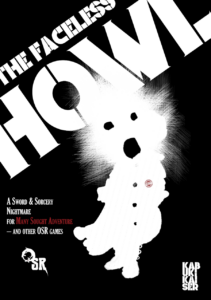
By Patrice Crespy
Kabuki Kaiser
OSR
Levels 1-4
It was bound to happen. Too many relics. Too many books. Too much past stacked in one place, the Monument Valley of scrolls and mouldy tomes. The Lucubrarium of Unobsolescence has gone wrong. In Bec–de–Corbin nearby, folk forget their names mid–sentence. Chalk–pale, traits blurred by scratches and hollow wrinkles, eyes sunk. Static. Howls in the night. The militia still stands at the keep and demands tolls, then forgets what it’s doing. The rain just won’t stop. Thugs move in, bold as daylight. And when night comes, the lights go out.
This 44 page digest adventure uses seven or eight pages to describe about forty locations in a town and in a two level library/abbey. You can tell what it is trying to do, but in spite of some great specificity it mostly fails to create the environment it is going for.
There’s this library place, including relics, with a small town around it. Some kind of memory eater/void monster shows up and people start forgetting their names. Some of them no longer have faces. Others are worse, their heads a ragged black blob and howling continually. You show up in town, make it to the library/abbey, and … do whatever. Loot the place for relics I guess.
Kabuki has some decent ideas and can conjure up some great imagery. The whole “forget your own name” is a nice touch. The ragged face monsters and howling and so on are quite appealing to me, personally (ever since The Void supplement for 3.0, I was captivated by it. Who doesn’t love Munch? At one point one of the random atmosphere tables has “A white noble dress fit for a young lady, nailed to a wall, torn. THAT’S NOT ME, written across the chest in coal.” Well now, that’s a statement, isn’t it? There are little bits and pieces of shit like this scattered throughout that are just great imagery.
Let us transition somewhat to the following entry. This particular location is a part of the “in town” section. “Falkenrot Manor Earl Falkenrot’s a ghoul — kept secret for ages by his family. When the Faceless came, they wandered off and left him here, locked down in the cellar. Half– Faced, black pits for eyes, ravenous.” Nice concept. Decent ghoul description. Mostly backstory. As a concept for something it’s great. As an actual place, meant to adventure in, it’s pretty lousy. And there is A LOT of this.
The town map is irrelevant, just a kind of conceptual thing with some numbers on buildings. The descriptions are short and=, again, just concepts. “Watchtower Deserted. An alarm fire atop has been spent. Did anyone see it?” Well I don’t know, did they? Are there consequences one way or another to that?
That bit at the end, it’s some kind of hipster pretension. And THAT absolutely IS prevalent everywhere. The whole “let’s put in a meaningless question under the pretext of giving the DM possibilities!” There’s a forest wolf encounter. The wolves are hungry and want to steal food and run off, mostly. That’s great! Except we also get “No food, they come in.’ This is supposed to, I think, convey a sense of menace. It does not. Nearby this, in a description meant to be atmospheric, about the journey to the town, it ends with something meant to convey the inclusion of the party in the description. “Chatter about the heist, maps, treasure. Or dead silence. Up to the table.” Why, yes, it is up to the table. But also, what’s with the sentence “Up tp the table?” Ol Craig used a cut down sentence, with dropped words and fragments, in order to save space. Space clearly isn’t an issue here given the ‘luxurious’ room given to simple tables. A couple of pages for “Which of the six howlers show up” could be compressed to maybe six short sentences. Or, the text implies that only three howlers exist, so, perhaps not having a table at all? This sort of needless randomness drives me crazy; an adventure is almost always better when the locales are themed around the specifics of a creature rather than just giving a random determination, for these sorts of encounters.
And how about those dungeon rooms? “Portcullis: Disjointed and stuck shut. S7 STR with up to 4 characters adding their STR to lift/bend. One attempt only.” Great! That’s how we get those thirtyish rooms down into the quite small page count devoted to locations, with the bulk of the text being other tables. The interactivity here boils down to finding, say, the wormacide that helps you fight the giant bookworms, or being confident in answering a forgetful sphinx’s riddles.
Not Kabuki’s best work. It feels like it needs another couple of polishes to make everything come together and work as a cohesive whole. Better integration of the various major enemy groups, and a more solid effort in brining out the … joylessness? Melancholy? The forgetful nature of things.
This is $5 at DriveThru.The preview really shows off the worse parts of the adventures, the sparse table nature. Things change, the text style and descriptive style, deeper in and that, being the bulk of the adventure, is where the preview should have focused.
https://www.drivethrurpg.com/en/product/556896/the-faceless-howl?1892600

