
By Xapur
Self Published
OSE
Level: NONE
A long time ago, a legendary hunter lived in the forest near a small village. He was ruthless and cruel, and delighted in tracking and killing dangerous foes and monsters. No, you have to find a missing son. Will you dare explore the Halls of the Hell Hunter?
This six page adventure uses about two pages to describe eighteen rooms in a tomb. It relies on abstracted descriptions and a minimalism style. This causes it to come off as a rather generic and unmemorable adventure with little to recommend.
On the plus side, the entries are terse. No hunting for information here …
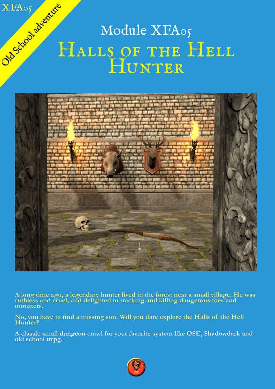
This is an EASL adventure, so I get to be an asshat here, making assumptions about someone whose english is far far better than any of the other languages I speak. But, also, the adventure borders on being illegible., Looking at the cover, the text on it is in white, with a black outline, on a blue background. It just looks blurry to me. And continuing inside, I’m not sure what it is, the kerning maybe? In any event it, also, looks somewhat blurry to me. Like the letters are bleeding in to each other. And then the map. We’re trying to do some fancy shit there with the grid and so on. But again it comes off small and hard to read. And the key numbers are in a light blue font with a light stroke weight. You’ll be hunting to find them on the map. Legibility is, perhaps, the very first thing on the adventure checklist. In order to run the adventure you have to actually be able to READ the adventure. I guess people think that the font they select is going to look cool. I don’t know. Maybe? But also it has to be readable and in far too many cases I see a font choice result in legibility issues and I seldom if ever think that the unusual font choice is cool, outside of a handout. I’m sure folks will argue that you can have an aesthetically pleasing thing to look at and be legible. And I’m sure that’s a correct statement. Just as I’m sure that if you’re picking a cool font you have deluded yourself in to thinking that its perfectly legible.
On to the background and intro! The setup here is that a legendary hunter lived in a forest near a small village. Hmmm, sound familiar? Yes, the marketing blurb is the intro. It’s repeated, of course, but go read it again. It is abstracted, yes? Exactly like one would expect in a marketing blurb. Except the actual background is just as abstracted. There is ZERO specificity here, even of the piss poor variety found in most adventures. “A mother for the village needs help: her young son has disappeared in the forest, searching for the famous tomb. The party has a mission: find the kid…” That’s your specificity. There is NOTHING here more specific than that in all of the background or intro. Hmmm, no, “legendary hunter” was killed by a green dragon. It’s irrelevant, but, also, I guess it is specific.
Lets hit the room keys, shall we? “The body of a young male human lies on the ground. He has been killed by a stone arrow. A mother will cry.” Well, props, I guess, for putting the pretext in the first room of the dungeon. But, how about: “A room dedicated to Dralena, the goddess of the hunt. The walls are decorated with decrepit tapestries of rural scenes and wild animals (stags, boars, foxes…).” This is not sterling writing. I’m not even sure what style to call it. Minimalistic, I guess.
There’s an almost obsessive lack of detail of detail here. “In the altar, a hidden cache contains a magical hunter’s dagger.” What kind of magic dagger/ What does it do? No idea. And no stats of ANY kind are present AT ALL. Not even Ye Old Skill Check DC 16. “Weakened stalactites can fall from the ceiling, especially if there is noise in the vicinity.”
These are all concepts. Its what you might jot down in the middle of the night, or on the drive to work, to remind you of an idea to expand upon further. But they are not expanded upon. The abstracted idea, the conceptual, barely that, is all that is described.
Specificity is the soul of the narrative. Don’t drone on in detail, but instead carefully select the important bits to be specific about. That’s what brings lifes to an adventure.
This is $1 at DriveThru. The preview is three pages and shows you the map and some room keys, so, good preview.
https://www.drivethrurpg.com/en/product/512435/halls-of-the-hell-hunter?1892600
From the preview: “I am a french GM”.
As established before, adventure written by non-native speakers normally gravitate towards an ostentatiously florid verbiage and MUCHO TEXTO. This is a rare but still noticeable minority, employing limited vocabulary and beige prose.
On a side note, *organic* diversity in the hobby is a good thing. We absolutely need more adventures written by non-Anglos. This one has promise, I kinda dig the whole “not-Artemis temple filled with hunting trophies” thing.
I completely agree in the conceptual sense. Concepts are cheap and easy, of course. I applaud this author for the attempt in either/any language. But – there is always a but – he needs a boxing coach or a music instructor or whatever to step in and ask if he wants to be serious about the craft. If so, he needs some guidance in the fundamentals. A clear vision for the adventure, engaging and/but concise presentation, and a second and third opinion on that cover. I think he has the right energy. He needs to focus it with qualified guidance.
You can throw a guitar down the stairs and make noise.
Also I don’t think anyone comes on this site and whips a guy just to watch him twitch. Even flawed work takes work. Everyone can respect that.
If an author/designer (what the fuck are these guys, anyway?) really wants to receive hard-won and pedigreed exchange about their work, this is the place to present themselves. Just like in boxing: you might get a bit hurt, but we won’t let you get injured. Injury comes from a lack of fundamentals. Start there. At the footwork.
“But – there is always a but – he needs a boxing coach or a music instructor or whatever to step in and ask if he wants to be serious about the craft.”
I believe they call such a person an “editor.” The work would benefit from an editor. Not even a professional, just somebody who is fluent in English and knows how to write.
Yes, an editor, but I would actually split the hair a bit further and step into a true “Instructor” of sorts.
Here’s why: the editor is going to butcher and boil, and maybe make some suggestions about adding content to deepen atmosphere or specificity, etc.
That would be how the editor earns his money, for that project.
An instructor of sorts takes the extra time (he gets paid for it) to demonstrate how to write and capture an atmosphere, and transitions and blah blah to develop an entire landscape, so that the author can use the skills going forward on subsequent projects. It is a kind of cultivation toward fighting a Puncher versus a Slugger versus a Boxer versus a Pointer with a long reach and good footwork . . . Mr. Author, are you intending to do this for money, or mere vanity?
The split hair should develop his skills toward future projects rather than simply butchering and boiling the current mess into something viable. If – if – he is playing for money.
It is a minor minor twist of the compass from Edit to Instruction. I am often wrong.
Stuff like a magic hunter’s dagger with no further qualification can’t help but make me suspect AI.
Perhaps that’s unfair. But even if it’s not AI you have to do better than AI.
According to the the DriveThruRPG page, the creation method is “Handcrafted.”
That settles it then!
Thats a truly poor cover.
The color grabs me because of my unnatural creepy-fondness for The Secret of Bone Hill. The rest looks more like a kind of template for playing cards than a cover of anything.
Looks like a screengrab from a DOS-era game cutscene. I actually kinda dig it – gives a vibe that takes me right back to the early ’90s.
Makes for a shitty adventure module cover though.
Well if your loved ones are bugging you for a present:
https://www.etsy.com/uk/listing/1047262536/classic-add-module-l1-the-secret-of-bone
Fun title!
The specificity vs abstract issue isn’t a language thing, it’s a not knowing how to write well thing. Not even knowing the basic fundamental rules of good writing.
The amount of people who think writing a module is “tell people your adventure idea” is staggering.