
By Stephen Smith
Mister Smith Design
BECMI
Levels 1-3
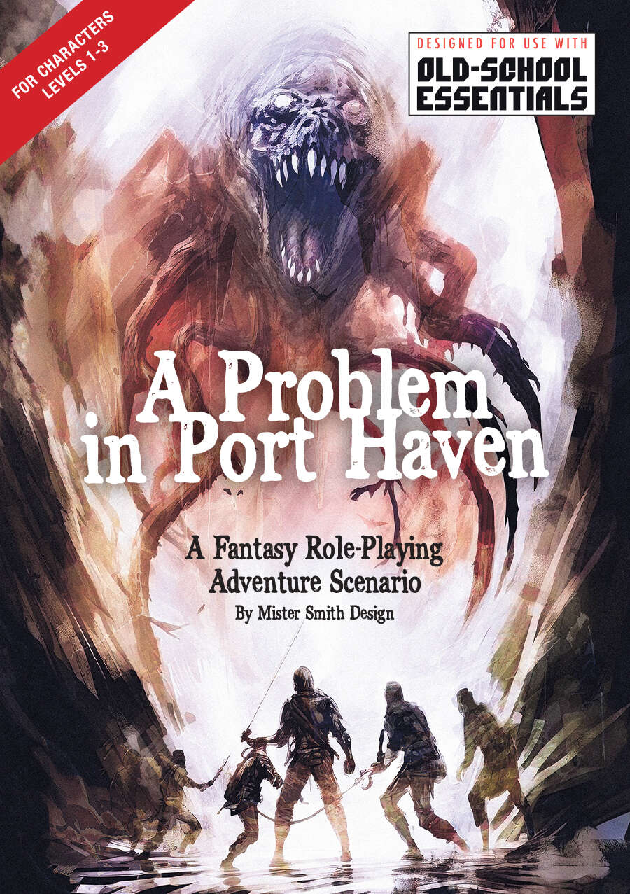
A peaceful village of fisher folk and artisans. A friendly community safely perched high above the raging sea. On the surface life is grand, but who knows what trouble lies below?
This 54 page supplement details a small seaside village and an even small cave/dungeon, using eight pages to describe about fifteen rooms in it. There’s an ability here, to describe a decent scene, but it’s squandered on a weird disconnect between the vibe of the room and the DM notes for the room. I’m not mad at this, just a little puzzled at what it’s trying to do.
Nice production values on this, with clear easy to read maps of the dungeon and a layout style that is not overly busy but does a decent job of focusing the attention. This is combined with some art that I don’t hate and in some cases kind of love, but I can recognize that some effort was spent on it and making it try to fit in to the vibe. And I say all of this and lead off the review with it because I was fully expecting a load of garbage. Those things, plus the obligatory background story/boring page, plus all of the title page crap didn’t get me in a place where I was expecting something good. And then the hooks started in, with the usual variations of “you are hired to …” … I was pretty much dreading what was coming. And then I got to the missing child hook. Where mayor dickcheese offers to replenish your food supplies if you find the missing kid they think went in to the old sea cave below. And that hook ends with “ (SPOILER ALERT: Little Timmie was hiding in the tool shed the whole time).” Woah … ok. The kids name is Timmy and he’s in the shed while the party is getting gutted? That’s my kind of twist! Things are looking up!
The next set of pages is devoted to the small village, its places and people. This goes on WAY too long. But, also, it’s going on too long in a weird way. So, the map of the village is keyed, which doesn’t help much, you have to refer back to the text to find out where something is on the map. And the various buildings/businesses don’t really get much of a description at all. Just a sentence or two. Props for not droning on, but those descriptions are VERY generic and don’t really say anything at all interesting about the place. So, then, what’s the point of the description? Let’s take this one “1. Fishmonger — fresh, smoked, dried, and salted fish, scallops, shellfish.” Did that add anything to the description of “Fishmonger?” And while it’s a single sentence, a few others go on for two or three or one long one. But they don’t really add any value to anything. Except, then, you run across “Naturopath — Ocean based dietary aids for allergies, headaches, fatigue, chronic pain, sleep and digestive disorders.” Well … ok. I’m noticing a trend here, of the designer slipping in, slyly, some pretty good shit. But, also, there’s a tackle shop, with a description? What’s the purpose of that?
And then there’s quite the long section of the people in the town. Again, this is mostly bullshitty useless padding, telling ups in a sentence or three why this person is the typical generic fantasy villager. And then we get to “Ongoing lunch feud with a pelican.” or “They and their twin always dress exactly alike” or “practices flirting with seagulls.” That fucking shit is great! That’s what I’m buying a D&D supplement for! I don’t give a fuck about generic bustling fantasy tavern. But the barmaid learns her flirting skills by practicing on gulls? GOLD! And the fucking thing takes a turn here. Every NPC in the village has this kind of shit for them. It’s great! It’s just like Pembrocktonshire, except the fucking entries are padded out uselessly and it takes far more space, thanks to that clear formatting/layout, to cram in the same amount of people.
The dungeon is about fifteen rooms, half sea caves and half carved out. The descriptions here range from ok to useless. The first entrance room is ok “On approach of this hollowed fissure, the sound of the crashing waves echo against the sheer rock face. Although once much larger, the passage is now choked with rubble. The gap is low, narrow, and just wide enough for one person to enter at a time. The rocky walls are slick with saltwater and the tangy odor of brine fills the air.” I get what the designer is going for, and it’s an ok job. The “Although once larger” thing is cumbersome, and the entire thing could be edited to get that vibe across a little better. But, also, it’s not terrible at all. Each room has something like that, not exactly read aloud, but more communicating things to the DM. Which is generally fine. Until we get to something like “K) The Morgue Several stone slabs serve as a temporary holding space for the recently deceased. Presently empty” Supposed to fire my imagination? Indeed DEVO, he doesn’t smoke the same cigarettes as me.
What follows, after this little not-read-aloud text, is something called “DM Insights”, for each room. This would be your DM text. For that Mortuary room it says “Shadows. (see Bestiary on pg 41) Treasure: Potion of Diminution” And this is the major disconnect I’m having. I don’t understand this. That room, in particular, is essentially as minimally keyed as Vampire Queen. The others do have a bit more description to them, but the DM Insights are almost always this kind of minimal keying. It’s more than a little rattling to come across, and I’m not sure why. It feels disconnected from each other. As if the room proper and the monster/loot somehow are not integrated at all. There are hints, here and there, of things. One room, wet, has a milky substance spread out in it … and it turns out there are giant spiders in the DM Insights section. So, sure, I guess that ties the two together? I kind of get what the designer is going for … a strong enough initial section and then a DM section that just clarifies things. I don’t think, though, that the initial sections are really strong enough on their own.
I might say that I can draw parallels to the dungeon as a whole and the town also. The sea saves turn in to a mortuary complex, turn in to a temple for Deep Ones. It’s a kind of linear map (but with monster names on it for reaction purposes. Yeah) But the entire thing feels pretty disconnected from each other. Not like you are in zones but rather “and then heres the mortuary complex!” for some reason. And, then, the inclusion of the town, or, rather, the amount of length spent on the town description. That’s a lot of text to support a small fifteen room dungeon (with some 5HD bosses in it …) It just feels like things are disconnected to each other and that they don’t vibe well … it’s not as blatant as a funhouse dungeon, but it sticks out.
This would have been MUCH better concentrating on the unique parts and minimizing the “typical fantasy” parts. A better integration both in the dungeon format, the dungeon proper, and the dungeons relation to the town. There is clearly a sly wink attitude here, which is wonderful, and the ability to turn a phrase to describe something. But the rest of it falls down. It’s not terrible, but I’m not sure why I would select this to play.
This is $8 at DriveThru. The preview is eighteen pages with a great selection of town, dungeon, and bestiary. Great preview!
https://www.drivethrurpg.com/en/product/479070/a-problem-in-port-haven?1892600