
By Daedalus
No Artpunk #2
1e
Levels 2-4
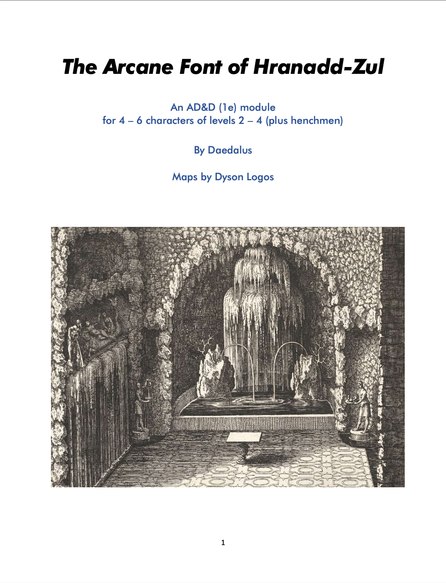
A MAGIC POOL grants knowledge of arcane spells to anyone who bathes at the full moon but in exchange, the bather’s physical and mental abilities are slowly depleted.
This 25 page adventure uses about nine pages to describe a dungeon with about 25 rooms. Good interactivity, for its size, with smatterings of good descriptions are detracted by a large amount of whitespace. Packs a decent punch in a wrapping that only a mother could love.
So, what do I mean by all of that? What we have here is what could be called, in Bryce jargon, a real dungeon. It’s got creatures, tricks, traps, and secrets to unlock. Interactivity, factions, and varied terrain. All of the great elements that surround and contribute to a great dungeon crawl. It’s got one of the better Dyson maps. Caves, rooms, same level stairs, a bridge over a chasm to cross, secret doors and statues all show up on the map, contributing to a vibe that is more than a simple map. And it noted major features on the map, along with a wanderers table, to help support the DM in play. My only complaint here, with the map, is that it feels rather constrained. As if the dungeon should be a bit larger. It’s not like the rooms are on top of each other, generally, but that it feels like it needs one more breathe ot two to really give it the expanse that a good dungeon needs. 25 rooms is no slouch of a five roomer, but the size makes it feel more like a good dungeon at the end of an investigation, rather than something that stands on its own.
I’m a big fan of the interactivity in this one. The place is chock full of stuff without it seeming like its full of set pieces. You’ve got a statue, pointing, in one of the first rooms. There’s a double dose here. Not only does the pointing statue involve some interaction, but, it also provides a hint to puzzles deeper in the dungeon. Another room, full of broken up furniture has an intact weapons rack in remarkably good shape. A mimic. And that’s something this dungeon does very well indeed: providing clues for the player that is paying attention. Bodies and abandoned campsites provide clues and hints as to what is going on. It ramps up the tension to find a dead body, and what killed it. The players get a bit worried. And are prepared for whats coming … if they care to pay attention. And this dungeon does that over and over again. It’s never hitting you over the head with it, but it seems natural. Really well done.
And the other encounters, not falling in to this category of hints and puzzles/traps, tend to the more interesting side as well. Ye Olde Bridge Over The Chasm has spiders in webs, high above, providing a nice little encounter. And the creatures in the dungeon, the intelligent ones, have some goals an motivations. SOme things going on with them that the players could exploit. Never going too far, and not really forcing that interactivity on to the players, but it’s there for the DM, in their motivations, should the players try and do a good job of not just stabbing.
Descriptions are hit or miss. Out first room is the entrance, of course, an opening in a low escarpment outside. A simple worked limestone post and lintel frame without a door. Weathered carvings on it. A dark cool and silent interior. That’s not bad. It’s also, I think, one of the best descriptions. So, good job with your mythic underworld entrance, but, things do tend to fall down after that. Simple facts with few appeals to imagery. It really needs more in this area.
And it’s not helped by the god awful formatting. Two column, with a lot of the rooms taking a full column. This isn’t necessarily wordiness, but rather large margins and line spacing. There’s too much in the wat ot bolding, underlines, and bullets. It’s too much to take in at once. There’s an attempt to follow a rough outline for a room, noting general features up front and then going in to more detail in the bullets, but the spacing, and degree of formatting, is just too much to follow easily.
This is a real dungeon. Or, at least as much as one can say that in 25 rooms. I’m not find of the lack of interesting descriptions, and the format is a mess to comprehend text with. But, the interactivity here, the understanding of what a dungeon should and should not be, is all here. That is pretty rare, indeed. But these days you don’t get to the Bryce Best list unless you’re firing on all chambers. (Which is a lie, I’m a hypocrite, but, whatever.) Nice to see this one.
Hah! Well deserved. As a bonus, Daedalus was also the winner of a custom made Buddyscott Entertainment T-shirt Auction, with the proceeds being added to the charity. I need to post that pic when I wrap up the NAP II charity because it is quite something.
Bryce should review his best list. there’s a lot of bullshit in there.
Here’s an idea. Start your own blog and do that. Oh wait, you won’t. That would require real effort and not just spouting needlessly confrontational garbage you pulled out of your ass, like you just did on this blog.
You should take bryce’s middle finger of vecna off your own ass before posting nonsense. Just a thought.
If that’s an example of your typical thoughts, check your brain. It ain’t working well
Where is the thumb up button when we need it?
Don’t think of the tags as absolute. Adventures took “the best” at the time of review may had gotten another tag 2 years ago or 2 years from now. People change, certain standards change, designs evolve. So I like to think “the best” as adventures Bryce thought deserving of the tag at the time of the review. That’s it. Good adventures.
Seems like a bit of a cope. But the important part of a review is the review itself anyway.
Thanks for the review, Bryce! It’s true that design and layout are not my strong suits – for example, that’s why I used a borrowed map. I also think I fell between two stools of simple bullet point layout on the one hand and nostalgia for ye goode olde glory days of TSR modules with the two-column layout, mimicking the TSR font, etc. on the other. But I’m happy to read you think I’m getting the content right, even if the descriptions need to be more evocative. Since this was my first published adventure, I’m happy with No Regerts. Cheers!
Try drawing your own maps. The only way to get good at it is to keep doing it. I know it’s tempting to just go out there and grab a Dyson map and yes some of his stuff is quite good but too many people do that these days and it leads to a sameness in products. Map drawing is fun. (really, it is) It doesn’t have to be “artistic” like so many of those map drawers who put their stuff up for use. Try it sometime.
Thanks for the encouragement. Maps are my favourite part of any module and are often the single element that brings a module alive for me. The Arcane Font was inspired by looking at that Dyson map and wondering what went on there. Conversely, my NAP III entry stalled and then was never completed because I was trying to do the maps myself, but just couldn’t get them right. As you urge, I need to deliberately set time aside to practice and get better…
I disagree with the person you’re replying to. Maps SHOULD be re-used. It’s a waste of time and energy to make a new map for every adventure. The whole point of the numeric key is to allow the same map to be used with different content! Dyson’s maps were one of the best innovations of the OSR. (Not to say his maps themselves are that good–talking about the idea of a collection of decent maps free for use and reuse)
Also “it leads to samey products” — uh maybe for the person reading the adventure because of the recognizable art style, but I’d very surprised if a player has ever recognized they’re in a Dyson map. We care about the play experience more than the reading experience here right?
Utter bullshit. Instead of taking the easy way out and using someone elses map, make it yourself. Reusing maps is lazy and the last thing we need in adventures is laziness. It’s hardly a waste of time and energy. it’s an essential part of adventure creation.
My vote’s also on using your own maps if you can for publication purposes. How the encounters connect to eachother is going to be dictated largely by the geometry. Using Dyson maps in your sandbox is fine.
Agree in general, but I will also note that if you’re using his commercial maps his extremely generous license means you’re welcome to bend, fold, and otherwise modify them to fit your purposes too. I’d hate for quality submissions like the Arcane Font here to not get turned in just because of mapping discomfort.
Sure, but the only way to combat mapping discomfort is to start drawing maps. There’s no question that Dyson is filling a need and as I said above, he does do nice work. I just object to the number of products that feature his maps. I truly wish more people would construct their own maps instead of relying on someone else. Of course, in this age of AI, all we’re going to see is more and more people trying to take the easy way out and let technology and/or others do all the work for them.
That is so. My preference is a preference only. It is not illegal to use Dyson maps.
Well done! Congratulations!
Thanks!