
By G Edward Patterson III
The Skull as a Complete Gentleman Company
S&W
Levels 1-4
This 73 page booklet describes a town and then also a small, dozen-ish room dungeon. The town is absurd, in the best way possible for D&D. Idiosyncratic and full of things to amuse yourself with between dungeoncrawls. The dungeon is fine, turning in tone a bit more serious, as it should be. And, everything is ruined because the thing is unusable because the designer decided to fill the entire fucking with a selection of hard to read fonts. A great supplement, that is unusable.
We’re gonna cover this FUCKING FONT ISSUE. I can’t fucking stand this shit. “Ooo, Bryce cares too much about usability and not enough about design.” Yeah, fuck you man. Look, I’ve only reviewed a small percentage of adventures released over the last few years. And yet there are at least a hundred on my Best of list. You could play these fucking things for the rest of your fucking miserable fucking lives. Why, on gods green earth, would I EVER torture myself in order to run something that I have to fucking flagellate myself to fucking use? THE NUMBER ONE FUCKING COMPLAINT OF ADVENTURES IS THAT THEY ARE HARD TO USE. Don’t be a fucking idiot and make your fucking adventure hard to use.
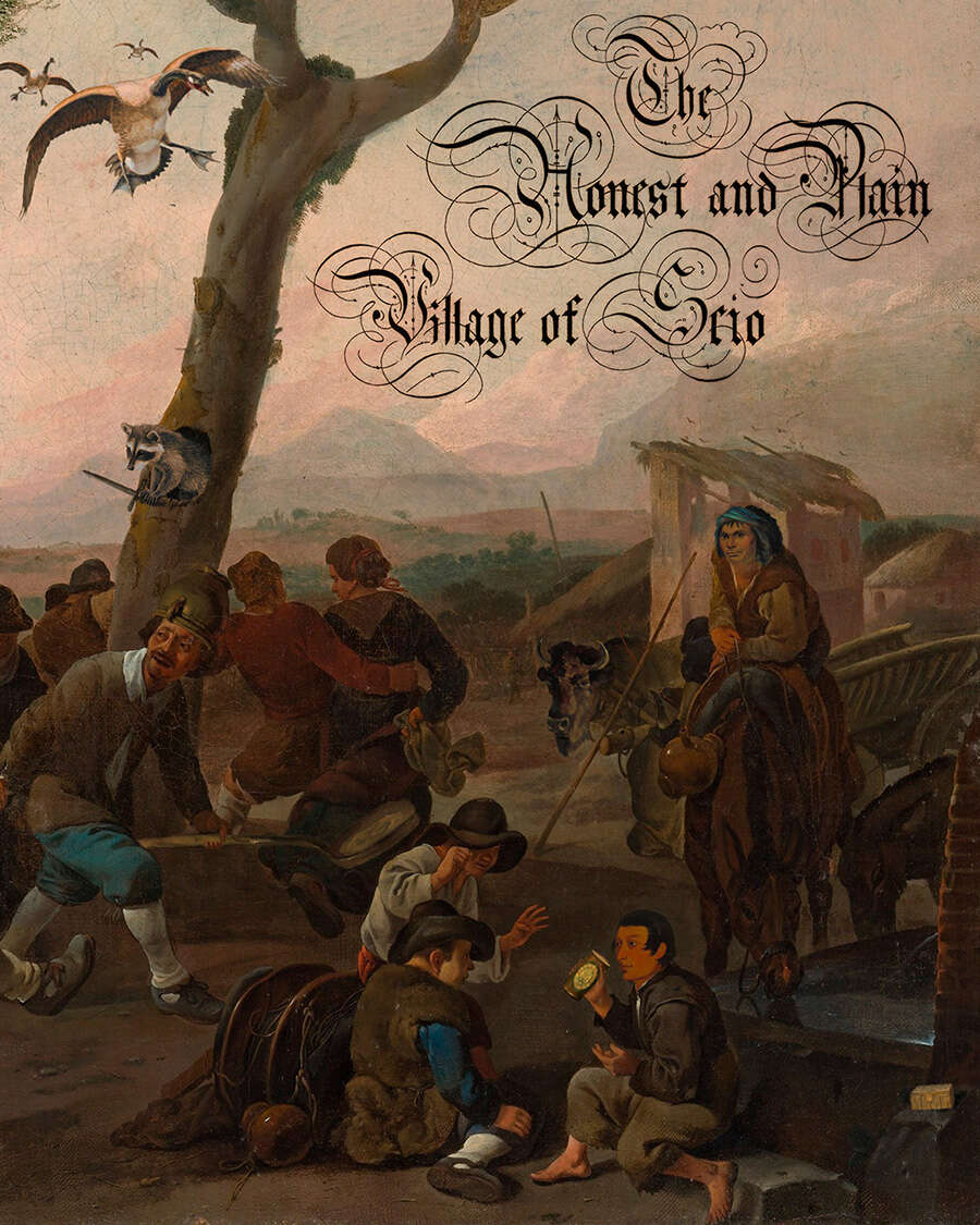
So, this thing is trying for some product image of some branding “the skull as a complete gentleman company” or some shit. And thus the designer has deigned to fill the fucking thing with some unusual font selections. Some kind of gothic cursive? Illuminated manuscript? I don’t fucking know. “Fucking Illegible” is what it shows up as in Word. So, the main body of the text, being the most legible, just has a font that is full of curly-q endings and shit. Then the section headings have some kind of illuminated-ish or gothic font. This is fucking bad enough that it takes my brain more than a few seconds to struggle through figuring out what the fuck the heading says. Like which fucking business the following text describes. I had to actually copy/paste one section heading in to a text document so I could figure the fuck out what it fucking said. Summary sections, for a person, place,e tc are a few sentences long and are at the tope where they should be. In italics. Sorry, no, in the italics version of the fucking curly-q font.
I’m not putting the fuck up with it. This thing is going on the trash heap, just like so many fucking others have. That’s right, all the fucking effort you put in to this causes it to end up in exactly the same fucking place as BloodyMage or Alfonso or the fucking rip off artists. The don’t give any fucks at all about your content … BECAUSE I CANT FUCKING DECIPHER IT!
That having been said, the content is magnificent. ?
The town is my kind of place. While I like my dungeons tending to the more serious side (with some absurdist situations) I like my towns and villages to tend towards the absurdist side of things with some serious situations. Ankh Morpork. A place full of hucksters and morons. With a rather fatalistic “adventurer” street people eat, drink, fuck, bet, and have a good time … because tomorrow they may die. And this city gets close to that.
It’s got absurdism. Like a flock of wild geese on the wanderers table. And a dude, in a separate location, called the goosemaster who “can speak a small amount of conversational goose.” (Note the use of the modifier “conversational” in that sentence. It adds a lot to the ambiance, yes? That’s good writing right there!”) There’s a table of petty businesses, which has as an entry “2. Carver of Knobs – ‘My true passion is shelving!’” That’s it. Absurd. And you can fucking run that fucking entry! Thats what I mean by the DM something to hang their fucking hat on! The dude that sells sticks/kindling does so with a call of “The finest sticks in all of Ouaricon”. Disrespect him and he offers you an exclusive deal: a branch from the golden tiny-apple bush which has ultramundane properties that reveal themselves to the person who possess it.’ If you agree, he tells you to come to the same spot at midnight. Where you are attacked by the thugs he sells you out to because you are clearly fucking morons who need to be relieved of their fucking money. Absolfuckinglutly!
So, usability wise, it could use a few more cross-references and putting some page numbers on the “map” of the town.
The dungeon at the end, a kind of point-crawl also-ran, has … fifteen rooms? I don’t know. They are not numbered and its laid out in a pointcrawl style, so one room tells you where to go fort the next room. With no fucking page references. We’re getting a little too fucking cute for our own fucking good here. Put some fucking numbers on it so I know if Mumified Garden is likely to be the page before or AFTER the page I’m currently fucking on. Otherwise, same shit. Too much italics. Fancy fucking font shit. Decent use of bullets and para breaks, and the interactivity is nice, if a little less exuberant. A little overemphasis on bring words, like Large and Small. But, it’s pretty much decent enough. At least it would e if it weren’t formatted/fonted in a cute way. Right now it’s just too busy. But, hey, lots and lots of interactivity, at least of the kind that fifteen room dungeons can have.
Monsters, in the appendix, are decent, but could use a little more emphasis on their descriptions, higher up in the text block. You want the visceral feel of a monster, and it’s lacking.
So, good example in this one of different text styles needed for different parts of an adventure. The town gets one thing. The dungeon needs another tone and style, and the monster descriptions yet something else. One size does not fit all in adventures …
I’d slap a Best Of on this, except for the font crap. Yeah, even though it’s not an adventure and I’m a little suspect that the adventure is a little more “victorian gentleman” than I’d prefer. It’s a rocking town setting with a possibility of becoming the one I use most, up with Pembrocktonshire and the one I can never spell correctly. But, with that font shit and little finger arrows as bullets? Absolutely the fuck not. I don’t give a fuck about using your content if I can’t actually use your content.
This is $5 at DriveThru.Preview is sixteen pages, and is a good one. CHeck out page seven for some eye glazing action and page five for some great wanderers.
There goes the last great American dynasty
https://www.drivethrurpg.com/product/419925/The-Honest-and-Plain-Village-of-Scio?1892600
Maybe its the fact that I fry my eyes daily interpreting hand-written cursive deeds from the 1800s, but I had no problems reading that. Seems like a nice piece for my Dolmenwood game.
From what I can tell, something like 3/4 of people read blackletter clearly, but it’s a puzzle for the other 1/4. Not sure what the reason is, but I think having experience reading old books isn’t the full story.
This is not an exaggeration at all: I have three times now encountered Milennial attorneys who struggle reading cursive. In one case, the attorney had to have entire documents reproduced in Word (like Bryce did). To a certain extent, I think, it is generational. Cursive writing isn’t taught anymore, exposure to writing that isn’t on screen or the result of laser printers seems to be less and less each year.
ultimately it only took me like 2 days to do the accessible version, and i already got some really positive feedback from a DM that has to use assistive software to read. so i am happy to make a version that i like visually and one for easy reading.
Humble brag.
I’ve checked out the preview. The blackletter is a little too over-decorated with all the extra swirls. It would work better as a plain-er version of blackletter. The other two typefaces are, like, fine.
The village sounds nice. I would use that. The “point crawl” type dungeon can die in a fire. I’m on the fence for this one.
I feel like submitting this in Arial Font for the next context as a joke.
There is an accessible version available, 12 point, single column, no blackletter fonts, no “tables” (for assistive reader software). Basically, tablet optimized; it has a few more dynamic pdf features than the version designed to be printed out.
Bryce, i think you should revise your rating since there is a “cleanly formatted” file as well…
I looked at the preview… no real issues with usability or reading for me.
The italics are *slightly* annoying but it’s not like there are blocks of it or it took me more than a 1 second pause and a squint to adjust…
Little bit more review on the dungeon would have been of interest.
Who will start a GoFundMe to get grampy old Bryce some new bifocals?
Show respect to your elders and betters please.
Only if you repost this in Blackletter
Where is that
Link
Many of us need Readers Digest large print versions. Should be a regular option on DTRPG. It’d be nice to see more +2 dentures in adventures too.
I would settle for a greater selection of magical ointments
==BRUCE SAYS== We’re gonna cover this FUCKING FONT ISSUE. I can’t fucking stand this shit.
I like Bringhurst’s The Elements Of Typographic Style.
Bruce’s gut feeling for presentation reminds my of BLM.