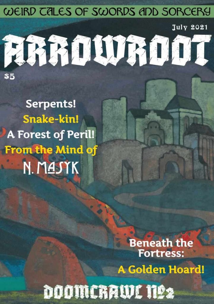
By N. Masyk
Monkey's Paw Games
OSR
Level ?
“Hail, Agkaman! Hail, the conquering hero! Hail, slayer of accursed serpents! A giant is he; panoply of burnished gold, so heavy that three men together would be buried by the immensity of its weight! A warrior is he; his sword so broad that held aloft it blots out both suns! Hail, the Agkaman, who scoured these lands of the hated snake-kin and took from them their glittering hoard, now the wealth and power of Evech! Hail, the Satrap! Hail the Golden King!”
*Sigh*
This nineteen page digest “adventure” contains a two page dungeon with ten rooms and some fluff for a city and the surrounding hexes. It falls in to the category of “Yet another inspiration product masquerading as an adventure.” There’s not much here more than picking a Dungeon Dozen table or two. Excellent marketing here. Nice cover and a teaser description that draws me in and hooks me for $5.
So, some city, with four surrounding hexes. One of the hexes gets the description “River; once clear and cool, winding lazily through the lowlands. Now, dammed near to the fortress to provide better irrigation for Agkaman’s crops. Frequently patrolled by riders.” The others are like that. Ok, get inspired and run your game! The city gets the same amount of detail, for this is just a collection of tables with no real meat anywhere. The two page dungeon (one for the map and one for the ten encounters) falls in to the “more of the same” category for descriptions. A symmetrical map (Ug! Fuck that shit!) and then descriptions like “Entry Hall: d6 gold-armoured knights patrol here at all hours.” or “Wine cellar: Den of the elusive wine vampire.” There’s nothing fucking here. The encounters show promise, in the abstract, but without fleshing them out and making them work together it’s just the results of a random computerized encounter table. “Hey, here’s four words about something freaky.”
I shall, however, use this as an example of of gameable content for about half the table entries Do have some sort of gameable content … if they were present somewhere else and strung together in a meaningful way. Maybe a third of the tables in this are more than just trivia.
Trivia vs gameable content. What is that? I’m sure we’ve all encountered long and detailed descriptions of a vendors physical appearance and their backstory. This is almost always trivia. Having blue or green eyes is unlikely to drive any meaningful interaction in the game. Gameable content, though, will lead to something in the game. It doesn’t have to be something serious, but it will be something that sticks more than green/blue eyes.
Let’s look at the wanderers table in this, which might more accurately be called the “Hirelings” table. We get a sentence for appearance. Ok. We get a sentence for equipment. Ok. And then we get the zinger, something that solidifies the NPC. “Haunted by the memories of a past life.” or “Hunting a vampire that slew their mentor” or “Blames the gods for every misfortune.” This is the sort of specificity that really can bring a game alive.
The wandering creature table has hunters tracking a herd for three days, or nomads contemptuous of roof-dwellers. While interesting, they don’t actually LEAD to anything other than a conversation. We’re at a kind of middle-ground. While the NPC details spices them up, the encounter detail needs to drive TOWARDS something. It needs potential energy. Treasure falls in to the same category as the NPC’s. It exists and a purpose in the game (for the hirelinings, stabbing shit) and the extra spice can be more static. “Pristine serpent scale, solid gold & incredibly heavy.” or “Gilded canopic jars, filled to the brim with naphtha.” One merchant in town is an alive merchant … with nothing else, while a Traveller is looking for a fight and doesn’t care with who. You can feel the energy in one and know how to use it, while the other just IS. What’s the point of the olive merchant? Why write it up? It’s not adding anything to the game.
This is $5 at DriveThru. The preview is fifteen pages. It’s enough to get a sense of the mixed-bag of content. Just know that it’s ALL like that.
https://www.drivethrurpg.com/product/366779/Arrowroot?1892600

That IS a great cover.
Agreed!
Looking at that cover, I thought this was going to be a magazine like we could find on the grocery store racks as kids. I thought it would hold within its thick page-count multiple mini-campaigns each with a few dungeons, a complete town, and a sandbox of a couple dozen hexes or so.
Bryce was going to pick just one to review, and, if not a shoo-in for “The Best,” it was going to still rate at least a No Regerts. (Of course, Bryce was going to forget to tag it, so it was just going to have to wear that badge in my mind.)
Obviously, that was all in my imagination.
Instead, this is what we got.
The cover art is beautiful, but all those exclamation marks are a red flag for me.
How can a hex be surrounded by FOUR hexes? It’s the second page of the preview and it’s the worst thing since the linear hexcrawl in The Pit! Also, are those ad-looking things at the bottom in the paid version as well?
hooded jumpsuit