
By Dan Smith, Steven Kenson, Dave Woodrum, Dante Parti-Smith, Adam Steele, Anthony Constantino
Smif Ink Games
OSR
Level 1?
A compendium of OTR compatable adventures that can be used as a connected campaign or dropped into your existing campaign as one off adventures.
This 41 digest page compilation contains twelve dungeons by a mix of designers. They are roughly interconnected through some pretexts but are different enough, in theme and style, that they can also easily be standalone entries. With a mixed group of designers and, it seems, no storing editor, it is no surprise that the quality ranges from “bad” to “Shows some promise …”
I suspect these compilation products sell well but get played minimally. They seem to offer value but my own experiences with them is that their quality is all over the place, based on the designer for the particular section you’re on. Even with a very strong guiding hand (Fullteron on Hyquatious Vaults comes to mind… ) it can be jarring to see writing styles and/or quality change. And the editing hand on this one is not very strong, exacerbating the problem.
First a few general comments. The stronger entries here are from Dan Smith and Dave Woodrum, both of whom I gather from the intro are more established designers. It shows. Their entries, while flawed, show some clear indication of understanding certain design principles. I’m going to cover some of their entries in this volume, and make some generalized comments about the rest.
The font, layout and such reminds me of a GURPS supplement and, I think, Dan Smith may be the one responsible, as the project guide. His name sounds familiar and it may be that he did a portrait of me for one of the GURPS books back in the 90’s. The fontis a chunky one with, essentially, BOLD always on. This is not the best for legibility purposes. I find it tiring on the eyes and not a quick read. It’s not exactly unreadable, but its getting awfully close to the line of “too much effort to bother.” There seems to be this desire to apply a house style to products when, in fact, just picking a very legible font is almost always the right way to go; house style can be implemented in other ways.
The levels are VERY loosely interconnected. Essentially you get a in and an out for each other and maybe a note that this level level can be connected to the one above it. Thematically they tend to be worlds apart. We get a tavern and some jail cells, a cult HQ, a pill bug/harpy cave level, a mushroom forest, a strange cult city/lair, and so on. Even then, the first six or so dungeons are more closely connected than the last few, which explicitly say things like “a set of caves off of a trade route” or some such. The product has no table of contents or summary to orient a DM to the dungeons within; you just get to wade in and see if the theming matches what you want. They tend to all have a full page map and then between one to three pages to describe fifteen-ish rooms in the dungeon, plus or minus a few rooms, depending on the level. For a product claiming to be OSR, treasure, meaning Gold=XP, is EXTREMELY light. Enough so that they might as well have put none in. Each dungeon gets a little summary paragraph, describing whats going on, right after its map, and maybe some environment notes about light, smells, etc. These are great, and do exactly what they should: provide some overall atmosphere and give the DM a summary as to what is going on. I still think atmosphere should be on an “always on” page, like the map, but, whatever. They tried.
Dans first entry, The High Priestess Tavern, is one of the stronger examples. It doesn’t really start strong though, with a minimal pretext. Basically someones son has gone missing and you’re sent to the tavern to find them. In there you get in a bar fight and are captured, or find your way, to the basement jail cells. That’s about as much pretext as you get, a sentence or two, and then it’s GO TIME! Things improve in usability and style after this. We get a note that the tavern environment is “heavy mead/body odor, dusty floor, 60% light” which is enough to start placing an image in the DMs mind that can be expanded upon Other rooms gives us notes, at the very beginning of “(lit)”, letting us know an important environment condition. There are a good detail or two being present, like certain people in the bar having a right hand that is stained red. Descriptions are short, with the fifteen or so rooms all being described on two pages. Loud and boisterous guards, a drunk dwarf, a barkeep who wont leave the bar. A few personalities for the prisoners would have been nice, and kicking up the descriptive text another notch to be more evocative would also be in order (with adding substantially more words, of course.)
Woodrums first entry, as an example of his work, differs quite a bit. We get about another sentence of description per room and the evocative nature of the text is quite a bit weaker. But the interactivity does get quite a bit more. There are frescoes to look at and get clues from, magic pools, and the monsters tend to be engaged in something, like alchemical researchers shoving a boulder aside. The “scene” setups are quite good, even if the descriptions could use some work.
The other designers are far weaker. The dungeons tend to be just hacks, with things to kill (and the trap quivelant) and little else except, maybe, an environment thing like a river or something. “As you enter this room, it appears to be nothing more than an empty dirt filled room.” The “as you enter” implies a kind of hybrid read-aloud format, but the “As you enter” shows the weakness in writing, as does the “appears” stuff. Another designer has room after room of descriptions like “This area contains fungus nutritious to the monsters.” … a dazzling example of how abstracted descriptions ruin a dungeon. Still another likes to tell us what a room USED to be used for, or using meandering writing styles to get to the point.
Of special note here is Adam Steele. This appears to be his first and only entry in to designing something. He’s written a trog-cavern level which could appear as a short dungeon In Fight On! And not be too out of place. “A cascade of ledgers, papers and scrolls is strewn about, along with body parts and blood.” Nice! And he’s got the style of the little scene/vignette thing that WOodburn does in place also, with a trog impaled on a spear in the wall, or another having a tasty snack with some slaves. Still a little loose on the writing, especially the longer and more complex rooms (which I suspect suffer also from the Dan Smith bold/font style which obfuscates monsters stats and makes everything run together instead of the stats being a kind of aside.)
These are all, essentially two to three page dungeons, with one page being the map. They suffer from that. One pagers don’t have enough room to breathe. It would have been better to include fewer dungeons but give the ones that are included more room. I’m no stranger to stunt writing a dungeon, and little good comes from the final product, except, perhaps, in the mind of the designer, as a tool to learn focus.
I’m not a big fan of compilations. As I said, the quality tends to be all over the place. And, I never feel like I do the review justice. Should I write fifteen separate reviews for what are, essentially, fifteen one page dungeons? (Ok, one page of description and one page of map.) QUality tends to be all over the place, as it is in this one. This needed some more conceptual work, a better layout, an summary/table of contents, and stronger editor control over the content. “No! Do it again!”
This is $4 at DriveThru. The preview is six pages and shows you the first dungeon, the Tavern and jail cells underneath. It is one of the better ones in the compilation … so judge the book accordingly.
https://www.drivethrurpg.com/product/332605/First-Level-Dungeons?1892600
OTR Compatable? I’m in!
“I’m not a big fan of compilations. As I said, the quality tends to be all over the place. And, I never feel like I do the review justice. Should I write fifteen separate reviews for what are, essentially, fifteen one page dungeons?”
Nothing wrong with this review.
I was (as in formerly, not now) a big GURPS guy back in the day and Dan Smith was their most prolific artist. In what book did your sketch appear?
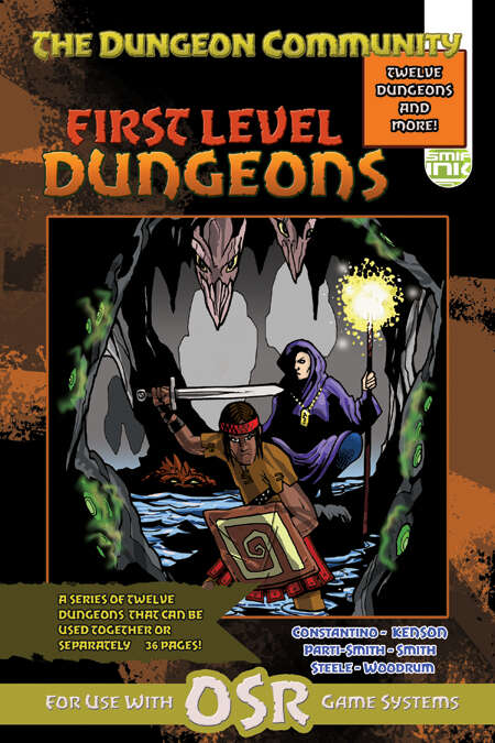
I appreciate what the cover is trying to go for.