
By Darren Brockes
Agony Song Games
Labyringth Lord Games/5e/Mork Borg/Trophy Gold
No Level. Recommend a fucking level Darren!
The mausoleum — called the Saints’ House — sits far out from a fort in low hills. Generally people avoid it; it is not a place of worship and no one mourns the saints who have passed, given death is necessary for the status of sainthood. However, that does not stop the rumors swirling in the fort: those men and women who do pilgrimage to the mausoleum return with healed wounds and hearts; blessed bones are found just inside, sold for a fortune; a priest wandering the halls who casts out the ruin from a weary traveler’s soul. All adventurers have pasts in need of atonement, whether for something small or large. As all who follow the saints know, the blood of a martyr is the only true forgiveness in this world. And you have decided to set foot in that mausoleum to seek it. Here is all you know: a true confession of what you seek atonement for, aloud, is the only way in. You will know when and where.
It’s four fucking pages, only two of which are real, for $4, with no preview and uses fancy fucking hard to read fonts. What the fuck doYOU think my summary of it should be?
Welcome to Train Wreck Tuesdays, written on a Sunday and published who the fucks knows when. Wednesday, maybe? Who knows, time no longer has meaning. In this occasional allerative series we find out just how fucking much of a hypocrite I am by examining works we would not otherwise. Besides, pickings are slim and I’m REALLY not in reviewing 100 page adventures right now, it would cut in to my Staring at the Sea Staring at the Sand time.
Bam! Here come ol flat top, cruising up slowly. Nice weirdo ruined cover, lets buy it! And then we look down to see $3! Great! And then we see it’s only four pages! Ought oh! Utopian hypocrisy time! Small things can be good. Well, I want to believe that small things can be good. And money? Bah! We’re in a post-consumerist society. It’s $3. If $4 is meaningful to you then you’ve got troubles.
The real reason, of course, is that we’re afraid. Because the price isn’t actually $3. The price is $100. And how can this be? I want to believe, and have said, that quality is worth paying for. Let’s say someone publishes a REALLY good 20 page adventure and prices it at, I don’t know, $50. “Woah!” We’d all look at that weird. But why? I mean, the price isn’t THAT unreasonable, is it? I mean, compared to going out to a first-run movie? And if you knew you’d get 3-4 sessions out of it and that it was good? But, of course, that’s not the case. A) It won’t be good. B) It won’t be 3-4 sessions. If I knew it was high quality and I could get multiple sessions out of it I would absolutely pay $50 for something. But, I mean, it’s not going to be good. Probably. But a boy can dream can’t he? Quality should be the determining factor for price, with a little bit of how many sessions thrown in. But designers all think they write like the demiurge and they all write like cold stinking shit. Well, not all, but it’s close enough to the truth to say its true. No one knows what they are doing.
And thus no, we are in a situation where you just EXPECT that whatever you buy is going to be crap. Isn’t that a great feeling? Knowing that you are burning your cash? And thus, if you buy, say, ten adventures at ten dollars each you might get one good one; spending $100 and becoming substantially more jaded in the process. What a world! What a world!
And thus we arrive, finally, at this adventure. It has no preview, so you can’t tell what you are buying before you are suckered out of your cash, once again. FOUR PAGES! That’s about how long Craigs adventures are, so it’s possible. But then you find out two of the pages are monster summary sheets. Exact copies of each other, one in white on black and one in black on white. Wow. What style. What grace. Avant Garde TO THE MAX. So, now we’re down to two pages. I nte that Agony Song has another adventure that is $3 .. and is only two pages, so this seems to be their schtick. Whatever.
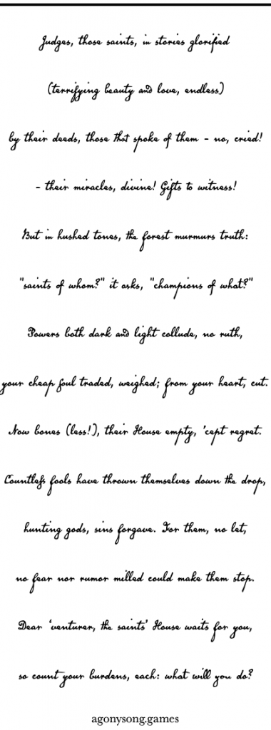
Ah, but then, the summary sheets are hard to read. Because they’ve used some bullshit artsy fucking font. I don’t know, that planescape font, maybe? Wth the “plus” circles and so on? It’s hard to fucking read. You know what you should not be doing as a designer? MAKING THE FUCKING DM’S LIFE HARDER! It’s supposed to be a play aid. All of the bullshit Plancescape font? All of the fancy cursive fonts on the two pages? AITS FUCKING CRAP! I’m not going to struggle to ead your fucking cursive text. And I REALLY don’t like struggling to read plancescape/whatever fonts. Jesus Christ, when did “legability” become a hurdle? I get it. Oooo, I’m artsy!” Fine. There are better fucking ways to accomplish this that don’t make my life as a DM trying to read the fucking text harder. Hang on, I’m going to link in a section of text. That section makes up about one sixth of the actual adventure, with another sxth being artwork. We’re now down to 1 and ? pages of text for the adventure,
The adventure, proper, is five rooms. Hmmm, not bad. I’ve seen fewer rooms in twenty page adventures. I’m … intrigued. Hmmm, monster descriptions are … ok? “The Unwashed: They are most noticeable when they pass in front of a beam of light from the entryway; rags moving as if underwater; covered faces; barely perceptible moaning.” Ok, I get it. Not the best imagery, but the designers heart is in the right place and trying to do the right thing. And then there’s a section on their habits: “HABITS: 1. watching just out of sight 2. amassing far above 3. clinging to loose pieces of equipment 4. trying to whisper secrets 5. fleeing to shadows 6. keeping a distance from the font.” I’ll buy that for a dollar! This is done with each of the three monster types; an appearance, stats on one line, habits, and then a little defenses and weaknesses section. In particular, the Unwashed have a weakness to light (the sun, torches) ; AND the ink, tagine shadow. That’s interesting. As implemented the weaknesses are a little mechanistic, but, especially that light and inky shadow, starts to deviate from that in to something much more interest. Something that supports free form play. How do you bless a corrupted shrine in a game? Do you cast bless? Clean it? Pour on holy water? Pray at it? Something else? Games that leave this open, or encourage open-endedness always seem more With It then games that say “If you cast bless you get a +1 For the next day.” The morons may demand mechanics, but for the rest of us it’s the inspiration portion that the designer needs to concentrate on.
The room descriptions are laid out nicely, in theory. There’s an overview, which handles the general description, and a section called “moments” which tends to go in to about one more sentence of detail for everything mentioned in the overview. “Props” seems to do the exact the same thing. Then there are sections on Traps, Treasures, Dangers, and Trinkets. This all happens in about half a column of text, so, fairly tight and covering enough evocative detail in a terse manner to make me generally happy. Here’s an example (fucked up line spacing is my own WordPress ignorance)
The Narthex
GOAL: Confess past regrets to enter the mausoleum.
OVERVIEW: The entryway of the mausoleum is entirely plundered and weather-worn. There are faded friezes, tall columns, and an inky web blocking passage behind a large font. MOMENTS: + doors, twice the height of the tallest adventurer, cracked open enough for a single person to pass through. + friezes depicting processionals, gift-giving and graphic violence; no faces survived weathering and scratching. + a sudden, sharp smell of burnt paper; a cloth billowing behind a column, not there.
PROPS: + the sacrificial font — a large, black, stone basin, wider than a human and rising to the navel, sits in front of a shadow strung up like a web. + tracts of miracles — delicately carved down the length of each column, every saint’s miracles are recorded.
TRAPS: the unwashed flit and glide through the entryway, unable to enter the mausoleum.
Treasures: none.
DANGERS: none.
TRINKETS: chipped off pieces of friezes; bits of paint ground up into pigment
What you can see here, negatively, is the sad devotion to form. The GOAL is meaningless in most rooms. The Treasures and Dangers in this first room don’t exist and yet we have to have a section heading telling us that anyway. The idea here is a good one but by including the negative. “There is no treasure here” you are, in most cases, just padding out the text. Just don’t say anything and use the space you’ve saved, in toto, to put in another room, more interactivity, opr something more interesting.
Slapping the monsters in to the “trap” section is interesting, and no really something I’m super happy to see. It’s a new convention, and I’m not gonna slap it for trying something new, but it is atypical. More worrisome is not telling us how many there are. The designer presumably knows their creation better than we do and should be giving us guidance on how to balance it/what they intended. 1 unwashed? 200 unwashed? 3? 6? What do they intend in their design? Otherwise it’s some bullshit “keep throwing them at the party until they feel challenged!” kind of nonsense. In general, though, the room layout format is decent and specific enough to add color and bring it to life in the DM’s head while still keeping it terse enough to scan quickly. A good job. Interactivity, though, is relatively poor. It’s mostly looking at shit and getting attacked, the usual. The curse of the short five room adventure: there’s just no room to DO things.
So, interesting ideas here. Interesting format used. Relatively decent evocative writing. But it’s too short. There’s no room here for an adventure to expand its lungs and breathe. Less devotion to the “I’m a clever boy!” aesthetic and more to usability, expanded to a length that makes sense, would really put this in another category for me. As is, now, if I were looking for a little roadside chapel, or something abandoned in the woods/cliffs/etc I might throw this in. It’s certainly atmospheric, but the size means its hollow inside, of actual play adventure. A little longer, a little more usable and less “look at me!” and/or more interactivity and this would easily be a No Regerts. Easily, if not higher.
This is $3 at DriveThru. There is no preview.
DAT FONT DOH
Well, that ended better than I expected.
Is this font you meant by Planescape font?
https://en.wikipedia.org/wiki/Exocet_(typeface)
It’s too bad this was neither a kickass module nor a translated telenovela – “The Beatified and the Damned” sounds like the best paranormal soap opera title ever!
“Can innocent Carmen resist the supernatural lure of Don Caine, or will his vampiric powers lure her to her doom? Stay tuned for the next episode of “La Beatificada y El Condenado”!