
Jim Stanton
Frog God games
S&W
Levels 5-7
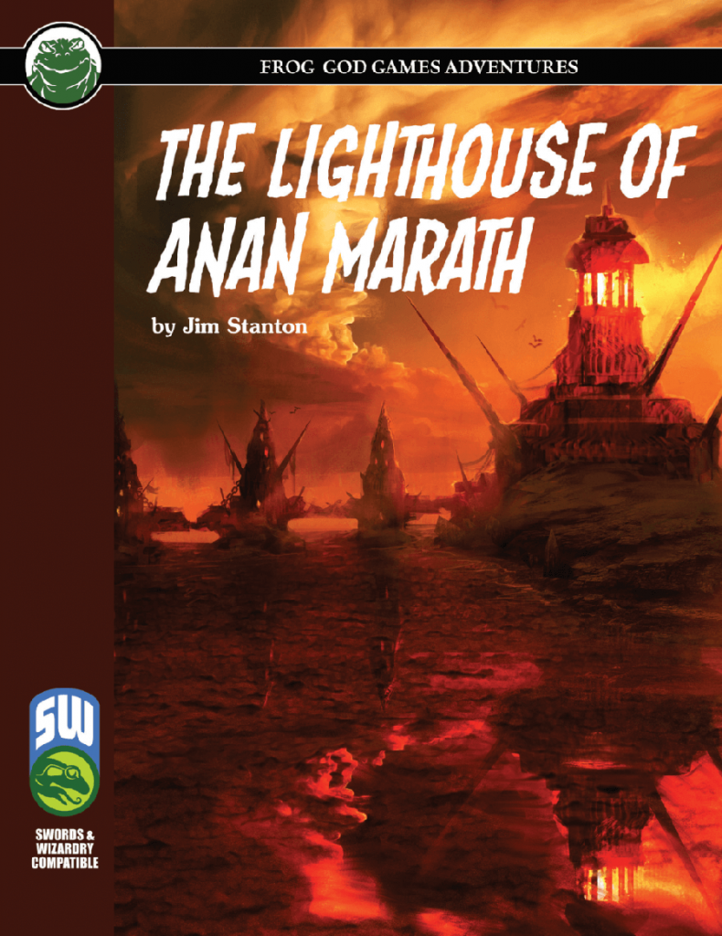
From the shoreline of the village of Saemish, waves can be seen tossing their salt and spray upon four small islands, the largest of which is Anan Marath. A great bridge, aged and deteriorated, spans from the mainland connecting these islands and ending at colossal lighthouse of Anan Marath. Each might y structure is created from the deep-green bedrock found only in the bedrocks of the watery abyss. For Decades, the Lighthouse of Anan Marath has remained dark. Slowly devolving into a state of shappy disrepair. But no longer! The village council has decided-narrowly and after angry debate-to restore the lighthouse and clear it of its dark and bloody past.
This thirty page adventure details fifty or so rooms of a lighthouse complex off the short of a small village. It has an interesting approach with the map environment and the writing can be quite evocative, if a bit unfocused in places. Some additional “context” work could have/should have been done, but otherwise it’s a solid effort.
Off the short of a small village is a chain of three islands, connected with a stone bridge, Florida Keys style At the far island is a lighthouse. Trade is returning to the region and the locals need someone to sort out the lighthouse so they can relight it, after many MANY years of disuse, allowing them to bring trade back to the town. It’s not abad set up and gets to that “points of light” theming of reclaiming the world. It also has a nice little non-standard reward: in addition to what you find they are willing to give you a percentage of all the trade goods/trade that come by. An investment in your future! I like that, and I like the way it cements the village in to the characters lives as a someplace other than a “one and done” adventure. There’s a bit of a disconnect in place: the lighthouse complex is either 250’ off shore (according to the text) or 50’ offshore (according to the map) and it’s stuffed FULL of evil baddies, from monsters to cultists to pirates. Why any one of them haven’t laid waste to the town is anyone’s guess. It’s pushing believability/pretext in that regard, but, at worst, it’s the town sewers problem all over again. And if I can deal with that I can deal with the baddies only being 50’ offshore of the village.
The writing here is not bad at all, from an evocative standpoint. Rotting trapdoors, mix with scrub and surf, wait-high crenels, bridges glistening with salt & spray and dark green seastone with the waves lapping up against it. It hits more than misses in this regard, with the locales really coming to life in the DM’s head through the word choice of designer. It doesn’t feel forced, it feels natural. I love this. The ability of the designer to put an image in to the DM’s head is one of the pillars of a good adventure. If the DM can really GROK the location then the chances they will communicate a great environment to the players is all the better. It really feels like the designer visualized the environment and then brought the power of the language to bear to describe it without going and on and on with the descriptions.
The map here is interesting, or, perhaps, the locale it is describing. Because it’s a causeway, it lands on the top of towers. Thus in many cases you are exploring DOWN, to the towers proper, or even to the rocky islands that support the towers the causeway lands on the top of. Likewise, the lighthouse is entered, in one possible method, midway through the top, where the causeway lands, giving opportunities to go down and up, with additional underwater tunnels. It’s a good effort of breaking the mold of just exploring down or up. Although, not always the clearest in it’s descriptions. There’s some puzzling to do to figure this out.
It does tend to lack focus in its descriptions. It mixes background and history and “this is why X is Y …” in to the descriptions. Regular readers will know that I eschew this. It detracts from the ability to scan the room at the table and relate the information to the players in a quick manner. The usual mistakes are made, from explaining why. Blah blah shaped this by magic, who were actually cultists of god blah blah blah. This is trivia and just gets in the way, and its done over and over again. Again, this is more like the writing I would expect in a style guide for the world rather tan in a technical resource for the DM at the table. In other places the writing isless direct, like with “This place has recently become the lair of an X.” Good that we’re being told X lives here, but it can be done in a more direct manner. These two things make the actual locations quite a bit weaker for use than if they were not present/used.
Of secondary interest is the lack of a polish edit. Certain things are confusing, or could be more direct. It mentions an arrow slit in one case, and only by extended thought does it turn out to be an alternative entrance to the lighthouse. The initial description, therefore, is not really effective in what it’s trying to relate: this is an entrance to the lighthouse that the party can use. It implied, rather than stated, and not implied very heavily. There are multiple examples of this in the adventure, things that require some puzzling out to figure out what is meant/intended. In other places there are opportunities missed. That one that sticks out, but its not the only example, is of the old town drunk, dead in a cellar from a beastie. He even gets a name ‘Cooter.’ That’s great, but the emphasis on this, up front, n the village, or an mentioning it up front in such a way that the party can learn it, is missing. There are passing references to clutists emerging from sea and ships in the night, but the emphasis and follow up isn’t there, up front in the overview and village, and this the opportunity is lost unless you read the entire thing and take notes. Not the strongest support and substantial missed opportunities for support play in the village before the adventure proper starts. There’s also a bit of lost opportunity to give overviews of the situations, since you’re outside and can see the entire thing. Thus if you want to do this you have to read the entire thing, figure out which parts are “visible” and try to come up with something on your own. Again, these sorts of “vista overview” descriptions are worth their weight in gold when trying to relate the overall situation to the party. If you can SEE cobwebs on the island, from the bridge, then that needs to be up front, not in the room key that describes that location.
Some of this, I think, is due to the Frogs lack of good editing. Simple mistakes crop up, like the HD3 fighter who is level 7. And, of course, the level range is missing from the cover or the product description on DriveThru instead hiding on the title page of the adventure … I wish the Frogs would make a fucking checklist and continously improve on it for these little mistakes ther continually make. At least they’ve stopped slapping the wrong cover on things.
Order of battles for the pirate and cultists are missing, but there are other strange comments like “If the party strikes up a conversation with this group of pirates ….” the ones guarding something, that you just killed a bunch of other pirates to get to? Are they in a talking mood? The adventure strikes me as a hack with little opportunity to talk to people implied in the text, so this comes out of nowhere.
But, still, a decent effort. Good environment, nicely evocative. Strains believability in places and the DM text is muddled, but, such is life in the age of cholera.
This is $11 at DriveThru. The preview is six pages and the last page shows you the first encounter description. It’s relatively good for determining what the writing is like for the rest of the locations, but I’d like to see more of them in a preview.
https://www.drivethrurpg.com/product/304474/The-Lighthouse-of-Anan-Marath-SW?1892600
Can someone explain what GROK means?
https://en.wikipedia.org/wiki/Grok
I wrote it for S&W originally, but in editing all the squares became 5′ instead of 10′. Personally, I’d still go with 10′ as the smaller squares make it a REALLY small area.
Needed a lighthouse. Chose this. Now i want to gouge my eyes out.
The idea/ concept is good execution is garbage.
The editing is an embarrassingly high level of no effort to make this playable.
I am legitimately pissed off.