
By Kelsey Dionne
The Arcane library
5e
Level 1
Baronness Elenore Rennet has yet to return home from a masque at Moldavia Manor two nights ago. Can the players find her and uncover the hideous secrets brooding inside the grim estate of Count Moldavia?
This sixteen page adventure features a dungeon with six rooms described on four pages. It’s formatted well and evocative. It’s creepy. It’s lacking a bit on the interactive side of the house, but it’s not a museum tour by any definition. I’m going to praise it and then nitpick, but it’s a good adventure.
Take a deep breathe and stay with me here. I promise I know what I’m doing. Ready? This adventure was written for streaming play, like Twitch. But it’s good! I know, There have been others, and the cnic in me notes this is a new way to market. In this case the “written for streaming play” seems to mean the inclusion of a high-res digital player map. Oh, there’s some mention made of being optimized for play and drama, but, since those are core elements that every adventure should do it’s not really relevant to just twitch play. It’s like saying “written down on paper!” or “uses roman numbers!” Well, yeah. Duh.
But, I get where the designer is coming from. While _I_ expect those things it’s clear that most designers don’t. They write dreck after dreck with shitty ass formatting that fights your attempt to use it in actual play. Even the major publishers, WOTC & Paizo, do this (so it’s no wonder people imitate them.)
But this designer rages against the dying of the usability. Kelsey notes in one small list the changes she’s using. Each encounter on one page. Bulleted lists and bolded keywords. A summary sheet of monster stats. Short room and area description. No paragraphs of droning text. Briefly explained non-encounter rooms. That’s her words! “No paragraphs of droning text.” I can’t tell you how revitalizing it feels to see a 5e adventure from someone who gets it.
And it’s all here. There’s a summary sheet for the monsters, stats all in one place for ease of use at the table. The encounters/rooms don’t span more than a page. Smaller, less interesting rooms get less text. Other features, like a pond out back, are just mentioned in passing. We were told “A dark pond next to the manor ripples in the chilly wind. Low clouds gather overhead.” What more do you need to run this? Nothing. There’s nothing there, why else would the designer devote more space to it? It’s not driving the adventure, it is at best setting mood and creating space for tension, hence its inclusion in the first place. This is exactly what SHOULD happen in ANY adventure written for use that the table. (That, of course, being the dirty secret of the publishers. At. The. Table. Isn’t their market.)
The designer actually fucking says “This adventure is meant to be run at a glance” It’s the first fucking words of the “A word to the GM” section that includes that small list I mentioned earlier. This designer gets it. This is how EVERY adventure should be written. Eight years. Three adventure reviews a week. 90% utter garbage. And then this, a bright jewel buried under the 5e DriveThru cesspool. This adventure delivers on the promise of usability.
You know what else it does? It has more than throw-away hooks and consequences. The baron hired you. He can pardon you. Or make you a knight. Fuck yeah he can! Consequences? If you brough back the big bad alive then he makes you fucking constables with full on cloak pins and writs! Consequences for different decisions! Rewards that are meaningful and drive future roleplaying! And further hooks with the baron turning evil (and some more boring stuff about returning to manor.) Things that drive the world AROUND the party. The environment they adventure in. Rock. Solid.
NPC’s get little offsets. A little one sentence-ish description, quirk, secret. Just enough to run them, easy to find in the text. One little girl is hiding on the grounds. Her secret is shes’ afraid her mother got taken by The Willowman (a folk story) because she stole some cookie. Word for word, that’s it. It’s fucking great. It appeals to Scared Little Kid imagery. It appeals to folklore. It appeals to Slenderman and everything else in the woods. And it tell you every fucking thing you need know to run it by including “(a folk story.)” Note how specific it is. Not that she was a bad girl, but that she stole cookies. Not a monster, The Willowman. The designer doesn’t include any more words because they don’t need to. The specificity and evocative nature of it give us all we need to know to run it. Bad girl is an abstraction. Stole cookies is specific. It didn’t take any more words. It wasn’t two paragraphs. Perfection Personified. At one point a body is holding not a wine bottle but a bottle Amontillado wine. Specificity for the win.
The bad guy is crazy and mutters to himself. Because the designer is actual good, she includes for us a page of his ravings. On a page, so you can print it out to have it always at hand instead of flipping through the book to find it. Bulleted. Little snippets, just about two-ish sentences each. Just enough to get the DM started out. Perfect. The designer recognized we needed this and they provided it. IE: what a designer is supposed to do.
Let’s cover the misses now. One of our hooks has a section heading of “Appeal to discovery” with a bolded section saying “dark discovery.” This is meaningless. The first hook has a section heading of “Appeal to reward” with knighthood, pardon, and 100gp all bolded. It’s easy to tell what the reward is, it’s bolded. The second section heading is Appeal to Heroism. That’s pretty self-explanatory, the same old do-gooder stuff. The third id the Appeal to Discovery with the “dark discovery” bolded. This tells us nothing. Further, the normal text mentioned “dark rumor and mystery” … an abstraction that is NOT specific. Bolding some rumor, mystery, or something else would have been better here. Then the DM’s eye would land on it, thanks to the bolding, instead of the generic “dark discovery.”
The map is hard for me to read. The player map is 12 meg and done digitally, no doubt for streaming/online play purposes. The DM map is the same map but with numbers, etc. It’s busy for that purpose, the “artistic” quality makes the number not stand out well, and the detail of the map, meant to inspire, is instead hard to read if running off of paper. I’m a big advocate of overloading the map with additional data, like a checkboard floor, then not needing to mention it in the text, but it can’t be to detriment of the core room/key usability. Larger numbers, in boxes, off to the side, with arrows pointing in, or something, maybe? It’s busy in a way that’s not useful to DM and even begins to detract. Not disastrous, but not doing what I think it wants to do.
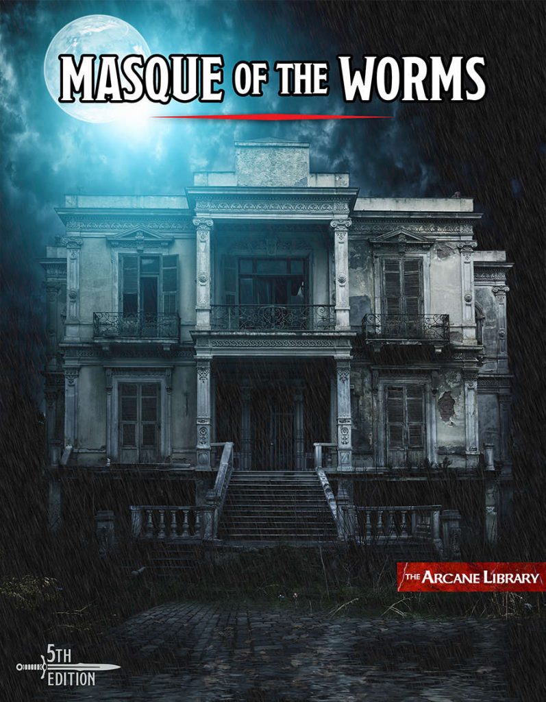
The cover (which I love, and is the reason I bought it) implies a two-story manor. Some of text also implies that, with climbing up to open windows being mentioned. The map seems one story though and I can’t figure out from the text if there is a second story or what. Either some text was left in or the text isn’t clear.
The bulleted format with bolding words well, along with the evocative descriptions, to give the DM what they need to run it a glance. But there are individual misses. The bulleted lists are not always formatted with the most obvious thing listed first. When the players open the door and the DM does their glance and summarizing for them then the most obvious and/or important things should come first. You don’t put 12 charging orcs at the bottom. In some cases the most obvious things are not first. A kitchen with bodies … do you mention a kitchen with dead bodies first or a kitchen with pots on the stove first? If the bodies are last then that implies they are hard to notice, I guess? But this was the results of a monster massacre, not a serial killer hiding bodies. Similarly, sometimes important things are left out. A common example of a room description is a library or kitchen. You don’t need to describe what it looks like or its contents, we all know what that it. You only need to describe what important and/or relevant to the adventure. There’s a grey area though. Let’s say the room is called a library, or study. Somewhere , deep in the text, it says there’s a secret door behind a bookcase. (Because there should ALWAYS be one there. Likewise, waterfalls. Life should be wondrous and magical.) But … that’s the first mention of a bookcase. As a DM you don’t know to include a bookcase in the players description, it wasn’t in the initial description. A bookcase in a library? Sure, but it relies on a kind of implicit understanding rather than a more explicit statement. If there’s a bedroom, is it fair to put a secret door under a rug on the floor if I never mention there’s a rug on the floor … until three paragraphs later? I like relying on universal knowledge and troped to add flavor … but I get nervous when something requires your knowledge. Of course, every medieval bedroom had rugs on the floor … A bookcase in the library isn’t that egregious, but it still feels wrong to me. It should have been a mention higher up.
More seriously, I think the chosen format of the adventure tends to run the text together and create a wall of text effect. The bullets and bolding work well, as to the offset boxes. The sections headings though don’t do a great job separating areas, or maybe I mean getting that message across to the DM. I look at it and my eyes glaze over at the full page instead of focusing in on just the room, one of three on the page. I don’t know if this is a layout/style template provided by DMsguild or what, but it stinks. Nire indepts, better whitespace, the background image, idk. But I do know it doesn’t work well.
Ending on an upnote, here’s the first bullet point for a room. Great imagery. Draped. Fresh. And then red smears and handprints to juxtapose.
• The hall is draped in fine white curtains; the walls are freshly painted white to match. Red smears and handprints dot the walls.
This is a good adventure. It easily hits the usability and evocative marks. Interactivity could be a little better, but it IS a horror adventure (I left unmentioned all of the Poe inspiration and references.) and that requires some room to build tension. Or I’m making excuses for something I like, won over by the blatant explicit appeal to usability, this blogs core thesis for eight years now.
This is $3 at DriveThru and easily worth that. The preview is fiv pages. The second preview page shows you the bullet/GM list I mentioned. The third the hooks/Appeal to Discovery section I mentioned. The third is the outside of the manor, with the little girl I mentioned, the pond throw-away, etc.The fourth some typical rooms. It’s a good preview, showing you what you’re actually getting.
https://www.drivethrurpg.com/product/251360/Masque-of-the-Worms?1892600
Oooo, nice. A 5E product I might actually like to read. Or recommend to my daughter as she is the 5E DM in the house. 🙂
Nire indepts, indeed.
Sounds great! Immediate buy…have to support people that actually know what they are doing!!!
Rennet? What a cheesy name!
holy shit a genuinely good 5e adventure time to buy a lottery ticket hey hey hey
I was hoping you would stumble over some of her work. She has had a few free adventures on her Arcane Library site. Her stuff is all written like that check it out: https://www.thearcanelibrary.com/
Got it and already thinking about getting the sequel!
Thanks Bryce!
Nice to see a positive review of a 5E adventure. Proves it can be done. Thanks Lynch!
I spent 3 bucks on this and I wasn’t disappointed
A advice to DM interested i running this : pitch this explicitely as an “atmospheric story-game-ish one-shot inspired by Poe’s short stories”. That can be a fun experience. I played this thinking this was as a “typical” D&D adventure, and was very underwhelmed (and deeply annoyed by the blatant Poe references that ruined my immersion. And by blatant, I mean it : the Tell-tale Heart happened in the manor, and I’m pretty sure the ramblings of the crazy guy are straight up quotes from the story.)
The whole adventure is an occasion for players to act, not explore or solve mysteries (or fight, for that matter) in a meaningful way. The NPCs and the exploration serve to support the mood and give acting prompts, but basically never yield any kind of actionable information to find the baroness (which the PCs will surely find if the go through the scenes).