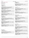
PC + NPCs in party:
Thief L7
Cleric L6 (effectively 8)
MU L8
F L6
F L5
F L4 (archer-savant NPC)
F L3
Pan-Dimensional Rock Troll L7
The big-ticket magic items---held
temporarily (after some long quests and promises) are some home brewed versions of a "Staff of Power" and a "Hammer of Thunderbolts" (w/ belt and gantlets). The later being particularly good against the Giants. But yeah, levels aside, and
despite all the caveats/limits/catches I try to place on things, the amassed magic items from a very long-running campaign usually carry the day. Magic's the real resource they horde and manage.
Every spell beyond 1st level the magic-user has was found "in world"---usually in the spellbook of a wizard recently dispatched along with lots of duplicates of ones she already has (and the need for a proper safe-haven/library/tower grows!).
All spells above 2nd-level the cleric has was either found on a scroll or obtained through communication with an emissary of her deity.
The thief tore up the Phase Minotaur with a wand he found in the dungeon that shoots 8d4 magic missiles (and had a "rare" button on it so any class could use it)---sure it only has 4 charges, but that's enough if you save it for a rainy day.
Most magic weapons they get in treasure was being used
against them by the bad guys they defeat. Typically, they get things and
additionally need to figure out how to use them/unlock their power. Nevertheless, over time, all these odd-ball, one-shot, slightly-flawed, items add up to a lot of firepower.
However, in the mass combat rules, heroes lead the troop but generally only fight other "heroes" in the enemy units --- so EOTB's notion of a single super-hero getting drowned in a mass of enemies if particularly apropos. ACKS does deal with mass-combat spell effects in detail.
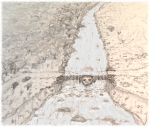
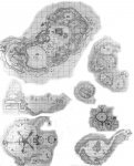
@Two orcs Thanks for the kind words about my map-turned-picture. I've put the little illustration "in my book" for now, but my final judgement is that it is too boring and has to be re-done. Still,
any images of your campaign world are probably better than none. Drawing is a never-ending time-suck that usually ends in frustration---I try not to indulge (except for maps). Someday, when I retire...
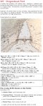
Thanks also for directing me to the ACKS mass combat book. The table I referred to is:
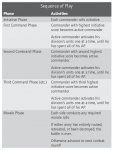
But, reading through the text that follows, there are a lot more elements that should be in a flowchart (like Shock). I am excited about trying the system out for real with (I anticipate) this little skirmish at
Dragonshead Ford.