Illusions
- Thread starter squeen
- Start date

squeen
8, 8, I forget what is for
A few questions for consideration:
a) Is it clear that rocks are on the left and forest/beach on the right?
b) Is it obvious where the water is? Is it too dark/light?
c) Is the forest better with (bottom) or without (top) outlines? Is the fractal canopy too weird?
d) sepia or pure black & white? Or more colors?
e) Is it distracting to switch the color (black/white) of the numbers based on the background?
f) generally too dark?
Last edited:
DangerousPuhson
Should be playing D&D instead
A) yes, though you could colorize if you're truly worried about itA few questions for consideration:
a) Is it clear that rocks are on the left and forest/beach on the right?
b) Is it obvious where the water is? Is it too dark/light?
c) Is the forest better with (bottom) or without (top) outlines? Is the fractal pattern too weird?
d) sepia or pure black & white? Or more colors?
e) Is it distracting to mix the color (black/white) of the numbers?
f) too dark?
B) Yes, just fine
C) with outlines - your southern forest looks better than your northern forest (it's more obvious what it is). Fractals are fine.
D) Sepia would be a nice touch, though spot-colorized on a sepia background would look even better IMO.
E) Seems fine, numbers could use a stroke outline though (white on black and black on white)
F) Looks fine to me (bottom cutaway map could be a touch lighter on the right side)
Beoric
8, 8, I forget what is for
a) Yes.A few questions for consideration:
a) Is it clear that rocks are on the left and forest/beach on the right?
b) Is it obvious where the water is? Is it too dark/light?
c) Is the forest better with (bottom) or without (top) outlines? Is the fractal canopy too weird?
d) sepia or pure black & white? Or more colors?
e) Is it distracting to switch the color (black/white) of the numbers based on the background?
f) generally too dark?
b) Yes. No.
c) Unlike DP, I prefer the north forest.
d) B/W is fine, but color if you add more terrain types. Sepia is for the unnumbered player map.
e) Yes. I agree with DP, use black letters with a white outline.
f) No.
DangerousPuhson
Should be playing D&D instead
The problem I have with the North Forest is that if you didn't know it was supposed to be a forest, it just as easily looks like it could be many other things - the grassy part of a sandy island, or a mud pit, or a rocky area. I think it'd be fine if it were combined it with color, but for sepia stuff the South Forest looks much more like a forest, IMO.c) Unlike DP, I prefer the north forest.
The Heretic
Should be playing D&D instead
Is (2) a clearing in the forest? If so, I'd agree with DP.
squeen
8, 8, I forget what is for
Yes, it's suppose to be a clearing in the woods. If that's confusing, then I guess it's settled.Is (2) a clearing in the forest? If so, I'd agree with DP.
(Although I do agree with Beoric, the "loose" trees have a certain photorealistic appeal.)
Played with a color-overlay layer too, but I am not at all happy with it....especially the water.
My daughter has a better color sense than I. I may let her have a crack at it.
Black & White | Sepia | Color |
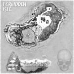 | 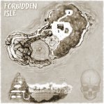 | 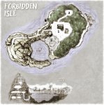 |
Drew the skull for a compass (not finished).
Last edited:
Malrex
So ... slow work day? Every day?
A. yes, yesA few questions for consideration:
a) Is it clear that rocks are on the left and forest/beach on the right?
b) Is it obvious where the water is? Is it too dark/light?
c) Is the forest better with (bottom) or without (top) outlines? Is the fractal canopy too weird?
d) sepia or pure black & white? Or more colors?
e) Is it distracting to switch the color (black/white) of the numbers based on the background?
f) generally too dark?
B. yes...I like the waves.
C. I prefer bottom forest...fractal makes sense
D. both styles work for em...I do not like the color version, but I'm just partial to black and white
E. I dont think its bad. 5 and 6 are hard to see for me. Lately, I've just been putting a white circle and the number in it..seeing the number is more important than the details in my opinion.
F. I dont think its too dark.
I also like the side profile...and the skeleton brings a nice touch.
The Heretic
Should be playing D&D instead
I don't think the color one looks that bad.
squeen
8, 8, I forget what is for
Wrote this for area 2 on the map (clearing in the woods).
Being a literary minded chap, I thought @PrinceofNothing might enjoy the overt reference.
As usual, it got wordy...
Being a literary minded chap, I thought @PrinceofNothing might enjoy the overt reference.
As usual, it got wordy...
Last edited:
Malrex
So ... slow work day? Every day?
It's good Squeen...I like the ideas of it...but it IS long...a lot going on. Are the characters going to appreciate the 'fly' voice or are they going to be too busy fighting...maybe good to have the interaction first...then the boars rush in..? I am a fan of the layout.
squeen
8, 8, I forget what is for
The "attack" doesn't happen for a couple of rounds, while the boars gather in the woods around the clearing. I was thinking that's enough time for some "parley" with the Beast's voice in their heads. A chance to pass each player a note with some temptation.
I'll fix the text to make that obvious.
I need to fix the treasure in the chest too --- forgot the conch & eyeglasses!
As to format and length. I'm not sure if this format begs you to add more layers of detail...or I just have a habit of doing so (the more I think about the elements). Either way, there's probably ways of saying things more briefly than I have done (or am wont to do).
I thought about shortening the TACTICS entry and letting the stat-block do all the heavy lifting...dunno why I hesitate.
Wouldn't it be nice if details-you-can-easily-skip could earn you a pardon on @bryce0lynch 's "too wordy" scale.
Anyway, thanks for the help Malrex. I am learning for you.
Last edited:
Malrex
So ... slow work day? Every day?
It's hard for me to really dig into this on the forum...but going to try. These are all just suggestions.
The first paragraph is good.
I feel like pigs head should go next, THEN encounter....that would show me that the flies may start to talk first--because that's cool--and makes sense as a distraction so the wereboars can get into position.
I like the examples of what the flies are saying.
Tactics--its too much to scan. Maybe do bullet points for that section. I'm almost wondering if the stats of ALL the monsters should go first, then tactics...because as someone reads through the monsters, they become familiar with the opponents, then can read the tactics of how to play em? For example, you explain the powers of the demon in the tactics section, when maybe that would be more appropriate in the statblock? Looks like it may be bugging you too...I think its good to have the tactics section, just needs to be more streamlined.
The Stick--seems like it should go at the end by the treasure. It feels like it breaks up the flow of the monster statblocks/tactics. Even though its second in the first paragraph, just seems out of place? Unless its needed to slay the demon or something, which doesn't seem to be needed.
I think rooms/areas of this length DO have a place in an adventure, but if every room starts looking like this, it just gets overwhelming where every little thing does something. For example, the stick--it's not doing much for me. I LIKE the item, but it kinda gets out-shined by everything else that's happening in the area....does that makes sense? I'd almost say focus more on the pearls...maybe if demon dies, the pearls shatter and some random dude pops out of the pearl for some roleplay interaction, heck, maybe its even an old pirate leader to match the geas.
But I do like the formatting. TACTICS and TRAP with the boxes--good stuff.
Remind me never to loot in your campaign.
squeen
8, 8, I forget what is for
How much? The title? They would never see or hear that.It would be really, really good if you removed the literary allusion. The allusion makes it familiar, it would be a good deal more horrifying if the PCs encountered it without that touchstone to ground them.
...or all of it?---pig-on-a-stick, etc
Last edited: