Grützi
Should be playing D&D instead
First of all: Thank you for the flattering review 
Let me comment on some things to clear stuff up
I've got no problem with the exclusion of the wilderness/lore/backgroudn sections. I would still love to hear your detailed toughts on these parts .. .but apart from the contest, just for myself.
I've said my part about the icons already, I'm simply glad they work so well.
A few words about the outside (better immersion for players) and multiple ways in (more tactical possibilities) are a must for most dungeons.
Area 2:
The dead dwarf in the pool was really the first idea I had ... I always like to scare a little here and there.
Clarify getting knocked down the catwalk ... dully noted
Area 3:
Yeah ... I find it very hard to design a puzzle that is engaging, yet not too hard. Glad you think it works.
In hindsight the randomization of the boon and loot is a mistake. I tought it would add an element of suspense to the game .. but that really only concerns the DM ... so not good.
Area 4:
The handout:
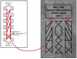
The idea is fo the DM to give the handout to players who look closer at the inscription and nothing else. The ancestors guided your way in Area 3, the engravings are not symetrical ... maybe someone gets the clue. I need to make that much clearer in the text to the DM.
Area 5:
Honestly ... I totally didn't think about including lava damage ...
Organic to the dungeon:
I think this adds much to any dungeon if loot is not just laying around but an active part of the dungeon itself. I love me some little mechanics that allow the party to tinker with stuff.
Area 10:
Yeah ... The only room on two pages ( a fact I really don't like), but i wanted to do the complexity of the situation justice.
I can see how all this is a bit much, but I wanted the players to have some fun in getting their cool powers (if any).
Maybe the whole thing could be trimmed down mechanically without loosing too much ... will look into that.
The treasure... it's a bit much yeah ... but you witness the quasi ressurection of a dead god in the ruins of an ancient, high-tech dwarven ruin ...
I really like to for dungeons to change the party ... so the place isn't totally forgotten in the next game ... this way the group will remember ... thats why i put the godsoul fragments in.
Area 11:
In my headcanon the whole secret passage was just a nifty way for the working dwarves to circumvent the hall of ancestors without having to revere them everytime they walk trough it.
But ignoring the ancestors isn't that wise so the coinslot was installed to make the dwarves pay.
You are absolutely right about it tough, it needs to be communicated to the DM better.
Treasure in 12 and 13:
The intention was to show, that the cult only hastily stuffed furniture into these rooms and didn't really look. They are not interested in money after all.
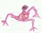
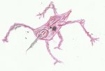
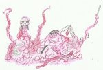
Rustrot art:
I will try to get some thing done ... simply didn't have the time (deadlines are the death of artistry ....)
Walking to the BBEG:
glad you caught that
No book monsters:
Players fear what they don't know ... that creates intense and fun play (for a certain definition of fun )
)
And I love me some non-standard monsters.
"Failed novelist syndrome":
Yeah I tried to trim it down to the absolute basics that were needed for the DM to
a) understand the background well enough to DM it
b) to give him a feeling for the world so he can communicate that to the players.
I love it when an adventure has a rich and interesting background ... most "plug-and-play"-adventures are rather thin on the background ... just a personal preference of mine.
To many boons:
Maybe ... but I am a strong follower of player empowerment. The shrine of the cupreous Lady for example... Player sacrifices something, interacts with world and setting and gets a a little extra.
Layout: One room per page.
That was a mostly deliberate choice. I like to print stuff out when i DM so having one page per room makes it easier for me to organize stuff.
That being said I'm a total newb in this whole layouting thing ... there is much to learn.
Putting room 5 and 6 on one page was done exactly because of the reinforcements. All following rooms flee foward towards 10.
Mechanics in general:
I lean rather heavily on the side of small mechanics, rules or even minigames to make things more intersting. That can be ahrd for many DMs ... you said yourself, that the DM has much to keep track of in this adventure. It comes easily to me, especially if i wrote the mechanic myself, but I can see that it's not for everyone
PS:
Oh and if it wasn't that clear from the theme ... I work in electronics (UPS systems if anyone cares)
Let me comment on some things to clear stuff up
I've got no problem with the exclusion of the wilderness/lore/backgroudn sections. I would still love to hear your detailed toughts on these parts .. .but apart from the contest, just for myself.
I've said my part about the icons already, I'm simply glad they work so well.
A few words about the outside (better immersion for players) and multiple ways in (more tactical possibilities) are a must for most dungeons.
Area 2:
The dead dwarf in the pool was really the first idea I had ... I always like to scare a little here and there.
Clarify getting knocked down the catwalk ... dully noted
Area 3:
Yeah ... I find it very hard to design a puzzle that is engaging, yet not too hard. Glad you think it works.
In hindsight the randomization of the boon and loot is a mistake. I tought it would add an element of suspense to the game .. but that really only concerns the DM ... so not good.
Area 4:
The handout:

The idea is fo the DM to give the handout to players who look closer at the inscription and nothing else. The ancestors guided your way in Area 3, the engravings are not symetrical ... maybe someone gets the clue. I need to make that much clearer in the text to the DM.
Area 5:
Honestly ... I totally didn't think about including lava damage ...
Organic to the dungeon:
I think this adds much to any dungeon if loot is not just laying around but an active part of the dungeon itself. I love me some little mechanics that allow the party to tinker with stuff.
Area 10:
Yeah ... The only room on two pages ( a fact I really don't like), but i wanted to do the complexity of the situation justice.
I can see how all this is a bit much, but I wanted the players to have some fun in getting their cool powers (if any).
Maybe the whole thing could be trimmed down mechanically without loosing too much ... will look into that.
The treasure... it's a bit much yeah ... but you witness the quasi ressurection of a dead god in the ruins of an ancient, high-tech dwarven ruin ...
I really like to for dungeons to change the party ... so the place isn't totally forgotten in the next game ... this way the group will remember ... thats why i put the godsoul fragments in.
Area 11:
In my headcanon the whole secret passage was just a nifty way for the working dwarves to circumvent the hall of ancestors without having to revere them everytime they walk trough it.
But ignoring the ancestors isn't that wise so the coinslot was installed to make the dwarves pay.
You are absolutely right about it tough, it needs to be communicated to the DM better.
Treasure in 12 and 13:
The intention was to show, that the cult only hastily stuffed furniture into these rooms and didn't really look. They are not interested in money after all.
Rustrot art:
I will try to get some thing done ... simply didn't have the time (deadlines are the death of artistry ....)
Walking to the BBEG:
glad you caught that
No book monsters:
Players fear what they don't know ... that creates intense and fun play (for a certain definition of fun
And I love me some non-standard monsters.
"Failed novelist syndrome":
Yeah
a) understand the background well enough to DM it
b) to give him a feeling for the world so he can communicate that to the players.
I love it when an adventure has a rich and interesting background ... most "plug-and-play"-adventures are rather thin on the background ... just a personal preference of mine.
To many boons:
Maybe ... but I am a strong follower of player empowerment. The shrine of the cupreous Lady for example... Player sacrifices something, interacts with world and setting and gets a a little extra.
Layout: One room per page.
That was a mostly deliberate choice. I like to print stuff out when i DM so having one page per room makes it easier for me to organize stuff.
That being said I'm a total newb in this whole layouting thing ... there is much to learn.
Putting room 5 and 6 on one page was done exactly because of the reinforcements. All following rooms flee foward towards 10.
Mechanics in general:
I lean rather heavily on the side of small mechanics, rules or even minigames to make things more intersting. That can be ahrd for many DMs ... you said yourself, that the DM has much to keep track of in this adventure. It comes easily to me, especially if i wrote the mechanic myself, but I can see that it's not for everyone
PS:
Oh and if it wasn't that clear from the theme ... I work in electronics (UPS systems if anyone cares)
Last edited:
