Feedback Thread: Maps
- Thread starter Grützi
- Start date
squeen
8, 8, I forget what is for
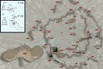
My players left the Gud Compound (above) and moved on down the road. Yesterday, I hurriedly sketched this in about an hour before the game. It's a natural tunnel or passage behind the waterfall with a small complex of caves that branch off. I've incorrectly labeled it a "ford", but that what I've decided the locals call it because it rolls off the tongue.
I drew the caves (I hate to call it a lair, that term has picked up some negative connotations lately---how about a road-side "location") right on top of this sketch in "non-photo blue" pencil --- which I have discovered does not in fact "disappear" from modern photos...just antiquated photocopiers, and is WAY harder to remove than folks would lead you to believe.")
I'll put that 10-room map up after I finish it. My players are currently inside, so I will likely get it done (probably the night before we play). Sadly, the Gud Compound (with its gonzo Air Station) was around 80% complete...but now it lacks priority to finish it (for Prince's Contest?) until the party makes the return leg of this journey which may be quite a while. It doesn't really matter---it was chocked full of disqualifying content. Maybe it can go somewhere else.
Clearly I'm using every flimsy excuse to practice drawing.

The Compass Rose is "borrowed" from the incomparable map-maker John Stevenson (sirinkman). I need to take some time and design my own one of these days.
At my daughter's suggestion...a "splash" of color.
I drew the caves (I hate to call it a lair, that term has picked up some negative connotations lately---how about a road-side "location") right on top of this sketch in "non-photo blue" pencil --- which I have discovered does not in fact "disappear" from modern photos...just antiquated photocopiers, and is WAY harder to remove than folks would lead you to believe.
I'll put that 10-room map up after I finish it. My players are currently inside, so I will likely get it done (probably the night before we play). Sadly, the Gud Compound (with its gonzo Air Station) was around 80% complete...but now it lacks priority to finish it (for Prince's Contest?) until the party makes the return leg of this journey which may be quite a while. It doesn't really matter---it was chocked full of disqualifying content. Maybe it can go somewhere else.
Clearly I'm using every flimsy excuse to practice drawing.
The Compass Rose is "borrowed" from the incomparable map-maker John Stevenson (sirinkman). I need to take some time and design my own one of these days.
At my daughter's suggestion...a "splash" of color.
Last edited:
squeen
8, 8, I forget what is for
Thank you so much! It means a lot to get that kind of feedback. I believe 75% of it is process---getting your tool-chain in place and getting comfortable with it.
I also hope watching me stumble my way through this the past year generally encourages others that it's totally possible to level-up your art game if you so choose. There are wonderful on-line resources, and lots of nice helpful people out there.
I also hope watching me stumble my way through this the past year generally encourages others that it's totally possible to level-up your art game if you so choose. There are wonderful on-line resources, and lots of nice helpful people out there.
The1True
8, 8, I forget what is for
let's start with this. Breuja's Hut:
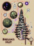
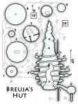
with a B&W version for the Squeens of the world . Here are my questions:
with a B&W version for the Squeens of the world
. Here are my questions:- Is it clear that 1-3, 5-8 are top-down and 4 is a side view? Are their separate scales clear?
- Did I get too crazy with the sub lettering (4d5 etc.)?
- There are no connecting corridors. The hut is an ancient artifact where transit from room to room is achieved by interacting with objects. Are the connections clear? Did the artistic choice to make them look eldritch and 'artifacty' end up making them confusing?
- I would probably provide the colour version as a VTT player map one way or the other, but Colour or B&W?
squeen
8, 8, I forget what is for
Does it look cool?: yes. Artistically it's fun to look at.
Did I understand it when I first saw it?: no
It's a sad fact that plain, boring B&W is usually far easier to understand on a map. I didn't want to accept that, and still shade and tint stuff to make it pretty, but the K&KA crowd has me convinced: Colors on a map, must be very washed out and muted or else they get in the way.
My eye kept going back to the one on the right to answer your questions.
Is it clear top vs. side?: not on the color one---I thought the faux circuit diagrams were actually the corridors and the slices were spheres. Why not label it "side view"?
Also, no way can you put the same size grid on both at different scales, in the same figure, and expect some folks to not get confused.
It's a weird, unfamiliar shape that looks intimidating. Does the text makes it clearer? I can't figure out if "e" is inside or outside...or what. How about changing the side view into an isometric with partial cut-away?
Hope that helps.
Last edited:
EOTB
So ... slow work day? Every day?
It took me a long time to find the "4" in the color map (I saw it easily when switching view to the other). I'd suggest putting the interior markers ("4", "a", "c", etc) on the outside and connecting them to what they're identifying with a line.
I'm guessing the 10' and 20' signify the different scales, but I wouldn't be sure of which applied where.
I presume that the "circuitry paths" are to connect the top down with where they're shown on the side view? It's hard to follow. It would be easier for me to follow if they shared a number - like the top down version of an area is "2A" and it's location on the side view is "2B".
Beoric
8, 8, I forget what is for
TL;DR, I don't get it. I tried to explain why I don't get it below, but I'm afraid it might come off as harsh, even though that is not my intent. I think what it comes down to is that some things can't be mapped in 2D, and shouldn't be attempted in a published module because of the limits of the medium. I think this might fall into that category. I get into specifics below, but you read them at your peril.
With the colour one I thought I didn't understand it because it was too busy. The b/w is clear enough that I now know that I didn't understand it because I didn't understand it. It made more sense when I looked at the text, but in my view it's not a great map if you need to read the key in order to navigate it.
Is there a key for the symbols on the circuit board? I'm guessing it is just for show? Looking at your text, I'm guessing that the information for getting from one place to another is entirely in the text, and all the "map" is supposed to do is provide a flow chart to demonstrate the possible flow of movement. If so, then the map is extra, and there just for clarification. However, if you want a flow chart for clarification, it should be simple and easy to follow and, well, clarify.
The thing is, I have no confidence that I'm not just misinterpreting the whole thing. I don't even get as far as whether there are different scales. I thought I could tell which areas were side view and which were top down, but I'm not sure with area g and those spikey things coming off of b, f and g. And is e supposed to be inside the other structure? Is e a hollow space or a solid object?
The1True
8, 8, I forget what is for
I'll take your advice EOTB and move the numbers to the outside. The arrows drawn from the top-down to the profile are actual connections. There are no duplications in the drawing. i.e. the line from 1 to 4d4 isn't saying that 1 is a slice of 4d4, but that there is a connection through the cauldron in 1 to the cave in 4d4. Apparently, I need to find a way to better communicate that.
You nailed it Beoric; the map is more a flowchart than a map. I believe we do need the the drawings for the purposes of VTT, just to have a place to put our counters and visualize combat. The circuit board is indeed for show and you're right, it's obscuring things. I was in love with my artwork and didn't want to rip it out. This can easily be cleaned up. Your criticism is in no way harsh, bring it on!
I guess my only constraint is I need the art to fit on an 8.5x11 page for print purposes, so I can't further separate the profile drawing of area 4 from the other areas.
Thanks for not holding back guys!
Beoric
8, 8, I forget what is for
The flowchart doesn't have to be the same page as the battlemaps. Since they are not connected in physical space they could be presented next to their keyed entries, and if you are publishing for VTT you can include larger battlemaps as a separate file. Not really sure how this would work on practice, so throwing it out there more as a possibility than as a recommendation.You nailed it Beoric; the map is more a flowchart than a map. I believe we do need the the drawings for the purposes of VTT, just to have a place to put our counters and visualize combat. The circuit board is indeed for show and you're right, it's obscuring things. I was in love with my artwork and didn't want to rip it out. This can easily be cleaned up. Your criticism is in no way harsh, bring it on!
I guess my only constraint is I need the art to fit on an 8.5x11 page for print purposes, so I can't further separate the profile drawing of area 4 from the other areas.
squeen
8, 8, I forget what is for
Working in two-column mode with inset-maps allows some flexibility along these lines. You can live in a single column if it's long and skinny or span a strip across the top or bottom of the page if the illustration is wide and short. You can also have many small images in-line with the text.I guess my only constraint is I need the art to fit on an 8.5x11 page for print purposes, so I can't further separate the profile drawing of area 4 from the other areas.
The1True
8, 8, I forget what is for
Yeah, these rooms will be easy to chop up and slap in a two-column page with the text. I'd still like a single page where I can see which rooms connect to which. I think if I make the connecting lines less artsy fartsy I can also include information like whether the connection is hidden or locked and basic notes like 'cauldron to cave' (although that might junk up the interface).
The1True
8, 8, I forget what is for
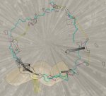
Moving on. I tried to map a series of platforms arrayed around the trunk of an enormous thorn tree. First I tried to just unwrap the tree, that led to this unholy mess:

(I threw in a rendering of the tree to give you an idea of what's getting mapped) There's no labeling because I quickly decided not to take it any further. I mostly got the various paths to wrap around and cleaned up objects that were stretching like the pagodas and stairs but it was clear that it was going to be unreadable no matter what I did. My other concern was that although the platforms aren't very big, I'd still like to see their top surface areas for the purposes of VTT play. So I removed the tree and broke the paths into rough concentric rings:

With an accompanying multi-angle side view to better clarify the top view. (Sorry, I had to bring the rez way way down on these to drag them into the body of the text). Anyway, these have been so thoroughly massaged at this point I'm not sure I can go back and get rid of the colour layers. I'll try to remember to give it a try later since people seemed keener for B&W. But what I'm wondering is; Is this clear? Could I have mapped this in a different way? Someone (Beoric?) mentioned that some things just weren't meant to be mapped for D&D which I am stubbornly refusing to believe. Definitely there are challenges presented, but I'm not ready to give up just yet!
(I threw in a rendering of the tree to give you an idea of what's getting mapped) There's no labeling because I quickly decided not to take it any further. I mostly got the various paths to wrap around and cleaned up objects that were stretching like the pagodas and stairs but it was clear that it was going to be unreadable no matter what I did. My other concern was that although the platforms aren't very big, I'd still like to see their top surface areas for the purposes of VTT play. So I removed the tree and broke the paths into rough concentric rings:
With an accompanying multi-angle side view to better clarify the top view. (Sorry, I had to bring the rez way way down on these to drag them into the body of the text). Anyway, these have been so thoroughly massaged at this point I'm not sure I can go back and get rid of the colour layers. I'll try to remember to give it a try later since people seemed keener for B&W. But what I'm wondering is; Is this clear? Could I have mapped this in a different way? Someone (Beoric?) mentioned that some things just weren't meant to be mapped for D&D which I am stubbornly refusing to believe. Definitely there are challenges presented, but I'm not ready to give up just yet!
Maynard
*eyeroll*
I think the biggest problem is one of scale here. The playable area is so small in comparison to the size of the trees. What's necessary is a zoomed in bottom of tree map, a zoomed in trunk of tree map for each side, etc.
Something this big gets a lot of advantage from being stylized for the sake of comprehension. All the detail on the tree render gets in the way of the details we want (I think you mentioned this above).
Something this big gets a lot of advantage from being stylized for the sake of comprehension. All the detail on the tree render gets in the way of the details we want (I think you mentioned this above).
The1True
8, 8, I forget what is for
I like what your suggesting here, but I'm staring at that stupid tree and failing to see how I could do it. I mean I guess I don't need accurate scale on the side view (though I like seeing the vertical distances mapped) but the top view I'm pretty attached to keeping the scale for tactical reasons. Definitely a cartoony representation of the map like in a video game would be more visually appealing and easier to disentangle though...Something this big gets a lot of advantage from being stylized for the sake of comprehension.
Beoric
8, 8, I forget what is for
I still think that, but not necessarily in this case. I think your problem here is you are thinking two-dimensionally in what you are considering to be a "level", which causes you to have these unusable cross-sections. If you instead consider a level to be "all the branches that start at around the same height on the trunk", and follow them as they rise and fall so that you have different elevations on the same level, then it would be easier to read.Someone (Beoric?) mentioned that some things just weren't meant to be mapped for D&D which I am stubbornly refusing to believe.
You could then mark elevations periodically, and use grid or hex coordinates for the maps. By comparing elevation and grid coordinates between mapped "levels", you could figure out how to move horizontally or vertically between levels when you are moving from branch to branch. So if you fall from hex xx.yy at elevation z, you could look at the other maps and see if you would hit a branch or if you would fall all the way to the ground.
The same thing goes for levels that are on the part of the trunk with no branches; just follow stairs and bridges as far as you can, and don't treat elevation changes as different levels. It is only a different level if it is below of above something you have already mapped.
Although there may be some instances where you will need to give up on the cool 3D image in your head for the sake of DM comprehension and playability.
The1True
8, 8, I forget what is for
I'm not sure I entirely understand this, but it sounds really promising. Almost the entire map is from the trunk, only the topmost path wanders out onto a branch, so pretty much everything is winding around and around the trunk overlapping platforms further below. I put in faint lines to show where some key overlaps are on the top-down map but even I can't entirely understand what connects to what.You could then mark elevations periodically, and use grid or hex coordinates for the maps. By comparing elevation and grid coordinates between mapped "levels", you could figure out how to move horizontally or vertically between levels when you are moving from branch to branch. So if you fall from hex xx.yy at elevation z, you could look at the other maps and see if you would hit a branch or if you would fall all the way to the ground.
I snuck into PS real quick to slap together a version showing all the overlap, if that helps everyone visualize this further: