How's my 'Room Key'?
- Thread starter RoeeAV
- Start date
Guy Fullerton
*eyeroll*
Too much text & space taken up for just two rooms, even though they have some complexity to them.
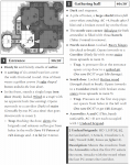
Don’t put room dimensions in the text. If door opening direction matters (and is different from standard directions for typical home security), then mark it on the map. If lighting matters, show it on the map. Don’t say where stairs lead; that’s obvious from the map.
“Dimly lit” by what?
why can only one PC cross the stairs at a time?
why state mechanical details with the objects? (Shield, barrels, hinges, etc.) Instead trust the referee to know the standard mechanics, or come up with ad-hoc mechanics during play.
Guy Fullerton
*eyeroll*
The blind spot and barrels seems forced. Like you wanted to have a “designed” encounter where the PCs had to rush the stairs, but realized after making your map that the arrow slits had a blind spot, so blocked that with barrels as a disincentive for the PCs to take advantage of the blind spot.
instead, redesign the map so there is no blind spot. Why would the original architect have left a blind spot?
incidentally, the barrels won’t block effectively, anyway. The ceiling in the room must be high enough for second level arrow slits to look down into the room, so a PC could simply boost themselves on top of a barrel, and be in the blind spot.
Guy Fullerton
*eyeroll*
Wasn’t planning to post about every little thing, but I can’t help myself:
carving of warriors should be stated better and more concisely. Maybe “wall reliefs” shortens the sentence. “Warriors” is too generic. What kind of warriors? What kind of weapons? Use something like “cruel-faced swordsmen” or “flail-wielding gladiators.”
how deep is the pit?
in arrow slits, especially narrow arrow slits, crossbows don’t work as well as bows because of the crossbow’s horizontal firing orientation.
Don’t bother stating the number of attacks a creature gets, if it’s the standard value (1attack). Why bother specifying the undead saving throw? Even if a 2nd level fighter’s saves are different from how a 1 HD undead would normally save, are they really different enough to matter and spend the words on?
RoeeAV
A FreshHell to Contend With
Thank you Guy, for your review and guidance.
You are absolutely right with your remarks (all of them).
I was looking for a way to minimize the amount of text, but i had no idea how and what exactly.
I will revise and delete the details you've mentioned.
Thanks again, this is a great feedback that i can learn from a lot.
You are absolutely right with your remarks (all of them).
I was looking for a way to minimize the amount of text, but i had no idea how and what exactly.
I will revise and delete the details you've mentioned.
- As for the blind spot, I want to add to the room elements that might make it as an interesting possibility space for the players (For example, the large shield, the rusty hinges on the wooden door etc.). What would you add to achieve that affect?
- As for the carvings, these suggestions are great, thank you.
- As for the pit's depth, in your opinion is that an important info i should mention?
- As for the arrow slits, i will change the Crossbows to Short Bows.
- As for the stats, so if the monster has standard 1HD values is should not mention anything other then it's HP and weapons?
Thanks again, this is a great feedback that i can learn from a lot.
squeen
8, 8, I forget what is for
Pretty at first blush. Guy's comments are great.
I would add:
a) You've over bulleted. The first level of bullets is just wasted margin space and unnecessary. That's why paragraphs were invented --- to break up ideas in a tight little format.
b) The font is too big. Reducing it and removing the top-level of bullets will help compact the space. You'll get 2 rooms in 1/2 to 3/4 of a page---which means more keys near your neat little inset map. I think most web-pages/phones etc use a San Serif font is because it looks better when smaller. Consider switching to Helvetica or the like. Even your line spacing looks over-large. The eye can only focus on a small silver-dollar in the center of your vision---denser layout is easier to scan.
c) Too much going on with the bolding/underlining/etc.. Have a purpose to it. Adding emphasis to everything emphasizes nothing. If it's already in parenthesis, does it also need italics? Less is more.
Fun!
Last edited:
Guy Fullerton
*eyeroll*
Regarding the blind spot: I'm not sure it's really an interesting element. After the undead snipe at the PCs from the arrow slits, any PCs who want to avoid targeting will probably just hide up the western stairwell. Sure, yeah, maybe using an in-the-room blind spot will serve some narrow tactical purpose, but I'm not convinced it's worth explicit words. The blind spot is already evident from the map itself, given the angle of the arrow slits themselves. In fact the northwest corner of the room probably counts as another blind spot.
Is the large shield a possibility space? Where I come from, most fighter types carry a large shield already. it doesn't give +4 AC though, it only gives +1 AC vs 3 attacks/round. +4 AC is a massive bonus in old school D&D — in AD&D it's about as big a bonus as you can get, analogous to the defender being invisible, or having 50% hard/impenetrable cover. This shield is probably more like a portable barricade, or maybe a tower shield (if the game supports it). Why not just leverage the game's default mechanics, and trust the referee to intuit the amount of cover or other good mechanics? You could still say, "a cracked tower shield (shatters after 5 attacks)." (And I picked "attacks" intentionally instead of "hits.")
Rusty hinges aren't a possibility space. It's just a standard stuck door, with rustiness as in-world color.
The pit: The depth is absolutely important to know; that's the first thing a player would ask about when they fall in. Every old school version of D&D already has rules for damage for falls of varying heights. As the reader, I have no idea what you intend here. Is it supposed to be merely an inconvenient 5 ft pit that PCs can easily scramble out of? Or is this supposed to be a 10 ft pit that will cause falling damage, then takes help, gear, or special training (thief abilities) to escape? It's fine to let the referee just make up the answer, but it's also an omission that makes the designer look like they accidentally forgot a detail.
On monster stats, don't list more than you think you need. Anything else potentially gets in the way, unless it's a big convenience. There are not always absolute answers on how many stats to list, but a tiny bonus in very narrow circumstances is probably not worth listing. For those undead brigands specifically, as referee I need to know what type of undead they are (skeletons, zombies, something else?) for purposes of turn undead. I don't need to know how they save, because 1 HD already tells me how they save for all old school versions of D&D.
What I like: The general concept of a series of rooms where monsters take advantage of sniper positions as PCs move through the complex. But I think you can communicate that better, especially since rooms 3 and 5 also appear (from the map) to be the same concept. I recommend a brief sentence *not* in a keyed area that says something like, "Once the zombie brigands in areas 3-5 notice intruders, they prepare to snipe from the barely-noticeable arrow slits."
Eliminate "Attacks with the sword when..." because it implies the brigand won't attack with the sword if one PC engages it in melee, but some other PC is still in the room below the arrow slit. Trust the referee to know/decide when the brigand switches to melee. Better, if the brigands have a *goal* (prevent theft of a particular thing, for example), then state that goal, so the referee has a better idea of how you intend them to prioritize their action.
Your room names could be better. A good room name gives a first-glance reminder about what's in the room, and sometimes allows you to eliminate words in the description. Offhand, instead of "Entrance," I'd use maybe something like "Warrior Reliefs" Instead of, "Gathering Hall" (what about the room makes it a gathering hall — none of the trappings support that), maybe "Sniper Gauntlet."
Please take this in the constructive spirit I intend: I get the feeling that you don't currently run a D&D game or run modules produced by others. The omissions and design choices make me think you aren't familiar with what players will be asking about the environment, and aren't familiar with players solving most tactical & strategic problems without tools being put in front of them in the applicable rooms.
Guy Fullerton
*eyeroll*
I just searched around and found your posts about this dungeon on reddit, as well as the earlier versions of the dungeon. In some of those threads, you mention that this is indeed supposed to be a mutually-reinforcing defensive setup for the current occupants. You should *absolutely* say that at the very beginning, and then you can omit all the in-room details about their tactics. Much shorter that way.
One other dumb thing: I personally don't like spear traps that have saves vs damage. Spears are not falling blocks, flame, explosions, or heavy (or physically unavoidable) things that bypass the protective qualities armor. For spear traps, armor ought to make a difference. In my modules, I try to make spear traps resolve as attack by a monster of a particular HD. But there are old school precedents for doing it with a save, so YMMV.
One other dumb thing: I personally don't like spear traps that have saves vs damage. Spears are not falling blocks, flame, explosions, or heavy (or physically unavoidable) things that bypass the protective qualities armor. For spear traps, armor ought to make a difference. In my modules, I try to make spear traps resolve as attack by a monster of a particular HD. But there are old school precedents for doing it with a save, so YMMV.
RoeeAV
A FreshHell to Contend With
Regarding the blind spot/s, I can easily redesign the layout in order to minimize or remove them.
When i initially designed the dungeon i had CQB tactics in mind (I'm an infantry veteran), and i wanted to create a space that will encourage players to think creatively beside the sword/bow/spell mentality and use their surrounding creatively in order to overcome challenges. In addition, i wanted to create an ongoing and dynamic fight, where the players will be on the move, tackling threats that will surprise them. I also wanted to present a low count of enemies/monsters but without diminishing the lethality/threat.
As for the shield. i think i will keep the stats out of the description and let the GM decide what kind of system related bonus it will give the player.
As for the rusty hinges, the door can be teared from the wall to clear the passage, but it can also be used as another shield from the arrows and as a plank over the spiked pit - I was thinking that the 'Rusty Hinges' will hint on the usage of the door as a tactical tool, but maybe i am mistaken.
I agree about the pit. I will look in commercial modules to see how they describe it.
I agree about the monster description. I will mention it as part of the background of overview of this section of the adventure.
Room names, will be changes. Defiantly.
I've been working as a professional game designer for 13 years, and i've been playing TTRPGs since 87`.
I do currently play D&D and i did ran many modules produced by others in the past.
But, this is my first attempt at designing/writing a small scenario / adventure professionally and i know i have a lot to learn in order to achieve that.
As of yet, I did not playtest this adventure.
Beoric
8, 8, I forget what is for
Never let a layperson talk you out of including an element in which you have expertise (although comments on presentation are valid, since laypeople have to understand it. An area that isn't covered is tactically interesting, as is figuring out how to take advantage of the blind spot when there is no obvious way of retaliating against the attackers from it. And there are all kinds of reasons why the resources may not have been expended to completely cover the area, as you are no doubt aware.Regarding the blind spot/s, I can easily redesign the layout in order to minimize or remove them.
When i initially designed the dungeon i had CQB tactics in mind (I'm an infantry veteran)
The description thereof is another matter, and I would have been inclined to shade the area on the map that is covered by each arrow loop, as well as the area of overlap, and state in the text that characters in those areas are vulnerable to attack from the monsters. This would also likely identify other, smaller blind spots without having to engage in lengthy descriptions. I'm betting there is one in the northwest corner, which makes the door more attractive, but requires you to pass through an area of crossfire. It also obviates the need for a description of the monster's tactics, since it should now be obvious to even to those who are not tactically inclined.
I agree that the descriptions could be shorter and have more flavour; the descriptions build a mental picture for the DM that allows him to improvise. In my view, too much detail defeats itself because it can't be found when needed, or in an impediment to understanding, because of navigating a larger amount of text. Also, I find that flavourful language can make your intent clearer. A good example is the hinges. If a DM described hinges as "rusty", I would not assume from that that they has lost structural integrity. But if the door was described at "hanging loosely of dilapidated hinges" I might be inclined to try to do something with that.
The position of the shield is important and should be highlighted on the map (I had to search for it.) I think you should mention the weight of the barrels, since there are various tactical reasons you might want to move them, and the DM needs to know how hard that it going to be. Also indicate how much space they take up, since you may have the whole party trying to cram into that corner. Both of these details will otherwise experience significant table variation, since estimating the size or weight of a "barrel" is beyond most DM's experience.
When I first read this I fixated on the sulfurous smell in room 1. I don't know if it if telegraphing something later in the dungeon, or if it is just random dressing. I am not a fan of random dressing without a purpose, it invites lengthy and pointless investigations that require the DM to improvise a bunch of irrelevant material, and players don't usually need help getting distracted (they are perfectly capable of manufacturing their own red herrings). If it is telegraphing something later in the dungeon, depending on what it is you might want to repeat it in room 2 (unless its absence is significant).
I think the carving needs more attention. It is an opportunity to provide hooks, or foreshadow elements later in the dungeon. The ruby latch is also incongruous if the initial description does not include features for the party to investigate. Also, it is not clear enough that it is a ruby shaped button (what is "ruby shaped"?), as opposed to an actual ruby; I missed that on my first readthrough ("ruby" is bolded and underlined, "shaped" is not) and think it could cause confusion.
I agree that the source of light in room 1 should be called out.
DangerousPuhson
My my my, we just loooove to hear ourselves don't we?
Did you seriously just call Guy Fullerton a "layperson" with regards to adventure design?Never let a layperson talk you out of including an element in which you have expertise
You've got some balls, Beoric, I'll give you that.
Guy Fullerton
*eyeroll*
Pretty sure he was referring to the blind spots and CQB tactics, and that the OP has proper combat experience. I don’t have combat experience, so it’s a fair point.
DangerousPuhson
My my my, we just loooove to hear ourselves don't we?
Hah, OK, for a second there I was just quietly admiring the gall...
Guy Fullerton
*eyeroll*
Even if he meant beyond that, it’s still a fair point. I appreciate your vote of confidence, but I’m just a guy who self publishes any old thing I want. It’s not like I’ve been working for a company/somebody else that has some say over the quality level.
DangerousPuhson
My my my, we just loooove to hear ourselves don't we?
Don't sell yourself short, man - you're a well-regarded, accredited authority around these parts. The fact that you're not under someone else's umbrella and consistently produce good work gives you the exact pedigree to be authority around here. It's more than most, and anyone dismissing that as "just another person's opinion" isn't doing the field any justice.
squeen
8, 8, I forget what is for
@Guy Fullerton : In a hobbyist environment you've got three things to your credit
The first two, exemplified by Gann, showed you have the kind of persistence that usually is absent (sometimes for valid reasons) from most hobbyists. Having creative content is a tier-one accomplishment (not entirely uncommon in DMs), but also getting something out the door rather than just dabbling and then growing bored is tier-two because of all the donkey-work involved. Tier-three is polishing your material --- a tight format, quality art, serious editing. It's rare folks make it that far in a non-professional environment. That's why I respect you. Gann was a ground-breaker in the sense of how well it hit all those marks, and impressive because it didn't try to reinvent the game in the progress---which was where things were trending in 2012. (...furthermore, you aren't a one-hit-wonder either!)
Bravo.
@RoeeAV : I think it's great you are bringing some of your combat experience/training to the D&D table. New ideas and fresh perspectives are valuable. Like Edison, play test 'em!
- You actually published something.
- It has been consistently of high quality.
- You're approachable, helpful, and willing to work with others.
The first two, exemplified by Gann, showed you have the kind of persistence that usually is absent (sometimes for valid reasons) from most hobbyists. Having creative content is a tier-one accomplishment (not entirely uncommon in DMs), but also getting something out the door rather than just dabbling and then growing bored is tier-two because of all the donkey-work involved. Tier-three is polishing your material --- a tight format, quality art, serious editing. It's rare folks make it that far in a non-professional environment. That's why I respect you. Gann was a ground-breaker in the sense of how well it hit all those marks, and impressive because it didn't try to reinvent the game in the progress---which was where things were trending in 2012. (...furthermore, you aren't a one-hit-wonder either!)
Bravo.
@RoeeAV : I think it's great you are bringing some of your combat experience/training to the D&D table. New ideas and fresh perspectives are valuable. Like Edison, play test 'em!
Last edited:
Malrex
So ... slow work day? Every day?
Cool! Thanks for having the courage to share your creation as we can all learn from the experience. I agree with what most other people have stated already. I will disagree with Guy on one point.
I don't mind the room dimensions in the room title like you have it. I know it can take up space sometimes and its horrible if in a sentence...but just the numbers like you have it, I think can be helpful--especially for larger rooms or caverns.
In fact, I like the box with the room number and title as well as the greyed out box for monsters with the bolded black line. You may want to consider a little more spacing in-between your columns..as it feels 'scrunched'.
Map could use compass on it (which way is north?) and I like having a scale (1 square =10') etc. Are Rooms 3-5 underwater or dark or something, or just darkened as they aren't discussed yet?
The comment about the stairs is true, it's unneeded in this case, however, if it goes to a second floor not shown on the map, I think its helpful to say where it leads (to Area #22) or whatever. I always get annoyed if I see stairs and can't tell where they go to on the next map.
RoeeAV
A FreshHell to Contend With
Thank you all for your suggestions and guidance. I appreciate it a lot.
To be honest, I've always had a certain fear from writing & designing scenarios/adventures professionally.
And I've been looking for a group of professionals such as yourselves for a long time.
As an experienced Game Designer, I've learned not to fall in love with my own Point of View, assumptions and ideas, and i always try to see and understand the perspective of others and learn from their insights. I think it's a healthy way to improve my craft and improve as a human being.
So in that regard, having no Combat experience (You are very lucky), but do having a lot of experience in writing, designing and publishing Adventures is something i can learn a lot from.
As for the Room Key.
I completely agree that i can describe elements in a more concise and interesting way.
Because i am not a native English speaker, i mostly tend to write in a simple and direct way.
I agree that certain tactical elements can be mentioned and illustrated in the map in order to take the load off from the text itself.
This balance between presenting game elements graphically and textually is defiantly something i will add in the next iteration.
As for the Blind spot/s
@Beoric the reason i mentioned the Sulfur is in order to give the player's an head's up or a hint for the Trap (That releases a sulfur gas into the room).
In addition, i agree about the carving, i will improve the clarity of the button that opens the door.
@Malrex i darkened the other rooms in order to make it easier for the GM to focus on the rooms/part of the map that's relevant to the text in the page. I don't know if i'll keep where each Stairway leads to... the map is not that complex. But i will add a compass, that's a good idea.
The1True
8, 8, I forget what is for
Love the formatting. Very clear and easy to read. It's true you probably don't need that first bullet, but don't let the haters put you off bulleting; it draws the eyes and prioritizes information; as long as you don't take it to ridiculous lengths (which you havn't).
The room dimensions are extraneous imho, but they're fine since you've given them a cozy place to live in the room title.
Definitely keep the rules for any skill challenges. Saves the DM having to look them up.
The monster stat block strikes a fine balance between crapping up the page with too much info, and presenting nothing but a name and some hp, thus forcing the DM to dig for a monster description. I'd keep it right where it is.