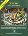
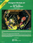
Introductory Adventure Covers
- Thread starter Commodore
- Start date
squeen
8, 8, I forget what is for
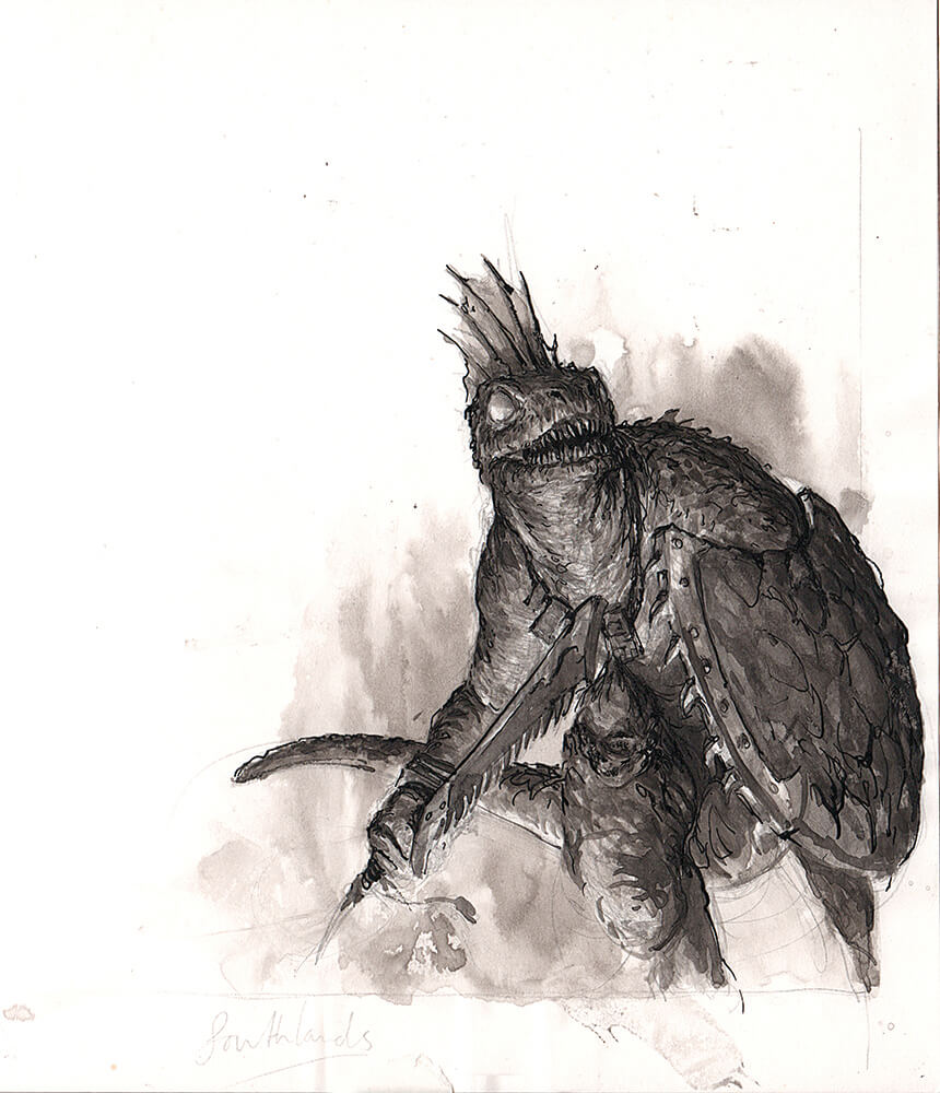
But just look at how much better Karl Kopinksi's Lizard Men are...the energy, the body language, the tones, the gravitas, etc.

The lighting on Parkinson's figures is inconsistent and it bugs me. Also, the compositions are only average. Look at how all those horses lean the same direction and seem small for their riders. I honestly believe his passion is landscapes and he's drawing D&D monsters for the paycheck.


The lighting on Parkinson's figures is inconsistent and it bugs me. Also, the compositions are only average. Look at how all those horses lean the same direction and seem small for their riders. I honestly believe his passion is landscapes and he's drawing D&D monsters for the paycheck.
Commodore
*eyeroll*
I love Dragonlance art, but I can see the sins of the books as actual adventures in the stately and very planned compositions.Everyone shits on Dragonlance (deservedly so), but Keith Parkinson rocks my world:View attachment 1330
this shit should be in the Louvre. I want to fight one of each of these things. Collect 'em all!
The1True
8, 8, I forget what is for
Sure, but did these guys even get published? What are they from?But just look at how much better Karl Kopinksi's Lizard Men
I hate city intrigue and this made me want to run Waterdeep:
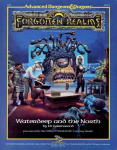
Shit. Back in the day, this made me go back to the MM to check the actual size of Beholders. The classic MM art in this case is terribly misleading! The dude has two pet Intellect Devourers and a pet Drow with 80's hair and aerobics stockings! Tell me more! This is, hands down, THE BEST beholder that has ever or WILL EVAR be rendered. This should be the motherfucking gold standard in every monstrous compendium from here to eternity. amen.
grodog
Should be playing D&D instead
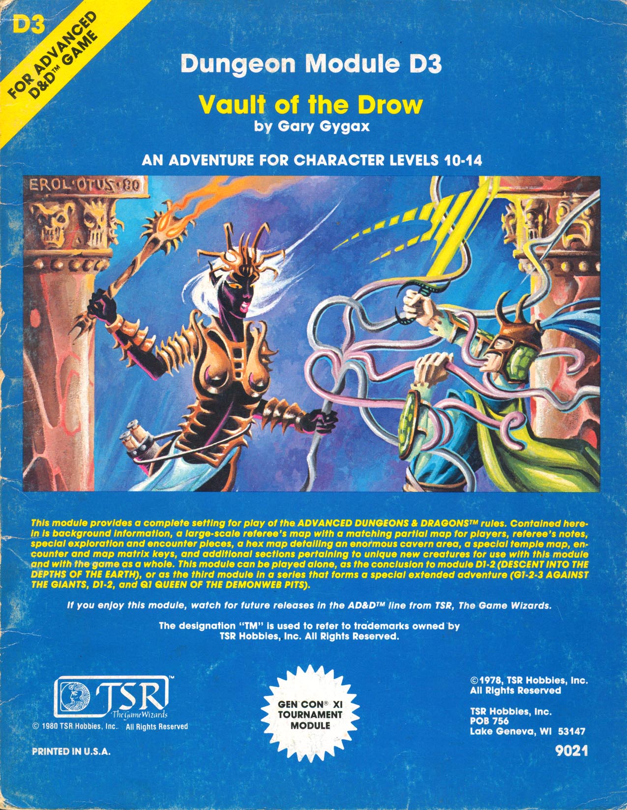
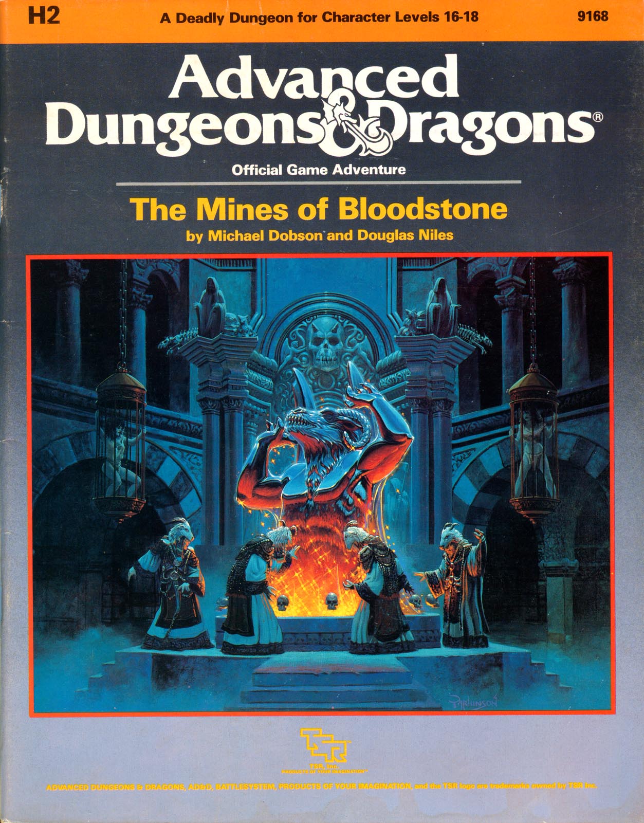
- Top of mind front covers: D3 blue version Eclavdra, H2 Mines of Bloodstone Orcus Parkinson, S4 behir Otus, X5 Temple of Death montage Tim TrumanThis has me engaged now. Moving on: What's the best published adventure FRONT Cover? Bonus points for best back cover...
- Top of mind back covers: A2 cloaker Otus, B1 monochrome Tower, B2 keep by Otus, D3 vampire/succubus, S2 monochrome WPM Otus, S2 color Elric Dee
TSR front/back cover browsing is easy at https://www.tsrarchive.com/
Allan.
The1True
8, 8, I forget what is for
The H2 cover is a beauty. Probably the only well thought-out encounter in that entire adventure as well.
S3 and S4 are easily the most compelling covers evar:
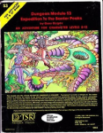
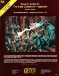
Do you want to fuck shit up with lasers and sci-fi helmets? Hell yes, I do!
Also, can anyone definitively tell me how the hell to pronounce Tsojcanth?
S3 and S4 are easily the most compelling covers evar:


Do you want to fuck shit up with lasers and sci-fi helmets? Hell yes, I do!
Also, can anyone definitively tell me how the hell to pronounce Tsojcanth?
squeen
8, 8, I forget what is for
I agree the beholder is well drawn...the rest, not so much. My objection is the ren-faire nature of this scene. Modernism projected into the D&D world was never my cup-o-tea.Sure, but did these guys even get published? What are they from?
I hate city intrigue and this made me want to run Waterdeep:
View attachment 1332
Shit. Back in the day, this made me go back to the MM to check the actual size of Beholders. The classic MM art in this case is terribly misleading! The dude has two pet Intellect Devourers and a pet Drow with 80's hair and aerobics stockings! Tell me more! This is, hands down, THE BEST beholder that has ever or WILL EVAR be rendered. This should be the motherfucking gold standard in every monstrous compendium from here to eternity. amen.
I totally agree with you about the S3 and S4 Otis covers. They were going to be some of my top picks. I am also partial to these two by Trampier:
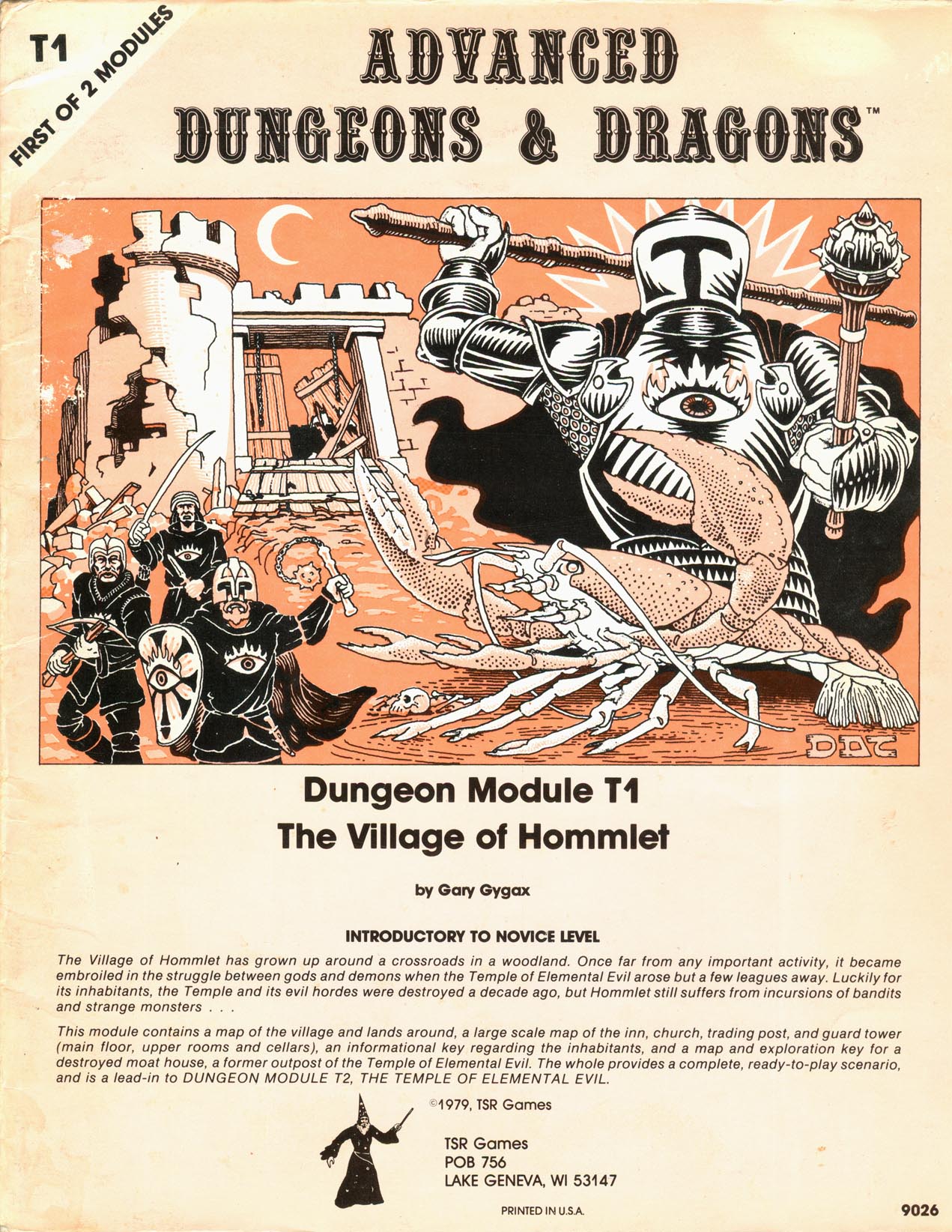
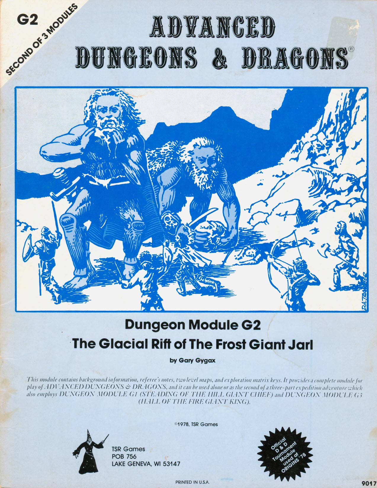
Why, oh why, would you ever replace them in the later printings with these two weak stand-ins that look like low-end 80's comic book pages? So bad.
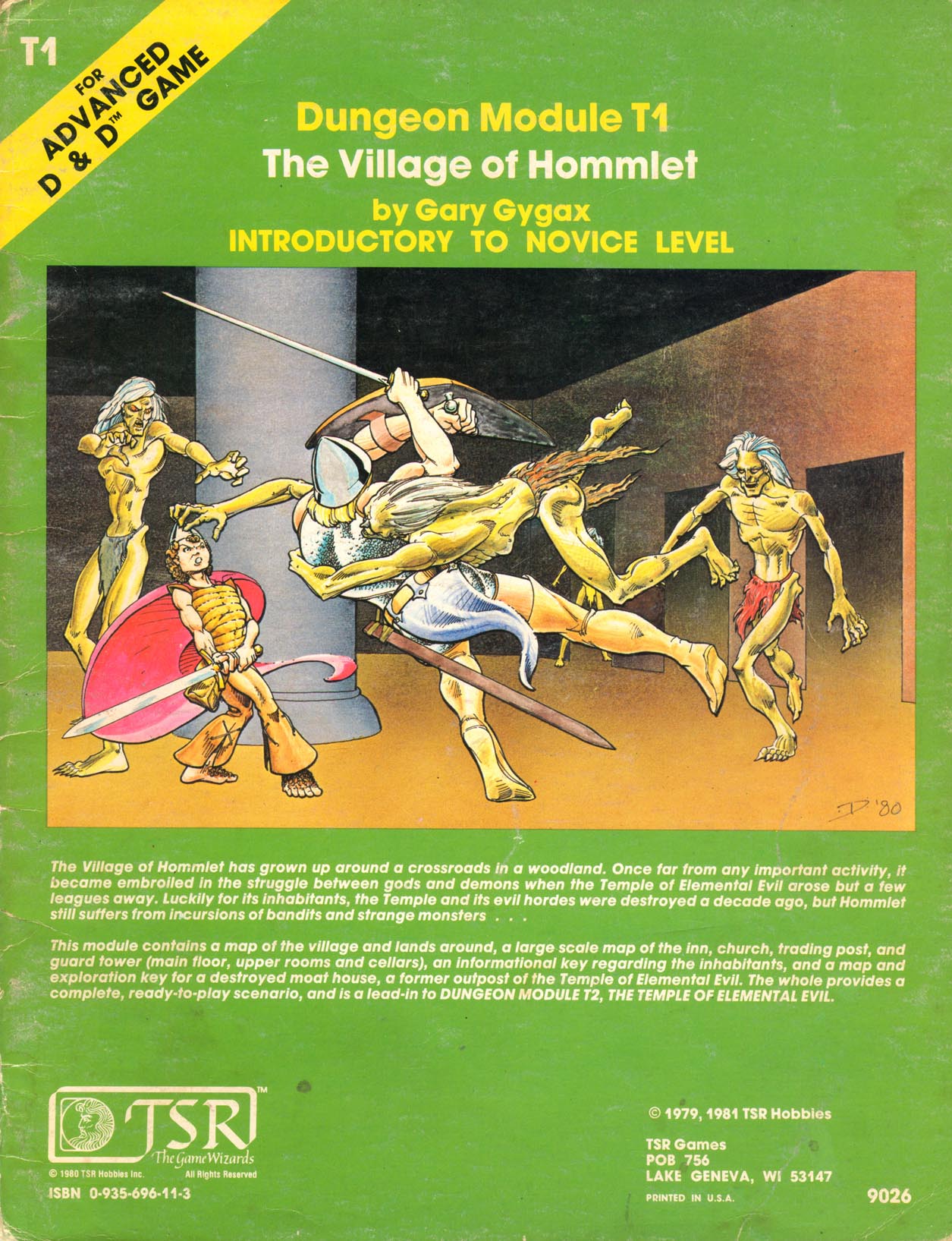
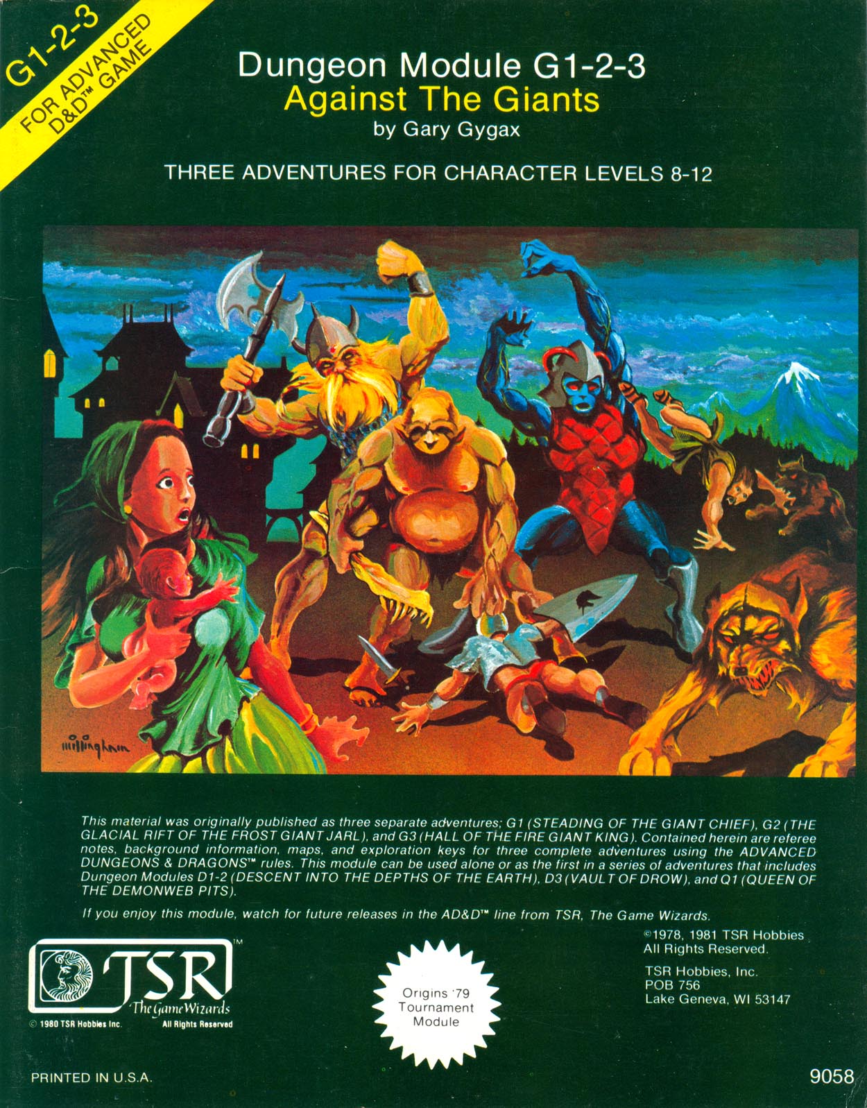
I also always liked this redo...probably just because of the lighting effects because the environment is weak.
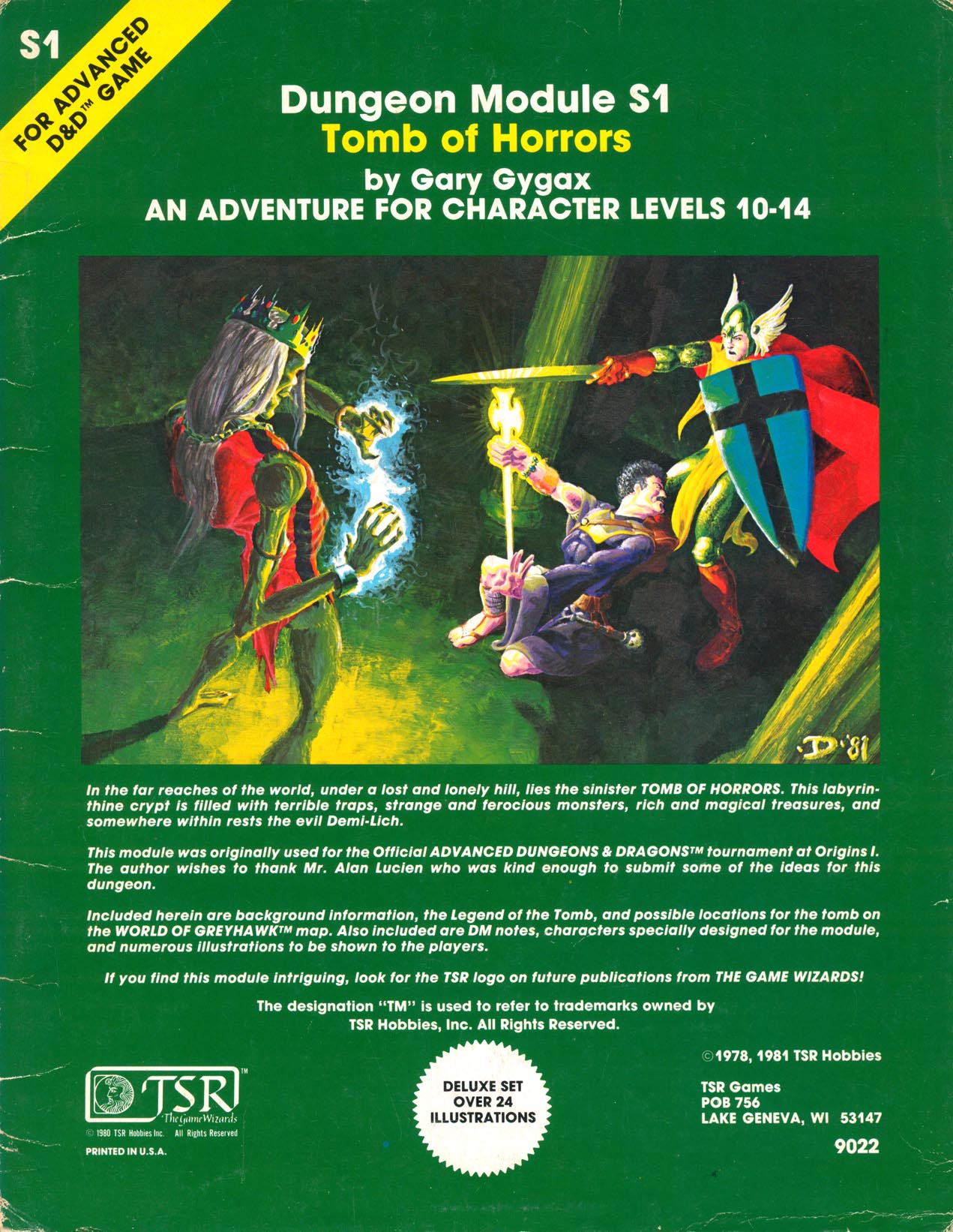
although the original had it's own weird magnetic charm that burns itself into your brain:
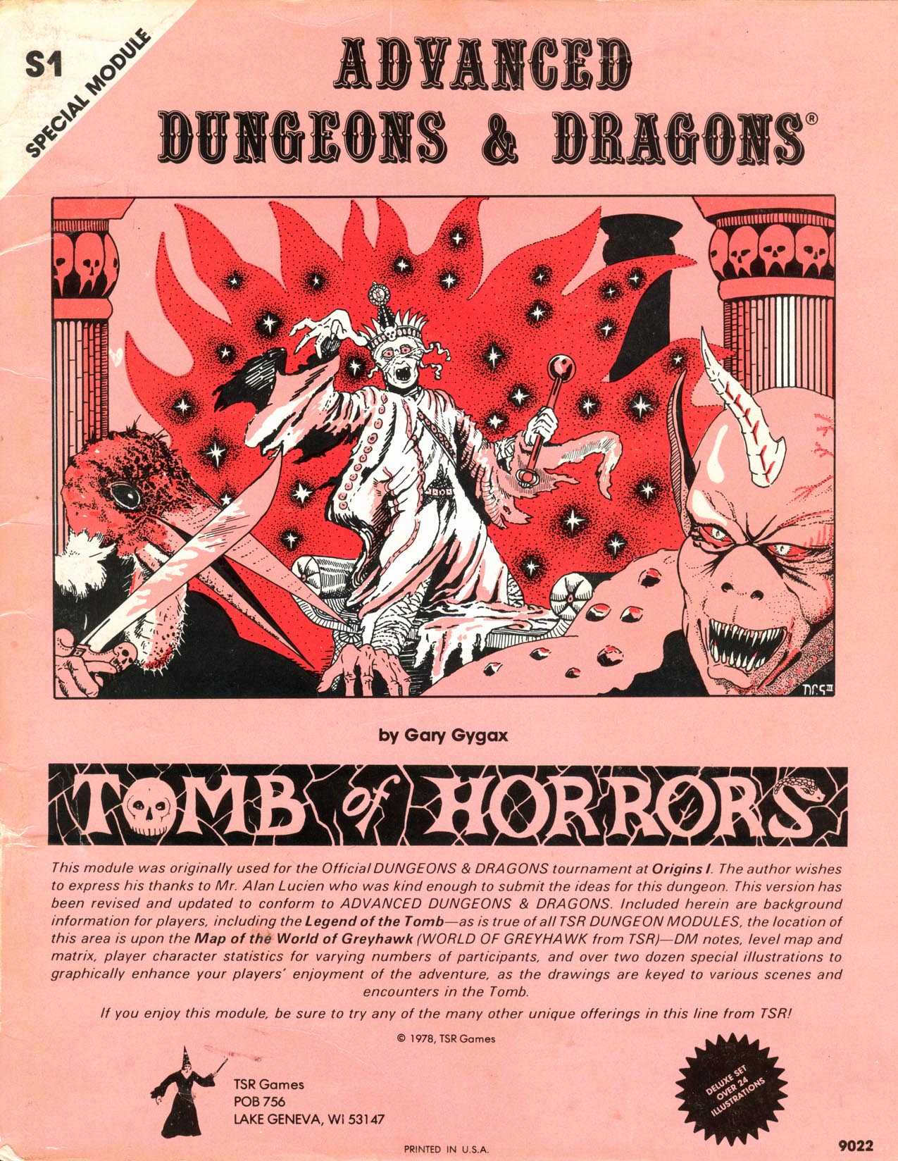
Sutherland was pushed to the side an "amateur artist", but there is really is something to his work that captures implies action and mood. I think he was/is under appreciated.
But honestly, the one cover (and I never owned it until recently...so it's not just nostalgia) that hits the D&D sweet spot is the original Sutherland + Trampier B1.
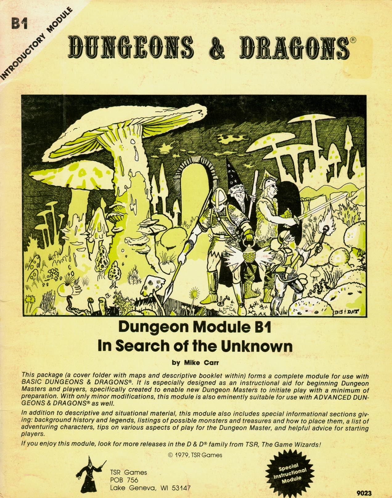
What idiot replaced it with this? (Sorry Darlene!)
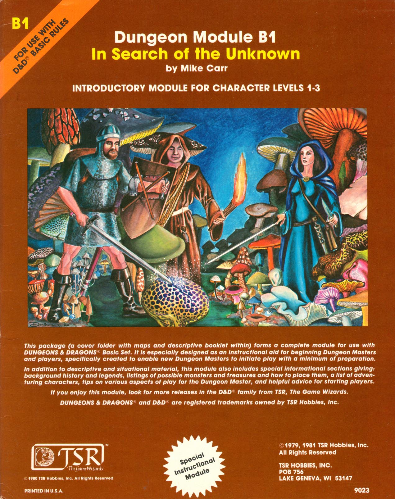
Look people...just because something is in full color and painted does not make it automatically "better art". That's the 2e/3e/4e/5e fallacy --- and the modern Photoshop lie. As today's young artists are starting to realize that their airbrush work is all starting to look redundant and boring, everyone is doing the same thing and decorating it with little curly-ques and the like --- aping Alphonse Mucha and the Art Nouveau movement. It's a move borne out of desperation that's become the new digital-art trope that is also as boring as ditch water.
D&D art went south for me with Elmore and Holloway. Everything became a safe, light-hearted joke.
No to Dungeon Punk. No to statically posed hyper-realism. No to video games aesthetics.
@The1True : I totally respect how certain art speaks to you and makes you want to play D&D. Honestly, I could pick it apart on technical grounds, but I would be 100% wrong to do so because THE ART DID ITS JOB---it inspired you. That's all that matters. Unfortunately (or maybe fortunately) we are all different, and what gets you going is often a turn-off for me. Que sera. It's neat we converged in Otis-land.
Last edited:
Two orcs
Officially better than you, according to PoN
Speaking of hype, there was a short music video of semi-animated pictures from AD&D (and 2e I think) that always made me incredibly hyped up to play D&D, and this is not nostalgia speaking as I never played D&D as a child or teenager. I can't for the life of me find it again, it was called something like "D&D land of adventure" with a guitar heavy metal in the background, black and white illustrations.
The1True
8, 8, I forget what is for
Otis rules them all. Fantasy surrealism is where it's at!It's neat we converged in Otis-land.
I love the old vs new comparisons! I'm with you on T1, not so much G2 (maybe the ink is too faint?). For a book cover, I prefer the new S1, but yeah, I've been trying to get that classic S1 art on a T-Shirt for years (you can find it in the US only on Etsy
I grew up getting the Dragonlance calendar for Christmas every year, so I am very partial to to Parkinson and Elmore in particular. Easley is alright as well. Caldwell is terrible (like Boris Vallejo. Jumped-up pin-up art). Those paintings told stories.
Okay okay, two more. Maybe controversial ones:
I get it, you blame ol' Tracy for ruining just everything. Still a great cover! A magic boat on a glass sea! Purple worms! totally radical!
And I'm sorry ToEE ruined your childhood hopes and dreams, but my friends from hs still talk about this adventure 30 years later! Hate all you like, you have to admit from the cover; the megadungeon beckons...
squeen
8, 8, I forget what is for
I am with you on ToEE, but that I5 cover is "great idea --- terrible execution". Really, really bad. (gag)
"Turn around. Put down the airbrush...and put your hands on your head. We're taking you in to read old EC comics until you're no longer a threat to the visual cortex of civil society."
Easley has some very good stuff (and some bad).
"Turn around. Put down the airbrush...and put your hands on your head. We're taking you in to read old EC comics until you're no longer a threat to the visual cortex of civil society."
Easley has some very good stuff (and some bad).
Last edited:
squeen
8, 8, I forget what is for
Great resource Allan!- Top of mind front covers: D3 blue version Eclavdra, H2 Mines of Bloodstone Orcus Parkinson, S4 behir Otus, X5 Temple of Death montage Tim Truman
- Top of mind back covers: A2 cloaker Otus, B1 monochrome Tower, B2 keep by Otus, D3 vampire/succubus, S2 monochrome WPM Otus, S2 color Elric Dee
TSR front/back cover browsing is easy at https://www.tsrarchive.com/
Allan.
I had never seen this H2 before. Pretty sweet.
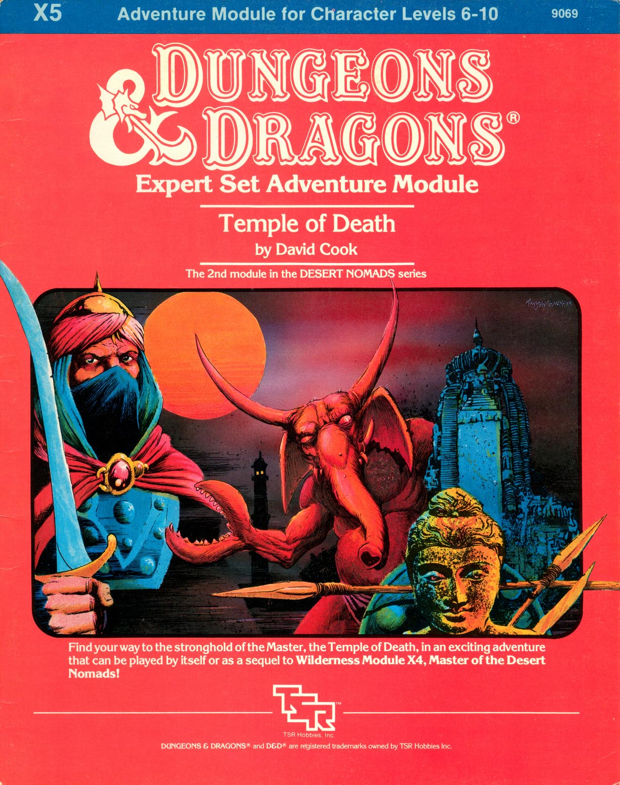
I can't bite on X5 (although I own it...untouched, unused!). I never could connect with B/X in and way shape or form. The photo bashing is a turn off.
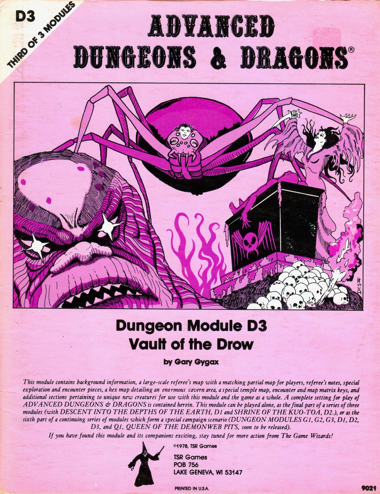
I bought the 1st printing of the D-series and thought I was alone in my fascination with the D3 cover. So hauntingly Lovecraft.
squeen
8, 8, I forget what is for
Flipping through the 5e cover stuff, WotC is still making the same old mistakes. So far, despite their huge art resources (via Magic: The Gathering) this is the only 5e image that ignites my imagination (not a cover) from Out of the Abyss. Probably because it doesn't have any anachronistically modern and super-heroic 5e adventurer's in it.
A great Demogorgon overall, but a very loose interpretation of "tentacle arms". I think a subliminal invocation of Godzilla is winning me over on this one.
/cdn.vox-cdn.com/uploads/chorus_asset/file/4020620/demons_demogorgon_2.0.jpg)
A great Demogorgon overall, but a very loose interpretation of "tentacle arms". I think a subliminal invocation of Godzilla is winning me over on this one.
/cdn.vox-cdn.com/uploads/chorus_asset/file/4020620/demons_demogorgon_2.0.jpg)
Last edited:
The1True
8, 8, I forget what is for
Yeah sorry, that D3 cover is fairly terrible. I agree that X5 cover is pretty weak. I'm usually a big fan of Timothy Truman. I LOVE his comics work!So hauntingly Lovecraft.
That is an incredible, bone-chilling Demogorgon. I really wish there was someone or something in that boat. Charon or a supplicant or something. Very digital storyboard style. It works out here.
H4 is interesting for the curiosity value of a 100th level adventure for 1e, but otherwise, the whole series is quite terrible. (Hasn't kept me from DMing and Playing H2 and H4 once each...)
squeen
8, 8, I forget what is for
Yes that's a flaw. When I first saw this image (4 years ago?) I was blown away, but now--after having seen enough digital painting "story board?" hacks---it starts to look less difficult to pull off. The lack of small details, chaotic regions of light/dark overlapping strokes, the magic of highlights, narrow color palettes, etc. There are just somethings that are almost impossible to do with lines that are easy with paint, and vice versa.I really wish there was someone or something in that boat. Charon or a supplicant or something. Very digital storyboard style. It works out here.
Yes. I was surprise @grodog also ranked D3 high---I thought it was just me that dug it. Perhaps he meant this Otis variant:
